Illustrations PowerPoint Charts
Formerly known as Illustrations PowerPoint Charts - this collection now covers topic-specific chart slide templates that pair functional data layouts with illustrated graphic elements. The subject areas run wide: chemical and biochemical sciences, AI and robotics, ecology and energy, logistics and drones, automotive, beauty, and more. Each template arrives as an editable .pptx file with chart zones, annotation areas, and vector illustration layers already structured.
The audience for this category is anyone building a presentation where the industry context is as important as the data itself. A scientist presenting research findings, a logistics director building a supply chain review, or a tech lead explaining an AI-driven workflow - all of them need slides where the visual language reinforces the subject matter rather than working against it. Generic chart templates produce slides that could belong to any industry. These don't.
Download a template, replace the sample figures with your own data, and the chart retains its illustrated context without additional design work.
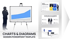 (12)
(12) Business Silhouettes PPT Charts Template - Editable SlidesID: #PC01110$15.00
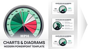 (17)
Professional Gauge Charts PowerPoint TemplateID: #PC01099$18.00
(17)
Professional Gauge Charts PowerPoint TemplateID: #PC01099$18.00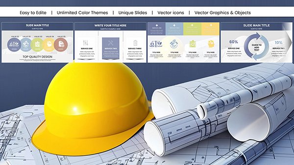 (900)
(900) Architectural PowerPoint Charts Template: Elevate Your Design PresentationsID: #PC01066$24.00
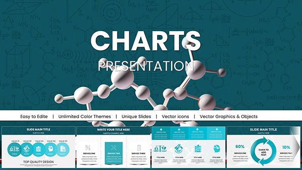 (821)
Pro Chemical & Biochemical Education PowerPoint ChartsID: #PC01062$22.00
(821)
Pro Chemical & Biochemical Education PowerPoint ChartsID: #PC01062$22.00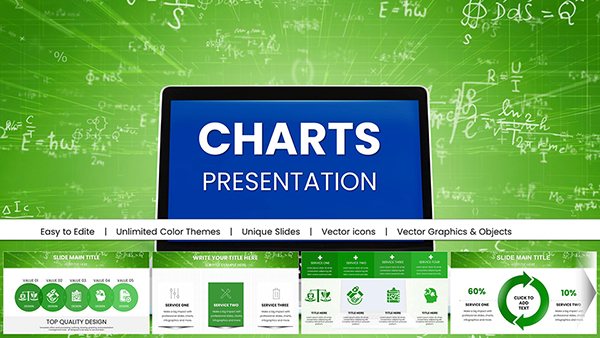 (953)
Engaging Online Math PowerPoint Charts TemplateID: #PC01060$18.00
(953)
Engaging Online Math PowerPoint Charts TemplateID: #PC01060$18.00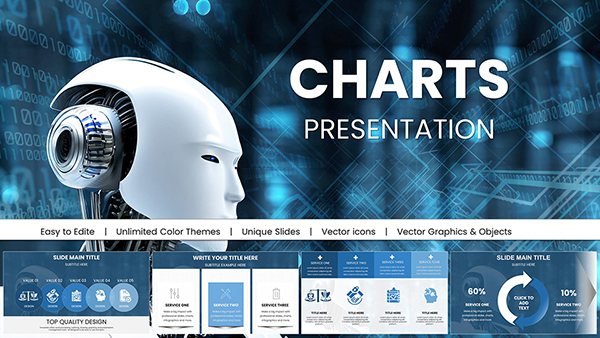 (657)
Presentations with AI-Powered Robot PowerPoint ChartsID: #PC01054$20.00
(657)
Presentations with AI-Powered Robot PowerPoint ChartsID: #PC01054$20.00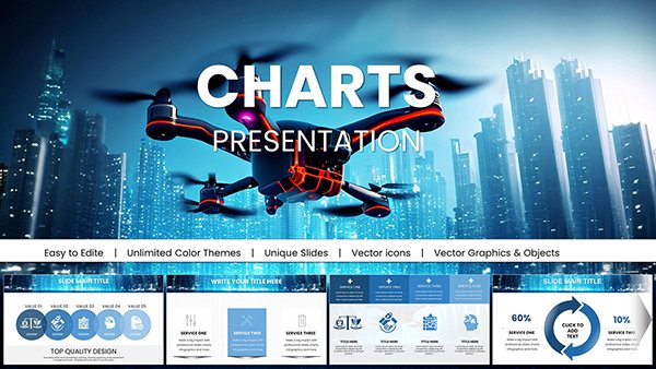 (251)
Presentations with Drone IT Technology PowerPoint ChartsID: #PC01052$25.00
(251)
Presentations with Drone IT Technology PowerPoint ChartsID: #PC01052$25.00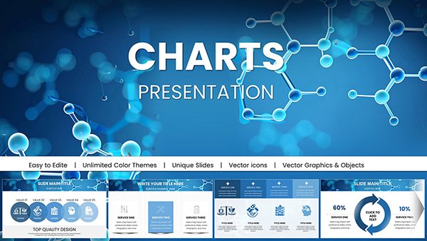 (856)
(856) Education Presentations with Chemical Molecules PowerPoint Charts: Ignite LearningID: #PC01050$18.00
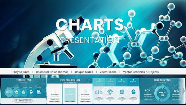 (1082)
Chemical PowerPoint Charts for Scientific ExcellenceID: #PC01047$24.00
(1082)
Chemical PowerPoint Charts for Scientific ExcellenceID: #PC01047$24.00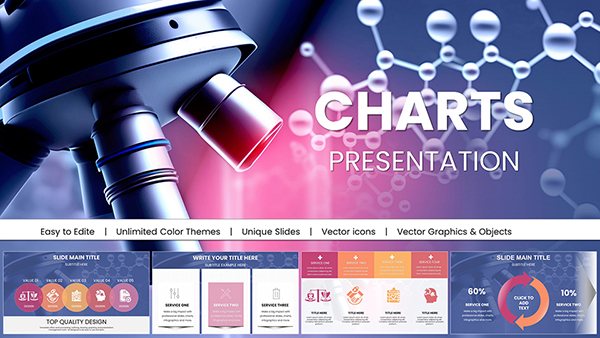 (637)
Microbiology Microscope PPT Charts DownloadID: #PC01044$22.00
(637)
Microbiology Microscope PPT Charts DownloadID: #PC01044$22.00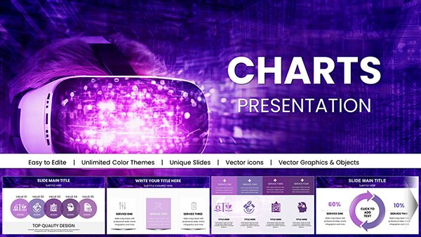 (571)
Virtual World Mask PowerPoint Charts - Immersive VR/AR Presentation TemplatesID: #PC01042$18.00
(571)
Virtual World Mask PowerPoint Charts - Immersive VR/AR Presentation TemplatesID: #PC01042$18.00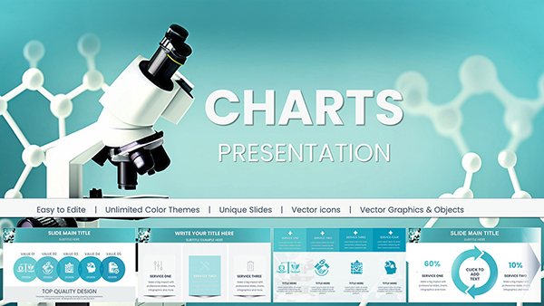 (154)
Chemical and Biochemical Engineering PowerPoint Charts: Precision Tools for Complex InsightsID: #PC01041$18.00
(154)
Chemical and Biochemical Engineering PowerPoint Charts: Precision Tools for Complex InsightsID: #PC01041$18.00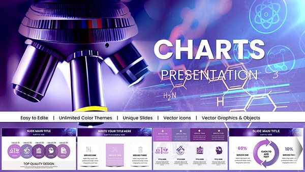 (1124)
 Nanoscience and Nanotechnology PowerPoint Charts: Magnifying the MinusculeID: #PC01039$20.00
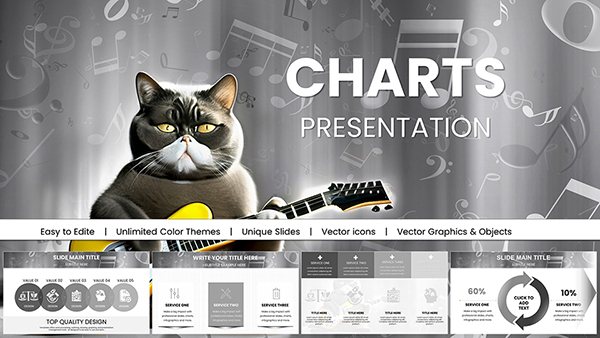 (1183)
Music PowerPoint Charts Template - Harmonize IdeasID: #PC01035$18.00
(1183)
Music PowerPoint Charts Template - Harmonize IdeasID: #PC01035$18.00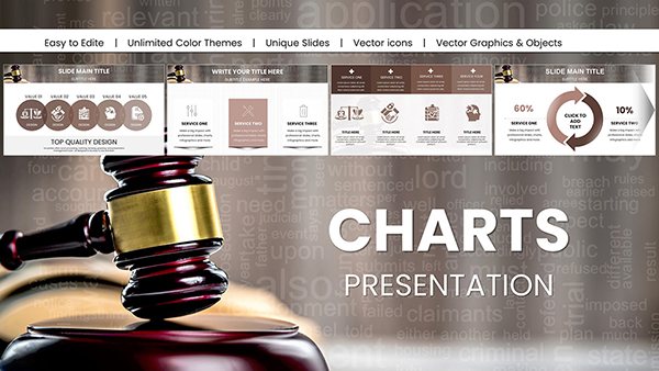 (960)
Comprehensive Legal Acts PowerPoint Charts for ProfessionalsID: #PC01033$25.00
(960)
Comprehensive Legal Acts PowerPoint Charts for ProfessionalsID: #PC01033$25.00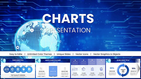 (1130)
Worldwide Internet Network PowerPoint Charts for Data MasteryID: #PC01030$18.00
(1130)
Worldwide Internet Network PowerPoint Charts for Data MasteryID: #PC01030$18.00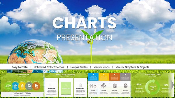 (630)
Eco Planet PowerPoint Charts for Green InnovationID: #PC01029$18.00
(630)
Eco Planet PowerPoint Charts for Green InnovationID: #PC01029$18.00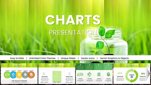 (1072)
Ecology PowerPoint Template - Fully Editable Conservation Charts | Instant DownloadID: #PC01028$18.00
(1072)
Ecology PowerPoint Template - Fully Editable Conservation Charts | Instant DownloadID: #PC01028$18.00 (1177)
Life Ecology Planet PowerPoint Charts: Visualizing Earth's Vital SystemsID: #PC01027$20.00
(1177)
Life Ecology Planet PowerPoint Charts: Visualizing Earth's Vital SystemsID: #PC01027$20.00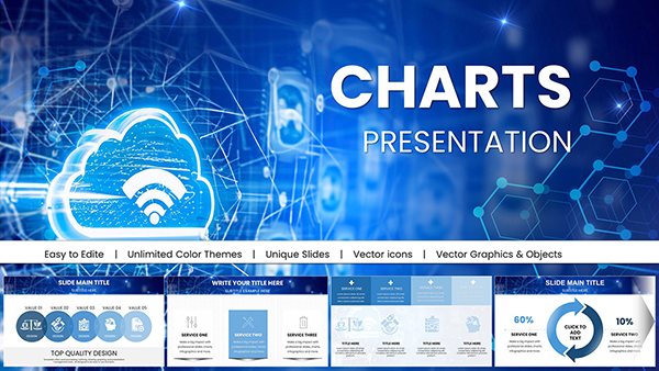 (27)
Network Cloud PowerPoint Charts - Connect SeamlesslyID: #PC01023$15.00
(27)
Network Cloud PowerPoint Charts - Connect SeamlesslyID: #PC01023$15.00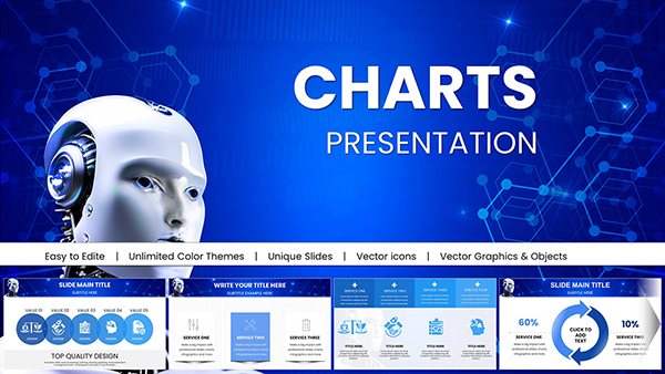 (830)
Robot Artificial Intelligence PowerPoint Charts Presentation: Revolutionize Your Tech NarrativesID: #PC01020$20.00
(830)
Robot Artificial Intelligence PowerPoint Charts Presentation: Revolutionize Your Tech NarrativesID: #PC01020$20.00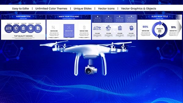 (921)
Flying Drone PowerPoint Charts Presentation: Capture Aerial Perspectives in Your SlidesID: #PC01019$18.00
(921)
Flying Drone PowerPoint Charts Presentation: Capture Aerial Perspectives in Your SlidesID: #PC01019$18.00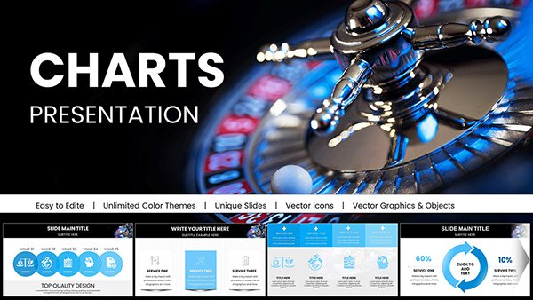 (458)
Winning Casino PowerPoint Charts Presentation: Gamble on Engaging VisualsID: #PC01018$20.00
(458)
Winning Casino PowerPoint Charts Presentation: Gamble on Engaging VisualsID: #PC01018$20.00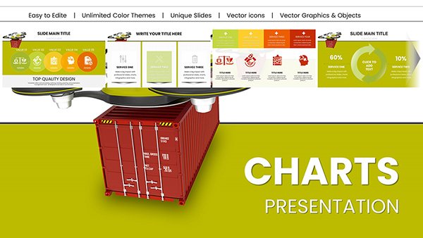 (26)
Heavy Cargo Drone Delivery PowerPoint Charts - Download Logistics TemplatesID: #PC01014$20.00
(26)
Heavy Cargo Drone Delivery PowerPoint Charts - Download Logistics TemplatesID: #PC01014$20.00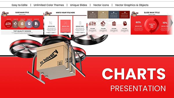 (958)
Drone Delivery PowerPoint Charts Presentation: Chart the Course of Modern LogisticsID: #PC01013$22.00
(958)
Drone Delivery PowerPoint Charts Presentation: Chart the Course of Modern LogisticsID: #PC01013$22.00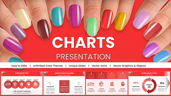 (946)
Manicure PowerPoint Charts Presentation TemplateID: #PC01009$25.00
(946)
Manicure PowerPoint Charts Presentation TemplateID: #PC01009$25.00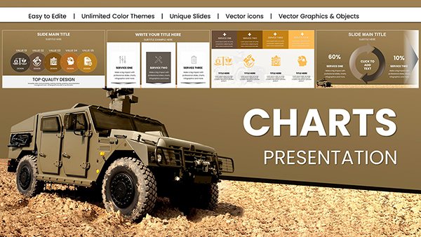 (743)
Military Vehicle PowerPoint Charts TemplateID: #PC01008$20.00
(743)
Military Vehicle PowerPoint Charts TemplateID: #PC01008$20.00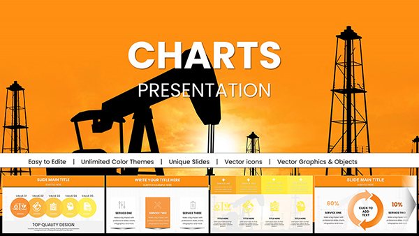 (923)
Oil and Gas Extraction PowerPoint Charts TemplateID: #PC01007$22.00
(923)
Oil and Gas Extraction PowerPoint Charts TemplateID: #PC01007$22.00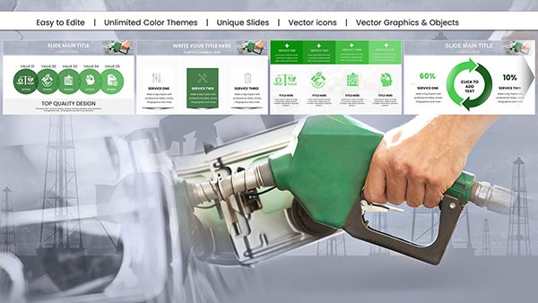 (890)
Gasoline Pump Refueling Car PowerPoint Charts: Elevate Your Automotive PresentationsID: #PC01006$18.00
(890)
Gasoline Pump Refueling Car PowerPoint Charts: Elevate Your Automotive PresentationsID: #PC01006$18.00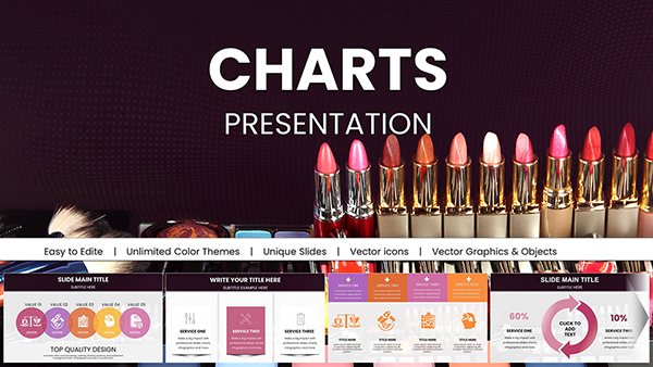 (727)
Vibrant Beauty Makeup Cosmetics PowerPoint Charts: Sparkle in Every SlideID: #PC01004$22.00
(727)
Vibrant Beauty Makeup Cosmetics PowerPoint Charts: Sparkle in Every SlideID: #PC01004$22.00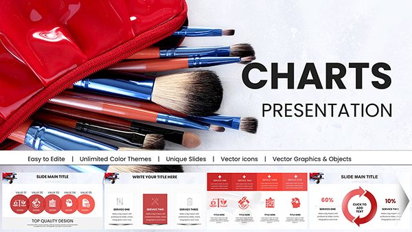 (1086)
Cosmetic Brushes Accessories PowerPoint Charts: Brush Up Your PresentationsID: #PC01003$25.00
(1086)
Cosmetic Brushes Accessories PowerPoint Charts: Brush Up Your PresentationsID: #PC01003$25.00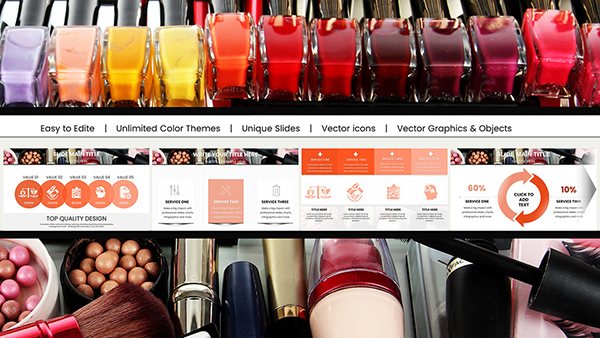 (767)
Nail Polishes and Cosmetics PowerPoint Charts: Transform Your Beauty PresentationsID: #PC01002$22.00
(767)
Nail Polishes and Cosmetics PowerPoint Charts: Transform Your Beauty PresentationsID: #PC01002$22.00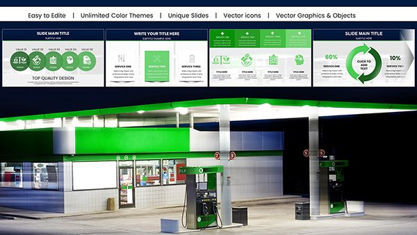 (116)
Gasoline Fuel Pump PowerPoint Presentation - Download ChartsID: #PC01001$18.00
(116)
Gasoline Fuel Pump PowerPoint Presentation - Download ChartsID: #PC01001$18.00
Why industry-specific illustration changes how data is received
When a data slide has no visual context, the audience reads the numbers in isolation. When the same data sits inside a slide built around molecular structures, drone imagery, or ecological systems, it reads as evidence within a story. That shift matters more than most presenters expect. A chemical engineer showing yield data alongside molecular structure graphics isn't decorating the slide - they're giving the audience a faster path to understanding what the numbers represent.
This is the core difference between a general chart template and an illustrated one. The illustration layer does informational work. It anchors the data in the real-world system it describes, which reduces the amount of verbal explanation needed during delivery. In a board or client presentation, that efficiency is worth something concrete.
Who uses these templates and why
Scientists and research leads building grant presentations, lab reports, or conference posters need slides that communicate both the data and the scientific domain. Templates in the chemistry, biochemistry, microbiology, and nanotechnology subsets are built for this context - the illustration elements double as visual shorthand that peer audiences recognize immediately.
Technology and AI leads presenting to non-technical executives face a different problem: making complex systems legible to an audience that won't follow raw architecture diagrams. AI and robotics illustration templates give those slides visual grounding - the robot or network graphic communicates the category before a word is spoken.
Sustainability and operations teams presenting ESG data, energy metrics, or supply chain performance benefit from templates where the ecological and logistics illustration layers frame the numbers as part of a larger system narrative, not just a data dump.
Marketing managers in vertical industries - automotive, beauty, food and beverage - need slides that match the visual identity of their sector. A beauty brand presenting campaign ROI slides in a template with cosmetics illustration accents lands differently in a client meeting than the same data in a generic blue bar chart.
How to match a template to your presentation's argument
Two factors determine whether an illustrated chart template serves your deck or fights against it: the chart type and the illustration register.
On chart type: choose the layout that matches your data's logic before you consider the illustration style. Comparison across categories needs a bar or column structure. Trend over time needs a line layout. Part-to-whole relationships need a pie or segmented format. These templates are organized by those structures - scroll past the illustration aesthetic and evaluate whether the chart zones support your specific data shape.
On illustration register: templates in this collection range from technical (molecular diagrams, engineering schematics) to stylized (cosmetics imagery, eco-globe graphics). Technical registers suit scientific and engineering audiences. Stylized registers suit marketing, event, or public-facing decks. Mixing a technical illustration with a marketing data set creates a visual mismatch that the audience will sense even if they can't name it.
A technical note on editing the vector illustration layer
The illustration elements in these templates are built as grouped vector shapes on a layer separate from the chart data object. When you open the file in Microsoft PowerPoint, the chart is a live editable chart object - you update data through the embedded spreadsheet view. The illustration layer is independent and won't change when you update figures.
The important thing to know: do not ungroup the illustration layer unless you intend to modify individual shapes. Ungrouping breaks the alignment anchors, and reassembling the layer correctly is time-consuming. If you need to recolor an illustration element, select it while the group is intact, then use Format > Shape Fill to change the fill color of the selected shape inside the group. This targets that element without breaking the layout structure. For whole-layer recoloring, use PowerPoint's theme color editor under Design > Variants > Colors so changes propagate cleanly across the entire file.
What makes this collection different from generic chart packs
Most chart template libraries are industry-agnostic by design - they're built to sell across the widest possible audience, which means they strip out the visual specificity that makes a chart slide feel authoritative in a domain-specific context. The templates in this collection are the opposite of that. The chemistry set looks like chemistry. The logistics set looks like logistics. The ecology set looks like ecology.
That specificity comes with a practical benefit: you spend less time explaining what the slide is about and more time on what the data means. Browse the full collection and download the set that matches your next presentation's subject.
Related categories on ImagineLayout
If you need the same data-forward approach without the illustrated overlay, the full PowerPoint chart templates library covers every chart type in a range of visual styles including flat, 3D, and graph-forward layouts. For presentations where the data story is driven by people and workflow rather than industry imagery, the Silhouettes & People PowerPoint chart templates provide a similar illustrated-plus-data structure. And if your deck needs visual analysis frameworks rather than data charts, the Graphs PowerPoint chart templates cover comparative and distribution layouts in depth.
Frequently Asked Questions
Can I replace the sample data in the chart without affecting the illustration layer?
Yes. The chart and the illustration layer are separate objects in the .pptx file. When you click the chart and use the embedded spreadsheet editor to update figures, only the chart data changes - the illustration graphics, background elements, and text annotation zones remain exactly as they were. The only scenario where the illustration layer shifts is if you manually drag or resize the chart object so that it overlaps or underlaps the illustration. To avoid this, update data only through the chart data editor, not by dragging the chart boundaries.
Are these templates compatible with Google Slides?
The templates are built in .pptx format and can be imported into Google Slides via File > Import Slides. The illustration layer - which consists of native PowerPoint vector shapes - generally transfers correctly as editable shapes. The limitation is that live PowerPoint chart objects become static images in Google Slides after import, meaning you can't update the data through a spreadsheet editor. If you work primarily in Google Slides and need editable charts, you would need to replace the imported chart image with a native Google Sheets chart after upload. For full editing functionality, Microsoft PowerPoint on Windows or Mac is the recommended platform.
What license applies - can I use these in client-facing presentations?
Yes. The standard ImagineLayout license covers commercial use, which includes client presentations, investor decks, conference materials, and internal business reports. You can edit the templates freely and present them in any professional context. The restriction is on redistribution of the original template files themselves - you cannot resell them, include them in a template pack you sell to others, or upload them to a public template library. If you need a white-label or extended distribution license, contact ImagineLayout directly.
Will the vector illustration elements scale correctly on a large projector screen?
Yes. The illustration elements are built as native PowerPoint vector shapes, not as embedded raster images. Vector shapes scale without quality loss at any resolution - they render as cleanly on a 4K display or large projector as they do on a laptop screen. If a template includes any photographic elements (some do, depending on the subject), those are placed at high resolution so they don't appear pixelated at standard projection sizes (1920x1080 or 4K). If you plan to present on a very large display, check the product description for resolution details on any photo elements included.
How do I change the color scheme to match my organization's brand?
Color updates work at two levels. For chart data series colors, select the chart object and use the Format Data Series panel to assign specific fill colors to each series - this gives precise control so your primary metric uses your primary brand color. For the illustration layer and background accents, use Format > Shape Fill on selected elements inside the group (without ungrouping). To apply brand colors consistently across the entire deck, go to Design > Variants > Colors > Customize Colors in PowerPoint and enter your hex values as custom theme colors. This approach updates all theme-linked elements across all slides simultaneously, which is the most efficient path for full-deck rebranding.