Illustrations Keynote Diagrams
These Keynote diagram templates replace generic shapes with custom illustrations that convey ideas through characters, icons, and scenes while still fitting corporate decks.
An internal trainer rolling out new policy guidelines to two hundred employees, or a marketing lead presenting campaign performance to the executive team - these moments benefit when the visual language feels human yet remains structured. The collection centers on illustrated storytelling layouts so the message lands faster.
Open the file and the narrative flow is already drawn. When the next training or pitch needs to connect with the audience on an emotional level without losing precision, the templates remove the illustration work that otherwise consumes design hours.
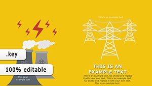 (225)
(225) Energetics Keynote Diagrams: Power Your PitchesID: #KD00210$18.00
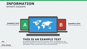 (121)
(121) Information Keynote Diagrams TemplateID: #KD00205$20.00
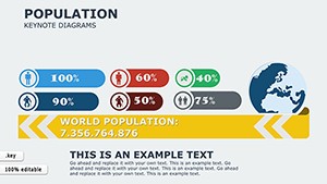 (330)
Population Keynote Diagrams TemplateID: #KD00204$15.00
(330)
Population Keynote Diagrams TemplateID: #KD00204$15.00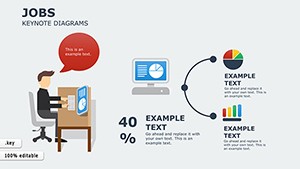 (392)
Jobs Keynote Diagrams for Career ProsID: #KD00201$14.00
(392)
Jobs Keynote Diagrams for Career ProsID: #KD00201$14.00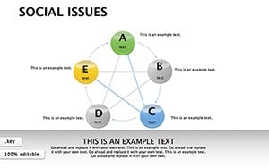 (602)
Social Issues Keynote Diagrams: Illuminating Societal ChallengesID: #KD00196$23.00
(602)
Social Issues Keynote Diagrams: Illuminating Societal ChallengesID: #KD00196$23.00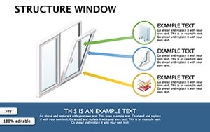 (749)
(749) Structure Window Keynote Diagrams: Engineering Precision VisualsID: #KD00195$21.00
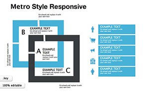 (846)
Metro Style Responsive Keynote DiagramsID: #KD00191$22.00
(846)
Metro Style Responsive Keynote DiagramsID: #KD00191$22.00 (513)
(513) Education Keynote Diagrams Template for Teachers and StudentsID: #KD00184$17.00
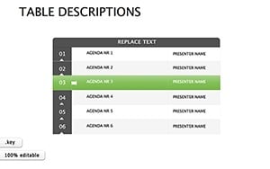 (103)
Creativity with Stunning Table Descriptions Keynote DiagramsID: #KD00183$16.00
(103)
Creativity with Stunning Table Descriptions Keynote DiagramsID: #KD00183$16.00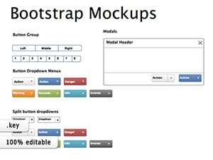 (1033)
Bootstrap Mockups Keynote Template: Elevate Your Web Design PitchesID: #KD00181$20.00
(1033)
Bootstrap Mockups Keynote Template: Elevate Your Web Design PitchesID: #KD00181$20.00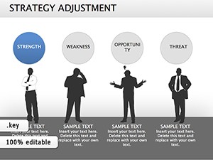 (425)
Strategy Adjustment Keynote Diagrams: Pivot with Precision and PowerID: #KD00177$18.00
(425)
Strategy Adjustment Keynote Diagrams: Pivot with Precision and PowerID: #KD00177$18.00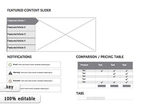 (488)
Mockups Website Keynote diagramsID: #KD00174$23.00
(488)
Mockups Website Keynote diagramsID: #KD00174$23.00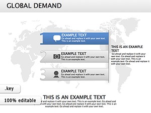 (158)
Global Demand Keynote Diagrams - Presentation TemplateID: #KD00173$20.00
(158)
Global Demand Keynote Diagrams - Presentation TemplateID: #KD00173$20.00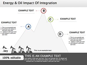 (288)
Crude Oil Energy Keynote Diagrams: Fuel Your InsightsID: #KD00170$20.00
(288)
Crude Oil Energy Keynote Diagrams: Fuel Your InsightsID: #KD00170$20.00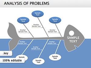 (1021)
Fishbone: Analysis of Problems Keynote diagramsID: #KD00167$22.00
(1021)
Fishbone: Analysis of Problems Keynote diagramsID: #KD00167$22.00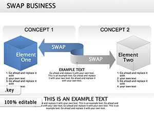 (1010)
Swap Option Keynote diagram templateID: #KD00164$22.00
(1010)
Swap Option Keynote diagram templateID: #KD00164$22.00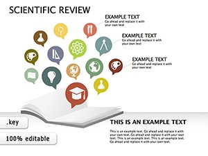 (313)
Illuminate Breakthroughs: Scientific Review Keynote DiagramsID: #KD00157$25.00
(313)
Illuminate Breakthroughs: Scientific Review Keynote DiagramsID: #KD00157$25.00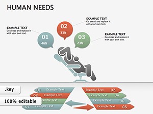 (818)
Human Needs Keynote diagrams templatesID: #KD00154$25.00
(818)
Human Needs Keynote diagrams templatesID: #KD00154$25.00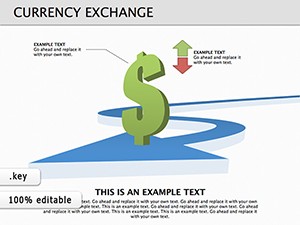 (759)
19 Currency Exchange Diagrams - Editable KEY | ImagineLayoutID: #KD00138$15.00
(759)
19 Currency Exchange Diagrams - Editable KEY | ImagineLayoutID: #KD00138$15.00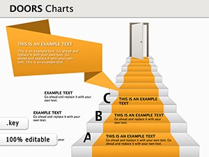 (294)
Doors Keynote Diagrams TemplatesID: #KD00135$25.00
(294)
Doors Keynote Diagrams TemplatesID: #KD00135$25.00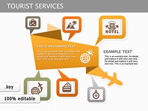 (671)
Tourist Services Keynote Diagrams for Engaging Travel PresentationsID: #KD00131$25.00
(671)
Tourist Services Keynote Diagrams for Engaging Travel PresentationsID: #KD00131$25.00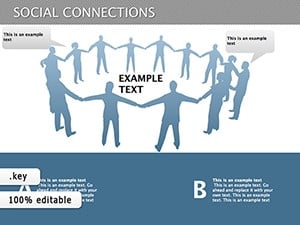 (139)
Social Connection Keynote Diagrams - Editable KeynoteID: #KD00120$18.00
(139)
Social Connection Keynote Diagrams - Editable KeynoteID: #KD00120$18.00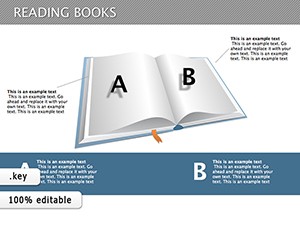 (508)
Reading Books Keynote Diagrams TemplateID: #KD00119$27.00
(508)
Reading Books Keynote Diagrams TemplateID: #KD00119$27.00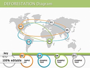 (322)
Causes of Deforestation Keynote Diagram TemplateID: #KD00112$19.00
(322)
Causes of Deforestation Keynote Diagram TemplateID: #KD00112$19.00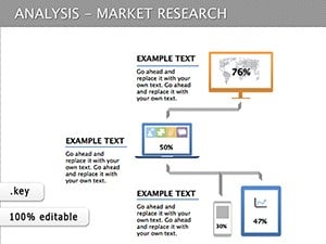 (296)
Market Research Keynote Diagrams: Insightful Visual ToolsID: #KD00110$15.00
(296)
Market Research Keynote Diagrams: Insightful Visual ToolsID: #KD00110$15.00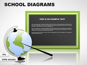 (383)
School Keynote Diagrams TemplatesID: #KD00049$22.00
(383)
School Keynote Diagrams TemplatesID: #KD00049$22.00 (281)
Energy Lamp Idea Keynote Diagrams TemplateID: #KD00043$22.00
(281)
Energy Lamp Idea Keynote Diagrams TemplateID: #KD00043$22.00 (281)
Test Tube Keynote Diagrams: Science Slides SimplifiedID: #KD00040$20.00
(281)
Test Tube Keynote Diagrams: Science Slides SimplifiedID: #KD00040$20.00 (28)
Honeycomb Keynote Diagrams: Modular Magic for Your IdeasID: #KD00038$25.00
(28)
Honeycomb Keynote Diagrams: Modular Magic for Your IdeasID: #KD00038$25.00 (822)
BCG Matrix Keynote diagram templateID: #KD00037$24.00
(822)
BCG Matrix Keynote diagram templateID: #KD00037$24.00 (960)
Flights Keynote diagramsID: #KD00036$15.00
(960)
Flights Keynote diagramsID: #KD00036$15.00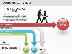 (1031)
Direction Arrows Keynote Diagrams - Fully Editable | ImagineLayoutID: #KD00032$14.00
(1031)
Direction Arrows Keynote Diagrams - Fully Editable | ImagineLayoutID: #KD00032$14.00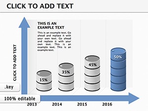 (1199)
Business Keynote Diagrams Template: Chart Your Path to IndependenceID: #KD00022$20.00
(1199)
Business Keynote Diagrams Template: Chart Your Path to IndependenceID: #KD00022$20.00
When Standard Shapes Fall Short and Illustrations Take Over
A learning and development manager must explain a complex compliance process to non-technical staff. Standard circles and arrows feel cold; the Energetics Keynote Diagrams replace them with illustrated figures moving through stages so employees see themselves in the story. The Population Keynote Diagrams template then visualizes demographic shifts with small character icons that instantly communicate scale without spreadsheets.
A career coach uses the Jobs Keynote Diagrams to map career pathways; the illustrated ladders and bridges make abstract progression tangible. An HR director presenting social-impact initiatives chooses the Social Issues Keynote Diagrams and the audience connects with the human scenes rather than abstract charts.
Finally, an engineering lead illustrates system architecture with the Structure Window Keynote Diagrams; the cutaway views clarify relationships that layered rectangles never could.
The Time Saved When Illustrations Are Already Drawn
Creating custom icons from scratch forces decisions about stroke weight, perspective, and color harmony across every slide. Those choices multiply in a thirty-slide deck and the thinking budget disappears. These templates hand you complete scenes that still allow full recoloring and repositioning so the design work stays in the story, not the artwork.
Workflow for Training and Client Decks
Recurring training programs reuse the same illustrated diagrams each quarter. Because the illustrations sit on locked background layers you update only the text and numbers; the visual language remains identical across sessions. The result is brand-consistent materials that feel fresh because the data changes.
After the use cases the next step is obvious. Select the illustration style that fits your audience and begin.
Keynote Tip for Working with Illustrated Layers
Open the slide master and confirm the illustration layer sits behind the text placeholder; Keynote`s layering order is preserved on duplication. When exporting to PDF choose "Include background graphics" so the custom drawings render at full resolution. For large decks keep file size low by compressing any added photos separately; the native illustrations remain vector-sharp regardless.
Why These Illustrations Fit Corporate Storytelling
The drawings avoid cartoon exaggeration yet stay approachable. Every element is a vector group you can recolor with one click to match your brand palette. The absence of decorative extras keeps the focus on the message while the human touch makes complex ideas memorable.
Choosing the Right Collection for Your Next Presentation
If your content involves physical site plans rather than conceptual illustrations, see our architecture and real estate layouts in Keynote. For step-by-step process mapping try the arrow-based diagrams in PowerPoint. When the meeting ends and you hand out contact details, the consulting business card designs extend the impression.
Ready to engage your next audience? Open any file and begin.
FAQ
Are these Keynote templates compatible with current versions?
All files open in Keynote 13 and later. The custom illustrations are vector groups so they scale cleanly on retina displays; older versions may require regrouping after opening. Embedded fonts ensure text styles match your brand across devices.
Can I recolor the illustrations to match my brand?
Each illustration is built from separate shape groups so you select and change fill or stroke colors in one action. Theme colors applied at document level update every instance automatically, keeping consistency when multiple contributors edit the same deck.
Do the diagrams work on both Mac and iOS Keynote?
Yes, the vector illustrations render identically on iPad and Mac. Touch editing works on grouped elements; simply tap to select and recolor. Exporting from iOS preserves all layers for later desktop refinement.
What happens on PDF export?
The illustrations stay vector-sharp because Keynote exports the native paths. Choose "Best" quality to keep crisp edges; file size remains reasonable since the drawings avoid heavy gradients or photos unless you add them.
Is team sharing allowed?
The license covers all internal use so colleagues can edit the same file. Client delivery as PDF or images is permitted; the original Keynote files remain inside the organization.