Hierarchy Keynote Diagrams
This collection contains hierarchy diagrams designed for Apple Keynote. A management consultant preparing an organizational assessment for a client executive team no longer redraws boxes and connectors when the deliverable must show clear reporting relationships.
These templates are for professionals who present layered information such as department heads in all-hands meetings or analysts in supply chain reviews where the audience needs to grasp how one level supports another.
The pre-aligned slide masters ensure the visual structure supports the argument instead of distracting from it. Download the Keynote file and update the text to fit your data.
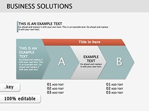 (202)
(202) Business Solutions Keynote Diagrams Template for PresentationID: #KD00163$23.00
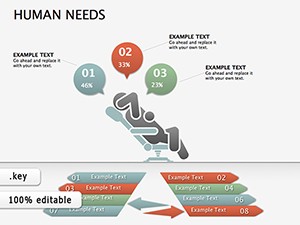 (818)
(818) Human Needs Keynote diagrams templatesID: #KD00154$25.00
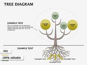 (841)
(841) Presentations with Tree Analysis Keynote DiagramsID: #KD00074$22.00
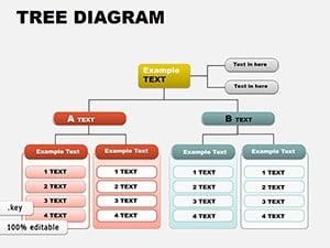 (472)
Editable Organizational Tree Keynote DiagramsID: #KD00057$16.00
(472)
Editable Organizational Tree Keynote DiagramsID: #KD00057$16.00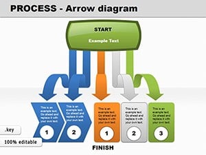 (120)
(120) Process Arrow Keynote Diagrams: Adapt & VisualizeID: #KD00046$20.00
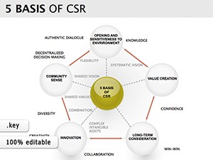 (255)
CSR Keynote Diagrams TemplateID: #KD00012$24.00
(255)
CSR Keynote Diagrams TemplateID: #KD00012$24.00 (753)
Circular Flow Keynote Diagrams - Editable .key | ImagineLayoutID: #KD00008$5.00
(753)
Circular Flow Keynote Diagrams - Editable .key | ImagineLayoutID: #KD00008$5.00
What Makes Hierarchy Diagrams Essential for Executive Communication
When the message involves multiple layers of responsibility or process flow, a single well-structured slide conveys what ten bullet points cannot. The audience sees the connections immediately rather than reconstructing them from scattered text. These layouts force the presenter to decide the hierarchy first, which sharpens the overall narrative before any slide is opened.
The Real Cost of Building Hierarchies from Blank Slides in Keynote
Starting from a blank slide means choosing connector styles, aligning text baselines across twenty boxes, matching the brand color palette on every branch, and then redoing the work when the structure changes. That sequence of micro-decisions consumes the thinking time that should go into the strategy itself. The templates remove those decisions so the file opens ready for content only.
Four Scenarios Where These Templates Save Critical Time
The HR director at a manufacturing firm had two days to prepare the new organizational chart for the CEO town hall. Opening the template let her drop in updated roles and titles; the connectors and spacing adjusted automatically. The slide went from draft to final without a single alignment fix, giving her time to rehearse the delivery instead of fighting layout.
A strategy consultant mapping five reporting levels for a client board meeting faced last-minute additions from the leadership team. The pre-built hierarchy branches expanded without shifting the entire diagram. The executive summary slide remained balanced, and the client saw the full picture in one glance rather than flipping between slides.
The finance lead preparing the quarterly budget review for the CFO needed to show cost-center hierarchies across divisions. Updating numbers in the template kept every level visually linked. The presentation moved from data entry to discussion in under an hour, avoiding the usual scramble to realign arrows after each change.
An operations manager rolling out a new supply-chain process to regional teams used the template to display tiered responsibilities. The same file was shared across departments; each team edited only its section while the overall structure stayed consistent. The meeting ended with clear ownership assignments instead of confusion over who reports to whom.
How Templates Support Consistent Workflow in Recurring Decks
For monthly reporting or quarterly reviews the same hierarchy structure appears again and again. The slide master carries the layout forward so every new deck inherits the correct spacing and connector style. Departments can share one master file and still produce decks that look as if a single designer created them all.
Practical Advice for Expanding or Contracting Hierarchy Levels
Group related branches before scaling text size; Keynote then treats the group as a single object and preserves relative spacing. When removing a level, delete the group first and let the remaining connectors snap back using the smart guides that appear automatically. This keeps the diagram balanced without manual repositioning of every element.
Technical Considerations for Keynote Slide Masters and Export
These files use native Keynote connection lines attached to the slide master. Changing the presentation aspect ratio from 16:9 to 4:3 keeps the connections intact because the lines are anchored to shape centers rather than absolute coordinates. When exporting to PDF the vectors remain crisp at any zoom level; embedded fonts travel with the file so recipient machines never substitute a default typeface.
The Design Philosophy Behind This Collection
Every diagram prioritizes editing speed and corporate readability over decorative flair. Shapes use only the minimal palette that works under boardroom lighting, and text hierarchy follows standard executive summary logic. The result is a file that feels like an extension of your thinking rather than an obstacle between idea and audience.
If your next presentation instead requires side-by-side comparisons, explore the matrix Keynote charts templates. For thematic visuals suited to sector-specific storytelling, consider the agriculture and animals PowerPoint templates. Teams focused on employee programs can also review the health and wellness PowerPoint templates.
The collection is ready when your next deliverable calls for clear layered structures.
FAQ
Are these templates compatible with the latest Apple Keynote version?
Yes, every file is built and tested on Keynote 13 and newer. The slide master layouts, vector connection lines, and embedded fonts render exactly as designed on both macOS and iPadOS. On versions earlier than 12 some grouping behaviors may require manual adjustment after opening, but text and color edits remain fully functional. After opening the file always select the master slide once to confirm connector styles match your display resolution.
What file format is provided and does it include the slide master?
The download is a single native .key file that already contains the complete slide master with all hierarchy layouts pre-configured. You do not receive a separate PPTX version because the connection lines are Keynote-native and behave differently in PowerPoint. The master slide is fully editable so any future deck started from the same file inherits the same spacing and connector rules automatically.
Can the templates be shared across a team under the license?
The standard license permits use by anyone inside the purchasing organization on any device owned or controlled by that organization. You may distribute the file internally via shared drives or email but not post it publicly or sell it onward. Each team member can edit and present without additional purchases as long as the work remains inside the same company.
How do I edit the hierarchy branches without losing alignment?
Select the entire branch group first, then edit the text inside the shapes. Keynote automatically resizes the connector lines while preserving the original angles and spacing ratios. If you need to add a new level, duplicate an existing group and drag it into position; the smart guides will snap it to the same baseline as the rest of the diagram. Never ungroup the connectors unless you intend to rebuild them manually.
Do the files work on both macOS and iPad versions of Keynote?
Yes, the same .key file opens identically on macOS, iPadOS, and even the web version of Keynote. Vector shapes and connection lines scale correctly on retina displays and the touch interface. The only difference is that some advanced animation options available on macOS are simplified on iPad, but the static hierarchy layouts remain pixel-perfect across all platforms.