Graphs Keynote Diagrams
A collection of graph diagrams created for Apple Keynote. These layouts place the axes and series for teams working on Mac when the message lives inside the trends.
When an operations analyst assembles the quarterly metrics review for the leadership team, recreating chart formatting eats the hours needed for insight. The templates open with preset scales and color logic.
The data structure stays intact as you swap values. Update labels, adjust series, and the deck advances. Select the graph type that matches the agenda and start editing.
 (1119)
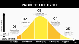
 Master Your Product's Journey: Product Life Cycle Keynote DiagramsID: #KD00220$16.00
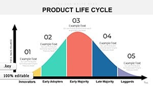 (475)
(475) From Seed to Success: The Ultimate Product Life Cycle Keynote ToolkitID: #KD00219$18.00
 (477)
Success Dynamic Diagrams Keynote Template for PresentationsID: #KD00188$15.00
(477)
Success Dynamic Diagrams Keynote Template for PresentationsID: #KD00188$15.00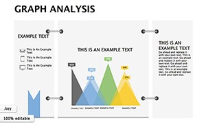 (1054)
Graph Analysis Keynote Diagrams: Illuminating Architectural InsightsID: #KD00185$15.00
(1054)
Graph Analysis Keynote Diagrams: Illuminating Architectural InsightsID: #KD00185$15.00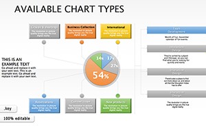 (1187)
 Available Types Keynote Diagrams: Visualize Data Cycles with PrecisionID: #KD00180$20.00
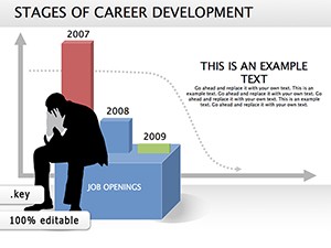 (1121)
Stages Career Development Diagrams: Chart Your Path to Professional PeaksID: #KD00178$20.00
(1121)
Stages Career Development Diagrams: Chart Your Path to Professional PeaksID: #KD00178$20.00 (845)
Statistical Analysis Keynote diagram templateID: #KD00165$22.00
(845)
Statistical Analysis Keynote diagram templateID: #KD00165$22.00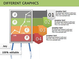 (825)
Different Graphics Keynote Diagrams: Versatile Visuals for Every PresentationID: #KD00150$16.00
(825)
Different Graphics Keynote Diagrams: Versatile Visuals for Every PresentationID: #KD00150$16.00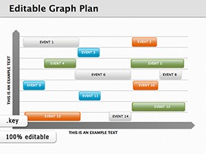 (179)
(179) 8 Graph Plan Keynote Diagrams - Instant Download | ImagineLayoutID: #KD00144$12.00
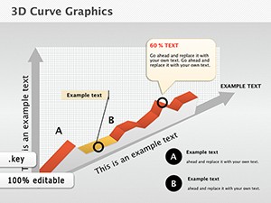 (926)
3D Curve Graphics Keynote Diagrams - Advanced VisualizationID: #KD00105$12.00
(926)
3D Curve Graphics Keynote Diagrams - Advanced VisualizationID: #KD00105$12.00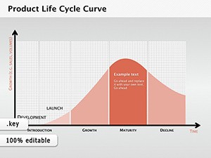 (1040)
Product Life Cycle Curve Keynote DiagramsID: #KD00101$12.69
(1040)
Product Life Cycle Curve Keynote DiagramsID: #KD00101$12.69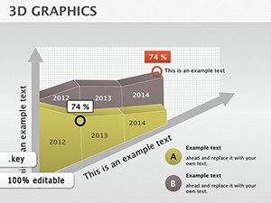 (639)
3D Graphics Keynote diagram PresentationID: #KD00099$14.00
(639)
3D Graphics Keynote diagram PresentationID: #KD00099$14.00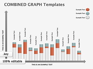 (89)
Column Graph Keynote Diagrams: Visualize Market Dynamics with EaseID: #KD00089$10.99
(89)
Column Graph Keynote Diagrams: Visualize Market Dynamics with EaseID: #KD00089$10.99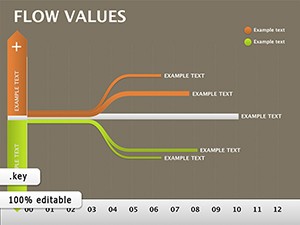 (669)
Flow Values Keynote Template: Illuminate Hidden Data ConnectionsID: #KD00066$21.00
(669)
Flow Values Keynote Template: Illuminate Hidden Data ConnectionsID: #KD00066$21.00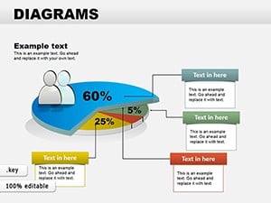 (1124)
Collection Data Pie Keynote DiagramsID: #KD00058$24.00
(1124)
Collection Data Pie Keynote DiagramsID: #KD00058$24.00
How Keynote Graph Templates Turn Numbers Into Immediate Insight
Line graphs with trend lines show trajectory without extra explanation. A growth lead presented user acquisition curves; the executive team spotted the inflection point and approved scaling budget the same hour.
Do Built-in Animations Survive Export?
Keynote animations travel with the file. Export to PDF freezes the final state while keeping the deck playable in Keynote for live delivery.
Four Moments Where Graph Templates Shifted Decisions
A SaaS metrics lead showed churn by cohort with stacked area graphs. Leadership identified the problematic onboarding month and launched a fix within days.
A retail category manager mapped sales mix with donut graphs. The visual revealed over-reliance on one product line; assortment changes were green-lit immediately.
An education director illustrated enrollment trends with column graphs. The board saw demographic shifts and adjusted scholarship allocation on the spot.
A consulting analyst presented client ROI with combo graphs. The client saw payback periods clearly and signed the expansion contract the following week.
Ready to visualize? The file awaits your data.
Non-Obvious Grouping for Multi-Series Graphs
Group each series before adding animation builds. Keynote keeps the group intact when you reorder slides, preventing series from drifting out of sync during rehearsal.
Technical Note on Aspect Ratio and Projection
All graphs are built at 16:9. When connecting to an external projector, Keynote maintains vector sharpness; avoid 4:3 mode or the axes will stretch.
The Advantage of These Templates for Corporate Teams
Charts stay fully editable with native Keynote objects. The collection skips decorative extras so updates remain fast and the output stays consistent across Mac users.
Choosing the Right Diagram Category for Your Next File
If spherical relationships fit the narrative, see the spheres Keynote diagram templates. For stacked structure the PowerPoint cube diagram templates offer dimensional blocks. Windows users can review the PowerPoint graph templates for native chart handling.
Select the graph collection that matches your format and open the file.
What Keynote version do these graph templates require?
Keynote 10 and newer supports full chart animations and data linking. Earlier versions keep the graphs editable but some build effects may not play. The .key file contains native chart objects so values update instantly on any supported Mac.
Are the templates licensed for commercial use and team sharing?
The license allows use in any number of presentations for your organization or clients. Internal team sharing on Mac devices is permitted. Separate licenses apply for consultants working with multiple external clients. The graphs cannot be resold as standalone assets.
How do I update the data in the graphs?
Click the chart, choose Edit Chart Data, and paste from Numbers or type directly. Scales and colors adjust automatically to the preset style.
What file format will I receive and how is it opened?
You receive a standard .key package. Double-click on any Mac with Keynote to open. All elements are native so fonts and animations stay intact.
Can I export these graphs to PDF while keeping data labels sharp?
Yes. Export at original 16:9 resolution; vector labels remain crisp. For printed handouts raise the DPI setting in the export dialog to avoid blur on legends.