Data Keynote Diagrams
Formerly known as data Keynote diagrams - this collection now covers the full range of diagram types used in business presentations: process flows, organizational hierarchies, relationship maps, cycle diagrams, and structured visual frameworks. If you're a business analyst mapping a multi-step approval process or a consulting team presenting a transformation roadmap, these templates give you a working visual structure before a single shape is drawn.
Instead of building diagrams manually in Apple Keynote - choosing shape sizes, drawing connectors, aligning elements slide by slide - you start with layouts that already reflect business logic: how steps connect, how hierarchy reads, how information moves across a slide. The visual system is in place so your attention stays on what the diagram needs to say, not how to build it.
Browse the collection below and choose a structure that fits your next presentation's logic.
 (412)
(412) Combination Photo Keynote Diagrams - Editable | ImagineLayoutID: #KD00216$12.00
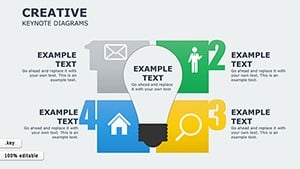 (337)
(337) Creative Keynote Diagrams TemplateID: #KD00202$22.00
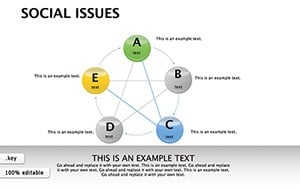 (602)
(602) Social Issues Keynote Diagrams: Illuminating Societal ChallengesID: #KD00196$23.00
 (513)
(513) Education Keynote Diagrams Template for Teachers and StudentsID: #KD00184$17.00
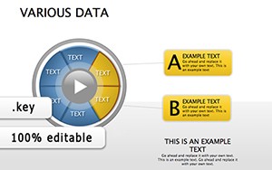 (401)
Various Data Keynote Diagrams for Modern Information ManagementID: #KD00182$20.69
(401)
Various Data Keynote Diagrams for Modern Information ManagementID: #KD00182$20.69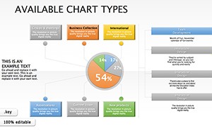 (1187)
Available Types Keynote Diagrams: Visualize Data Cycles with PrecisionID: #KD00180$20.00
(1187)
Available Types Keynote Diagrams: Visualize Data Cycles with PrecisionID: #KD00180$20.00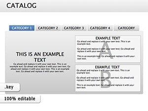 (733)
22 Catalog Keynote Diagrams - Fully Editable | ImagineLayoutID: #KD00176$16.00
(733)
22 Catalog Keynote Diagrams - Fully Editable | ImagineLayoutID: #KD00176$16.00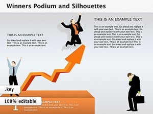 (795)
Winners Podium and Silhouettes Keynote Diagrams TemplateID: #KD00103$22.00
(795)
Winners Podium and Silhouettes Keynote Diagrams TemplateID: #KD00103$22.00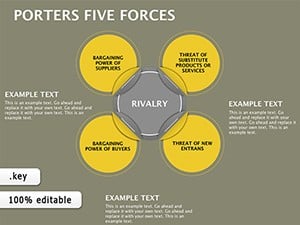 (821)
Master Competitive Landscapes with Porter's Five Forces Keynote DiagramsID: #KD00069$18.00
(821)
Master Competitive Landscapes with Porter's Five Forces Keynote DiagramsID: #KD00069$18.00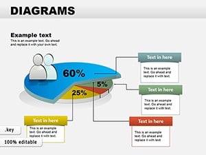 (1124)
Collection Data Pie Keynote DiagramsID: #KD00058$24.00
(1124)
Collection Data Pie Keynote DiagramsID: #KD00058$24.00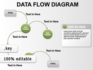 (1039)
Data Flow Keynote Diagrams - Fully Editable KeynoteID: #KD00017$20.00
(1039)
Data Flow Keynote Diagrams - Fully Editable KeynoteID: #KD00017$20.00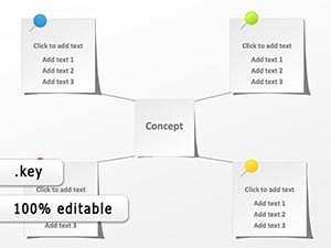 (331)
Sticker Keynote Diagram TemplateID: #KD00005$12.00
(331)
Sticker Keynote Diagram TemplateID: #KD00005$12.00
Why the diagram layout itself is part of the argument
A diagram that's hard to read doesn't just slow the audience down - it shifts attention from the idea to the visual. When a process flow has inconsistent arrow spacing, or a hierarchy chart compresses three levels into an awkward column, people spend time decoding layout instead of understanding the relationship being explained.
These templates are built around how business diagrams are actually read: left to right for sequences, top to bottom for authority, radially for ecosystem relationships. The structure is already embedded, so you're editing content into a working visual rather than constructing one from scratch.
This matters most in presentations where diagrams carry analytical weight - not as supporting decoration, but as the primary explanation. A consulting team presenting a client transformation roadmap, an operations lead explaining a multi-department handoff process, or a product manager mapping how components interact all depend on diagram clarity to make their case.
Named frameworks in this collection and how to use their layouts
Porter's Five Forces
The Five Forces framework is a structured competitive analysis tool used by strategy teams, MBA programs, and consulting firms to assess industry dynamics. The five forces - threat of new entrants, bargaining power of buyers and suppliers, threat of substitutes, and competitive rivalry - each require roughly equal visual weight in the diagram. A common mistake when building this manually is allowing one segment to crowd others when text is longer. The templates here use fixed-area segments, so editing one force's label doesn't shift the others. This is important when presenting to a client leadership team: the framework's symmetry is part of its credibility.
Process and flow diagrams
Process diagrams in this collection are built for business workflows, not technical documentation. That means swim-lane structures for multi-department processes, sequential flows for approval chains, and branching diagrams for decision trees. Each type has a distinct reading pattern, and the templates reflect that - swim lanes read horizontally, decision trees flow downward, approval chains follow a linear path with clear entry and exit points.
Organizational and hierarchy diagrams
Hierarchy slides are used for more than org charts. Team structure presentations, reporting line explanations, and authority maps all use the same visual grammar. The layouts in this collection handle varying numbers of nodes without requiring manual repositioning - you can expand or reduce a hierarchy level by duplicating a node rather than redrawing the tier.
What real-world work looks like before and after using these diagrams
A business analyst preparing a quarterly operations review needs to show where delays occur in a six-step approval process. Building this from scratch means drawing six shapes, connecting them with arrows, adjusting arrow styles for consistency, and ensuring spacing is even - before writing a single word of content. The template skips all of that. The analyst opens a pre-structured process flow, replaces step labels, and marks the delay point with a different color. The meeting starts on time.
A consulting team presents a 90-day transformation roadmap to a client's executive committee. The plan has three phases, each with parallel workstreams. A phased diagram with clearly separated tracks makes the plan immediately readable. Without that structure, the same information presented as bullet points takes three times as long to explain and invites more questions about sequencing than about substance.
An HR director presents a new onboarding workflow to department leads across a 200-person company. The process involves five departments with handoffs at each stage. A swim-lane diagram shows each department's responsibilities in a single view. Without it, the same explanation requires a separate description per department and still leaves ambiguity about handoff timing.
A startup founder pitches investors on product architecture. A system relationship diagram shows how three components interact - replacing five minutes of verbal explanation with one visual that the audience can reference during Q&A.
Start with a diagram layout that fits your logic and adapt it to your content.
A practical detail when editing grouped diagram elements in Keynote
Many diagram templates use grouped shapes to maintain alignment between connected elements - connectors, labels, and shapes that move together. The common mistake is ungrouping everything immediately to edit text. Instead, double-click into a group to enter it, then edit the text. Only ungroup when you need to restructure the diagram itself - adding a new step, removing a tier, or changing the flow direction. Maintaining groups preserves the spatial relationships built into the layout, which is particularly important in diagrams where connector positions are anchored to shape edges.
Also: when exporting diagram slides to PDF for distribution, Keynote renders grouped shapes as a single vector element. This keeps the diagram sharp at any zoom level and ensures it prints cleanly for review sessions where stakeholders annotate on paper.
How this category relates to other diagram and template options on the site
If your presentation combines diagrams with data visualization, you may want to pair slides from this collection with Keynote chart templates that handle quantitative comparisons and trend lines. For complete deck architecture - title slides, agenda, section dividers, and closing slides - the full Keynote templates collection provides broader slide sets that include diagram slides alongside other formats. If your team works in Microsoft PowerPoint, PowerPoint diagram templates offer the same logic-focused layouts in PPTX format for Windows-based workflows. Choose this category when your primary need is a specific visual structure - a flow, a hierarchy, a relationship - rather than a complete presentation framework.
Frequently asked questions
Are these Keynote diagram templates compatible with current macOS versions?
Yes. The templates are built for modern Apple Keynote releases and open without issues on current macOS versions. In practice, this means shapes, connectors, and grouped elements render as intended. If you're opening files in an older Keynote version, some animation or grouping behaviors may differ slightly. The safest approach for older systems is to review the slide master and test grouped elements before building out your full presentation. For distribution, exporting to PDF ensures consistent rendering regardless of the recipient's Keynote version.
Can I add a sixth step to a five-step process flow diagram without breaking the layout?
Yes, but the method matters. The best approach is to duplicate an existing step element - shape plus connector - rather than drawing a new one. Duplicating preserves the sizing, style, and spacing that's already set in the template. Once duplicated, reposition and reconnect the new element within the flow. If you draw a new shape manually, it may not match the existing elements exactly, and connector alignment often needs adjustment. For flows with more than eight steps, consider splitting the process across two slides rather than compressing all steps onto one - readability drops quickly when shapes are made smaller to fit.
Can I export these Keynote diagrams to PowerPoint for use on Windows?
Yes. Keynote allows direct export to PPTX format. Most diagram elements - shapes, text, and basic connectors - transfer correctly into Microsoft PowerPoint. Areas that sometimes require adjustment after export include connector styles, grouped element positioning, and font rendering if non-standard fonts are used. After exporting, open the file in PowerPoint, check that connectors are properly anchored to shapes, and verify that grouped elements haven't shifted. For presentations that will be edited in both environments, testing the exported PPTX early in your process prevents last-minute formatting corrections.
What license applies to these diagram templates - can I use them in client presentations?
Templates from ImagineLayout include a license for business and personal use, which covers client presentations, internal reports, and training materials. This means you can adapt the diagrams, insert your content, and present them to external audiences without restriction. What's not permitted is redistributing or reselling the template files themselves. Always check the specific license terms on the individual template page to confirm usage scope for your organization, particularly if your company has procurement policies around third-party design assets.
How do I maintain consistent diagram styling when multiple people contribute to the same deck?
The most effective approach is to share the original template file rather than individual slides. When contributors start from the same .key file, the slide master ensures that any new slides they add inherit the same fonts, colors, and spacing rules. For distributed teams using Keynote's iCloud collaboration feature, assigning clear section ownership reduces the risk of conflicting edits on the same diagram slide. After merging contributions, export a PDF version for a final visual review - this catches formatting inconsistencies that are easier to spot in a rendered format than in edit mode.