Streamline operations using our workflow charts Keynote templates, which map processes from start to finish with intuitive, animated flows. Tailored for operations leads, HR specialists, and agile teams who need to depict sequences clearly and compellingly.
Incorporating decision nodes, swimlanes, and milestone markers, these templates adapt to your narrative, with Keynote`s smooth transitions bringing steps to life. Customize arrows, icons, and timings to reflect real-world paces.
Whether onboarding new hires or auditing supply chains, these charts clarify next actions. Select from our range and propel your projects forward.
Flow into efficiency - discover Keynote workflow templates.
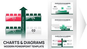
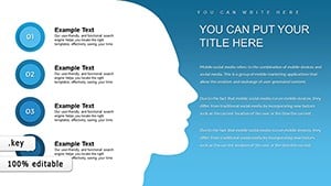
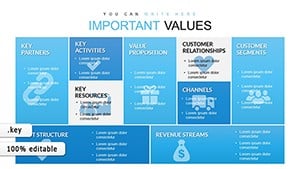
Business Model Canvas Keynote - Fully Editable | ImagineLayout
ID: #KC00612
free
(677)
Choice and Advantages Keynote Charts: Simplify Decisions Visually
ID: #KC00563
$18.00
(1015)
Sphere of Influence Keynote Charts: Visualize Networks and Impacts
ID: #KC00562
$20.00
(1065)
Positive and Negative Effects of Technology Keynote Charts Template
ID: #KC00561
$20.00
(839)
Growth Prospects Keynote Charts Template: Visualize Business Expansion with Ease
ID: #KC00559
$23.00
(984)
Cause and Effect Keynote Charts - Editable | ImagineLayout
ID: #KC00557
$16.00
(165)
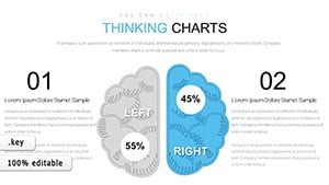
Creative Thinking Keynote Charts: Where Ideas Take Flight
ID: #KC00533
$23.00
(834)
Development Keynote Charts Template: Empower Your Project Narratives
ID: #KC00530
$23.00
(744)
Marketing Ideas Keynote Charts: Ignite Innovation and Growth
ID: #KC00485
$17.00
(997)
Creative Light Coloured Keynote Charts: Illuminating Pathways to Brilliance
ID: #KC00475
$18.00
Defining Workflow Charts in Keynote Context
Workflow charts templates for Keynote illustrate sequential tasks, decisions, and loops, often as flowcharts or swimlane diagrams. They guide viewers through operational journeys, highlighting bottlenecks with color-coded alerts.
Optimized for Keynote, they utilize shape libraries for rapid assembly, ensuring scalability for complex multi-department views.
Broad Applications in Organizational Settings
HR departments chart recruitment pipelines, from sourcing to onboarding, to shorten hire times. In manufacturing, they sequence assembly lines for lean improvements.
Software Development: Depict CI/CD pipelines for devops clarity.
Customer Service: Map ticket resolutions across agents.
Event Coordination: Outline timelines for seamless execution.
Freelancers use simplified versions for client project briefs, setting expectations upfront.
Why Prefer Our Templates to Basic Ones
Keynote`s stock flow shapes lack branching logic visuals; ours embed conditional icons and parallel paths, with auto-routing for clean layouts.
They support timeline integrations, syncing workflows with Gantt elements for holistic planning.
Attribute
Basic Templates
Ours
Branching Support
Manual
Pre-built decisions
Swimlane Features
Add-on
Integrated lanes
Animation Flow
Generic
Step-sequenced
This foresight minimizes revisions, maximizing focus on strategy.
Strategies for Compelling Workflow Visuals
Emphasize critical paths with thicker lines; use icons for task types. Balance detail with overview slides.
Validate flows with stakeholders early.
Layer approvals as gated stages.
Embed metrics nodes for performance tracking.
Harness Keynote`s presenter notes for rationale behind each step.
Transformative Examples
A retail chain redesigned inventory workflows via our template, reducing stockouts by 25%. Marketing agencies charted content calendars, aligning teams for timely launches.
Nonprofits streamlined grant applications, increasing approval rates through visualized processes.
Chart your course - download a workflow Keynote template and thrive.