Bridge numbers and narratives seamlessly with our Venn chart templates for Keynote. These sophisticated designs quantify overlaps, unveiling patterns in datasets that inform and inspire.
Targeted at presenters in research, business intelligence, and academia, they merge chart precision with diagrammatic intuition. Chart collaboration metrics where team contributions intersect or survey responses in unioned categories, all within Keynote`s intuitive canvas.
Vector scalability, data-linked tables, and kinetic animations ensure your charts evolve with your story. Fine-tune opacities for emphasis and embed formulas for dynamic calculations, crafting visuals that resonate.
Unite your data - peruse our Venn Keynote charts lineup.
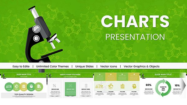
Keynote Cycle Process Charts - Fully Editable | ImagineLayout
ID: #KC00683
$18.00
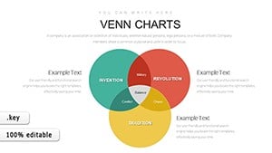
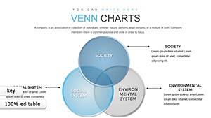
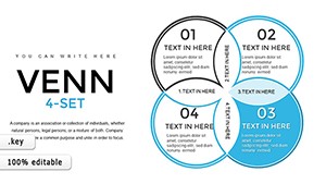
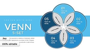
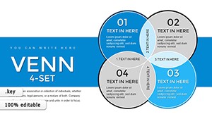
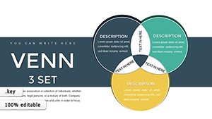
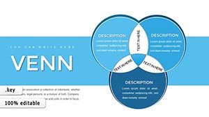
Venn Charts: Keynote`s Analytical Ally
Venn charts fuse set visualization with quantitative depth, perfect for proportional analyses and correlation spotlights. Our Keynote templates incorporate shape libraries and calculation engines for vibrant, responsive graphics.
Researchers Venn experimental variables for hypothesis validation. Executives chart market penetrations, overlaps forecasting revenues. Educators overlap curriculum outcomes with assessments.
Outshining Defaults
Formula Integration: Built-in sums for intersection metrics.
Kinetic Builds: Physics-based animations for organic flows.
Theme Harmony: Auto-matches slide masters.
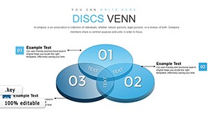
Basic charts in Keynote lack intersection smarts; ours simulates Venn logic with ease.
Charting Cross-Disciplinary Paths
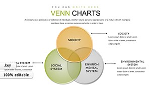
Social scientists Venn demographic trends for policy insights. Engineers overlap component tolerances in designs. Philanthropists chart impact areas, unions maximizing reach.
Journalists compare poll data for narrative angles. Chefs Venn ingredient profiles for fusion recipes.
Mastery Moves
Proportional Padding: Adjust for visual balance in uneven data.
Callout Clouds: Annotate key unions dynamically.
Export Enhancements: Retain interactivity in videos.
Layer with Keynote`s charts for hybrid dashboards, blending Venns with bars for totality.
Chart Innovations Ignited
Incorporate sliders for variable overlap simulations. Animate metric migrations across sets. For keynotes, use as metaphors - overlaps symbolizing synergies in visions.
Charts become catalysts.
Merge mastery - download your ideal Venn Keynote chart.
Frequently Asked Questions
1. How to link external data in Keynote charts?
Import CSV via tables, syncing to shapes.
2. Custom calculations possible?
Embed formulas in text boxes for live math.
3. Animation sequencing tips?
Order by dependency for logical progression.
4. Multi-device compatibility?
Optimized for Mac, iPad, and iCloud.
5. How to style intersections?
Blend modes in the Graphic inspector.
Venn charts in Keynote now vector victory. Journey on to more visual victories in our collection.