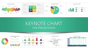
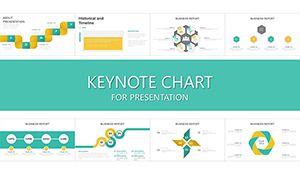
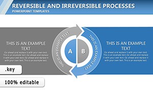
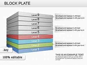
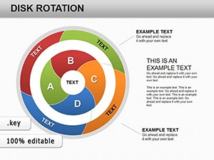
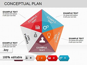
Winning tenders demands clear, credible communication. Our tender chart collection for Keynote provides more than 100 professional templates tailored for proposals, bids, and procurement presentations.
From process flowcharts to cost comparison tables and timeline schedules, these designs help you present complex requirements with confidence.
Stand out from generic slides with polished, animated visuals that demonstrate attention to detail.
Every template is fully editable, allowing quick adaptation to specific tender specifications.
Browse the collection to give your next bid the professional edge it needs.
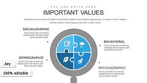
Clear visuals build trust with evaluators by showing organized thinking and thorough preparation. Structured charts make compliance matrices and timelines easy to follow.
Key Applications in Tender Presentations
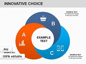
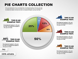
Government bids outline compliance requirements. Corporate proposals compare pricing options.
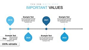
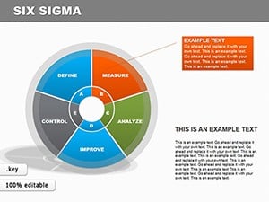
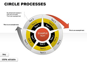
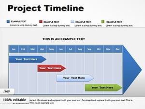
Timeline charts: Show project phases and deliverables.
Use neutral, professional colors to maintain credibility.
Label everything clearly for quick evaluation.
Keep layouts simple to avoid overwhelming reviewers.
Include source references where required.
Our templates are built around these standards.
Advantages for Bid Presentations
Default charts rarely meet formal tender formatting needs. Our specialized designs save time while delivering the professional polish evaluators expect.
Strengthen your next bid - download a tender chart template today.
Frequently Asked Questions
Are these charts suitable for government tenders?
Yes, designs follow formal, clear standards ideal for public sector bids.
Can I include compliance checklists?
Many templates feature checklist-style tables ready for requirements.
Do templates support multiple pricing scenarios?
Yes, comparison tables make alternative bids easy to present.
Are free tender chart templates available?
Yes, start with free designs and access premium for advanced layouts.
Will charts maintain formatting when edited?
Yes, smart objects and guides keep alignment perfect.