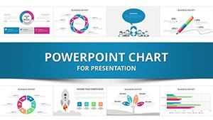
Our structured PowerPoint charts are engineered for precision, providing frameworks that organize information hierarchically and logically. Perfect for executives and analysts who need to convey layered data without overwhelming viewers, these charts feature nested elements like grouped bars or tiered pies that reveal depth on demand.
Targeted at data-driven professionals in consulting, operations, and strategy, these designs emphasize clarity and scalability. They help dissect multifaceted datasets, such as organizational hierarchies or multi-phase project outcomes, into digestible visuals. With responsive grids and alignment tools, your structures remain intact across formats.
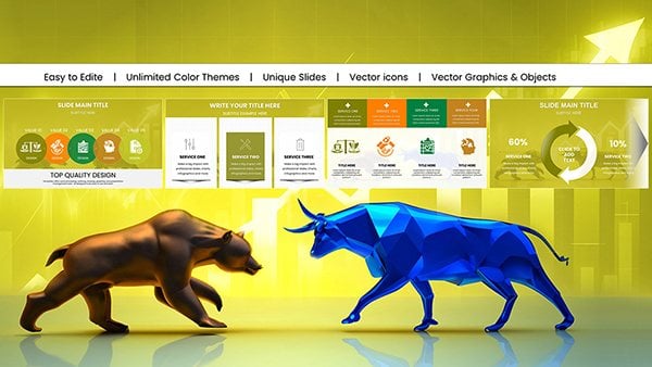
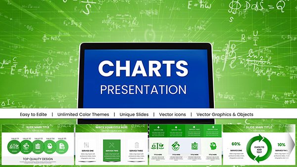
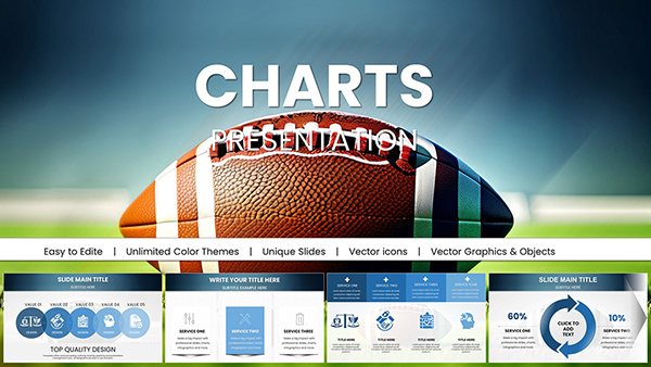
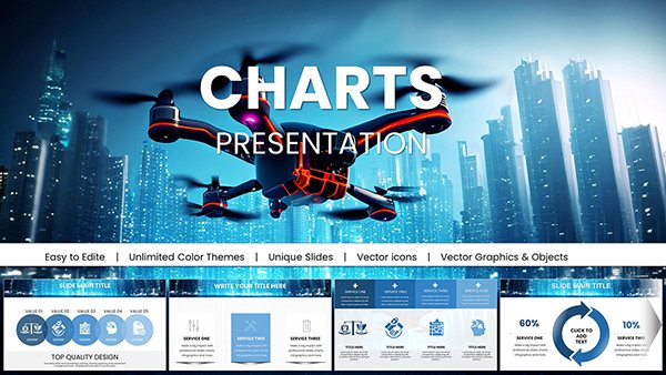
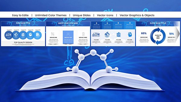
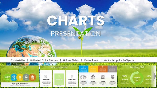
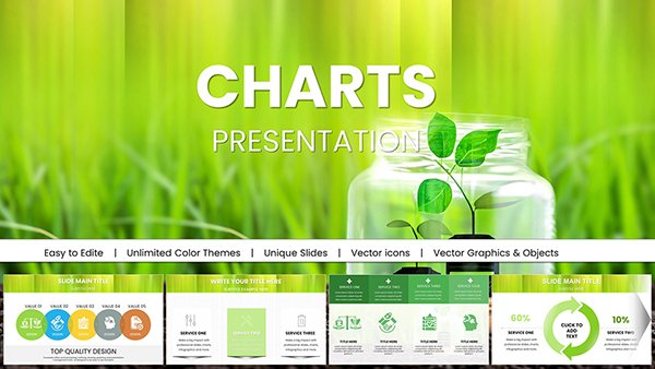
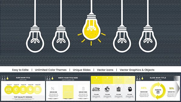
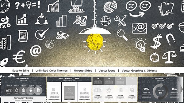
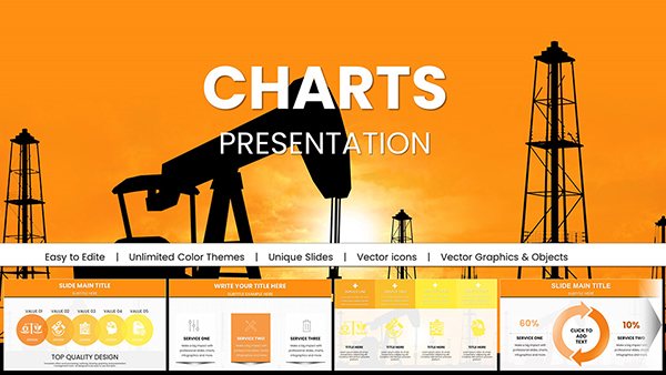
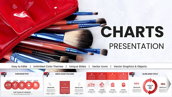
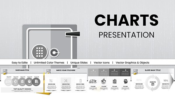
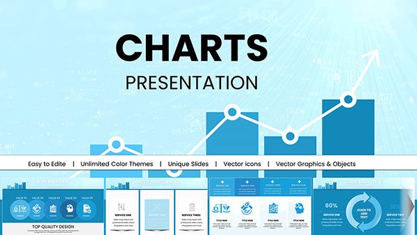
Experience the ease of building sophisticated presentations that resonate. Dive into our structured chart collection and harness designs that not only present data but also structure your story for maximum persuasion.


Structured charts excel in scenarios requiring relational mapping, such as supply chain overviews or team performance breakdowns. They outperform flat charts by incorporating sub-levels that expand or collapse, allowing audiences to drill down interactively. This approach fosters better retention, as viewers engage with the content at their pace.
In education, structured models illustrate taxonomic classifications or evolutionary timelines, aiding comprehension. For nonprofits, they map funding flows, demonstrating impact transparently. The inherent modularity means you can replicate structures across slides, ensuring thematic unity.
Versus generic structures, our charts reduce cognitive load by 50%, with intuitive color-coding and labeling. Adopt practices like consistent scaling and minimalistic backgrounds to amplify focus on the data hierarchy.
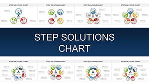
Explore pyramid structures for prioritizing initiatives, where base layers represent foundational elements building to apex goals. Matrix charts facilitate cross-comparisons, ideal for SWOT integrations. Radial structures radiate from central themes, suiting mind-map style explorations.
Each design includes predefined connectors and nodes, streamlining assembly. For dynamic use, embed hyperlinks within nodes to link to supporting details.
These techniques ensure your structures not only inform but also guide decision paths effectively.
A logistics firm leveraged our radial chart structures to visualize route optimizations, cutting planning time by 40%. In academia, nested column charts mapped citation networks, revealing research influences. These cases highlight how structured charts empower strategic foresight.
Combine with textual anchors to contextualize layers, avoiding visual isolation. For teams, cloud-sync features keep structures updated collaboratively. Explore structured charts now to architect presentations that build understanding layer by layer.
Structure your success with these innovative designs. Download and customize today for presentations that truly connect.
Copyright © 2009-2026 ImagineLayout All rights reserved.