Strategic Keynote Charts
Great strategy deserves great visuals. Our collection of over 100 strategic chart templates for Keynote helps leaders communicate vision, goals, and plans with clarity and impact.
From SWOT analyses to multi-year roadmaps, each template combines strategic frameworks with contemporary design.
Fully editable, animated, and executive-ready , these charts make complex strategies accessible and inspiring.
Align your team and stakeholders with confidence.
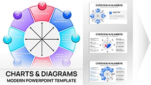
Bowman's Strategy Clock Keynote Template - 42 Fully Editable Slides | ImagineLayout
ID: #KC01088
Psychology of Leadership Charts Keynote Template: Insightful Tools for Dynamic Leaders
ID: #KC01051
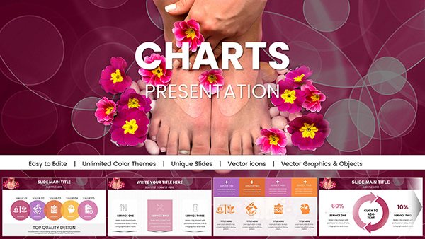
Spa Pedicure Treatment Keynote Charts Presentation
ID: #KC01012
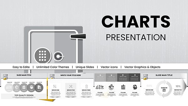
Bank Security Safeguarding: Keynote Charts for Financial Fortification
ID: #KC00981
Vitamin A and Carotenoids Keynote Charts for Health
ID: #KC00949
Healthy Food Keynote Charts Template - Fully Editable | Instant Download
ID: #KC00946
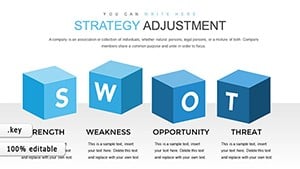
Editable Strategy Adjustment Keynote Charts - 28 Slides
ID: #KC00866
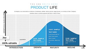
Product Life Keynote Charts: Mapping Architectural Project Journeys
ID: #KC00840
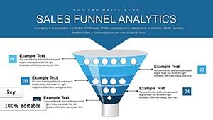
Sales Funnel Analytics Keynote Template: Drive Revenue Growth
ID: #KC00818
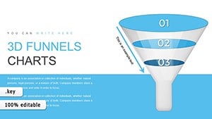
3D Funnel Keynote Chart Template
ID: #KC00803
Leadership Skills 3D Cube Infographic Keynote Template: Inspire and Lead
ID: #KC00793
Targeting Aspects Branching Keynote Charts for Presentation
ID: #KC00784
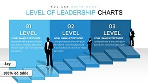
Climbing the Stairs to Leadership: 3D Keynote Charts for Team Empowerment
ID: #KC00769
Branching Service Tables Keynote Charts Template
ID: #KC00757
Six Sigma Keynote Charts - Fully Editable | ImagineLayout
ID: #KC00747
SEO Infographic Keynote Charts - Editable | ImagineLayout
ID: #KC00735
Economic Integration Keynote Charts - Editable | ImagineLayout
ID: #KC00714
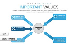
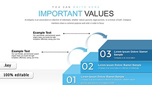
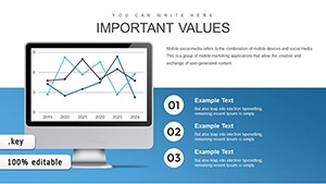
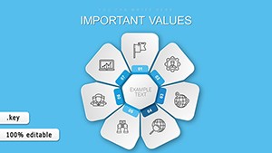
Core Values Keynote Charts Template - Editable Keynote
ID: #KC00699
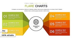
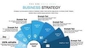
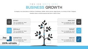
Business Strategy Keynote Charts - Editable Keynote | ImagineLayout
ID: #KC00698
Sales Growth Earnings Keynote Charts - Fully Editable | ImagineLayout
ID: #KC00697
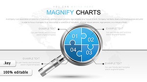
Magnifying Glass Analysis Keynote Charts - Editable Keynote
ID: #KC00688
Market Segmentation Keynote Charts - Fully Editable | ImagineLayout
ID: #KC00677
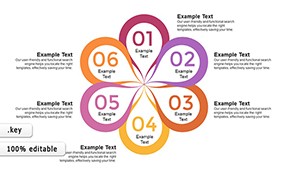
Petal Flower Keynote Charts - Fully Editable | ImagineLayout
ID: #KC00674
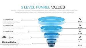
5-Level Sales Funnel Keynote Template - Editable Keynote | ImagineLayout
ID: #KC00661
Why Strategic Visuals Matter Strategic presentations need to inspire action while providing structure. Clear charts turn abstract plans into tangible direction.
Advantages of Professional Strategic Templates Pre-built frameworks (SWOT, PEST, OKR, etc.) Clean hierarchy and flow Elegant color schemes Smooth animations for phased reveals Real-World Strategic Applications Executive Strategy Reviews Present vision, objectives, and progress.
Board Meetings Share multi-year roadmaps or market positioning.
Team Alignment Sessions Facilitate OKR or goal cascade discussions.
Change Management Visualize transformation journeys.
Select the strategic chart that best conveys your plan and download it now.
Tips for Strategic Charts Keep text concise and action-oriented Use arrows and flow to show direction Highlight priorities with color or size Reveal elements progressively Creative Strategic Visualization Ideas Combine SWOT with roadmap elements. Use concentric circles for strategy layers. Create timeline-based balanced scorecards.
Bring your strategy to life - download a template today.
Frequently Asked Questions What strategic frameworks are covered? SWOT, PEST, Porter`s Five Forces, OKR, balanced scorecard, roadmaps, Ansoff matrix, and more.
Are the templates suitable for executive presentations? Yes - clean, sophisticated designs that convey authority.
Can I modify the frameworks? Absolutely - every element is fully editable.
Are free strategic templates available? Yes, several free options are included.