Research Keynote Charts

Dive into our specialized selection of research Keynote chart templates, crafted to make data visualization a breeze on Apple devices. Perfect for scientists, data analysts, and academics, these templates feature sleek animations, precise graphing tools, and intuitive layouts that bring your research to life. From scatter plots revealing correlations to flowcharts mapping methodologies, each design ensures your insights shine without technical hurdles.

Targeted at users seeking polished, Mac-native formats, these templates integrate seamlessly with Keynote`s ecosystem, supporting transitions and builds that enhance narrative flow. Save time on formatting and focus on your message, with benefits like responsive scaling for any screen size and export options for PDF or video sharing.

Whether preparing for a conference or team review, our collection empowers you to create professional visuals that engage and inform. Start customizing now and transform raw data into compelling stories.


View by: Last Added | Most Popular
  • like 2
    (293)
    Spa Pedicure Treatment Keynote Charts Presentation
    ID: #KC01012
    $23.00
  • like 4.5
    (6)
    Vitamin A and Carotenoids Keynote Charts for Health
    ID: #KC00949
    $20.00
  • like 4
    (1096)
    Healthy Food Keynote Charts Template
    ID: #KC00946
    $20.00
  • like 5
    (985)
    Editable Strategy Adjustment Keynote Charts - 28 Slides
    ID: #KC00866
    $20.00
  • like 3
    (650)
    Superimposed Boundary Sheets Keynote Charts Template: Elevate Your Comparisons
    ID: #KC00849
    $14.00
  • like 2
    (1070)
    Development Keynote Charts Template: Empower Your Presentations with Dynamic Growth Visuals
    ID: #KC00781
    $17.00
  • like 3
    (1089)
    Business Strategy Keynote Charts: Plan Your Path to Success
    ID: #KC00698
    $18.00
  • like 4
    (383)
    Chain Sequence Keynote Charts: Master Storytelling Through Processes
    ID: #KC00680
    $12.00
  • like 3
    (1064)
    Market Segmentation Made Easy: Professional Keynote Charts Template
    ID: #KC00677
    $22.00
  • like 5
    (230)
    Free Speedometer Keynote Charts for KPI Gauges
    ID: #KC00632
    free
  • like 2
    (1120)
    Free Bridge Value Keynote Charts: Track Changes
    ID: #KC00631
    free
  • like 3
    (1140)
    Funnel Concept Keynote Charts for Flows
    ID: #KC00629
    $5.00
  • like 5
    (215)
    Stripe Reports Keynote Charts Template: Unlock Data Storytelling
    ID: #KC00620
    $10.00
  • like 5
    (714)
    Traffic Lights Keynote Charts Template: Signal Your Success
    ID: #KC00619
    free
  • like 4
    (746)
    Free Innovation Funnel Keynote Charts Template
    ID: #KC00614
    free
  • like 3
    (1145)
    Free Business Model Canvas Keynote Template for Entrepreneurs and Consultants
    ID: #KC00612
    free
  • like 4
    (326)
    Logic of Operational Analysis Keynote Charts
    ID: #KC00603
    $17.00
  • like 2
    (159)
    Great Value Keynote Charts Template: Mastering Relationship Visuals
    ID: #KC00601
    $20.00
  • like 4
    (1045)
    Business Development Strategies Keynote Charts: Navigate Growth with Visual Precision
    ID: #KC00587
    $20.00
  • like 3
    (893)
    Business Strategy Development Keynote Charts
    ID: #KC00577
    $19.00
  • like 3
    (109)
    Simple and Useful Tricks for Analysis Keynote Charts
    ID: #KC00574
    $21.00
  • like 4
    (951)
    Strategic Analysis Value Chain Keynote Charts: Unlock Business Insights
    ID: #KC00571
    $24.00
  • like 3
    (1035)
    Research & Innovation Infographic Keynote Charts: Spark Creative Insights
    ID: #KC00538
    $19.00
  • like 3
    (16)
    Business Keynote Charts Template: Architect Your Success Story
    ID: #KC00522
    $24.00


The Advantages of Research Keynote Chart Templates

Unlike generic charting tools that require manual tweaks, our Keynote templates come pre-configured with research-oriented elements like error bars, statistical annotations, and multi-series comparisons. This streamlines the process, allowing you to input data directly from spreadsheets and watch charts update in real-time. The result? Presentations that feel custom-built yet took minutes to assemble.

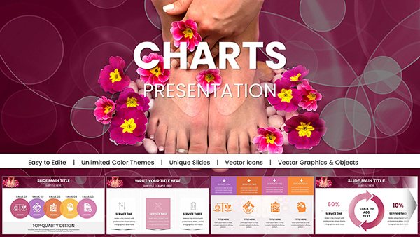
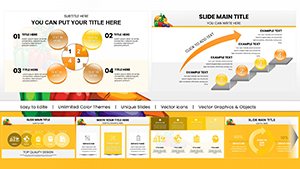
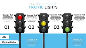
For example, a biology template includes DNA helix icons alongside line graphs for gene expression trends, while a social science version offers pie charts for demographic breakdowns. Standard Keynote defaults lack this thematic depth, often leading to bland visuals that fail to hold attention.

  • Animation-Ready: Built-in effects for revealing data points sequentially.
  • Color-Coded Schemes: Scientifically inspired palettes for accurate representation.
  • Layered Structures: Easy to edit without disrupting overall design.

Versatile Use Cases in Research

In academia, these charts illustrate thesis defenses, with Gantt charts tracking project timelines. Corporate R&D teams deploy them in strategy sessions, using radar charts to compare competitive landscapes. Environmental researchers visualize climate models via heat maps, making abstract projections tangible.

Creative twists include embedding hyperlinks to source data for interactive demos or syncing with iPad for on-the-go edits. Best practices: Limit to 5-7 data series per chart to avoid clutter, use consistent axis labeling, and rehearse animations for smooth delivery.

Integrating Advanced Visuals

Enhance with Keynote`s magic move for fluid transitions between chart states, ideal for before-and-after scenarios in experimental results.

Customization Tips for Maximum Impact

  1. Import Data Smartly: Leverage Keynote`s table tools for live updates.
  2. Ensure Accessibility: Add alt text to charts for screen readers.
  3. Optimize for Export: Test resolutions for print or web sharing.
  4. Theme Alignment: Match fonts and colors to your institution`s guidelines.

These templates support collaboration via iCloud, enabling team feedback loops. Download and iterate quickly for refined outputs.

Case Studies: From Concept to Presentation

A physics lab adapted our quantum mechanics template, using vector diagrams to explain particle behaviors, earning praise at a symposium. In market research, a firm utilized bubble charts for segmentation analysis, boosting client conversions by 30%. Such examples highlight the templates` role in professional success.

Experiment by combining chart types - pair a histogram with a trend line for comprehensive overviews.

Frequently Asked Questions

Elevate your next research talk - select a template and begin visualizing today.