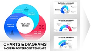
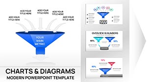
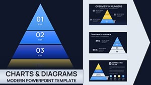
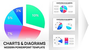
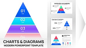
Charts breathe life into data, and our multi-purpose PowerPoint templates make it effortless for analysts, managers, and presenters across fields. From sales funnels to project timelines, these slides adapt to any dataset with professional finesse.
Pre-built options like bar clusters, radar plots, and waterfall diagrams come animated for emphasis, with color schemes that suit corporate or creative palettes. Drop in your figures, tweak axes, and watch bland stats become compelling narratives.
Features: Responsive scaling, Excel links for updates, and legend automations. Suited for board meetings or client demos, they ensure clarity without complexity.
Curate your toolkit from our range and chart your path to persuasive presentations.
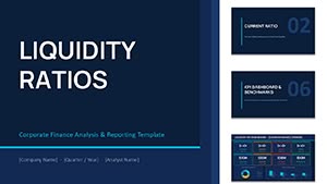
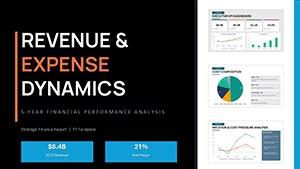
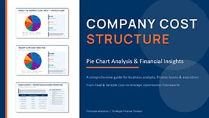
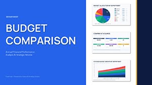
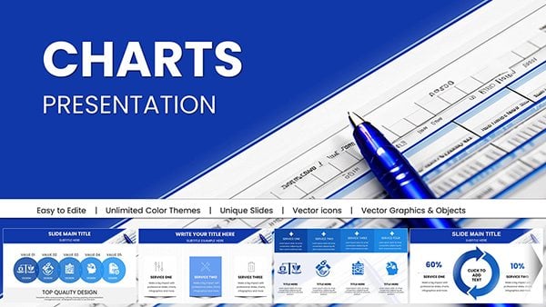
Business Financial PowerPoint Charts - Drive Decisions
ID: #PC01036
$25.00
(921)
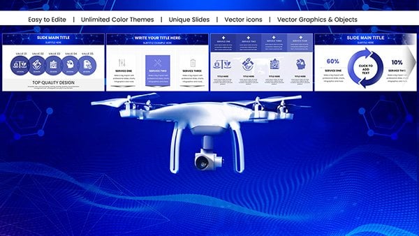
Flying Drone PowerPoint Charts Presentation: Capture Aerial Perspectives in Your Slides
ID: #PC01019
$18.00
(26)
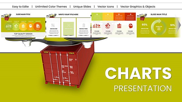
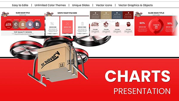
Heavy Cargo Drone Delivery PowerPoint Charts - Download Logistics Templates
ID: #PC01014
$20.00
(958)
Drone Delivery PowerPoint Charts Presentation: Chart the Course of Modern Logistics
ID: #PC01013
$22.00
(743)
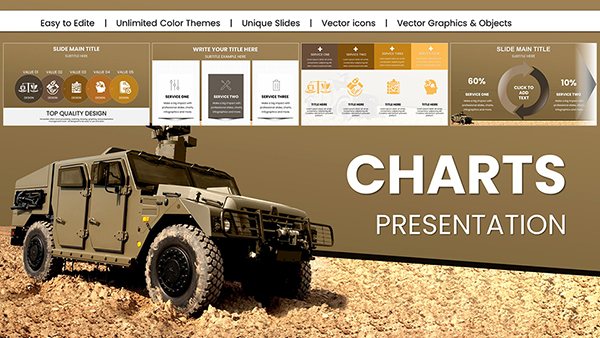
Military Vehicle PowerPoint Charts Template
ID: #PC01008
$20.00
(1177)
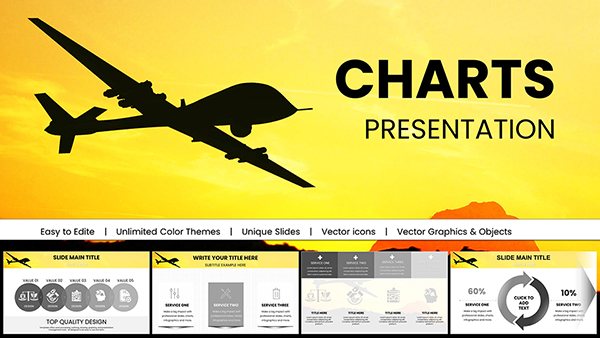
Military Technology Drone Warfare PowerPoint Charts Template
ID: #PC00997
$18.00
(1136)
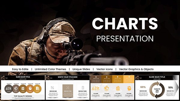
Sharpshooter PowerPoint Charts Template for Precision Presentations
ID: #PC00995
$18.00
(627)
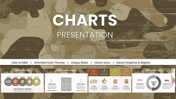
Military Camouflage PowerPoint Charts Templates
ID: #PC00994
$18.00
Unlocking Data Potential with Flexible Chart Templates
Default charts feel cookie-cutter; ours offer modular builds where you mix pie slices with line trends, fitting narratives from quarterly reviews to innovation roadmaps. This adaptability crushes static tools, enabling tailored insights that resonate.
Presenters gain 35% better feedback, as visuals align precisely with stories told.
Everyday Wins with Chart Applications
Financial Reports: Stacked bars for revenue streams.
Marketing Plans: Funnel diagrams for conversion paths.
HR Analytics: Heat maps for turnover trends.
Product Demos: Gantt for feature rollouts.
Universal appeal for data-driven decisions.
Refinement Techniques for Chart Excellence
Label sparingly, use tooltips for details. Harmonize colors with brand guides, and animate sequentially for build-up. Validate accuracy with source footnotes, and rehearse zooms for emphasis.
Export subsets for handouts. These pro moves elevate from good to gallery-worthy.
Multi-Purpose Charts vs. Basic Ones
Customization: Layered options vs. rigid
Animation: Smooth reveals vs. none
Integration: Live data vs. static
Scalability:
Any size dataset
Limited inputs
Versatile wins for varied needs.
Examples and Advanced Twists
A startup visualized growth with combo charts, landing investments. Experiment with 3D for volumes or interactive hyperlinks for drill-downs.
Themed packs for seasons keep visuals fresh. Innovate to captivate.
Build your chart library - start downloading.
Frequently Asked Questions
Visualize victory with pro charts. Download and dazzle with data.