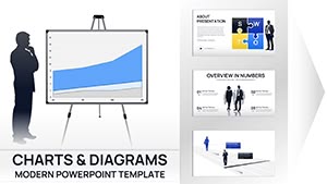
Revolutionize your PowerPoint presentations with chart templates that prioritize clarity and style. Perfect for managers, researchers, and sales pros, these visuals make data digestible and decisions decisive.
Our library includes clustered columns, area plots, and doughnut breakdowns, all optimized for Microsoft`s robust charting engine. Input your figures, and watch as smart layouts auto-adjust for balance and readability.
Fully customizable, they sync with your slide master for consistent branding. Turn spreadsheets into showstoppers that inform, persuade, and propel your objectives forward.
Visualize victory - explore PowerPoint charts templates and download to elevate your decks immediately.


PowerPoint charts bridge numbers and narratives, and our templates amplify this by offering refined aesthetics over vanilla inserts. They incorporate gridless backgrounds for focus, variable scales for precision, and callout boxes for emphasis.
Sales teams leverage waterfall charts to unpack deal pipelines, revealing wins and leaks. Researchers plot regressions with confidence intervals shaded subtly. Superior to ad-hoc builds, these cut prep time while boosting polish.
Unlike generic Office charts, ours embed thematic icons and micro-animations, enhancing retention without overwhelming.
Select types wisely: Bubbles for correlations, surfaces for 3D terrains. Use data labels sparingly, favoring trends over exacts. Technique: Group elements for unified edits, streamlining revisions.
Illustration: An e-commerce review using cohort curves to trace retention waves, curving upward to celebrate loyalty gains. This visual hooks investors emotionally.
Blend charts with icons - a speedometer gauge for velocity metrics, needling to highs. Or mosaic tiles assembling into totals, disassembling to parts for reveals.
Drive data home - choose a chart template and power up your next presentation.
Compatible with 2016 and newer, including Microsoft 365 for cloud collaboration.
Via paste special as linked objects, refreshing automatically from Excel or Access.
Yes, responsive scaling ensures legibility on tablets during on-the-go reviews.
Easily, as images or PDFs, retaining vectors for scalable prints.
Templates include swatch libraries, or import your brand palette for harmony.
Push boundaries: Integrate sparklines in tables for at-a-glance trends, or pyramid charts for hierarchical breakdowns. In an era of information overload, these charts cut through, making your points unmissable.
Whether sealing deals or sharing discoveries, superior visuals seal success. Stock up on our templates and present with precision that persuades.
Copyright © 2009-2026 ImagineLayout All rights reserved.