Transform rows of numbers into compelling visual stories with our extensive collection of numeric data charts for Keynote. Ideal for analysts, researchers, scientists, and anyone presenting quantitative information.
More than 100 specialized templates handle large datasets, statistical distributions, comparisons, and trends with designs that prioritize accuracy and readability.
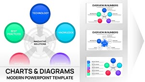
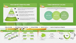
Partnership Organizational Keynote Pie Charts Template
ID: #KC00527
$23.00
(457)
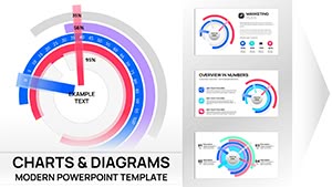
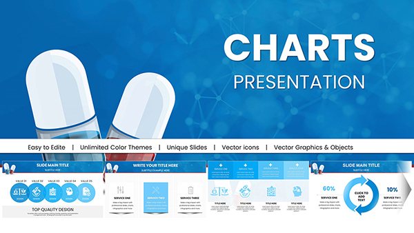
Business Slideshow Keynote Charts Template
ID: #KC00524
$21.00
Challenges of Presenting Numeric Data
Raw tables overwhelm audiences. Effective numeric charts reveal patterns, outliers, and relationships at a glance. Our templates follow data visualization best practices while remaining beautiful and professional.
Typical Use Cases
Research & Scientific Presentations
Display experimental results, statistical significance, confidence intervals, or distribution curves.
Analytics & Data Reports
Show correlations, time series, rankings, or multivariate comparisons with appropriate chart types.
Survey & Market Research
Present response distributions, demographic breakdowns, or rating scales clearly.
Tips for Strong Numeric Charts
Choose chart types that match your data relationships
Round numbers appropriately for your audience
Use log scales when showing large range variations
Label data points selectively to avoid clutter
Upgrade your numeric presentations - discover our full collection and download the ideal template for your data.
Frequently Asked Questions
Do templates support large datasets?
Yes, charts are built to handle dozens to hundreds of data points while maintaining readability.
Are statistical elements like error bars included?
Many templates feature error bars, confidence intervals, and trend lines.
Can I use logarithmic or dual-axis scales?
Yes, several advanced templates include these options.
How do I update the underlying data?
Simply edit the organized data tables - charts update automatically.