Transform complex mill data into insightful visuals using our specialized Keynote chart templates. Geared toward renewable energy firms, manufacturing leaders, and agricultural processors, these designs simplify turbines, workflows, and yields with precision. Featuring windmill-inspired motifs or industrial gears, they blend functionality with thematic relevance for agriculture or power sectors.
Audience benefits include rapid prototyping of dashboards that highlight efficiency gains or output trends, saving hours of manual charting. Compatible with Apple`s ecosystem, they support smooth animations and real-time updates, ideal for boardroom briefings or field reports. From bar graphs mimicking mill blades to pie charts as silos, creativity meets clarity.
Browse this focused array and empower your narratives with charts that drive decisions. Download today to mill your data into gold.

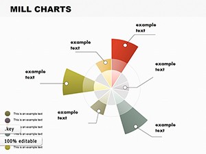
In the grinding world of industrial presentations, generic charts fall flat - our Keynote templates rise above with sector-tailored aesthetics, like radial diagrams echoing windmill rotations for energy capture rates. They outperform standard tools by embedding formulas for auto-calculations, reducing errors in volatile markets like grain pricing.
Envision a sustainability pitch: Flowcharts trace biomass from field to pellet, color-coded for carbon footprints. Educators use them for milling history lessons, animating evolution from water wheels to modern hybrids. Depth comes from layered vectors, allowing drill-downs without redesigns.
Pro tips: Opt for monochromatic schemes in low-light venues, integrate 3D effects sparingly for emphasis, and pair with Keynote`s build-ins for phased reveals. These elevate from data dumps to strategic dialogues.
Leverage built-in themes for seasonal adaptations - autumnal tones for harvest reports or crisp blues for hydro mills. Unlike rigid Excel imports, our templates allow fluid reshaping, supporting voice-over narrations for remote teams. Creative uses span scenario modeling: What-if analyses for drought impacts on grain mills, visualized through branching trees.
Field experts appreciate the mobile optimization, syncing with iPads for on-site tweaks. Always validate data sources upfront, ensuring charts reflect audited figures for credibility. This approach not only informs but propels action, like greenlighting expansions based on projected yields.
Master these, and your charts become cornerstones of persuasive storytelling. Select yours now for unparalleled clarity.
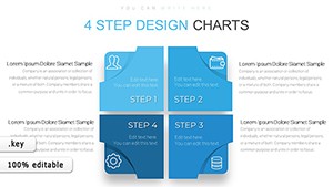
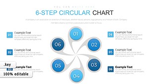
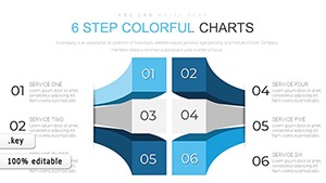
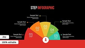
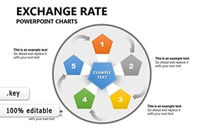
Bar, line, pie, and custom radial designs tailored to industrial flows.
Yes, direct links update charts dynamically in Keynote.
Fully, with options for speed, direction, and easing.
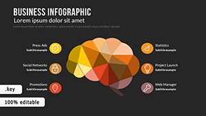
Over 30, from turbines to silos for authentic visuals.
Gear up your presentations - download mill chart templates and turn numbers into narratives that resonate.
Copyright © 2009-2026 ImagineLayout All rights reserved.