Incoming charts in PowerPoint are your go-to for visualizing data streams, inflows, and progression metrics, ideal for sales pipelines, resource allocation, or trend forecasting. These templates make it easy to represent incoming elements as they build toward goals.
Targeted at analysts, marketers, and managers, they deliver instant professionalism with drag-and-drop customization. Say goodbye to manual graphing - our designs handle the heavy lifting, letting you focus on insights that drive decisions.
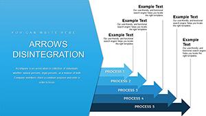
Featuring funnel-like structures and layered inflows, these charts add depth to your narratives. Browse our selection and infuse your PowerPoint decks with actionable visuals that captivate and convert.
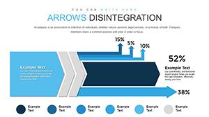


Incoming charts excel at depicting accumulation and progression, such as customer acquisitions or budget inflows, using tapered designs that narrow toward outcomes. In PowerPoint, they integrate smoothly with tables for hybrid views, offering a holistic snapshot that`s far superior to scattered bullet points.
Default PowerPoint inflows often appear flat; our templates introduce perspective shading and gradient fills, creating a sense of motion and urgency that draws eyes to key progress points.
These examples underscore how incoming charts clarify pathways, empowering teams with foresight.
Align chart widths to slide proportions for balanced compositions, and use milestone markers to denote thresholds. Incorporate data labels with percentage callouts for precision, and animate inflows from base to apex to simulate real-time buildup. Validate accuracy by cross-referencing with source spreadsheets.
Enhance interactivity by linking to embedded Excel sheets, allowing live updates during presentations.
Visualize website traffic inflows in a digital marketing review, segmenting by source to pinpoint high-performers. In event planning, chart attendee registrations building to capacity, adjusting logistics on the fly. Our templates facilitate such tailored uses, blending creativity with functionality.
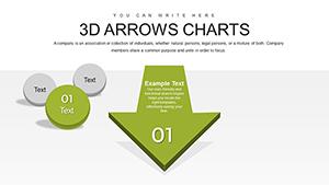
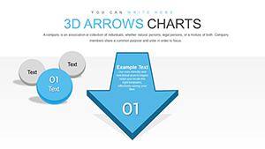
Options include horizontal inflows for wide datasets or stacked variants for multi-category tracking.
These PowerPoint incoming charts are engineered for efficiency, with pre-formatted axes and legend placements. Their modular structure lets you mix and match elements across slides, maintaining visual cohesion throughout your deck.
Don`t settle for ordinary - download these templates and turn data streams into strategic stories that resonate.
Copyright © 2009-2026 ImagineLayout All rights reserved.