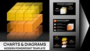
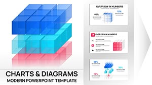
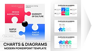
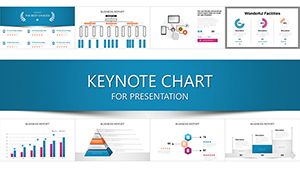
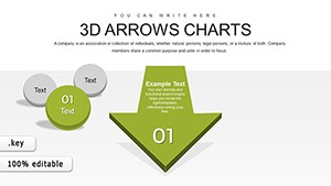
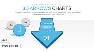
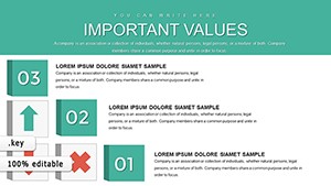
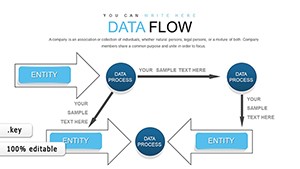
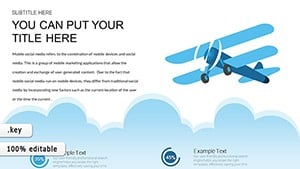
Chart templates in Keynote revolutionize how we present data, transforming spreadsheets into insightful graphics that support every argument. Our assortment at ImagineLayout covers bar graphs, pie charts, and line trends, all vector-based for sharp scalability.
Perfect for analysts unveiling metrics, managers reviewing performance, or researchers sharing findings, these templates integrate seamlessly with Keynote`s charting engine. Effortlessly input your data and watch animations bring trends to life, captivating viewers without overwhelming them.
Harness the art of visualization to make numbers memorable. From quarterly summaries to market analyses, our charts ensure accuracy and aesthetics, helping you communicate with precision and poise.
Visualize success - check out the gallery and grab templates tailored to your data stories.
Data without visuals is forgettable; with our Keynote chart templates, it`s persuasive. These go beyond basic inserts by including layered annotations and color-coded legends, outpacing generic charts with interactive drill-down capabilities.
Envision a finance review: drop sales figures into a stacked area chart, add hover effects for breakdowns, and highlight peaks with callout bubbles - turning raw stats into strategic insights that guide boardroom decisions.
Versatile Applications for Chart Templates
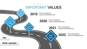
Financial Reporting: Illustrate revenue streams with waterfall diagrams for granular breakdowns.
Project Management: Track milestones via Gantt-style bars with progress indicators.
Marketing Analytics: Depict engagement funnels with Sankey flows for conversion paths.
Scientific Presentations: Plot experiment results in scatter plots with error bars.
Relative to stock Keynote charts, ours feature pre-styled axes and gridlines, minimizing formatting hassles and ensuring publication-ready polish.
Expert Strategies for Chart Excellence
Select chart types wisely - lines for trends, columns for comparisons - to avoid misinterpretation. Customize axes for context, like logarithmic scales for exponential growth. In a sustainability pitch, animate a donut chart to reveal segment contributions progressively, emphasizing eco-impacts.
Prioritize simplicity: cap series at five for readability, and use tooltips for details. Innovate with combined charts, blending lines and bars for multifaceted views.
Customization Blueprint
Paste data directly into editable tables for auto-updates.
Tweak styles via theme colors for brand alignment.
Export as vectors for integration into reports.
Test on projectors for color fidelity.
Delve into uses like real-time dashboards or comparative studies that leverage Keynote`s strengths. Our templates make advanced visualization accessible, empowering data storytellers.
Chart your course - download now and illuminate your data.
Frequently Asked Questions
Can I import Excel data into these chart templates?
Yes, Keynote supports direct linking for live updates from spreadsheets.
Are animations included in the charts?
Templates come with build-in options for smooth data reveals.
What chart types are covered?
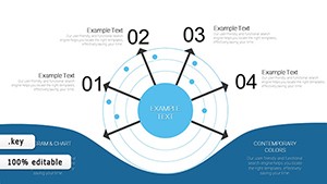
From pies and bars to radars and bubbles, a comprehensive set.
How do I adjust scales dynamically?
Use the format sidebar to set min/max values on the fly.