Master asset visualization with our Keynote chart templates focused on management and optimization. These designs empower financial advisors, portfolio managers, and executives to present holdings with sophistication and precision.
Explore options like allocation pies, performance radars, and growth lines that adapt to diverse asset classes from bonds to real estate. Keynote-native, they offer drag-and-drop simplicity for tailoring to client needs.
Gain an edge in consultations by delivering data that inspires confidence. Our templates streamline preparation, allowing more time for strategic advice. Begin your selection process now.
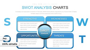
Keynote charts for assets illuminate diversification and returns, crucial for stewardship roles. Suited for wealth managers and fund operators, they highlight correlations and benchmarks effortlessly.
Perks: Responsive scaling for mobile reviews and export to images for reports.
Performance Audits: Waterfall charts break down value changes over periods.
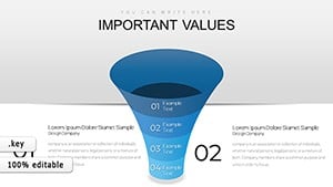
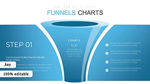
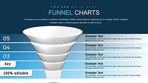
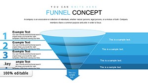
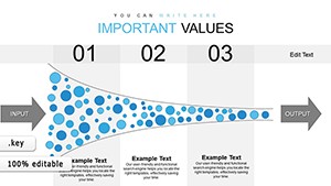
Client Proposals: Funnel visuals map investment flows from inflow to maturity.
Valuable in board simulations or regulatory submissions.
Elevating Beyond Generic Asset Charts
Generic tools overlook asset nuances; ours embed Sharpe ratios and yield curves natively. Color gradients represent risk spectrums, and layered views compare against indices like S&P 500.
Superior interactivity via hyperlinks to detailed spreadsheets enhances depth.
Premier Value Propositions
Analytical Depth: Formulas for IRR calculations within slides.
Client-Centric: Neutral palettes for unbiased presentations.
Workflow Integration: Import from portfolio software like Morningstar.
Expert Tips for Asset Keynote Charts
Pair complementary charts for holistic views, like combining treemaps with timelines. Animate transitions to reveal phased growth. Innovate with geo-charts for international assets.
Essential: Label axes clearly for non-expert audiences.