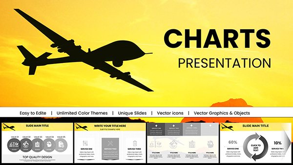
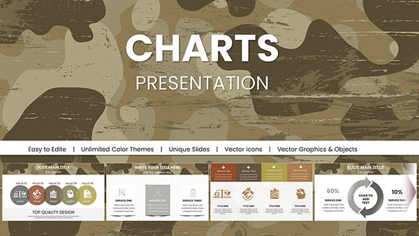
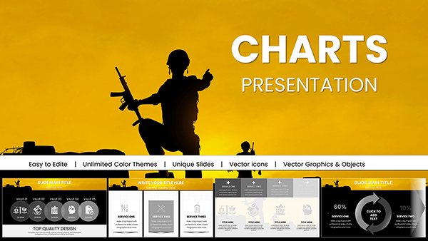
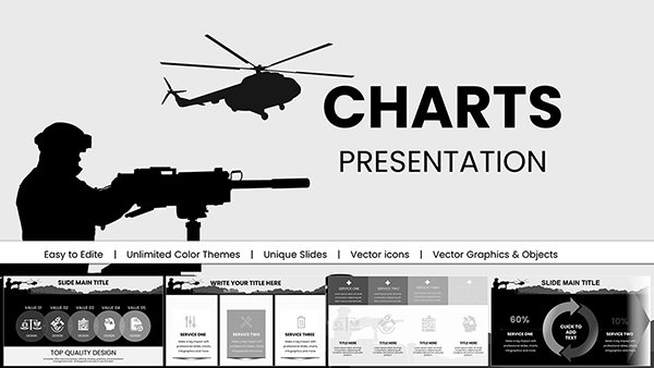
Analysis PowerPoint chart templates are built for professionals who need to interpret data, justify decisions, and present evidence-based conclusions. These slides are designed for financial reviews, KPI dashboards, performance audits, marketing analytics, and strategic planning sessions where clarity and credibility matter. Instead of relying on default PowerPoint charts that require time-consuming formatting and redesign, these templates provide structured layouts, visual hierarchy, and comparison logic that support analytical storytelling. They are ideal when your goal is not just to show numbers, but to explain trends, variances, risks, and opportunities in a business context.


Analysis presentations differ from generic data slides. They are used when executives must approve budgets, investors need performance transparency, or managers must evaluate operational results. In these situations, charts are not decorative elements — they are decision tools. This category includes structured visual models that help presenters move from raw numbers to actionable insight.
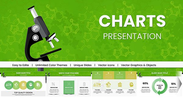
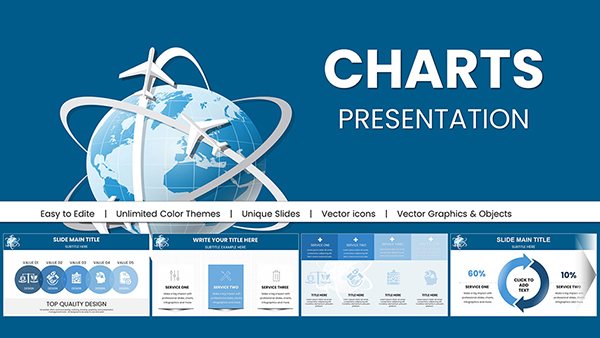
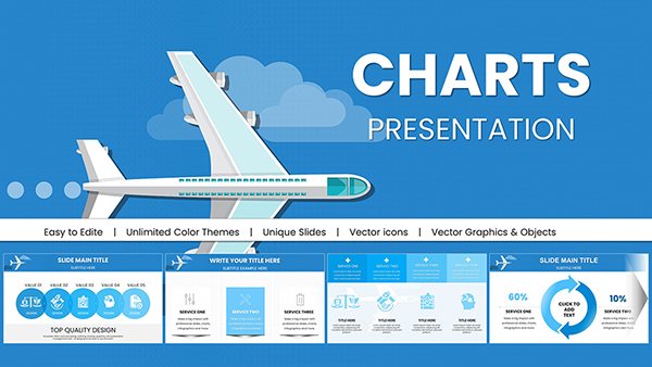
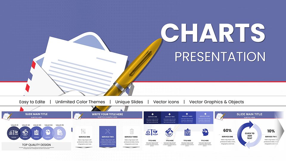
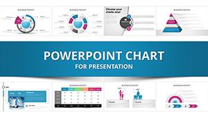
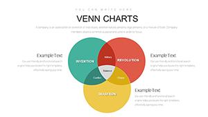
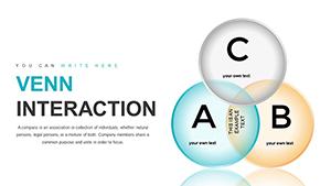
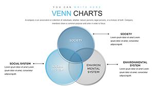
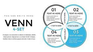
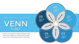
Standard PowerPoint charts are useful for quick visuals, but they rarely provide built-in analytical framing. Analysis chart templates include:
Use these templates when presenting quarterly reports, board-level summaries, ROI reviews, marketing performance analysis, or financial forecasting. They help translate data into meaning without redesigning each slide manually.
Finance teams use analytical charts to explain revenue growth, cost structure changes, profitability ratios, and forecast deviations. Structured comparison slides allow stakeholders to immediately identify patterns and outliers. Instead of isolated bar charts, you present aligned metrics with commentary and contextual markers.
Consultants frequently present diagnostic findings and scenario modeling. Analysis charts help break down market segmentation, risk exposure, competitor benchmarking, and performance gaps. Clear visual segmentation enhances credibility and simplifies complex frameworks.
Marketing professionals rely on analysis charts to demonstrate funnel performance, channel efficiency, audience growth, and campaign ROI. Structured templates allow side-by-side comparisons across time periods or target segments, supporting persuasive internal reviews.
Operations managers use analytical dashboards to monitor productivity, logistics efficiency, quality control metrics, and resource utilization. Templates in this category help combine multiple indicators on a single slide without overwhelming the viewer.
Unlike generic chart categories that focus on visual variety, the Analysis PowerPoint Chart collection is built around evaluation and interpretation. The emphasis is not on aesthetic experimentation, but on structured reasoning. These slides are organized to support:
If your objective is storytelling or timeline narration, another visual type may be more suitable. This category exists specifically for analytical depth and executive reporting precision.
Each slide uses visual hierarchy to highlight primary metrics before secondary data. Clear typographic contrast and spacing ensure that key insights stand out immediately during live presentations.
Business analysis often involves multiple variables. These templates balance information density with readability, preventing clutter while maintaining analytical richness.
Unlike default PowerPoint graphs, many slides include dedicated areas for insights, conclusions, and next-step recommendations. This transforms charts from static visuals into strategic communication tools.
To maximize impact:
Remember that analysis slides are most powerful when they answer a specific business question. Avoid overwhelming stakeholders with excessive metrics that do not influence the final recommendation.
Senior leaders expect clarity, not complexity. These analysis chart templates are structured to help you summarize large data sets into focused conclusions. Whether presenting to investors, department heads, or project teams, the layouts reinforce credibility and structured thinking.
The templates are suitable for corporate finance, startups, education institutions, government reporting, and non-profit organizations. Any scenario that requires evaluation, measurement, or performance review can benefit from structured analytical slides.
They are used for presenting structured data evaluations such as financial results, KPI tracking, campaign performance, risk assessments, and strategic reviews where interpretation and decision-making are required.
Unlike basic charts, analysis templates include structured layouts, comparison logic, insight sections, and executive-ready formatting that reduce preparation time and improve clarity.
Yes. The slides are designed for professional environments including board meetings, investor updates, and management reviews where structured analytical communication is essential.
Yes. All data points, labels, colors, and layout elements can be customized directly in PowerPoint to match your metrics and brand guidelines.
Copyright © 2009-2026 ImagineLayout All rights reserved.