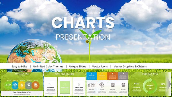
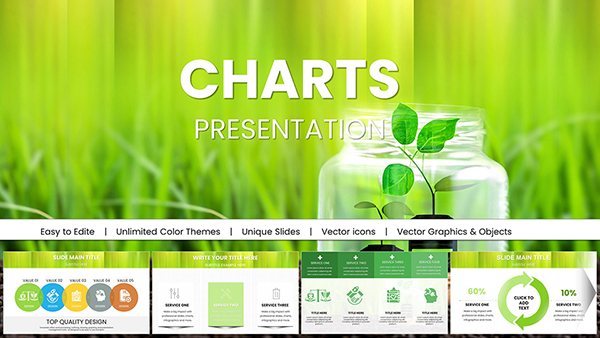
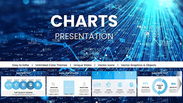
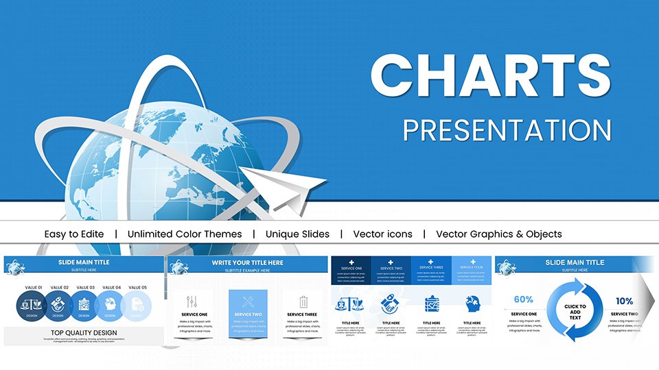
Accounting PowerPoint charts are designed for professionals who present financial data that must be precise, credible, and immediately understandable. Whether you are preparing quarterly reports, audit summaries, budget reviews, or investor updates, specialized accounting visuals communicate structured financial insight far more effectively than default shapes or generic graphs. These templates help transform complex balance sheets, income statements, and cash flow data into executive-level presentations that support confident decision-making.


Financial data carries responsibility. Unlike general business graphics, accounting visuals must preserve hierarchy, comparability, and traceability. Accounting PowerPoint charts are structured specifically for profit and loss breakdowns, expense allocation, variance analysis, and year-over-year comparisons. Default PowerPoint graphs can display numbers, but they rarely communicate financial relationships clearly enough for board-level discussion.
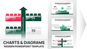
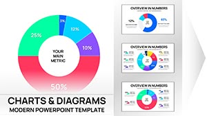
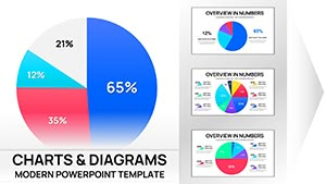
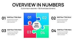
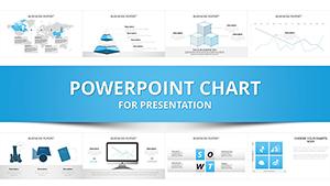
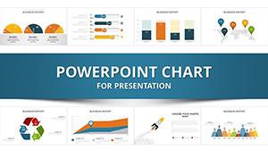
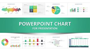
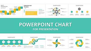
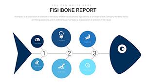
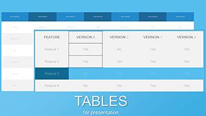
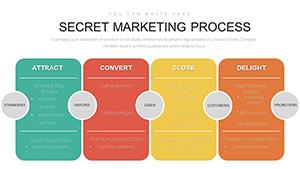
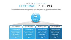
These templates provide predefined layouts for revenue segmentation, operating expense mapping, asset-liability distribution, capital structure analysis, and audit commentary slides. Instead of manually aligning columns and recalculating proportions visually, you work within professionally balanced financial frameworks.
In these contexts, visual clarity supports credibility. Clean spacing, logical grouping, and financial labeling standards reinforce trust.
Accounting charts serve structured communication. CFOs use them to summarize earnings performance. Controllers rely on them to present cost center accountability. Financial analysts apply them to visualize trend development and margin dynamics. Consultants adapt them for valuation and due diligence reporting.
Because financial presentations often move from internal teams to external stakeholders, consistency matters. These templates help maintain uniform formatting across departments.
Keep numeric emphasis clear. Use comparison layouts when presenting trends. Highlight variance visually rather than verbally. Avoid decorative clutter. Accounting audiences prioritize substance over style, and these templates reflect that principle.
General business charts focus on marketing metrics or operational indicators. Accounting PowerPoint charts concentrate on financial compliance, structured reporting standards, and formal documentation requirements. They support balance sheet logic, fiscal accountability, and audit defensibility.
If your goal is storytelling through marketing data, other categories may suit you better. If your goal is financial precision and executive validation, this accounting-focused collection is built for that exact need.
Every scenario demands disciplined data visualization. These templates simplify preparation while maintaining professional authority.
Yes. The layouts are structured for formal reporting environments, including internal and external audit reviews, with clear financial hierarchies and clean data organization.
All charts are fully editable in PowerPoint, allowing you to modify account names, values, fiscal periods, and financial groupings.
Yes. Many templates include comparison layouts designed for year-over-year analysis and trend evaluation.
Absolutely. These charts are formatted for executive-level communication where clarity and financial credibility are critical.
Copyright © 2009-2026 ImagineLayout All rights reserved.