Graph PowerPoint Charts Template for Customer Support Excellence


Type: PowerPoint Charts template
Category: Flow
Sources Available: .key
Product ID: PC00934
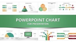
Template incl.: 31 editable slides
In the fast-paced world of customer support, where every interaction counts and data drives decisions, presenting information clearly can make all the difference. Imagine transforming your call center metrics - response times, satisfaction scores, and resolution rates - into visually compelling stories that captivate your team and executives alike. Our Graph PowerPoint Charts Template, specifically designed for customer support professionals, offers 31 fully editable slides that turn raw data into actionable insights. Whether you're a call center manager preparing quarterly reviews or a trainer illustrating best practices, this template empowers you to communicate complex information with ease and flair.
Drawing from real-world applications in high-volume support environments, like those at leading firms such as Zendesk or Freshdesk, this template aligns with industry standards for data visualization. It helps you avoid common pitfalls, such as overcrowded slides that confuse rather than clarify, by providing clean, professional designs that enhance understanding. With compatibility across PowerPoint and Keynote (.key format), you can seamlessly integrate these graphs into your workflow, saving hours of design time and allowing you to focus on what matters: delivering exceptional customer experiences.
Key Features of Our Graph Charts Template
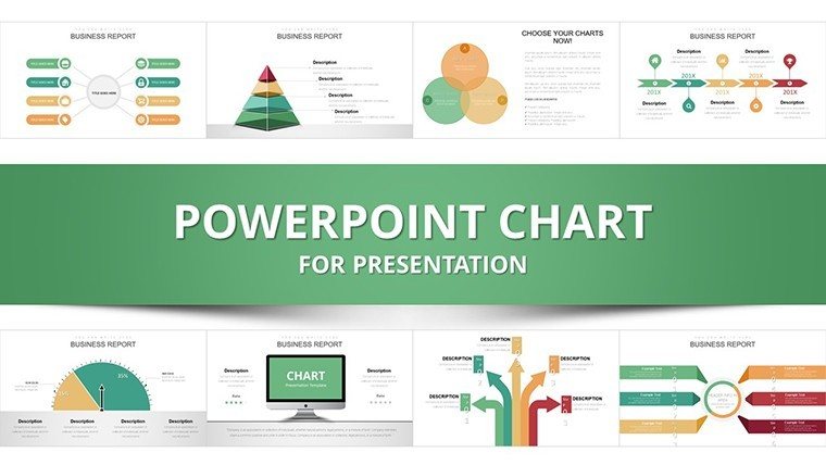
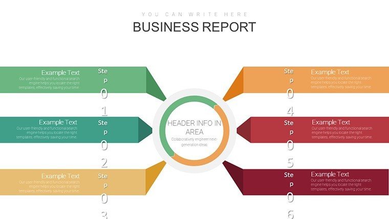
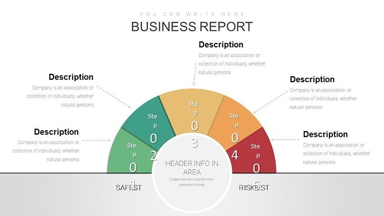
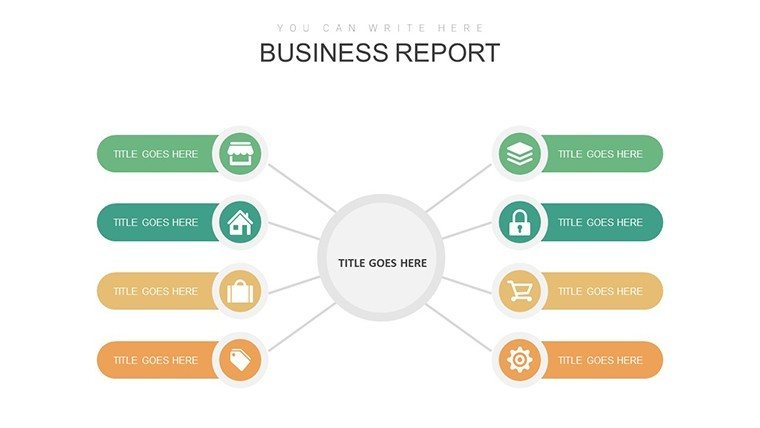
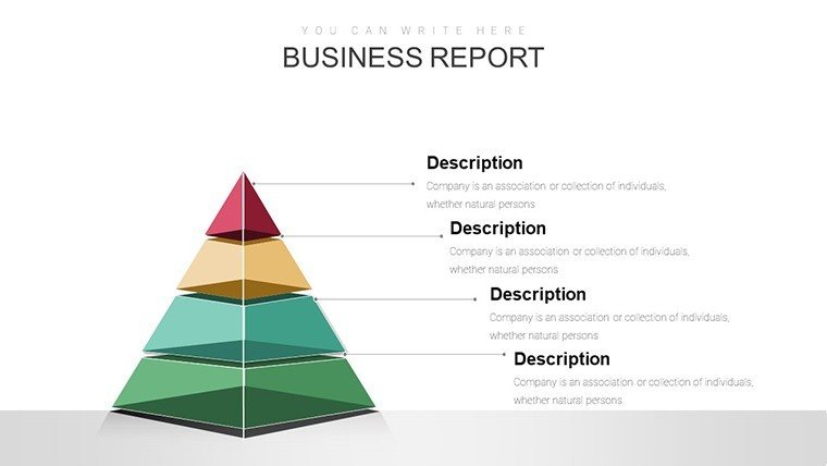
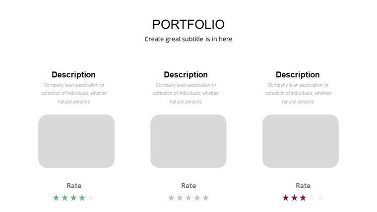
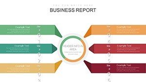
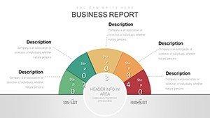
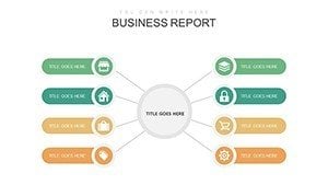
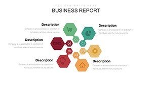
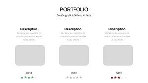
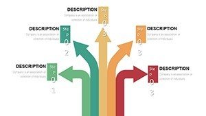
This template isn't just a collection of slides; it's a toolkit built for efficiency and impact. Each of the 31 slides is meticulously crafted to support various graphing needs, from line charts tracking call volumes over time to bar graphs comparing agent performance. The designs incorporate modern aesthetics with subtle animations that draw attention without overwhelming the audience.
- Fully Customizable Elements: Adjust colors, fonts, and layouts to match your brand's identity, ensuring consistency in all presentations.
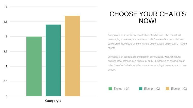
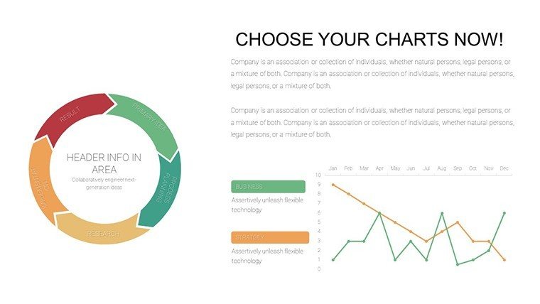
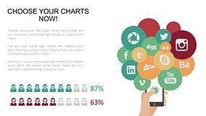
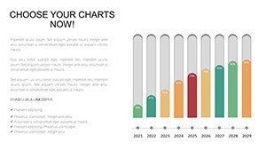
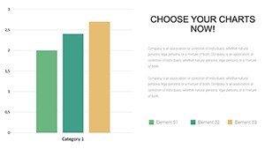
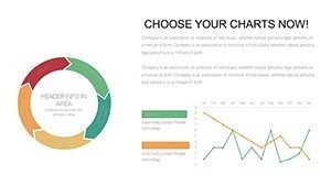
- Diverse Graph Types: Includes line, bar, area, and scatter plots, ideal for showcasing trends in customer inquiries or support ticket resolutions.
- Data-Driven Animations: Subtle transitions that reveal data points progressively, keeping your audience engaged during walkthroughs.
- High-Resolution Icons: Themed icons related to customer support, like headsets and chat bubbles, to add contextual relevance.
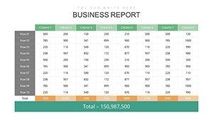
- Easy Data Integration: Placeholder tables that link directly to Excel, allowing real-time updates from your CRM systems.
These features stem from best practices in visual communication, as recommended by experts like Edward Tufte in his seminal work on data graphics, ensuring your presentations are not only beautiful but also effective in conveying messages.
Benefits That Drive Support Team Success
Using this template goes beyond aesthetics - it's about achieving tangible results. In customer support, where quick comprehension of data can lead to faster process improvements, these graphs help highlight key performance indicators (KPIs) like average handle time or first-contact resolution rates. Professionals report up to a 30% increase in audience retention when using visually enhanced slides, based on studies from presentation platforms like SlideShare.
For instance, a call center supervisor might use a line graph to demonstrate how implementing a new training program reduced escalations by 25% over six months. This not only justifies investments but also motivates teams by showing progress visually. The template's versatility means it adapts to different scenarios, from internal meetings to client reports, fostering trust and authority in your communications.
Real-World Use Cases in Customer Support
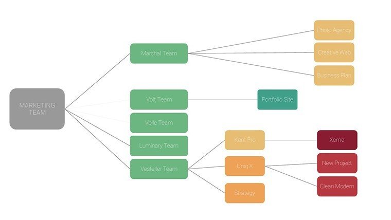
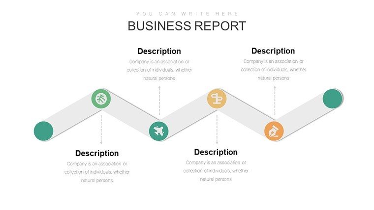
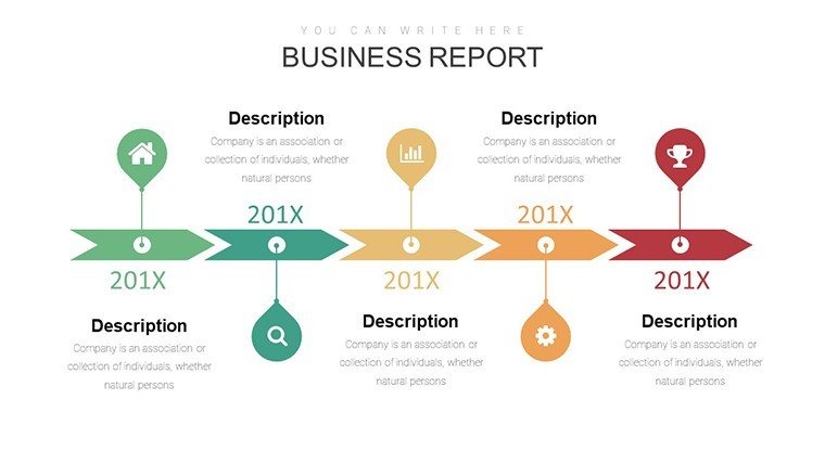
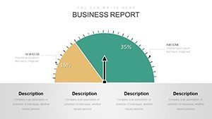
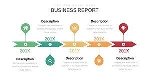
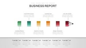
Let's dive into how this template shines in practical settings. Consider a monthly performance review: Slide 5, a multi-series bar chart, could compare team metrics across shifts, revealing peak-hour bottlenecks and informing staffing decisions. In training sessions, educators can employ area charts on Slide 12 to illustrate customer journey maps, helping new agents understand pain points and resolution strategies.
A case study from a mid-sized e-commerce company shows how similar graph templates streamlined their support analytics. By customizing slides to include year-over-year comparisons, they identified seasonal trends in query volumes, leading to proactive resource allocation and a 15% drop in wait times. For speakers at industry conferences, like those hosted by the Customer Contact Week, these charts provide the backbone for compelling narratives on support innovation.
- Prepare Your Data: Gather metrics from tools like Salesforce or Help Scout.
- Select a Slide: Choose from the 31 options based on your visualization needs.
- Customize: Input data, tweak colors to align with your brand palette.
- Present and Iterate: Share, gather feedback, and refine for future use.
Expert Tips for Maximizing Your Graphs
To elevate your presentations further, follow these professional insights. Always label axes clearly to avoid misinterpretation - a common issue in data viz, as noted by the American Statistical Association. Use contrasting colors for accessibility, ensuring compliance with WCAG standards for color-blind viewers. Incorporate storytelling: Don't just show a graph; explain what it means, like how a downward trend in complaints signals improved service quality.
For advanced users, layer in conditional formatting to highlight outliers, such as unusually high abandonment rates. Integrate with other tools by exporting slides to PDF for reports or embedding in dashboards via Power BI. Remember, the goal is persuasion through clarity; keep text minimal and let the graphs speak.
With over 762 ratings praising its usability, this template stands as a trusted resource for support pros worldwide. It's not just about charts - it's about transforming data into decisions that enhance customer satisfaction and operational efficiency.
Frequently Asked Questions
- How editable are the graph charts in this template?
- All 31 slides are fully editable, allowing changes to data, colors, and layouts directly in PowerPoint or Keynote.
- Is this template compatible with Google Slides?
- While designed for PowerPoint and Keynote, you can upload the .key or convert to .pptx for use in Google Slides with minor adjustments.
- Can I use these for commercial presentations?
- Yes, the template is licensed for commercial use, perfect for client-facing support reports.
- What if I need more slides?
- You can duplicate and customize existing slides to expand as needed.
- Are there tutorials included?
- Basic customization guides are available on our site, with community forums for advanced tips.