5-Set Venn Diagram PowerPoint - Fully Editable PPTX | ImagineLayout


Type: PowerPoint Charts template
Category: Venn
Sources Available: .pptx
Product ID: PC00789
Template incl.: 39 editable slides
Files and Formats Included
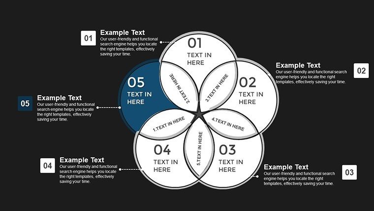
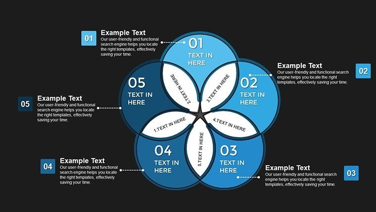
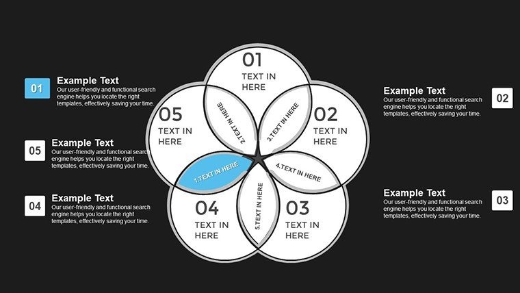
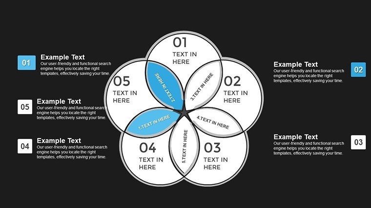
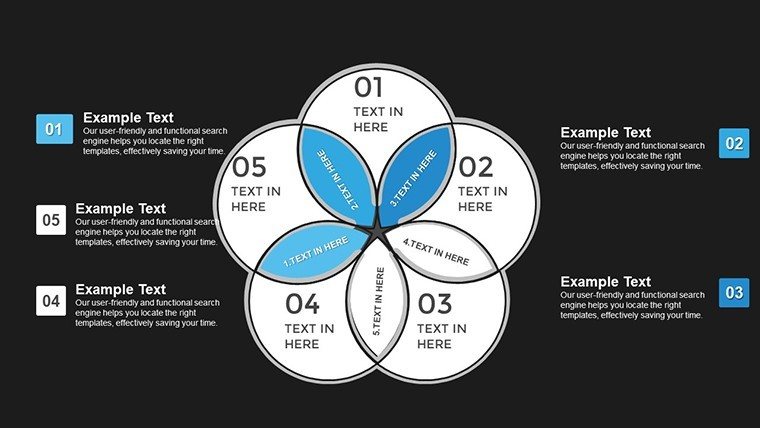
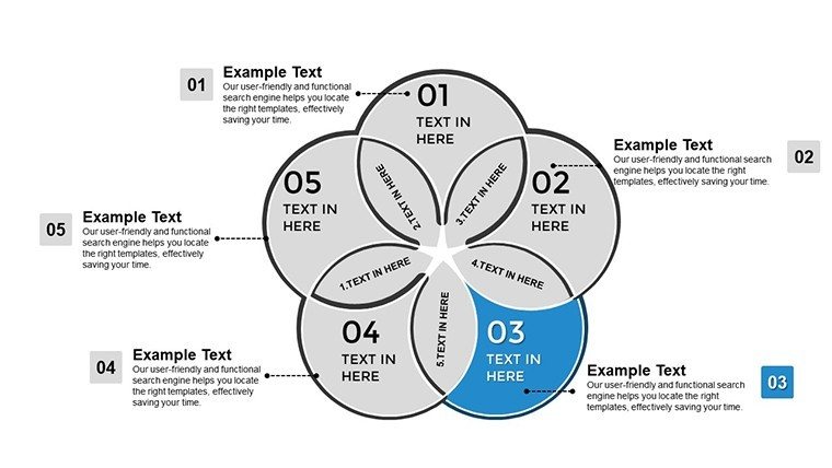
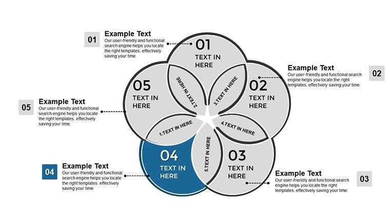
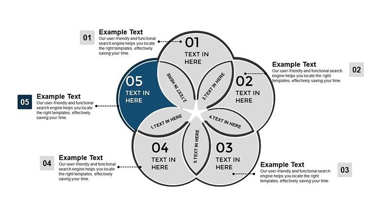
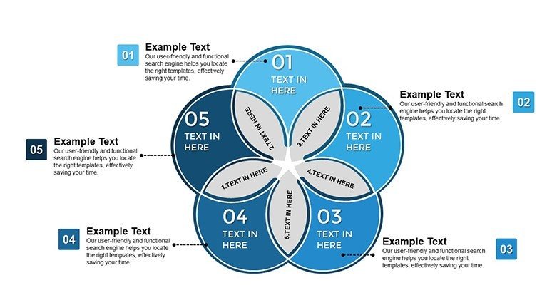
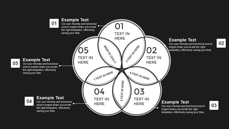
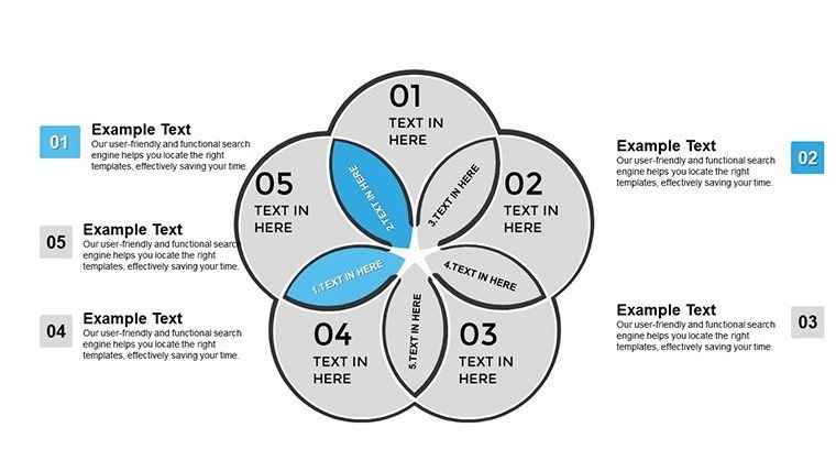
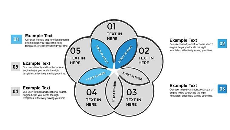
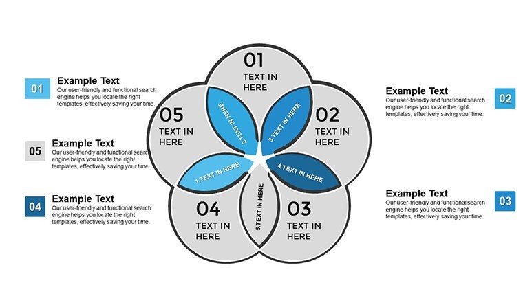
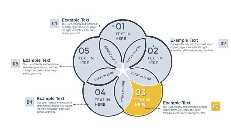
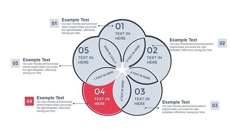
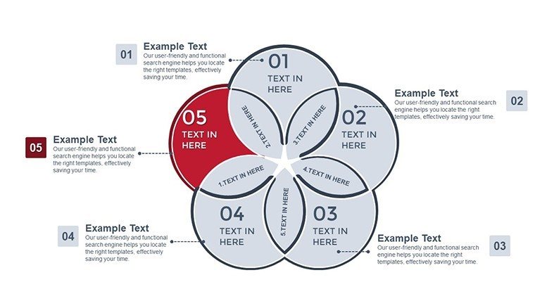
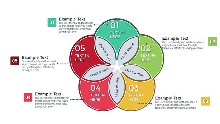
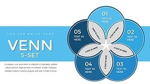
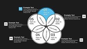
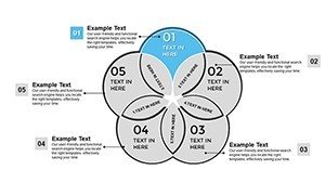
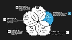
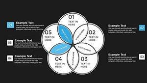
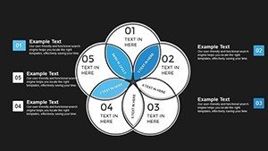
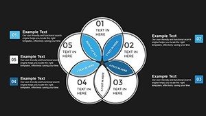
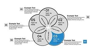
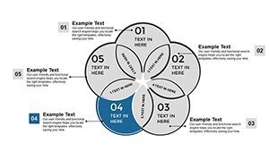
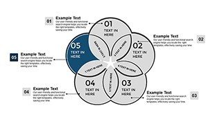
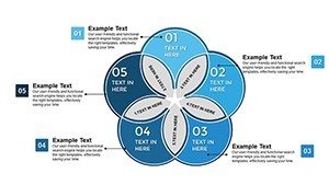
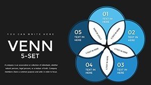
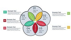
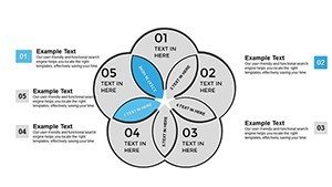
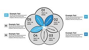
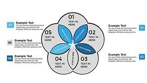
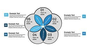
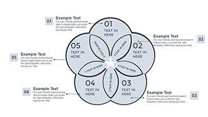
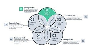
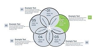
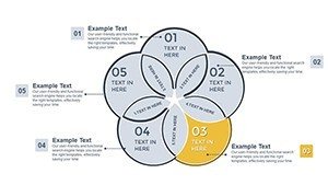
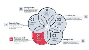
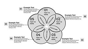
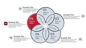
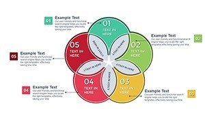
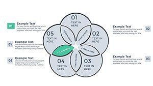
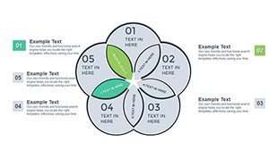
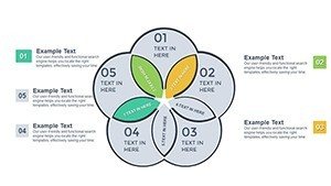
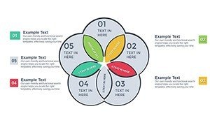
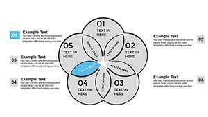
39 editable slides arrive in one PPTX file with 5-set Venn diagrams for complex overlaps.
These charts transform multi-dimensional data into executive visuals for investor updates.
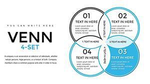
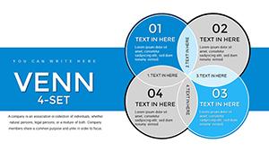
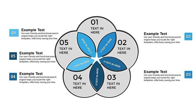
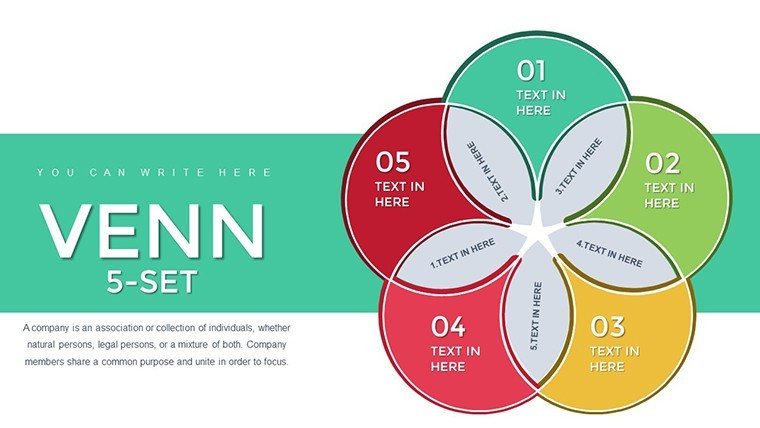
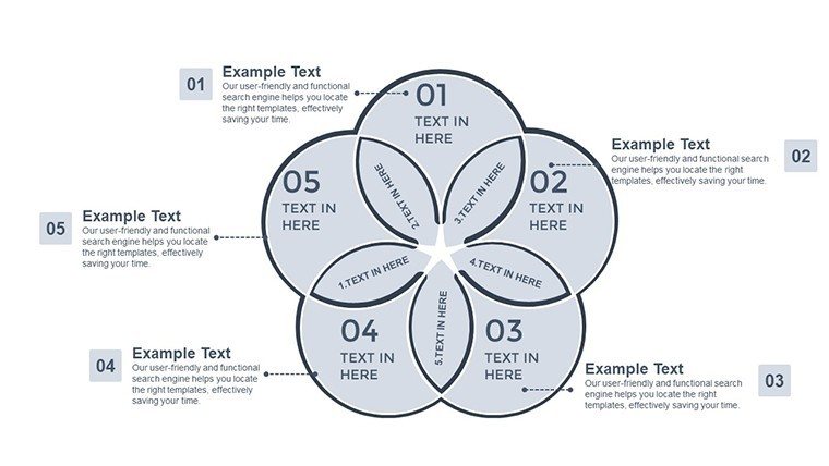
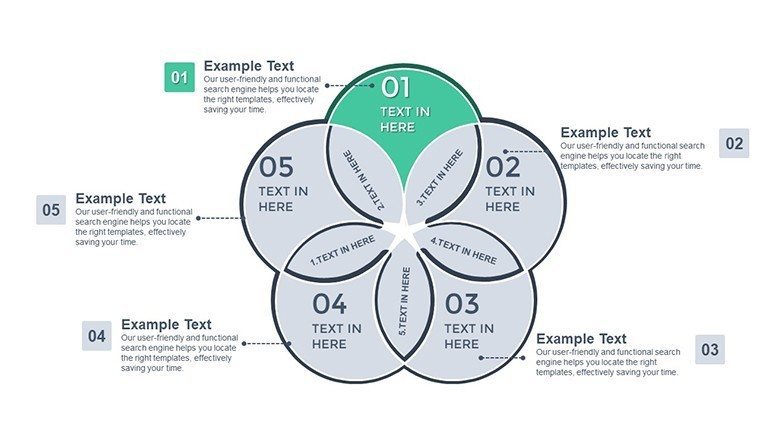
The 5-set structure here differs from simpler sets by handling stakeholder overlaps with precision. Analysts use it when precision matters most over basic intersections.
Consultants often pair these with Venn PowerPoint charts templates in performance reviews.
Editing Capabilities at a Glance
| Feature | Details |
|---|---|
| Slides included | 39 editable 5-set Venn diagrams |
| Editable shapes | overlap segments resize and recolor independently |
| Text placeholders | labels update without unlocking grouped elements |
| Color theme adjustments | compatible with PowerPoint slide master palette |
| Diagram connectors | lines adjustable in direction and weight |
| Export options | PPTX for editing PDF for distribution |
Who Reaches for This Template
An executive in consulting maps market segments for board meetings. The same file reuses across three client reports by swapping color schemes.
A project manager in tech identifies stakeholder overlaps during strategy workshops. Adaptation for five consecutive briefings takes minutes.
Download the 39 editable slides now.
Edit, Brand, Present: The Workflow
1. Open the PPTX file in PowerPoint 2016 or later (1 minute).
2. Replace placeholder text with your content (3 minutes).
3. Adjust brand colors via the slide master (2 minutes).
4. Edit Venn labels and connectors (4 minutes).
5. Export as PPTX or PDF (1 minute).
Editing difficulty Moderate.
Compared to Starting From Zero
Creating 39 5-set Venn diagrams manually requires hours of precise overlap alignment. Starting here finishes in minutes.
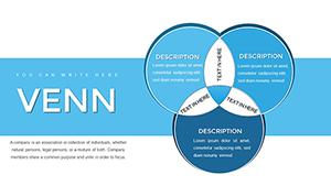
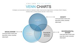
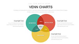
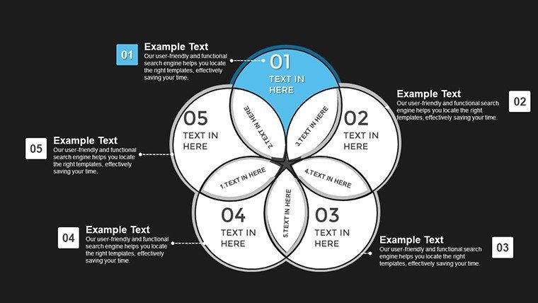
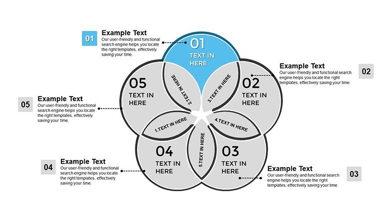
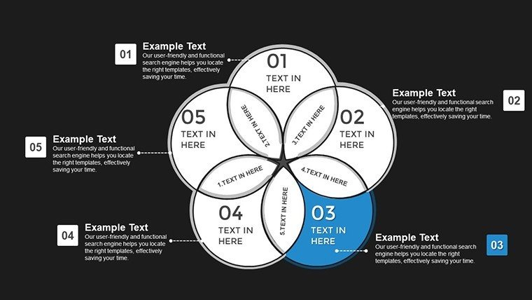
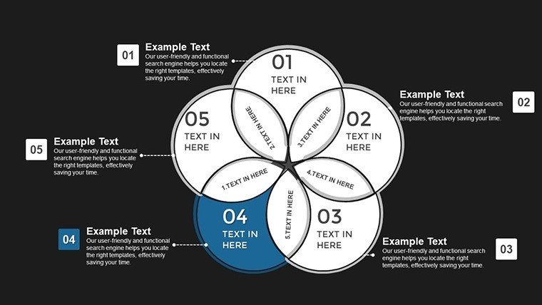
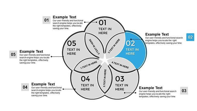
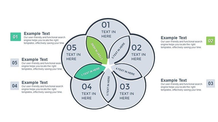
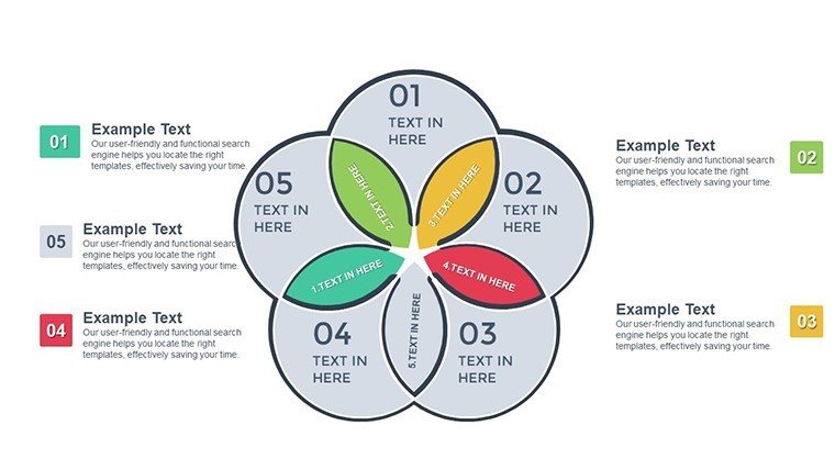
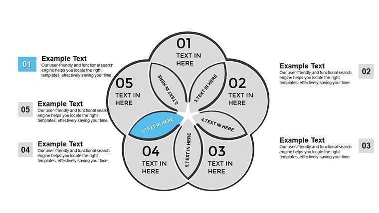
Many presentations place labels directly inside shapes. That works on a laptop screen yet becomes hard to read on a projection screen. This layout places labels outside the shapes connected by thin lines. Readability stays high during live meetings without added editing complexity.
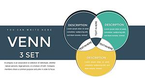
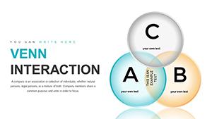
Information spacing aids hierarchy perception. The Venn type fits data structures that need zone segmentation.
HR specialists pair these with professional Venn layouts for team analysis.
Which PowerPoint versions does this support?
PowerPoint 2016 2019 and 365 on Windows or Mac open the PPTX file without issues. Earlier versions may lack full shape editing. Always verify your version before purchase. The file uses standard master slides compatible across recent releases.
How do I change the color scheme?
Go to View then Slide Master in PowerPoint. Update the theme colors in the palette. All Venn segments inherit the changes automatically. Save the master and return to normal view. The entire deck updates in seconds.
What does the license allow?
Internal company use and client work are permitted. Resale or sublicensing of the file itself is not allowed. You may present the edited deck in paid consulting projects. The original masters stay with the buyer only.
What is the difference between free and paid?
The paid version includes all 39 editable slides in PPTX format. Free tier details do not appear on the page so the purchase covers the complete set. Overlaps and labels are fully available only after download. No partial files are offered separately.
What software opens the file?
PowerPoint 2016 and later opens the PPTX format directly. Keynote cannot import it natively. Export to PDF works for sharing after edits. The file contains no external dependencies beyond standard PowerPoint features.
What is the refund policy?
Contact support within 30 days if the file does not open in PowerPoint 2016 or later. Provide proof of compatibility issue for review. Refunds process only for technical failures not for change of mind after successful download. The policy covers download errors only.