Matrix PowerPoint Charts
This collection covers matrix chart slides for Microsoft PowerPoint - layouts built around the two-axis comparison logic that strategy, risk, and product teams use to show trade-offs, priorities, and competitive positions. Every template arrives in PPTX format with editable shapes, axis labels, and quadrant structures you can adapt without touching the slide master.
A strategy consultant assembling a portfolio review for a client executive team, a product manager mapping feature priorities before a sprint planning session, or a risk officer preparing a quarterly compliance update for the board - all of them need the same thing: a grid that positions ideas against each other so the audience reads the placement, not the speaker's explanation. That structure is already built into these files.
The named frameworks in this collection - SWOT, Ansoff Matrix, Risk Matrix, Porter's Diamond, and PEST - are covered as individual layouts, not variations of a single generic grid. Browse the collection and pick the framework that matches your next decision.
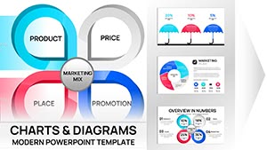 (11)
(11) Marketing Mix PowerPoint Charts - 47 Editable Slides for Strategy Presentations | Download NowID: #PC01108$20.00
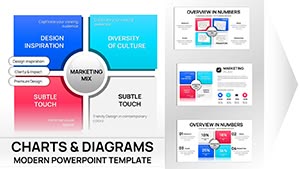 (11)
(11) Marketing Mix PowerPoint Charts - 31 Editable Slides for Board Meetings | Instant DownloadID: #PC01090$15.00
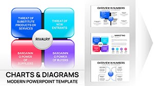 (14)
Porter's Diamond Charts PPT Template - 38 editable slidesID: #PC01089$15.00
(14)
Porter's Diamond Charts PPT Template - 38 editable slidesID: #PC01089$15.00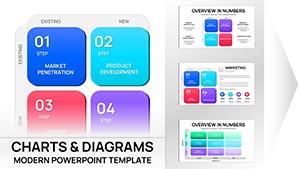 (17)
Ansoff Matrix Charts PPT Template for PowerPointID: #PC01082$20.00
(17)
Ansoff Matrix Charts PPT Template for PowerPointID: #PC01082$20.00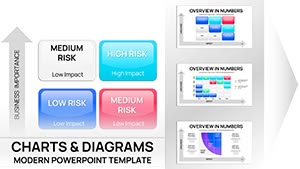 (12)
Risk Matrix Charts Template for PowerPointID: #PC01080$18.00
(12)
Risk Matrix Charts Template for PowerPointID: #PC01080$18.00 (694)
(694) Market Trend PowerPoint Charts: Navigate Business LandscapesID: #PC01063$25.00
 (1049)
International Currency Exchange PowerPoint Charts: Master Global Finance VisualsID: #PC00982$18.00
(1049)
International Currency Exchange PowerPoint Charts: Master Global Finance VisualsID: #PC00982$18.00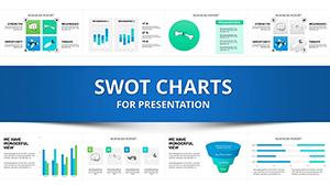 (383)
SWOT Analysis PowerPoint Charts Template DownloadID: #PC00296$20.00
(383)
SWOT Analysis PowerPoint Charts Template DownloadID: #PC00296$20.00 (520)
(520) Professional Development PowerPoint Charts: Fuel Your AmbitionID: #PC00936$20.00
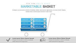 (873)
Marketable Basket PowerPoint Charts Template for Professional PresentationsID: #PC00853$20.00
(873)
Marketable Basket PowerPoint Charts Template for Professional PresentationsID: #PC00853$20.00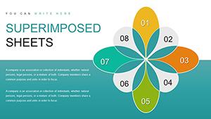 (508)
Superimposed Boundary Sheets PowerPoint Charts - Instant Download | ImagineLayoutID: #PC00849$14.00
(508)
Superimposed Boundary Sheets PowerPoint Charts - Instant Download | ImagineLayoutID: #PC00849$14.00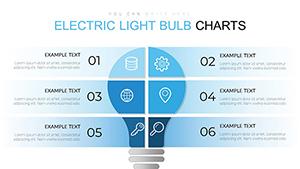 (557)
Electric Light Bulb PowerPoint Charts TemplateID: #PC00689$18.00
(557)
Electric Light Bulb PowerPoint Charts TemplateID: #PC00689$18.00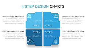 (494)
4 Steps Square PowerPoint Charts Template - PresentationID: #PC00686$12.00
(494)
4 Steps Square PowerPoint Charts Template - PresentationID: #PC00686$12.00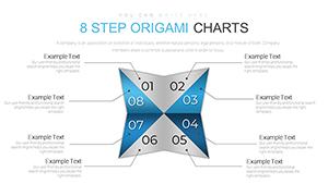 (574)
8-Step Origami PowerPoint Charts TemplateID: #PC00685$16.00
(574)
8-Step Origami PowerPoint Charts TemplateID: #PC00685$16.00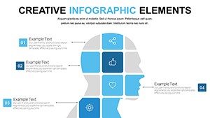 (309)
Free Creative PowerPoint Chart Presentation Template for MatricesID: #PC00622free
(309)
Free Creative PowerPoint Chart Presentation Template for MatricesID: #PC00622free (538)
Analytical Tool PowerPoint Charts Template: Elevate Your Data PresentationsID: #PC00597$15.00
(538)
Analytical Tool PowerPoint Charts Template: Elevate Your Data PresentationsID: #PC00597$15.00 (518)
Training Courses PowerPoint Charts Template: Inspire Learning with VisualsID: #PC00594$15.00
(518)
Training Courses PowerPoint Charts Template: Inspire Learning with VisualsID: #PC00594$15.00 (1021)
Research Methods PowerPoint Charts Template: Transform Data into Compelling NarrativesID: #PC00583$15.00
(1021)
Research Methods PowerPoint Charts Template: Transform Data into Compelling NarrativesID: #PC00583$15.00 (196)
Workflow Business Process PowerPoint Chart TemplateID: #PC00569$22.00
(196)
Workflow Business Process PowerPoint Chart TemplateID: #PC00569$22.00 (412)
Features and Applications PowerPoint Charts: Empower Your InfographicsID: #PC00567$20.00
(412)
Features and Applications PowerPoint Charts: Empower Your InfographicsID: #PC00567$20.00 (184)
Choice and Advantages PowerPoint Charts: Master Decision VisualsID: #PC00563$18.00
(184)
Choice and Advantages PowerPoint Charts: Master Decision VisualsID: #PC00563$18.00 (266)
Sphere of Influence PowerPoint Charts: Map Networks and ImpactID: #PC00562$20.00
(266)
Sphere of Influence PowerPoint Charts: Map Networks and ImpactID: #PC00562$20.00 (381)
Growth Prospects PowerPoint Charts Template: Propel Your Business ForwardID: #PC00559$23.00
(381)
Growth Prospects PowerPoint Charts Template: Propel Your Business ForwardID: #PC00559$23.00 (838)
Sustainable Development PowerPoint Charts TemplateID: #PC00553$15.00
(838)
Sustainable Development PowerPoint Charts TemplateID: #PC00553$15.00 (898)
Mastering Data Management with Advanced PowerPoint ChartsID: #PC00547$22.00
(898)
Mastering Data Management with Advanced PowerPoint ChartsID: #PC00547$22.00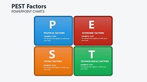 (429)
Factors PEST PowerPoint Charts Template: Strategic Insight Made SimpleID: #PC00200$22.00
(429)
Factors PEST PowerPoint Charts Template: Strategic Insight Made SimpleID: #PC00200$22.00 (1130)
Construction Company PowerPoint Charts Template: Download PresentationID: #PC00526$21.00
(1130)
Construction Company PowerPoint Charts Template: Download PresentationID: #PC00526$21.00 (534)
Infographic Creator PowerPoint Charts TemplateID: #PC00494$22.00
(534)
Infographic Creator PowerPoint Charts TemplateID: #PC00494$22.00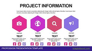 (793)
Powerful Project Information PowerPoint Charts TemplateID: #PC00466$21.00
(793)
Powerful Project Information PowerPoint Charts TemplateID: #PC00466$21.00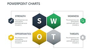 (160)
Change Management PPT Charts - Editable PPTX | ImagineLayoutID: #PC00424$18.00
(160)
Change Management PPT Charts - Editable PPTX | ImagineLayoutID: #PC00424$18.00 (992)
Choice Analysis PowerPoint Charts Template: Navigate Decisions WiselyID: #PC00418$17.00
(992)
Choice Analysis PowerPoint Charts Template: Navigate Decisions WiselyID: #PC00418$17.00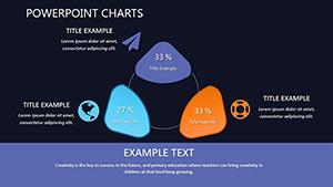 (509)
Website Promotion PowerPoint Charts Template: Drive Traffic and ConversionsID: #PC00411$15.00
(509)
Website Promotion PowerPoint Charts Template: Drive Traffic and ConversionsID: #PC00411$15.00 (634)
SEO Optimization Services PowerPoint Charts - Editable PPTX | ImagineLayoutID: #PC00408$15.00
(634)
SEO Optimization Services PowerPoint Charts - Editable PPTX | ImagineLayoutID: #PC00408$15.00
What Each Named Framework in This Collection Is Actually Used For
SWOT Analysis
The SWOT slide is one of the most overused and under-structured layouts in corporate presentations. When built from scratch, teams often end up with four text boxes of unequal length that make no visual argument. The template here structures the four quadrants with consistent proportions and a clear header hierarchy, so the comparative logic reads before anyone speaks. A marketing director preparing a brand positioning review for the CMO uses this to anchor the conversation - not as a summary slide at the end, but as the frame that the rest of the deck resolves.
Ansoff Matrix
The Ansoff Matrix slides in this collection are structured for strategic growth discussions, not textbook illustrations. Each quadrant - market penetration, market development, product development, diversification - carries enough space for a brief rationale alongside the label. A corporate development team presenting growth options to a board uses this to show where the proposed acquisition falls relative to the existing portfolio. The argument becomes spatial rather than verbal.
Risk Matrix
A risk matrix is not useful if it is decorative. The probability vs. impact layout here is built so high-severity items stand out through positioning alone, without requiring the presenter to point to them. A compliance officer preparing a quarterly risk update for a financial services firm can plot current exposures, add color coding by category, and the board reads the picture in the first ten seconds. The debate moves to remediation, not identification.
Porter's Diamond
Porter's Diamond is a more complex framework than a simple two-axis grid, and the template reflects that. The six interconnected factors - factor conditions, demand conditions, related industries, firm strategy, government, and chance - need a layout that shows the relationships between them, not just a list. A management consulting team presenting competitive landscape analysis to a client in manufacturing uses this to show why a particular market is structurally favorable or constrained.
PEST and PESTLE
Environmental scanning frameworks like PEST and PESTLE work best when the categories are visually separated but held in the same visual frame. The templates here give each factor its own space while keeping all of them on a single slide, so the audience absorbs the full picture at once. A strategy team opening a market entry presentation uses this slide to establish context before getting into recommendations.
The Specific Problem with Building a Matrix Slide from Scratch in PowerPoint
The grid itself is not the hard part. The hard part is everything around it. Which line weight do you use for the axis so it reads clearly but does not compete with the content? How wide do you make the quadrant labels so they do not clip on the left edge when the slide is projected at 1920x1080? How do you make the four quadrants visually equal without making the overall slide feel rigid? Each of those is a small decision that takes a few minutes - but in a 40-slide deck where the matrix appears on slides 8, 14, and 29, those decisions have to be made three times and stay consistent.
Starting with a template removes that layer entirely. The proportions are already tested, the font stack works at standard 16:9 aspect ratio, and the grouped shapes scale predictably when you copy the slide into a different deck. What remains is the actual analytical work - deciding what goes into each quadrant and why.
How to Use a Priority Matrix Without Weakening Your Own Argument
The non-obvious risk with matrix slides is artificial balance. When a team places items in a matrix, there is a natural pressure to distribute them evenly across quadrants - it feels more rigorous. In practice, a real risk assessment or feature prioritization will cluster. Most initiatives will sit in the same two quadrants. Spreading them artificially to fill the grid hides the actual signal.
The templates here leave every quadrant empty by default. Resist the urge to populate all four just because the space is there. A matrix with eight items in the high-impact/high-effort quadrant and nothing in the low-effort zone is telling a clear story. That story loses its force the moment you move items to justify the layout.
Browse the full collection below and download the framework that fits your next planning session.
Managing Consistency When Matrix Slides Appear Across a Large Deck
In recurring reports - quarterly business reviews, annual strategy updates, monthly risk dashboards - the matrix slide often appears in the same position in every deck. If the layout is built from scratch each time, small inconsistencies accumulate: the axis label font shifts slightly, the quadrant color in December's version does not match October's. For an executive audience that receives the same report quarterly, those inconsistencies signal that different people prepared different sections.
When the matrix layout lives in the slide master, those choices propagate automatically. Update the content inside the grid - not the grid itself - and every version stays consistent. Teams that share a deck across multiple contributors especially benefit from this: the template becomes the formatting contract, and editors focus on the data instead of the alignment.
Technical Detail: Why Grouped Shapes Behave Differently Than Tables in PPTX
Most of the matrix templates in this collection are built from grouped vector shapes rather than PowerPoint's native table objects. The reason matters in practice: grouped shapes scale proportionally when you change the slide aspect ratio from 16:9 to 4:3, which occasionally happens when a deck needs to be repurposed for a different venue. Native tables in PowerPoint do not always scale cleanly - column widths and row heights can shift in unexpected ways.
If you need to make structural changes to the grid - adding a fifth zone, adjusting quadrant proportions - ungroup the shapes first, make the edits, then regroup before adding content. This preserves the alignment logic. Editing individual shapes inside a group without ungrouping first can cause elements to drift when the slide is resized or exported to PDF.
What This Collection Focuses On That Generic Marketplaces Do Not
The matrix slides here are built around named analytical frameworks that appear in real strategy and risk work - not decorative grid patterns dressed up as business tools. Each layout reflects how the framework is actually used in presentations: with space for brief rationale text in each quadrant, clean axis labels that do not require explanation, and enough white space that the positioning of items reads clearly without crowding. There are no unnecessary icons, gradients, or decorative elements that add file size without adding argument.
Adjacent Categories Worth Considering for the Same Project
Matrix charts work well as a decision anchor in a larger deck, but most strategy presentations need more than a single framework slide. If your deck requires a broader analytical structure - competitive analysis, business model canvases, or multi-step evaluation frameworks - the full PowerPoint chart template library covers those layouts. For decks that need to show how decisions were reached through a step-by-step process, the PowerPoint diagram templates provide process and flow layouts that pair naturally with matrix slides. If your presentation combines data visualization with the matrix framework, the graph and chart slides in the same parent category give you the quantitative support slides to accompany the positional argument.
Frequently Asked Questions
Can I add a fifth quadrant or zone to the matrix layout without rebuilding the slide?
Most of the matrix templates use grouped vector shapes rather than native PowerPoint tables, which means structural changes are straightforward. To add a zone - for example, a "monitor" quadrant alongside the standard four - ungroup the shape set, copy one of the existing quadrant shapes, resize and reposition it, then update the axis label text. The PPTX format preserves all shape properties during this process. Once the new zone is placed, regroup the entire grid so it scales and moves as a single unit. The alternative - editing individual shapes inside the group without ungrouping first - risks elements drifting when the slide is resized or copied into a different deck.
Do these templates work in Google Slides as well as PowerPoint?
The files are delivered in PPTX format, which Google Slides can import directly. In most cases, the shapes, groupings, and text boxes transfer without loss. The main issue to watch is font substitution: if the template uses a font not available in Google Fonts, Slides will substitute the nearest match, which can shift text alignment inside quadrant labels. To avoid this, after import, select all text elements and confirm the font family before distributing the deck. If you collaborate in Google Slides regularly, choose a template that uses widely available fonts - these are noted in the file description.
How do I link a matrix template to live data from Excel without breaking the layout?
Matrix slides built from grouped shapes - as most of these are - do not support a direct data link the way native PowerPoint chart objects do. The item positions within the grid are set manually, which is appropriate for frameworks like SWOT or Risk Matrix where placement reflects qualitative judgment rather than a numeric value. If you need positions to update automatically from a data source, the most practical approach is to place a native PowerPoint scatter chart object over the grid background, then format the data points to match the template's visual style. This allows you to refresh positions by updating the linked Excel workbook.
Is the license suitable for including these slides in a client deliverable?
Yes. The standard license covers use in client-facing presentations, reports, and deliverables - including work you are paid to produce. You can customize the matrix slides with client branding, data, and content and include them in any final deliverable without additional licensing fees. The restriction is on redistribution: you cannot resell the template files themselves or share the unmodified PPTX as a standalone product. For consulting teams that use the same framework template across multiple client engagements, one purchase covers all of those uses.
Will the matrix layout export cleanly to PDF for client sharing?
Yes, with one important caveat. PowerPoint's PDF export preserves vector shapes and alignment reliably, so the grid, axis lines, and labels all render at full sharpness regardless of zoom. The issue that occasionally arises is font rendering: if the template uses a custom font that is not embedded in the PPTX file and is not installed on the machine you are exporting from, text may reflow slightly. To prevent this, use the "Embed fonts" option in PowerPoint's Save settings before exporting, or replace any custom fonts with standard system fonts. Preview the PDF at 150% zoom before sending to confirm that quadrant labels and data annotations are correctly positioned.