Development Keynote Charts Template: Empower Your Project Narratives


In the realm of development - be it software, product, or infrastructure - clear communication is key to success. Our Development Keynote Charts Template is your ally in turning intricate project data into compelling visuals that resonate. With 22 editable slides, this template caters to developers, project managers, and educators who need to showcase progress, timelines, and insights without the hassle of starting from scratch. It's more than slides; it's a toolkit for storytelling that highlights growth trends and resource allocations vividly.
Envision pitching a new app feature to investors, using line graphs to illustrate user growth projections. Or, in a team huddle, mapping out sprint timelines with bar charts that everyone grasps instantly. Crafted with the development lifecycle in mind, this template aligns with agile methodologies, making it indispensable for modern workflows. Exclusive to Keynote on Mac, it guarantees fluid animations and sharp graphics every time.
Essential Features for Dynamic Presentations
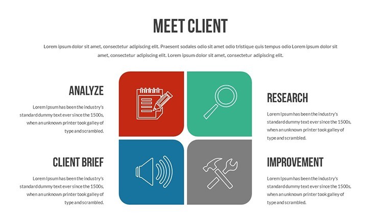
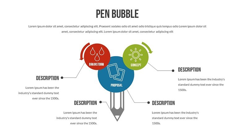
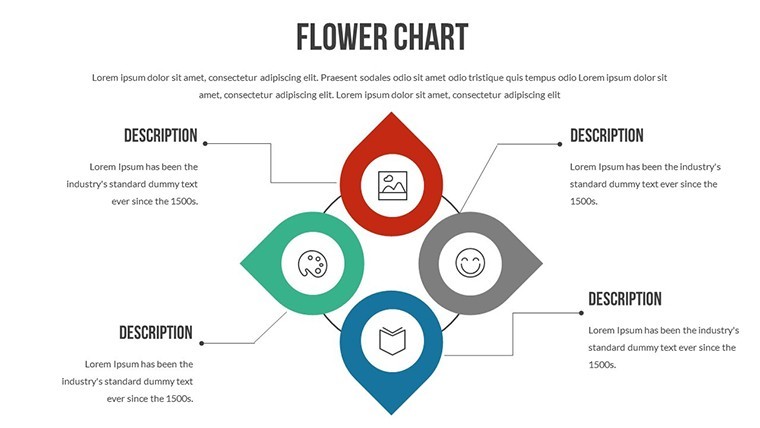
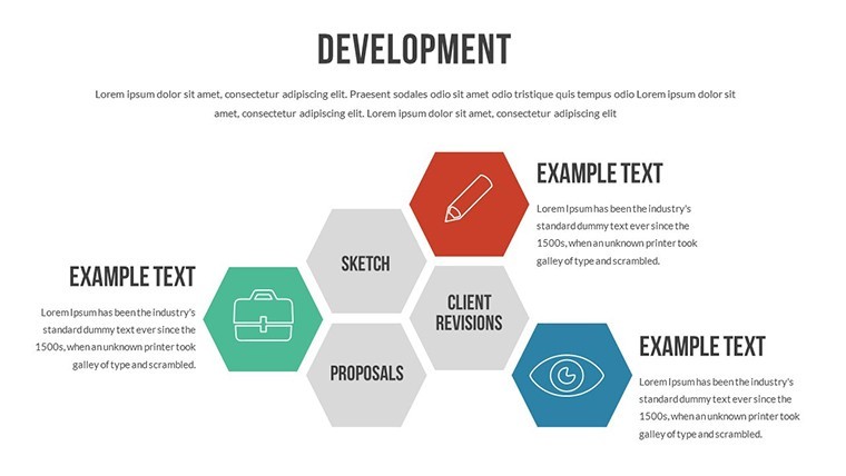
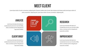
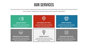
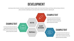
Built for versatility, the template includes a mix of flow and analysis charts, all fully customizable. Adjust fonts, colors, and layouts to echo your project's vibe, whether minimalist or bold.
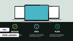
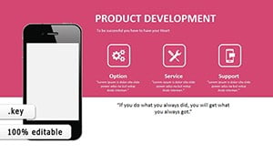
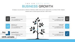
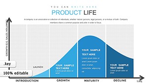
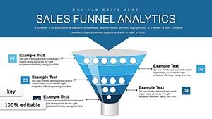
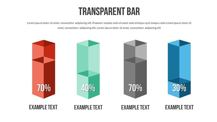
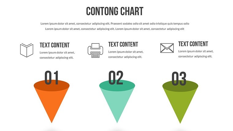
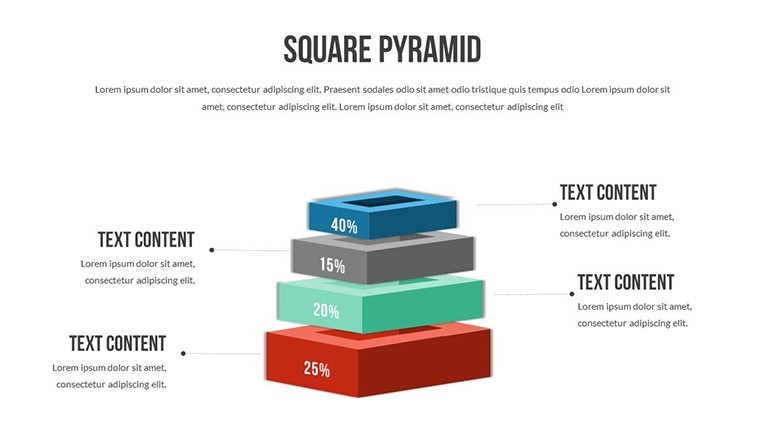
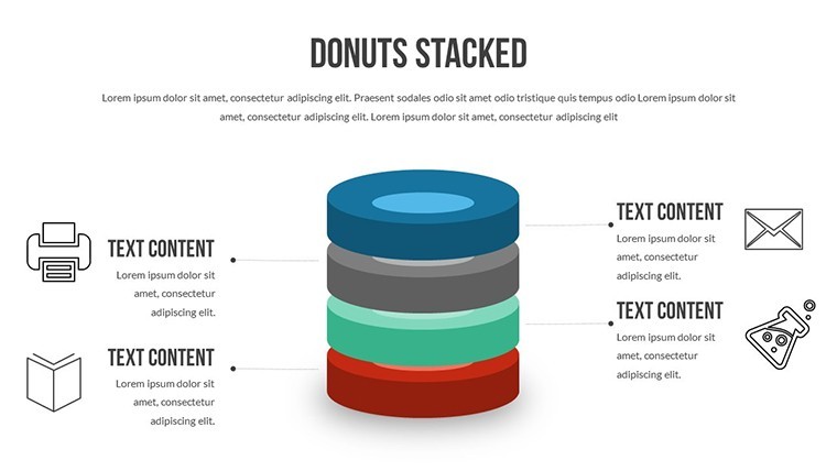
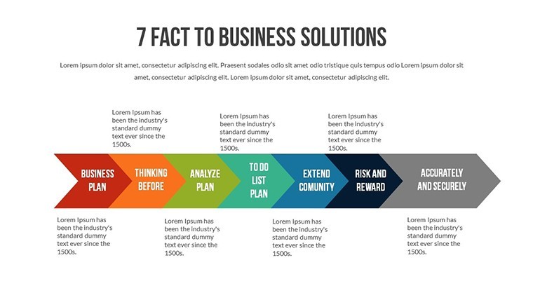
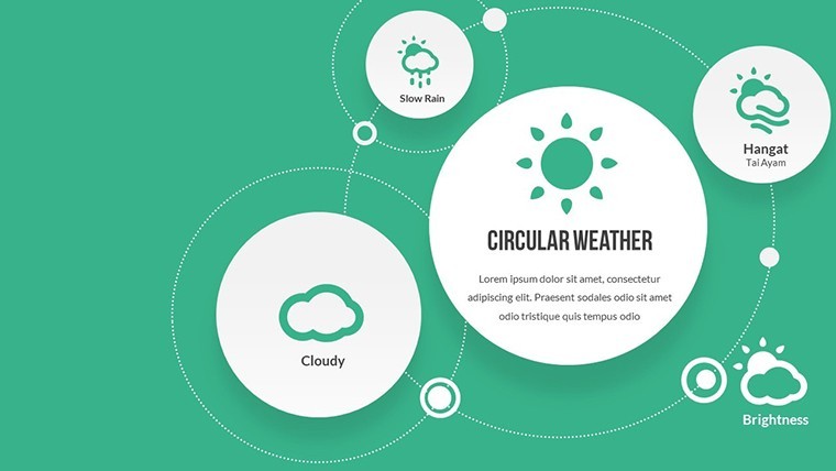
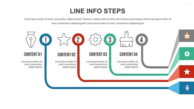
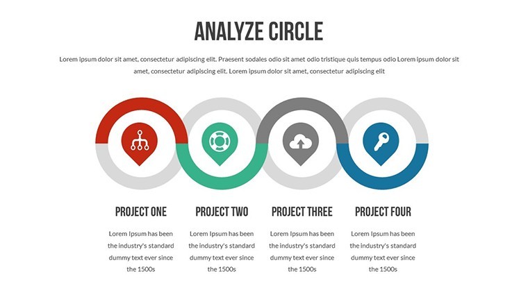
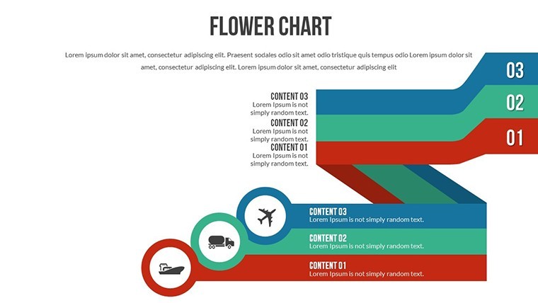
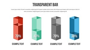
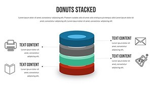
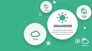
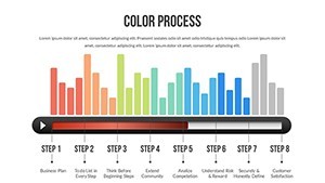
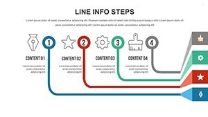
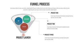
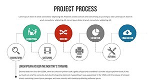
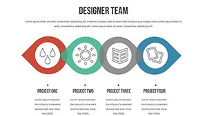
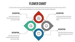
- Diverse Visual Options: Line graphs for trends, pie charts for breakdowns, and more to suit any data type.
- Engagement Boosters: Custom animations that reveal information step-by-step, maintaining audience interest.
- Efficiency Tools: Pre-designed templates save time, letting you prioritize content over design.
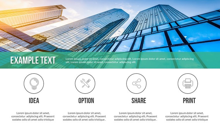
- Branding Integration: Easily incorporate your logos and palettes for a unified professional touch.
These elements draw from best practices in UI/UX design, ensuring your charts aren't just data dumps but persuasive tools, like visualizing code deployment cycles in DevOps pipelines.
Targeted Applications Across Roles
For developers, this means presenting code metrics or bug tracking with clarity, perhaps comparing pre- and post-refactor performance. Project managers can outline milestones, using Gantt-style flows to track dependencies in construction projects. Educators benefit by breaking down algorithms visually, aiding student comprehension in computer science classes.
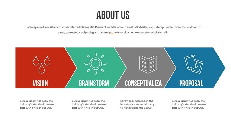
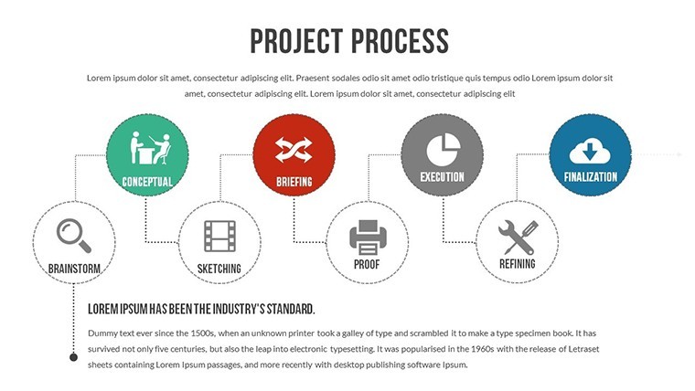
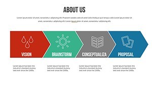
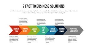
In business analysis, communicate ROI forecasts to stakeholders, drawing parallels to successful cases like Google's iterative development. The template's flow charts excel in depicting processes, such as software release pipelines, fostering better team alignment and quicker iterations.
Seamless Integration into Your Process
- Start Strong: Download the .key file and open in Keynote.
- Tailor Content: Input project-specific data, tweaking visuals as needed.
- Enhance Delivery: Add transitions and rehearse for impact.
- Share and Collaborate: Export or present directly, gathering input for refinements.
Outperforming basic charts, this template incorporates thematic consistency, potentially halving your prep time while amplifying message retention.
Delivering Tangible Benefits
The payoff? More engaged audiences and informed decisions. Developers report smoother reviews when using these visuals to demo prototypes. It builds authority by aligning with standards like PMI for project management, subtly reinforcing your expertise.
Weave it into tools like Jira for real-time data pulls, keeping presentations fresh in fast-evolving fields like app development.
Insider Tips for Stellar Results
Layer narratives over data - start with challenges, then reveal solutions via charts. Use contrasting colors for emphasis, like red for risks in timeline slides. Practice virtual setups to avoid glitches, and conclude with actionable next steps to drive momentum.
Unleash your project's full potential with this template. Begin your journey to more influential presentations now.
Frequently Asked Questions
- How customizable are the charts?
- Fully, including colors, fonts, styles, and data inputs to match your needs.
- Who is this template best for?
- Developers, managers, educators, and analysts in project-oriented fields.
- Does it work on non-Mac devices?
- No, it's optimized for Keynote on Mac only.
- What chart types are included?
- A variety like line, bar, pie, and flow diagrams for comprehensive coverage.
- How many slides are there?
- 22 editable slides focused on development themes.