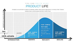
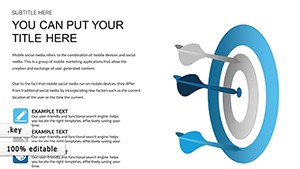
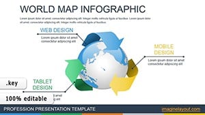
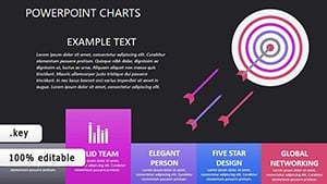
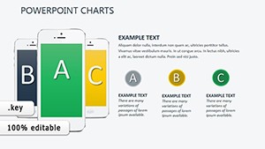
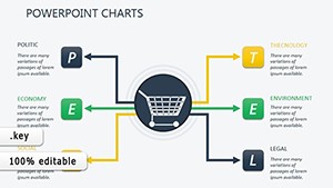
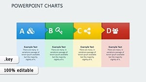
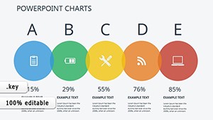
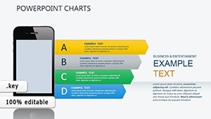
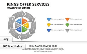
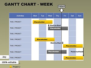
Elevate your strategic discussions with Keynote charts for product market expansion, meticulously designed for Apple enthusiasts and creative professionals. This category showcases visuals that blend Apple`s sleek aesthetic with robust analytical tools, perfect for unveiling growth plans in style.
From ecosystem mapping to performance dashboards, these charts help marketing directors and product managers articulate expansion visions with finesse. Their fluid animations and high-fidelity renders make every reveal a highlight, ensuring your message sticks.
Aimed at innovators in dynamic industries, these templates foster collaboration by simplifying data complexity. Dive into the selection and transform your next presentation into a masterpiece of clarity and creativity.

Keynote`s native strengths shine in our Keynote charts for product market expansion, where smooth transitions meet data precision. These go beyond standard graphs, offering morphing animations for timeline evolutions and layered builds for scenario explorations - ideal for captivating live audiences.
Strategy consultants use them to dissect market gaps, while entrepreneurs pitch scalability with confidence. The designs prioritize usability, with drag-and-drop elements for rapid prototyping.
Envision a fashion label scaling online: our animated bar chart pulses with sales data by quarter, morphing to reveal regional variances - a visual symphony that underscores expansion potential.
Conventional charts can feel rigid; ours leverage Keynote`s magic move for seamless data shifts, creating immersive experiences. With retina-ready graphics, they excel on large screens, outpacing pixelated alternatives.
Select chart styles that match your pace - steady builds for deliberate reveals. Pro advice: Sync animations with voiceover cues to guide emphasis, enhancing retention in virtual formats.
Highlights include theme harmony with macOS and export options for cross-platform sharing.
For a travel app`s geographic push, employ our world map chart with pulsing nodes for user growth hotspots. Innovate by layering audio cues via Keynote`s media integration for narrated insights.
In non-profits, adapt pyramid charts for donor expansion funnels, stacking segments for impact visualization. Tip: Use subtle shadows for depth, adding a premium feel without overwhelming.
Embed hyperlinks to appendices or integrate with Numbers for live data pulls, making charts evolve with inputs.
CTA: Animate your ambitions - download Keynote charts and stage your expansion triumph.
Addressing key concerns to streamline your adoption. Explore more in this vibrant category.
CTA: Spark innovation - secure your chart and elevate every slide.