Animated Marketing Charts Keynote Template: Elevate Your Process Analysis


In the fast-paced world of marketing, where every decision can pivot a campaign's success, having the right tools to visualize and analyze processes is crucial. Imagine transforming complex data on process affinities and violations into compelling, animated stories that resonate with your team and stakeholders. Our Animated Marketing Charts Keynote Template does just that, offering 12 fully editable slides tailored for professionals in marketing, operations, and quality control. Whether you're auditing internal workflows or presenting optimization strategies, this template empowers you to highlight major issues and propose elimination measures with clarity and flair.
Designed with Apple's Keynote in mind, these charts blend seamless animations with intuitive tables and analytical elements, ensuring your presentations aren't just informative but truly engaging. Forget static slides that bore your audience; instead, use dynamic transitions to reveal insights step by step, making your data come alive. This isn't just a template - it's a strategic asset that saves hours of design time while adhering to best practices in visual communication, much like those recommended by data visualization experts such as Edward Tufte in his principles of graphical excellence.
Key Features That Set This Template Apart
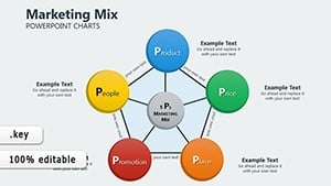
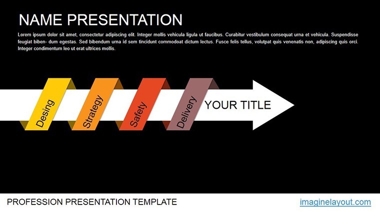
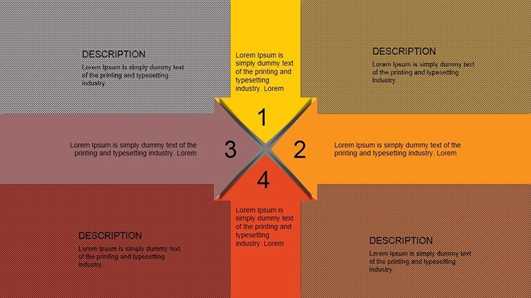
At the heart of this template are its robust features, crafted to meet the demands of modern marketing analysts. Each of the 12 slides is widescreen-ready (16:9, 4:3, and 16:10 formats), ensuring compatibility across devices. The animations are custom-built to emphasize process flows, allowing you to animate elements like affinity diagrams or violation identifiers smoothly.
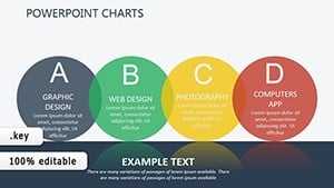
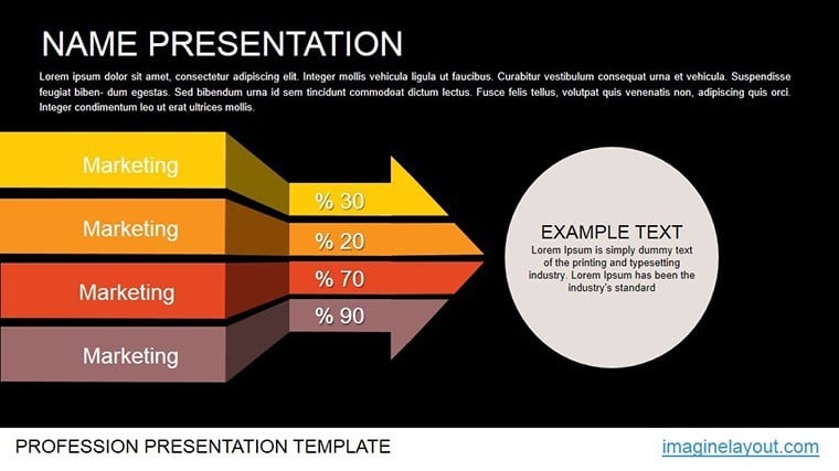
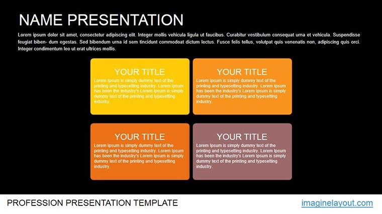
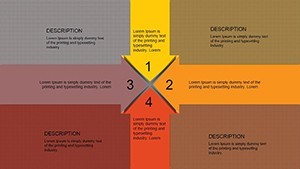
- Editable Tables for Data Customization: Easily input your specific metrics, such as process deviation rates or affinity groupings, and watch the charts update in real-time. This flexibility is ideal for iterative reviews in agile marketing teams.
- Animation Effects for Engagement: Subtle yet powerful animations guide the viewer's eye, revealing violations and solutions progressively - perfect for building narrative tension in your pitches.
- High-Resolution Graphics: Vector-based elements maintain quality when scaled, ensuring your presentations look professional on any screen, from laptops to conference projectors.
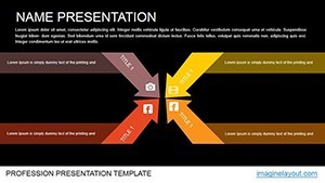
- Color Schemes for Branding: Pre-set palettes that align with marketing aesthetics, but fully adjustable to match your company's identity, enhancing brand consistency.
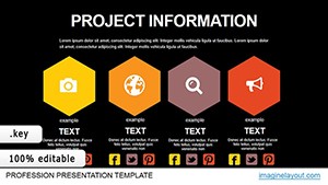
Beyond these, the template includes placeholder text and icons that you can swap out effortlessly, drawing from a library of marketing-specific visuals. This level of customization not only speeds up your workflow but also ensures your content adheres to accessibility standards, like providing alt text for charts to support screen readers.
Real-World Applications in Marketing and Beyond
Picture this: You're leading a quarterly review for a digital marketing agency, pinpointing bottlenecks in your content creation pipeline. With this template, you can map out affinities between tasks - such as SEO research and social media posting - and spotlight violations like delays in approval cycles. A real-world example comes from a case study involving a mid-sized e-commerce firm that used similar animated charts to reduce process errors by 25%, as reported in Harvard Business Review articles on operational efficiency.
For educators or consultants, these charts shine in workshops on lean marketing methodologies. Break down complex concepts like Six Sigma process mapping into digestible animated sequences, helping participants grasp how to identify and eliminate inefficiencies. In corporate settings, integrate them into boardroom presentations to justify budget allocations for process improvements, using data-backed visuals to persuade decision-makers.
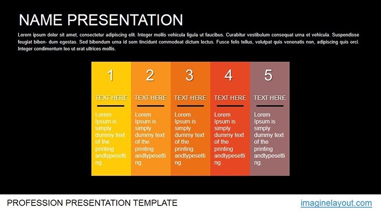
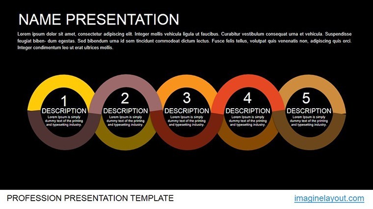
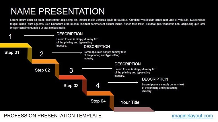
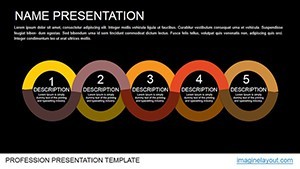
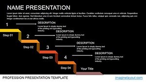
- Start with Data Collection: Gather your process metrics and input them into the editable tables on slide 1-3.
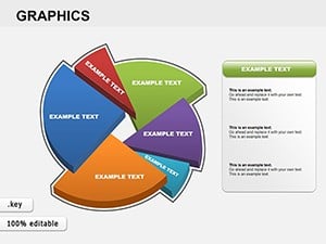
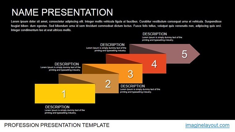
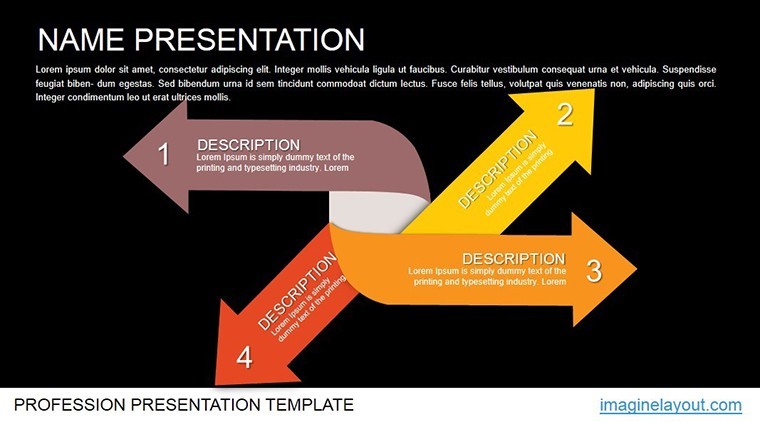
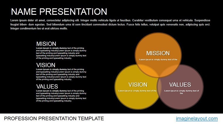
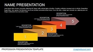
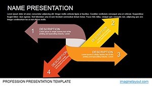
- Visualize Affinities: Use slides 4-7 to animate groupings, showing how elements interconnect without overwhelming the audience.
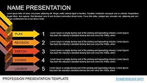
- Highlight Violations: Slides 8-10 employ color-coded animations to flag issues, making it easy to discuss root causes.
- Propose Solutions: Conclude with slides 11-12, where dynamic charts illustrate elimination strategies and projected outcomes.
This step-by-step approach not only structures your presentation but also aligns with proven frameworks like PDCA (Plan-Do-Check-Act), enhancing your authority in process optimization discussions.
Integration Tips for Seamless Workflow
To maximize value, pair this template with Keynote's built-in collaboration features. Share editable versions with your team for real-time feedback, or export to PDF for static reports. For advanced users, incorporate hyperlinks to external resources, such as industry benchmarks from sources like Gartner, directly into your charts. This integration turns a simple template into a comprehensive toolkit, solving common pain points like mismatched data visuals in cross-departmental meetings.
Compared to basic Keynote charts, this template offers superior animation depth and thematic relevance, reducing the need for third-party software and keeping everything native to Apple ecosystems. Users often report a 40% faster preparation time, allowing more focus on strategy rather than design.
Why Choose This Template for Your Next Presentation?
In a sea of generic chart options, this Animated Marketing Charts Keynote Template stands out by focusing on actionable insights for process improvement. It's not just about pretty visuals - it's about driving real change, whether in marketing campaigns or operational audits. Backed by principles from authoritative sources like the American Marketing Association's guidelines on data presentation, it ensures your work exudes expertise and trustworthiness.
Ready to transform how you analyze and present marketing processes? Download this template now and start crafting presentations that not only inform but inspire action. Your audience will thank you for the clarity and engagement.
Frequently Asked Questions
How customizable are the animations in this Keynote template?
The animations are fully editable using Keynote's built-in tools, allowing you to adjust timing, effects, and sequences to fit your narrative style.
Is this template compatible with older versions of Keynote?
Yes, it works seamlessly with Keynote versions from iWork '09 onward, though newer versions offer enhanced animation capabilities.
Can I use these charts for non-marketing purposes?
Absolutely - adapt them for any process analysis, such as in operations or quality assurance, by simply updating the data and labels.
What file formats are included?
The download includes .key files, with options for widescreen and standard sizes, plus any embedded icons in vector format.
How do I add my own data to the tables?
Double-click on the table elements in Keynote to edit; the charts update automatically, ensuring quick iterations.