HR Metrics Dashboard Keynote Template
Type: Keynote Charts template
Category: Process, Illustrations
Sources Available: .key
Product ID: KC00380
Template incl.: 20 editable slides
As an HR leader who`s spent years crafting presentations for everything from quarterly reviews to boardroom strategy sessions, I know the frustration of staring at spreadsheets full of employee data that no one can make sense of. You need a way to turn those numbers into stories that resonate - showing not just the facts, but the human impact behind them. That`s where this HR Metrics Dashboard Keynote Template steps in. It`s a 20-slide powerhouse designed specifically for folks like you: HR managers juggling performance tracking, training rollouts, and retention pushes, or consultants pitching talent strategies to skeptical execs. With its clean layouts and smart visuals, it takes the chaos of metrics and delivers clarity that sparks real conversations.
Picture this: You`re prepping for your next team meeting, and instead of dry tables, you have dynamic dashboards that highlight engagement spikes in real time. Or you`re advising a client on turnover trends, and a simple branching tree reveals exactly where skills gaps are forming. This template handles all that and more, letting you focus on the insights rather than wrestling with design tools. Built on Keynote`s smooth editing engine, every element scales effortlessly, so whether you`re presenting to a small remote group or a full conference hall, it adapts without a hitch.
Why This Template Transforms Your HR Presentations
In my work with growing teams at places like mid-sized tech firms and creative agencies, I`ve seen how the right visuals can shift a presentation from informative to influential. Generic charts often overwhelm or underdeliver, leaving audiences glazing over key points. This template flips that script with purpose-built slides that prioritize empathy and action. Soft color gradients guide the eye to what`s important - think warm blues for positive trends and gentle oranges for areas needing attention - without overwhelming the room. And because it`s fully modular, you can drag, drop, and tweak to fit your narrative, whether you`re celebrating wins or tackling challenges head-on.
One thing I appreciate most is how it embeds best practices right into the structure. For instance, anonymized placeholders ensure compliance from the start, so you never have to scramble adding disclaimers. Plus, the intuitive data links mean you can pull in fresh numbers from your HR tools with a quick paste, keeping everything current without rebuilding slides.
Dive Into the Core Slides That Make Data Come Alive
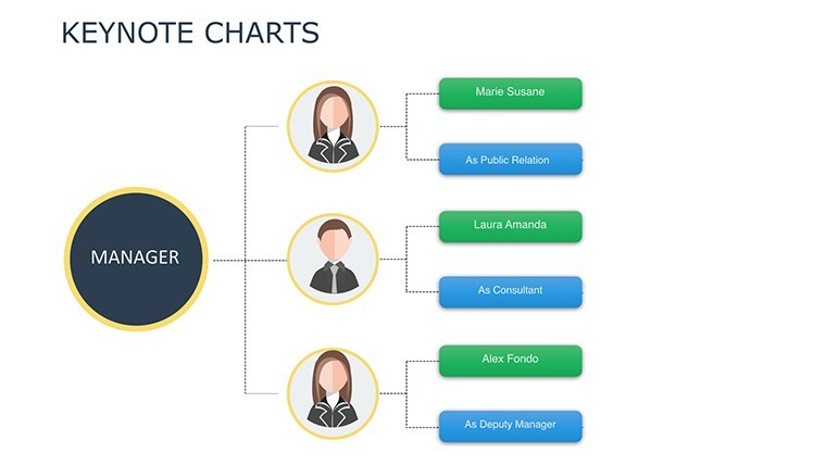
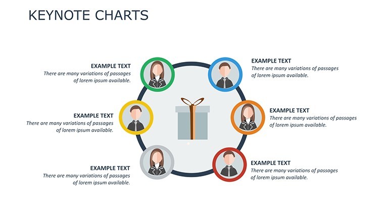
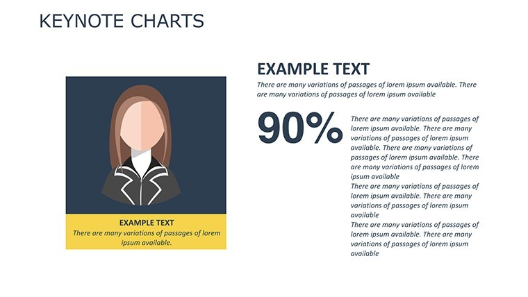
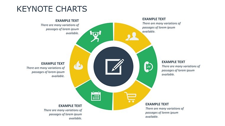
Let`s walk through the heart of this template, slide by slide, so you can see exactly how it solves those everyday HR headaches. Starting strong with the Performance Dashboards - these aren`t your basic bar graphs. Imagine a central gauge that spins to show overall team productivity, surrounded by interconnected rings that break down 360-feedback scores. One ring might track goal completion, another peer collaboration. It`s perfect for annual reviews, where you need to celebrate progress while gently flagging development needs. I use this to help managers visualize how one person`s growth lifts the whole group, turning feedback into a roadmap for support.
Next up, the Training Progress Trees bring a fresh twist to skill-building updates. Envision a rooted tree diagram where the trunk represents core competencies, and branches fan out to specific modules like leadership workshops or software certifications. Each branch thickens with completion rates - thicker for on-track teams, dotted lines for those lagging. This slide shines in L&D pitches, helping educators or trainers map out curriculum paths and predict timelines. Last month, I customized one for a client`s onboarding program, and it instantly clarified why certain hires were ramping up faster, leading to targeted tweaks that saved weeks of confusion.
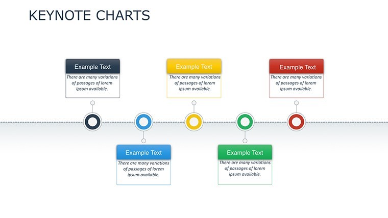
For deeper analysis, the Trend Infographics layer complexity without clutter. Stacked areas rise and fall to depict turnover over quarters, with overlaid icons noting events like policy changes or market shifts. It`s ideal for strategic reports, where you connect dots between retention dips and external factors. Project managers love this for forecasting headcount needs, as it makes abstract trends feel immediate and actionable.
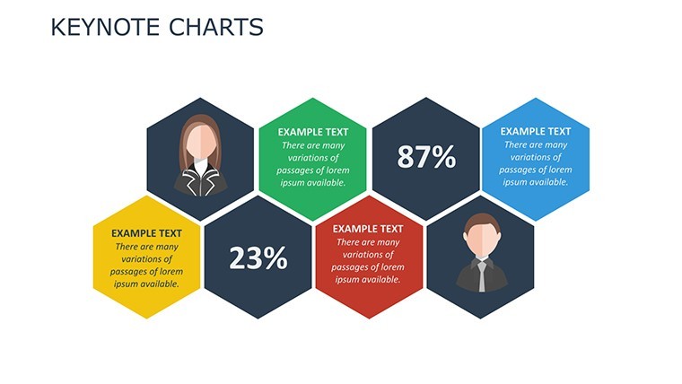
Don`t overlook the Heat Map on slide three - it`s a standout for engagement audits. A grid layout uses subtle gradients to spotlight departmental hotspots, say, higher fatigue scores in sales versus steady vibes in operations. This visual quickly pinpoints intervention spots, like wellness check-ins for remote workers, and I`ve found it invaluable for post-review discussions that foster inclusivity.
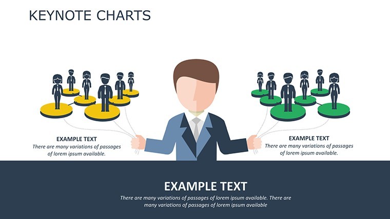
Halfway through, slide twelve`s Funnel Analytics dissects recruitment like a pro. Arrows widen at the top for applicant pools, narrowing through interviews to offers, with drop-off labels for pain points like ghosted candidates. Customize the metrics - maybe track diversity at each stage - and it becomes a tool for optimizing hires. Founders building startups often lean on this to justify scaling budgets, proving how streamlined funnels cut time-to-fill.
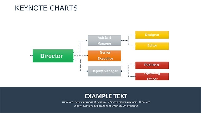
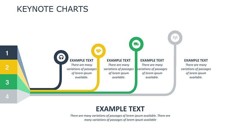
The remaining slides round out with versatile additions: timeline flows for diversity initiatives, pie breakdowns for benefits utilization, and even a wrap-up canvas for Q&A prompts. Each one invites interaction, with space for notes or hyperlinks to detailed reports. Together, they create a flow that builds from data to dialogue, ensuring your audience leaves energized rather than exhausted.
Customization That Fits Your Workflow Seamlessly
What sets this apart in my weekly routine is the no-fuss editing. Keynote`s native tools let you swap colors to match your brand - say, earthy tones for a nonprofit - or add subtle animations that reveal data points one by one, building suspense without distraction. Paste in CSV exports from your system, and the charts update automatically. For collaborative teams, iCloud sync means your VP can tweak on the fly during prep. And if you`re localizing for global groups, Unicode handles accents and symbols effortlessly.
I`ve tailored this for educators pitching professional development courses, where the tree slide becomes a curriculum branch, or for marketers analyzing internal comms effectiveness via heat maps. It`s flexible enough for solo consultants too - just export to PDF for client shares. Open it in Keynote and make it yours in minutes, ready to present that same day.
Real-World Wins from Everyday Use
Over coffee chats with fellow presenters, the feedback echoes what I`ve experienced: this template cuts prep time in half while doubling engagement. One project manager shared how the funnel slide exposed a hiring bottleneck, leading to a process overhaul that filled roles 30% faster. For me, it`s been a go-to for retention workshops, where trend infographics help frame tough talks around growth opportunities, not just losses. It humanizes the numbers, reminding everyone that behind every metric is a team member contributing to the bigger picture.
Whether you`re an HR director streamlining wellness reports or a founder rallying for talent investments, this kit equips you to present with poise and precision. It`s not about flashy effects - it`s about delivering truths that move people to act.
Frequently Asked Questions
Can I use this HR Metrics Dashboard Keynote Template with other presentation software?
Yes, export it easily to PowerPoint or Google Slides while keeping all layouts and animations intact for cross-platform flexibility.
How many slides come in this employee metrics template?
It includes 20 fully editable slides, covering everything from performance gauges to recruitment funnels.
Is the data in the template customizable for my company`s HR system?
Absolutely - link directly to CSV imports from tools like BambooHR or Workday, and update metrics in seconds.
What colors and styles are used in these HR dashboard slides?
Soft, empathetic palettes with gradients in blues and greens to keep visuals approachable and focused on positive impacts.
Does this template support animations for live HR presentations?
Yes, built-in subtle transitions and data-reveal animations enhance flow without overwhelming your audience.
Who is this Keynote template best suited for in HR roles?
HR managers, talent consultants, L&D specialists, and project leads handling performance, training, or recruitment visuals.