GE McKinsey Matrix Keynote Template - Fully Editable | ImagineLayout


Type: Keynote Charts template
Category: Matrix, Business Models
Sources Available: .key
Product ID: KC00280
Template incl.: 18 editable slides
Package Contents
The download packs one .key file containing 18 fully editable slides.
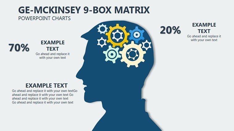
GE McKinsey matrix stands apart from HR Metrics Dashboard Keynote Template, Development Concepts Keynote Charts Template and Momentum Concept Keynote Charts in the related section by using bubble plotting with strategy zones instead of simple dashboards or concept flows.
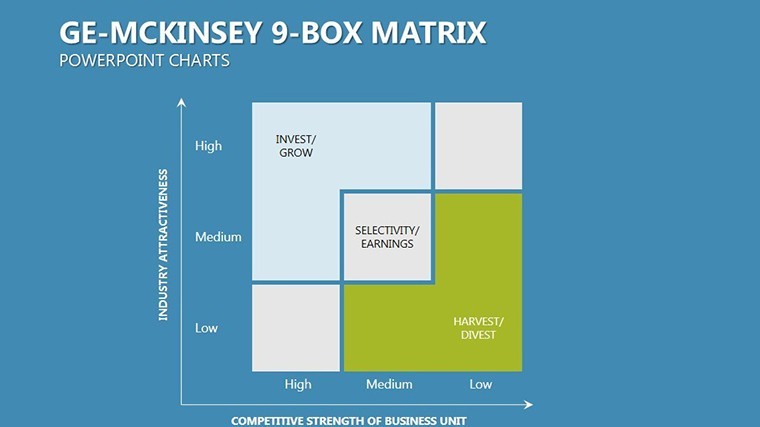
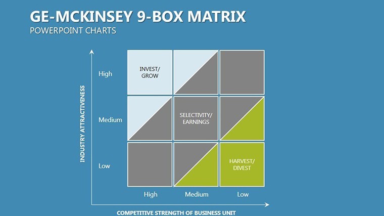
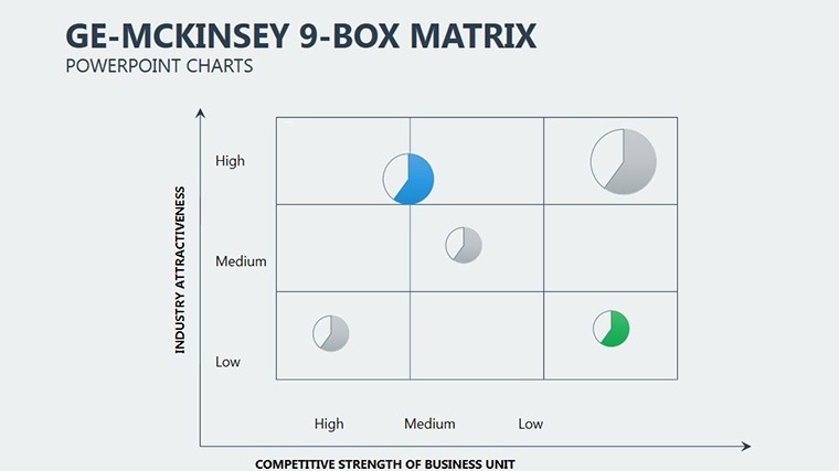
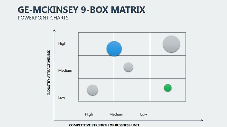
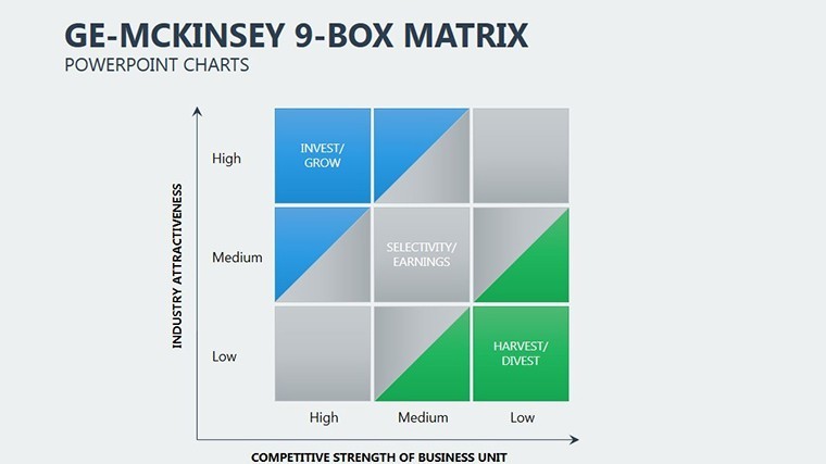
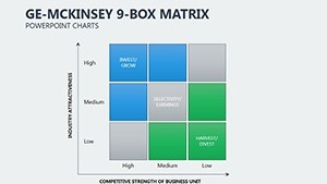
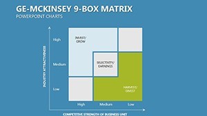
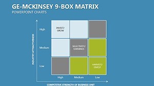
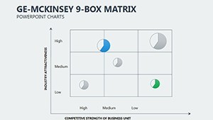
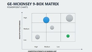
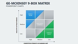
The specific visual characteristic is customizable axes with red-risk and green-opportunity zone segmentation.
This template works best for portfolio evaluation because the matrix allows instant bubble repositioning over the static alternatives in those neighbors.
The paid version includes the full set of 18 editable diagrams in .key format that free previews lack.
Technical Specs
| Feature | Details |
|---|---|
| Slides included | 18 matrix slides with bubble plotting |
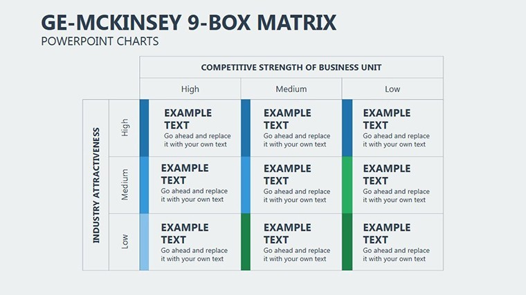
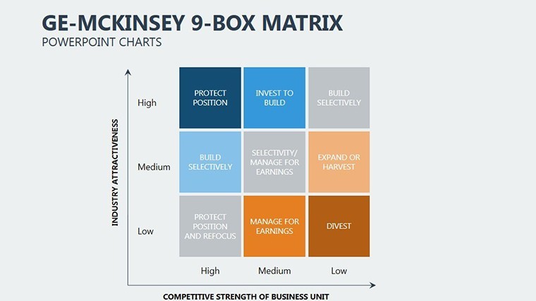
| Diagram categories | 9-box strategy zones, axes customization |
| Editable elements | bubbles, axis labels, zone colors, data values |
| Aspect ratio | 16:9 optimized for Keynote presentations |
| PowerPoint compatibility | Native Keynote only with export to PDF |
| Color themes | Adjustable through slide master palette |
| Animation support | Basic transitions for data reveal |
| Icon layers | Replaceable without breaking layout composition |
| File formats | Single .key file |
| Free vs Paid differences | Paid delivers complete 18 slides; free not specified on page |
How to Make It Yours in Under 20 Minutes
Editing difficulty is Moderate.
- Open the .key file in Keynote 12+ (1 minute).
- Replace placeholder data in matrix bubbles (8 minutes).
- Adjust color theme via master (3 minutes).
- Add labels or export to PDF (2 minutes).
Who Reaches for This Template
Corporate Executive in Strategy
Corporate executives in strategy use this during board briefings to evaluate business units.
They cut deck preparation from 3 hours to 45 minutes by repositioning bubbles.
Management Consultant
Management consultants reuse the same file across three client reports by swapping color schemes.
They maintain information spacing consistency in workshops.
Download the GE McKinsey Matrix Keynote Template Now
Building From Scratch vs. Starting Here
Building a GE McKinsey matrix manually requires advanced alignment skills and zone balancing that often fails on projection screens.
This template avoids that by providing pre-set axes.
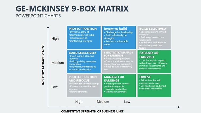
Many presentations place bubbles without clear zone segmentation causing confusion.
This one uses color contrast zones for immediate understanding during live meetings without extra effort.
Combine this with the Animated Tables Keynote Template for full reporting.
See more in the Keynote Charts template category for matrix options.
Pair it with Pictorial Meaning Illustrations Keynote Template when adding depth.
FAQ
Which Keynote versions does this template support?
It opens in Keynote 12 and newer on Mac and iPadOS. Older versions may need export conversion. Test compatibility by opening the .key file directly. The layout remains intact across supported releases.
How do I change the color scheme?
Open slide master then select color palette and apply to all slides. Update individual elements if needed afterward. Takes under 3 minutes total. Works with any brand colors through diagram structure adjustments.
What license permissions apply for client work?
The license permits use in paid client presentations and reports. Resale or sublicensing of the template itself is not allowed. You can modify and distribute the final decks. Check the terms for full details on commercial use.
What does the paid version include compared to free?
The paid version delivers the complete .key file with all editable charts. Free options on the site typically show previews only. Full customization requires the paid download. No partial files are available otherwise.
Which file formats are included and what software is required?
Only the native .key format is provided. Apple Keynote is required to edit. Export to PDF or images for sharing. No PowerPoint version included.