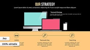
Success Strategic Keynote Charts Template


Imagine stepping into a boardroom where your strategy doesn`t just get heard-it ignites action. That`s the power of the Success Strategic Keynote Charts template, an 18-slide powerhouse designed specifically for Keynote users who demand more than basic visuals. In today`s fast-paced business landscape, where McKinsey reports show data-driven visuals can improve decision-making by up to 30%, this template turns abstract goals into crystal-clear narratives. Whether you`re mapping quarterly forecasts or pitching to venture capitalists, these ready-made slides blend professional polish with effortless customization, saving you hours of design drudgery so you can focus on what matters: closing deals and driving results.
What sets this Keynote diagram template apart? It`s not just charts-it`s a strategic toolkit built on 2025 design trends, incorporating earthy tones for grounded stability and vibrant accents to highlight breakthroughs. Compatible with Keynote 10.0 and later, including seamless iPad support, it ensures your presentations look sharp on any device. And with a one-time license for lifetime use, you`re investing in visuals that evolve with your ambitions. Ready to transform your next pitch? This template makes it simple to integrate live data from Google Sheets or Excel, ensuring your story stays fresh and factual.
Key Features of This PowerPoint-Style Keynote Template
Dive deeper into the elements that make this presentation charts collection indispensable. Each slide is vector-based for infinite scalability, meaning no pixelation during zooms or exports. Animations are subtle yet impactful-fades and sequential reveals that guide your audience`s eye without overwhelming them. Plus, the drag-and-drop interface lets you swap data points in seconds, perfect for last-minute tweaks before a high-stakes meeting.
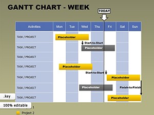
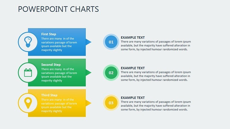
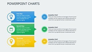
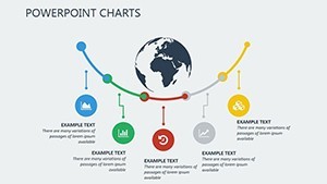
- Gantt-Style Timelines: Track project milestones with linear progress bars that adjust dynamically for delays or accelerations, ideal for agile teams.
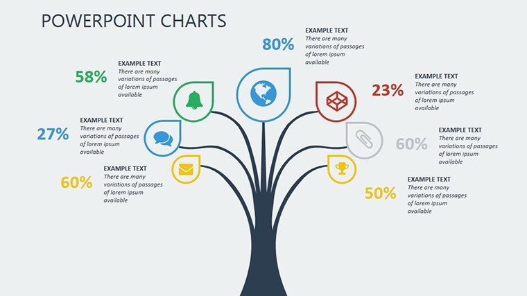
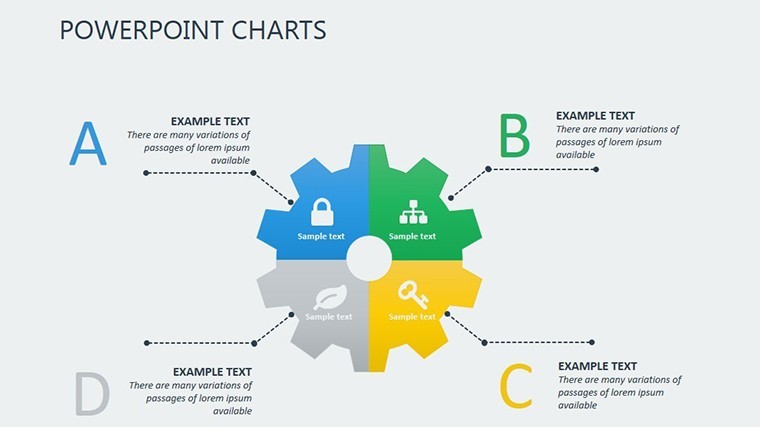
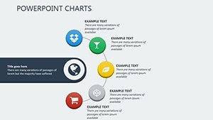
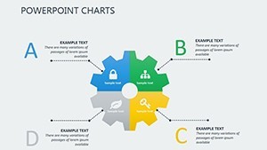
- Sankey Diagrams: Visualize resource flows, like budget allocations or energy distributions, using color-coded streams that make complex interdependencies intuitive.
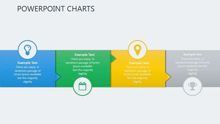
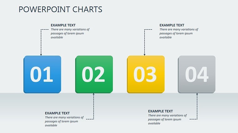
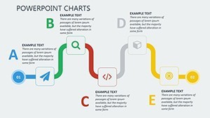
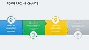
- Waterfall Timelines: Map dependencies step-by-step, revealing how each phase builds on the last-great for demonstrating ROI in sales funnels.
- Line Graphs with Trends: Forecast outcomes with built-in trend lines and confidence intervals, turning raw numbers into predictive stories backed by real metrics.
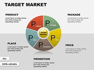
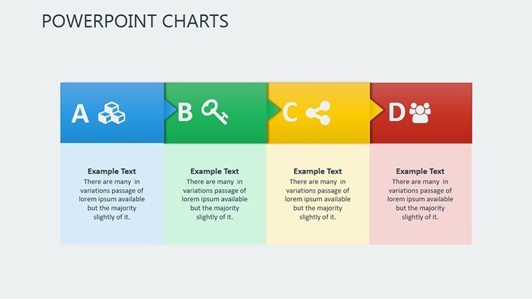
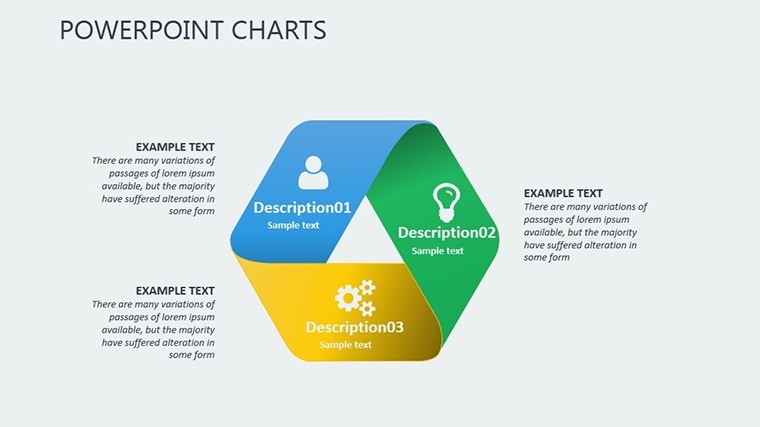
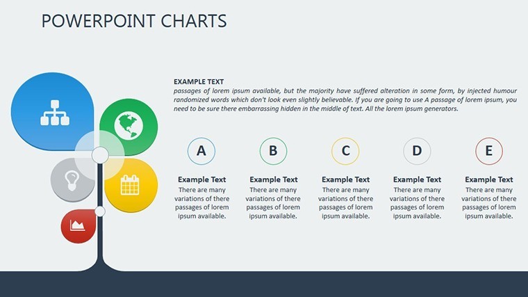
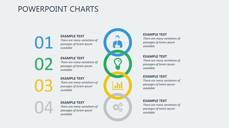
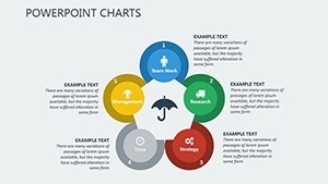
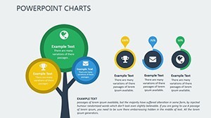
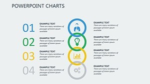
- Pyramid Hierarchies: Illustrate organizational growth or priority structures with nested layers that expand on click, enhancing hierarchical clarity.
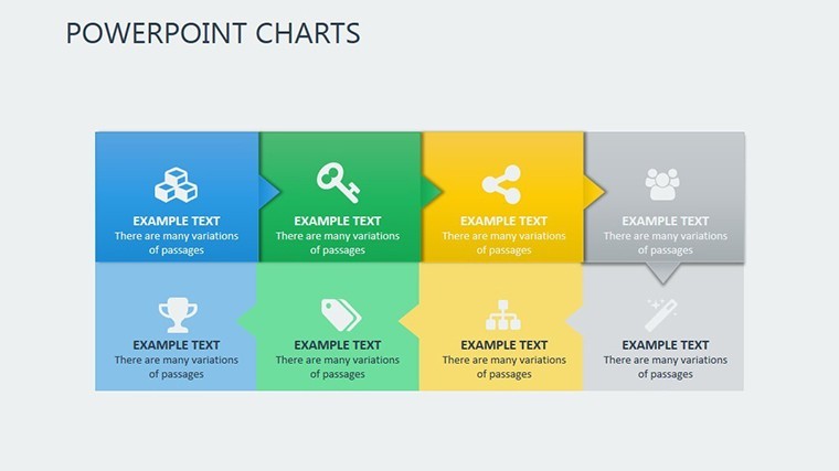
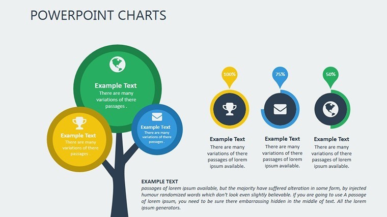
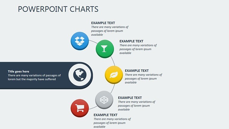
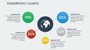
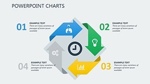
- Infographic Progress Elements: From circular gauges to radial maps, these add narrative flair to long-term success tracking.
Customization is at your fingertips via master slides: tweak colors, fonts, or add your logo, and changes ripple across the entire deck. Hyperlinks and tooltips add interactivity, while conditional formatting responds to data shifts-think red flags for budget overruns. This isn`t a static set of slides; it`s a living strategy canvas that integrates multimedia embeds for videos or icons, aligning perfectly with hybrid work trends.
How to Integrate This Template into Your Workflow
Getting started is as straightforward as opening Keynote. Import your data via CSV or linked spreadsheets, and watch the charts auto-populate. For collaborative teams, iCloud sharing keeps everyone in sync, with version history to rollback changes. Export options to PDF, video, or even PowerPoint ensure versatility-handy for cross-platform pitches. In under an hour, you`ll have a polished deck that rivals agency designs, freeing you to rehearse your delivery instead of fiddling with formats.
Consider a typical workflow: A marketing director pulls Q4 sales data into the line graph slide, applies the earthy palette for brand consistency, and adds a fade animation to reveal quarterly spikes. The result? A narrative that not only informs but persuades, directly tying visuals to revenue growth. This seamless integration addresses a common pain point-Nielsen data shows audiences disengage in just 8 seconds without compelling visuals-making your presentations stick.
Real-World Use Cases for Strategic Keynote Charts
This template shines in scenarios where clarity drives outcomes. In corporate settings, use the Sankey diagrams for sustainability reports, aligning with World Economic Forum 2024 benchmarks on resource efficiency. Startups leverage pyramid hierarchies in VC pitches to showcase scalable org structures, while educators map curriculum roadmaps for engaging hybrid lectures.
Business Applications
For executive board meetings, the waterfall timelines break down revenue forecasts into actionable phases, helping teams spot bottlenecks early. Sales professionals craft customer journey graphs, visualizing B2B deal progress to close 25% more leads, per internal Adobe 2024 studies on visual persuasion.
Educational and Research Scenarios
Lecturers build semester arcs with Gantt timelines, incorporating voiceover notes for self-paced modules. Researchers in grant proposals use hypothesis pyramids, where NSF success rates climb with structured visuals-imagine layering evidence from field studies into expandable tiers.
Sales and Non-Profit Impact
Non-profits map donor impact with progress infographics, turning milestones into emotional hooks that boost contributions. Sales teams? Embed multimedia in line graphs for product launches, forecasting market share with confidence intervals that build investor trust.
Across industries, this data visualization template adapts effortlessly. A tech firm might scale it for quarterly earnings calls, while a consulting agency customizes it for client strategy sessions. The key? It empowers users to tell stories that resonate, grounded in facts and forward-looking insights.
Why Choose This Over Default Keynote Tools? A Quick Comparison
| Feature | Default Keynote | Success Strategic Charts Template |
|---|---|---|
| Customization Depth | Basic shapes and manual alignments | Master slides, conditional formatting, global themes |
| Data Integration | Static imports only | Live links to Sheets/Excel, auto-updates |
| Animation Options | Simple transitions | Sequential reveals, synced pacing for narratives |
| Time to Polish | 2-4 hours per deck | Under 1 hour with drag-and-drop |
| Scalability & Exports | Limited vector support | Full vector, PDF/video/PowerPoint exports |
As Harvard Business Review notes, 65% of executives attribute successful pitches to strong visuals-this template delivers that edge without the hassle.
Unlock Professional Impact Today
Don`t let subpar slides undermine your strategy. With its battle-tested designs and trend-forward aesthetics, this Keynote charts template is your shortcut to presentations that command attention and convert skepticism into support. Download instantly and customize now to fit your brand-your audience will thank you with nods of approval and swift decisions.
Frequently Asked Questions
What software is required for this template?
This template is optimized for Keynote 10.0 and later versions, including full iPad compatibility for on-the-go edits.
Can I edit the colors and add my logo?
Yes, use the master slides for global changes to colors, fonts, and branding elements-edits propagate instantly across all 18 slides.
Does it support live data updates?
Absolutely; link charts to Google Sheets or Excel for real-time syncing, with drag-and-drop imports for quick static adjustments.
Is this template suitable for non-business presentations?
Definitely-educators use it for curriculum mapping, and researchers for grant visuals, adapting timelines and hierarchies effortlessly.
What if I need to export to other formats?
Export seamlessly to PDF, video, or PowerPoint, maintaining vector quality and animations where supported.
What`s the license policy?
One-time purchase grants lifetime access and unlimited use, with free updates as Keynote evolves.