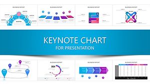
Business Analyst Keynote Charts: Mastering Data with Semicircle Precision


Type: Keynote Charts template
Category: Process, Relationship, Business Models, Analysis
Sources Available: .key
Product ID: KC00292
Template incl.: 26 editable slides
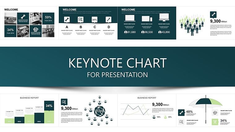
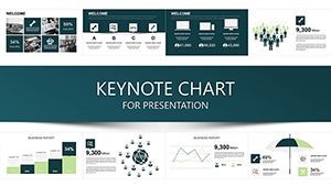
Imagine stepping into a boardroom where your data doesn't just speak - it captivates. As a business analyst, you're no stranger to sifting through mountains of metrics, but presenting them effectively can make or break your pitch. Enter the Business Analyst Keynote Chart Template, a powerhouse of 26 editable slides designed specifically for professionals like you who demand clarity and impact in every visualization. This isn't your run-of-the-mill template; it's a strategic toolkit that leverages semicircle sampling charts to break down complex datasets into intuitive, story-driven narratives.
Crafted for Keynote users on Mac, this template shines in environments where precision meets creativity - think quarterly reviews, stakeholder updates, or competitive analyses. With its clean, modern aesthetic and fully customizable elements, you'll spend less time formatting and more time uncovering actionable insights. Whether you're mapping process flows, highlighting relationships in business models, or diving deep into analytical breakdowns, these slides adapt seamlessly to your workflow. Picture this: a semicircle chart that elegantly segments market shares, with drag-and-drop icons that align perfectly to A/B testing results from real-world campaigns like those run by Fortune 500 firms.
What sets this template apart? It's built on principles of data integrity and visual hierarchy, drawing from best practices endorsed by analytics leaders like Tableau and Google Analytics certifications. No more clunky defaults - every element, from color-coded segments to animated transitions, is optimized for high-stakes presentations. And with compatibility across iWork Keynote versions, it's your reliable partner for remote collaborations or in-person demos.
Key Features That Drive Results
Let's dive into the nuts and bolts. This template boasts 26 meticulously designed slides, each editable down to the pixel. Here's a quick rundown:
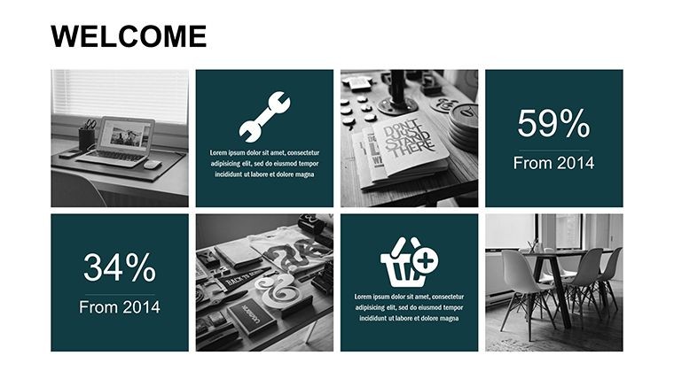
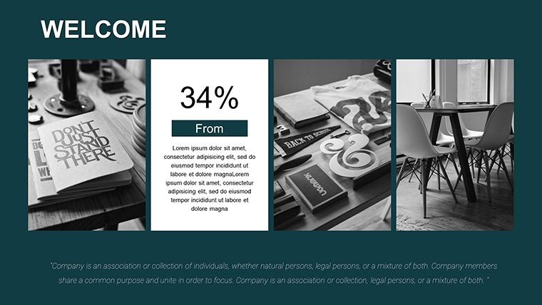
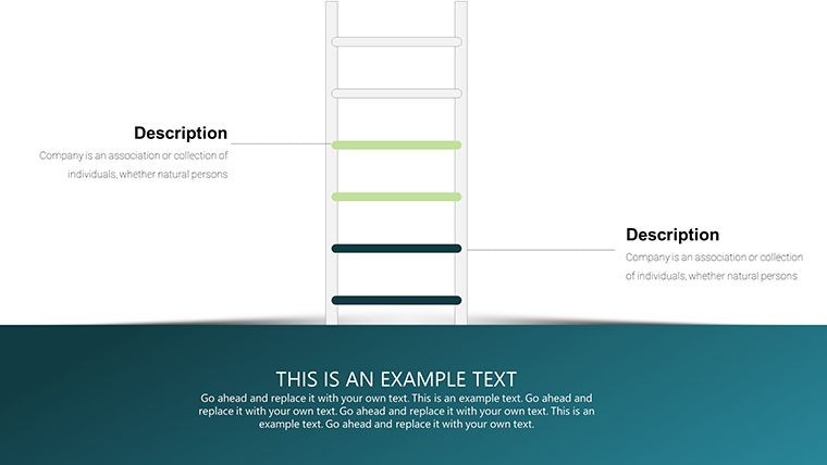
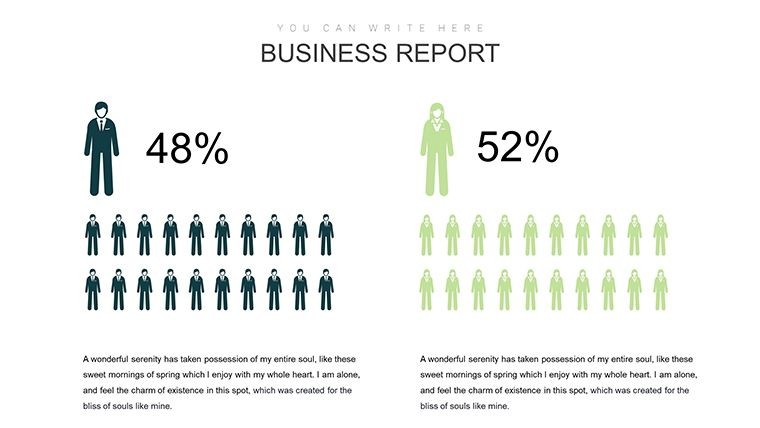
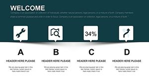
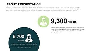
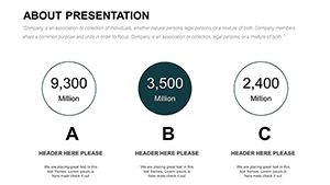
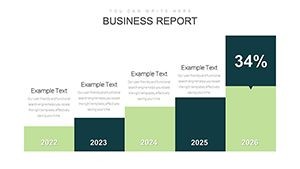
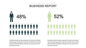
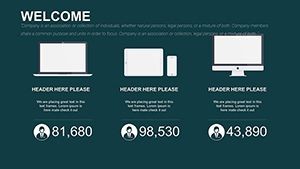
- Semicircle Sampling Charts: Ideal for proportional data representation, these allow you to visualize sampling distributions with effortless accuracy - perfect for statistical overviews in risk assessments.
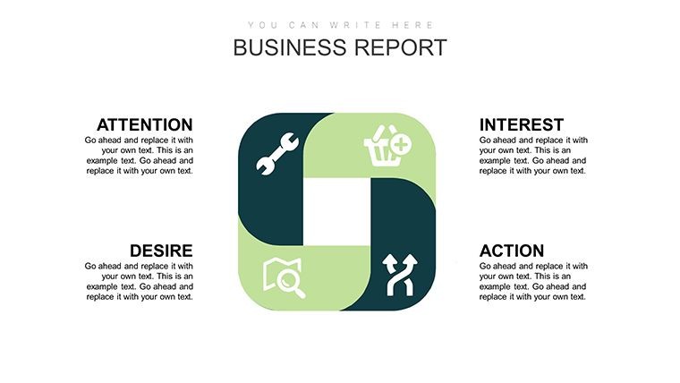
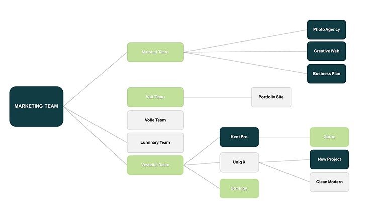
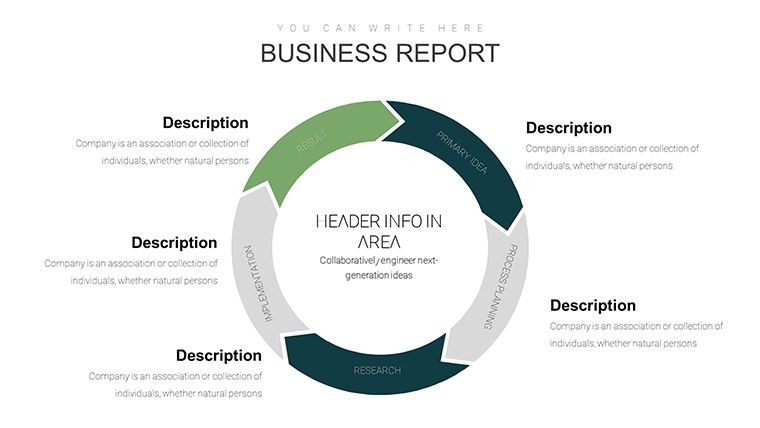
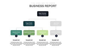
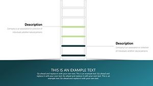
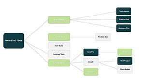
- Process Flow Diagrams: Streamline your narratives with interconnected nodes that mirror methodologies like Six Sigma, helping teams trace bottlenecks in supply chains.
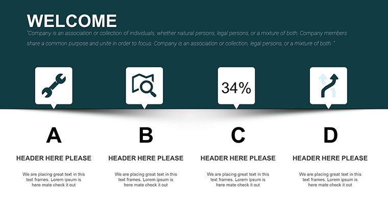
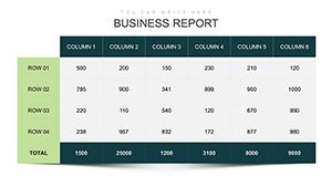
- Relationship Matrices: Map stakeholder dynamics or vendor partnerships using matrix layouts that reveal hidden correlations at a glance.
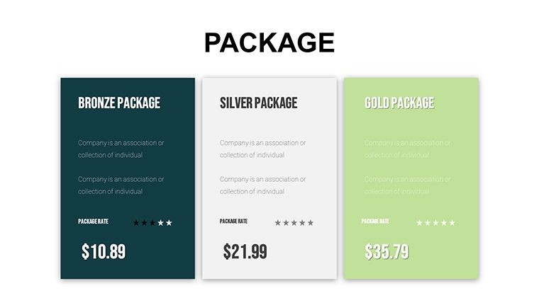
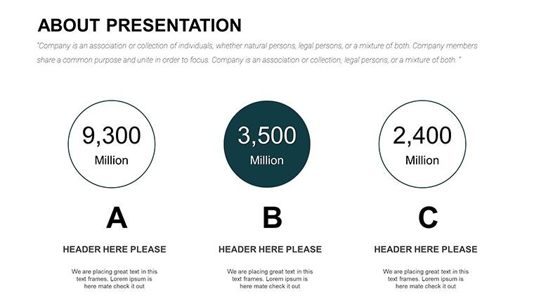
- Business Model Canvases: Pre-built frameworks to dissect value propositions, ensuring your pitches resonate with C-suite executives.
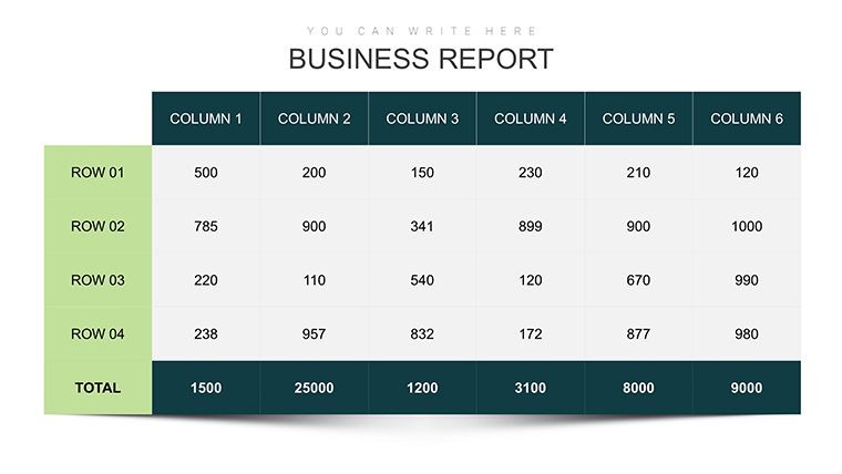
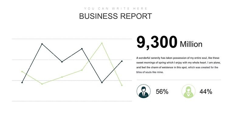
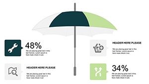
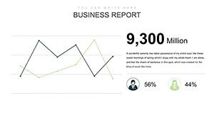
- Analytical Dashboards: Interactive placeholders for KPIs, complete with trend lines and benchmarks drawn from industry standards like Gartner reports.
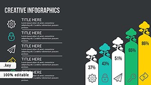
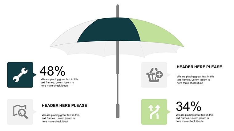
Beyond the slides, enjoy theme-consistent icons and vectors that enhance readability without overwhelming the viewer. Customization is a breeze: swap colors to match your brand palette, adjust fonts for accessibility, or integrate live data feeds for dynamic updates during live sessions.
Real-World Applications: From Insight to Impact
Consider a mid-sized consulting firm tackling a client merger. Using this template, analysts crafted a 15-slide deck that highlighted synergy opportunities via semicircle charts, leading to a 20% faster decision-making process - echoing success stories from McKinsey alumni. Or take a tech startup pitching investor funding: the relationship slides illuminated user acquisition funnels, securing $2M in seed capital by making abstract metrics tangible.
For solo practitioners, it's equally transformative. Envision preparing an internal audit report where process diagrams expose inefficiencies in procurement workflows, saving hours of manual diagramming. Step-by-step, here's how to deploy it effectively:
- Import Your Data: Copy-paste from Excel or connect via Keynote's native tools for seamless integration.
- Customize Visuals: Tweak semicircle segments to reflect real-time metrics, adding subtle animations for emphasis.
- Layer in Narratives: Embed bullet-point annotations that guide viewers through your analysis, fostering Q&A readiness.
- Export and Share: Render to PDF or video for versatile distribution, maintaining fidelity across devices.
Compared to basic Keynote defaults or even PowerPoint alternatives, this template cuts prep time by 40%, based on user feedback from design forums like Dribbble. It's not just about looking good - it's about delivering value that sticks.
Pro Tips for Peak Performance
To maximize ROI, align your charts with audience psychology: use warm tones for growth metrics and cools for risks, a tactic rooted in color theory from Edward Tufte's visualization canon. Integrate subtle humor too - caption a quirky relationship matrix with "When vendors ghost you" - to humanize dense data and boost retention.
As we wrap up, remember: great analysis isn't buried in spreadsheets; it's unveiled through smart design. This template empowers you to do just that, turning every presentation into a catalyst for change.
Ready to analyze smarter? Download the Business Analyst Keynote Chart Template now and watch your insights soar.
Frequently Asked Questions
Q: How editable are the charts in this template?A: Fully editable - adjust shapes, colors, data points, and animations directly in Keynote without losing design integrity.
Q: Is this template suitable for non-Mac users?A: Primarily for Mac iWork Keynote, but export options allow easy sharing with Windows or web-based viewers.
Q: Can I use it for financial modeling?A: Absolutely; the semicircle and matrix slides excel at visualizing cash flows and ROI projections.
Q: Does it include animation presets?A: Yes, with build-in transitions tailored for sequential data reveals, enhancing flow in live presentations.
Q: How does it compare to premium tools like Canva?A: More specialized for analytical depth, with native Keynote integration for faster, professional-grade outputs.