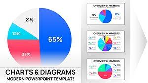
12 Pie Charts Keynote - Editable KEY | ImagineLayout


The .key file packs 12 diagrams ready for proportional data in sales reports.
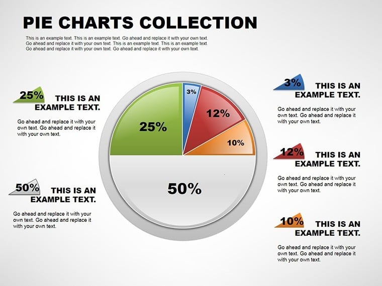
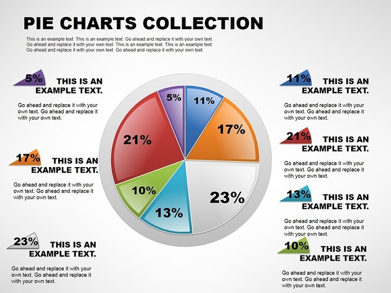
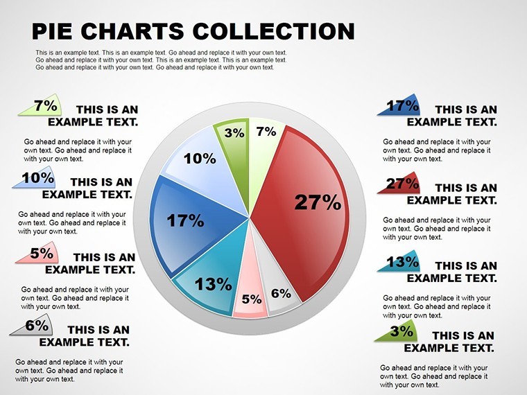
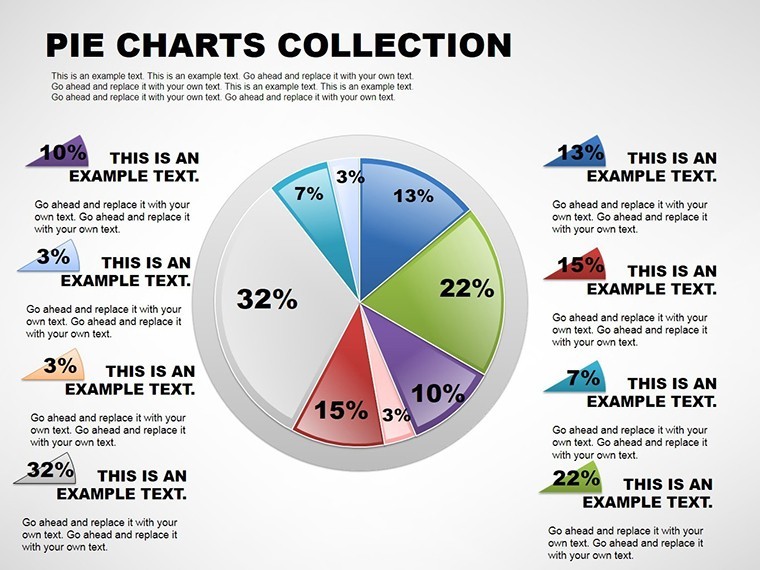
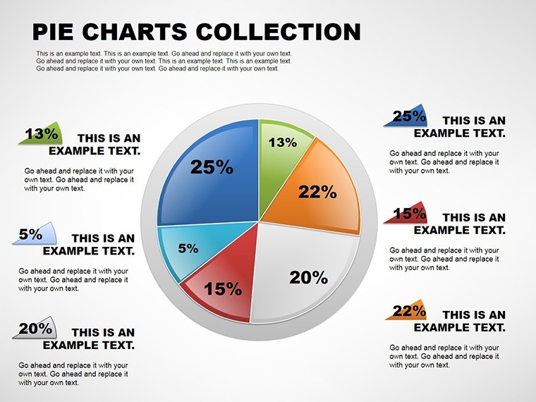
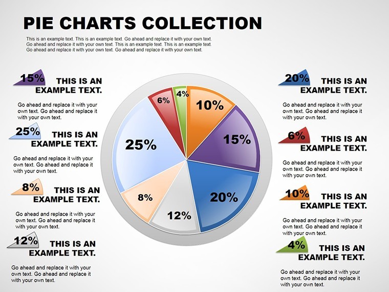
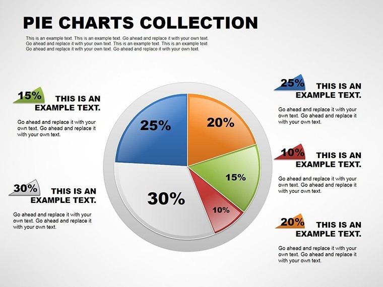
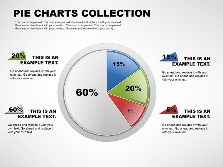
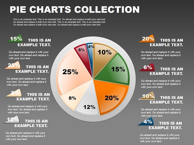
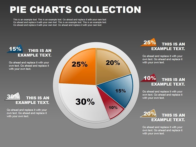
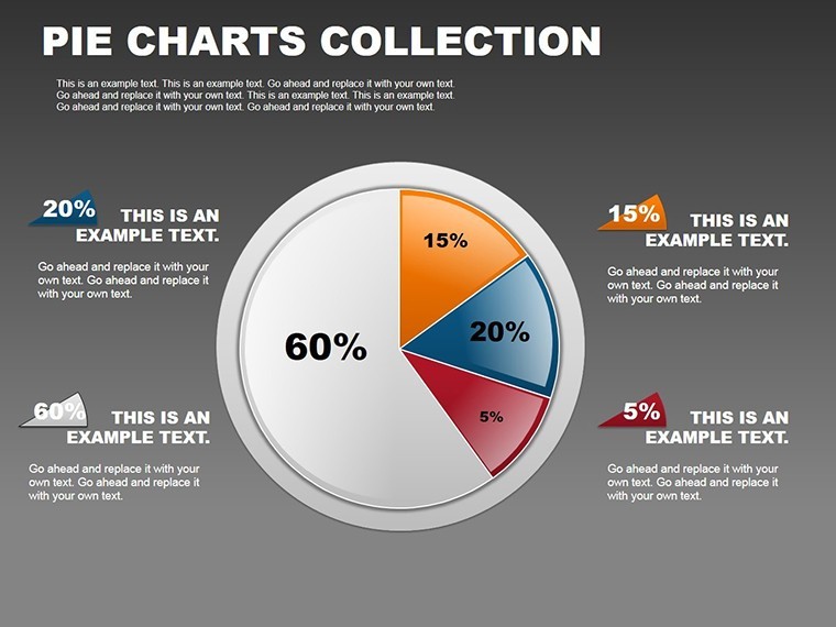
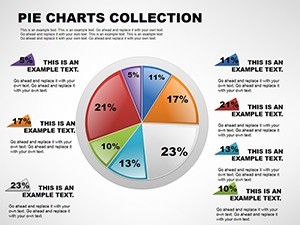
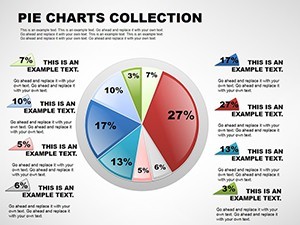
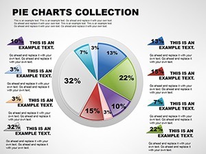
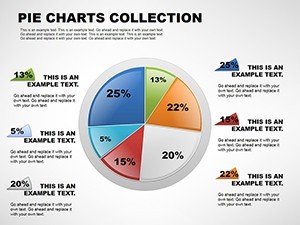
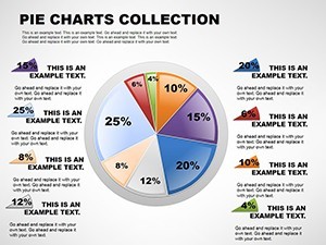
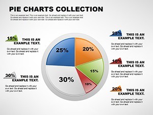
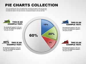
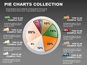
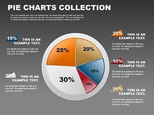
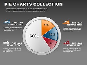
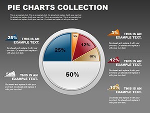
Exploded segments pull outward from the center with thin connector lines linking external percentage callouts while multi-pie layouts sit side by side on single slides.
You can duplicate slides and reuse the same structure.
In most cases you only replace text and adjust colors via the slide master that instantly updates gradient fills and icon layers across every variation in Keynote 12+.
When you need to map budget allocation during a performance review the radial structures handle the part-to-whole comparison out of the box instead of building diagrams manually.
This Keynote pie chart template supports analysis that reveals dominant segments so the viewer can decide on resource reallocation right after the presentation.
Financial analysts suit this file best when preparing client proposals.
The layouts keep structure readable on one slide preventing overcrowded designs.
Best used when your data consists of categorical proportions.
Not designed for sequential process flows where timelines would fit better.
Not ideal for data-heavy dashboards that require dozens of items on screen.
Typically teams reuse the exploded view across three client proposals by adjusting only slice colors.
Use this instead of manual pie construction in Keynote to save hours.
A financial analyst in banking mapped budget allocation during a performance review and reused the exploded view across multiple reports.
Specifications
| Feature | Details |
|---|---|
| Slides / diagrams | 12 pie doughnut exploded multi-pie percentage-labeled gradient and icon-integrated layouts |
| File format | .key |
| Software version | Keynote 12+ |
| Color schemes | Gradient fills update via slide master across all multi-pie comparisons |
| Editable elements | Pie slices separate and recolor independently icon layers swap without regrouping |
| Aspect ratio | Not specified on page |
| Free vs Paid | Paid includes all 12 slides with exploded and multi-pie options no free variant listed |
| Masters / Backgrounds | Slide master for instant theme changes |
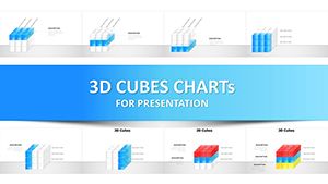
See also the 3D Cube Infographics Keynote Template or 3D Cube Infographics Keynote Template for expanded data storytelling.
Everything is already structured.
Download and start editing immediately
How do I change the color scheme?
Enter slide master mode and modify the theme colors once. Every standard pie doughnut and exploded slide updates instantly. Gradient fills and legends reflect the change without manual rework.
What does the license allow for client work?
Full permission for client presentations and reports. File resale remains forbidden. No sublicensing allowed while unlimited internal projects are fine for educators or marketing teams.
What does the free version include versus the paid version?
No free variant appears for this template. The paid download supplies all 12 slides with exploded and multi-pie options fully editable. Complete percentage callouts and gradient fills exist only in the purchased package.
What are the refund conditions?
Contact support within 30 days if the file fails to open correctly in Keynote 12+. Standard marketplace policy applies for compatibility issues. Full refund issued once the problem is verified.
Which Keynote versions does this template support?
Keynote 12 and above open the file natively on Apple platforms. Legacy versions convert yet keep pie slice proportions and editable shapes intact. Confirm your setup before academic lectures or client proposals.