 Click to zoom
Dynamic Cycle Charts Keynote Template - Fully Editable | Instant Download | ImagineLayout
| Format | .pptx |
| Slides | 57 unique layouts |
| Aspect ratio | 16:9 |
| Compatibility | PowerPoint |
| Animated | No |
| Language | English |
| License | Commercial |
| File size | — |
| Version | v1.0 |
| Last updated | February 2026 |
What's inside
Get the Dynamic Cycle Charts Keynote Template with 57 editable slides including interlocking cycles, puzzle-piece processes, arrows and pies. Built-in animations, five color schemes and vector graphics for seamless data storytelling in Apple Keynote. Instant .key download for project managers, marketers and consultants.
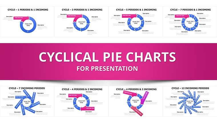
The Dynamic Cycle Charts Keynote Template includes 57 fully editable slides crafted for Apple Keynote users who need to convert project timelines, business cycles and seasonal trends into precise visuals. This collection features interlocking cycles, flowing arrows, puzzle-piece processes and pie charts segmented with puzzle edges, turning abstract data into decision-driving narratives.
What's Included
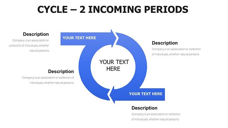
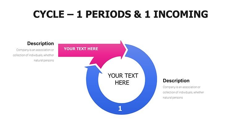
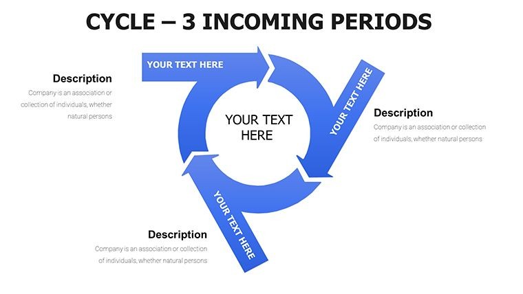
You receive 57 editable slides in native .key format with interlocking cycles, flowing arrows, puzzle-piece processes, circular cycles with radial spokes, layered arrows and pie charts with puzzle edges. Five versatile color schemes come built-in for one-click brand matching. All graphics are vector-based at high resolution with gradient fills, subtle shadows and baked-in animations including sequential reveals and path animations.
Slide Breakdown
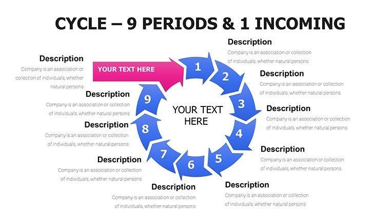
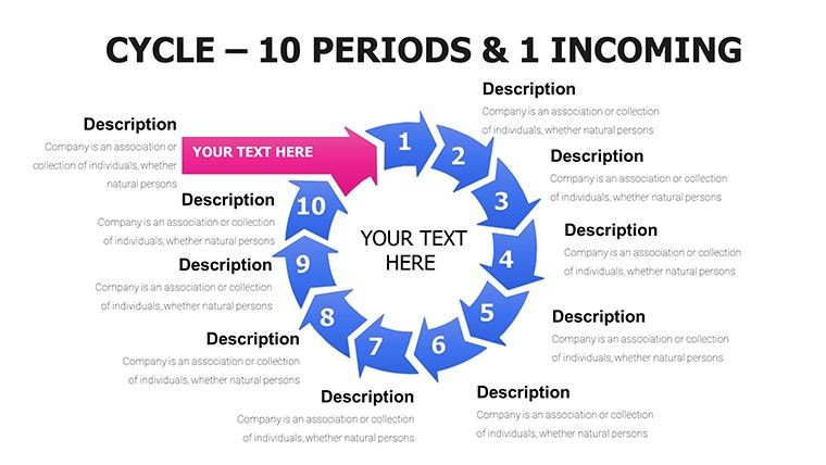
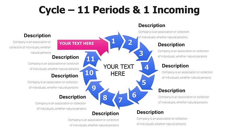
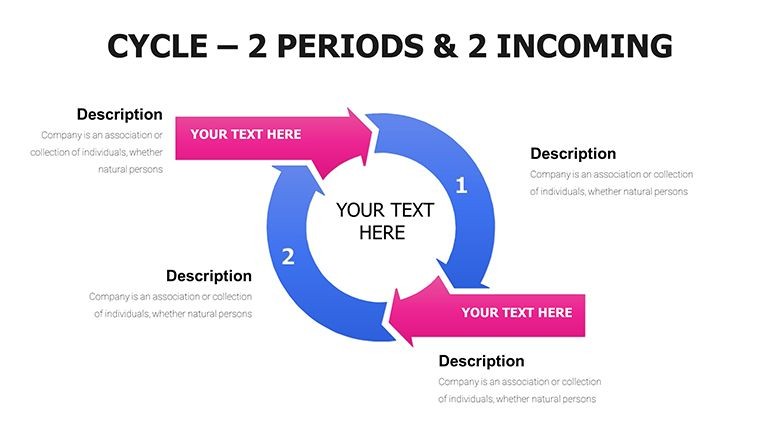
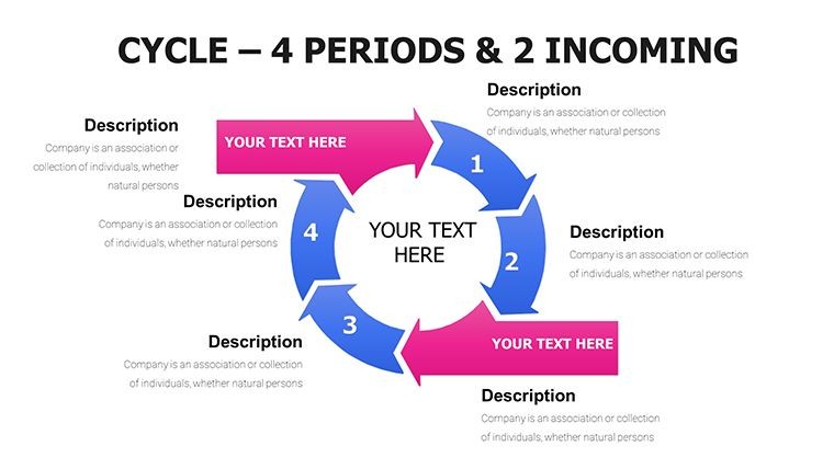
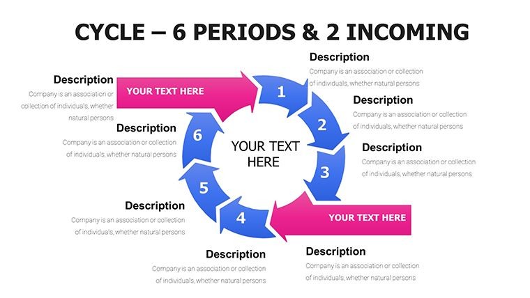
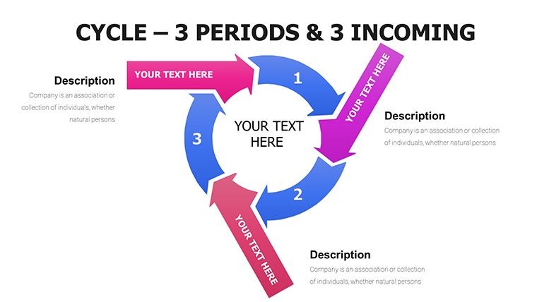
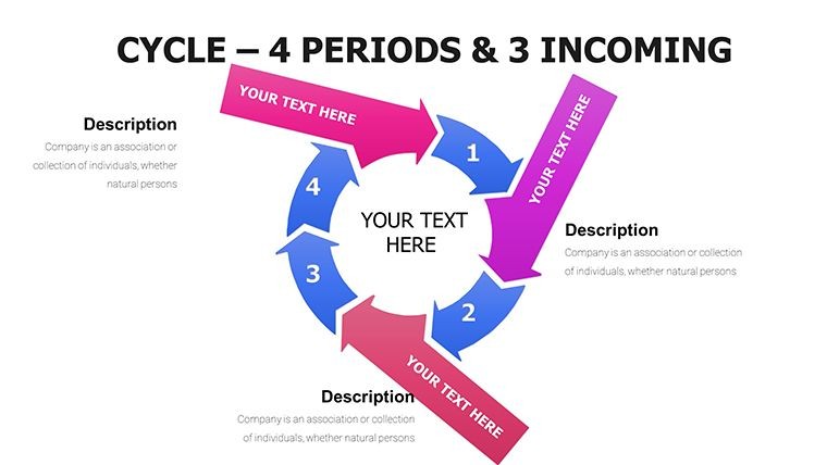
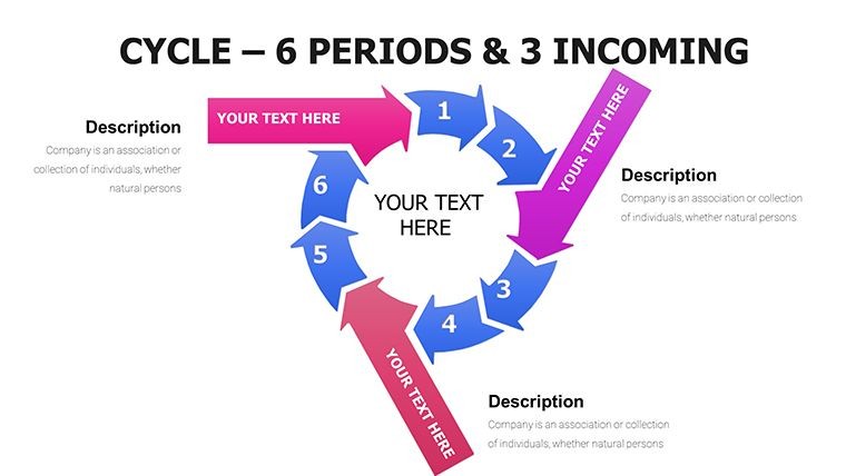
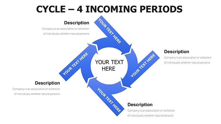
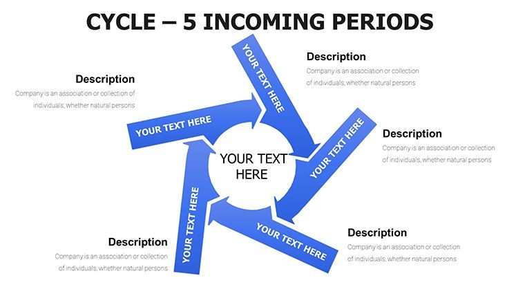
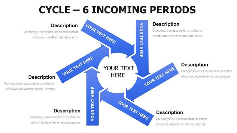
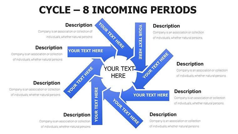
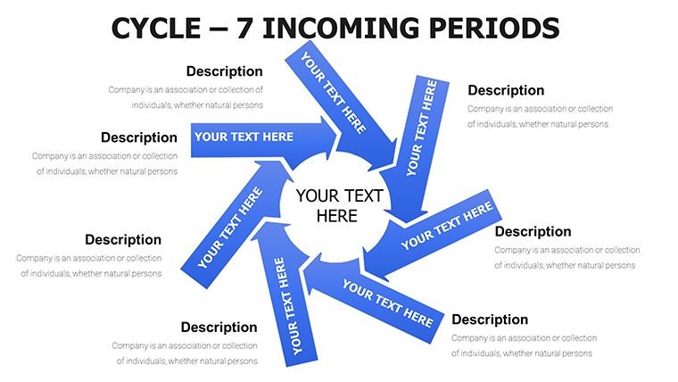
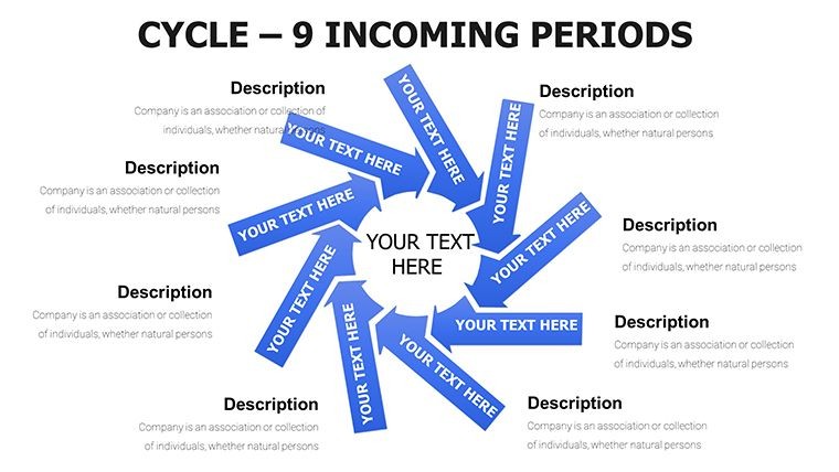
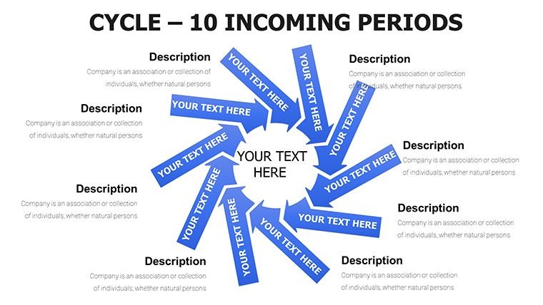
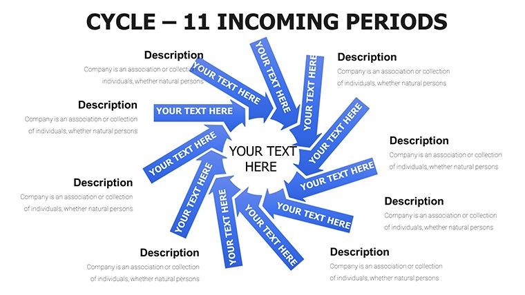
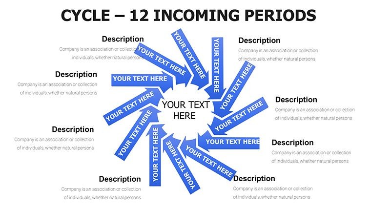
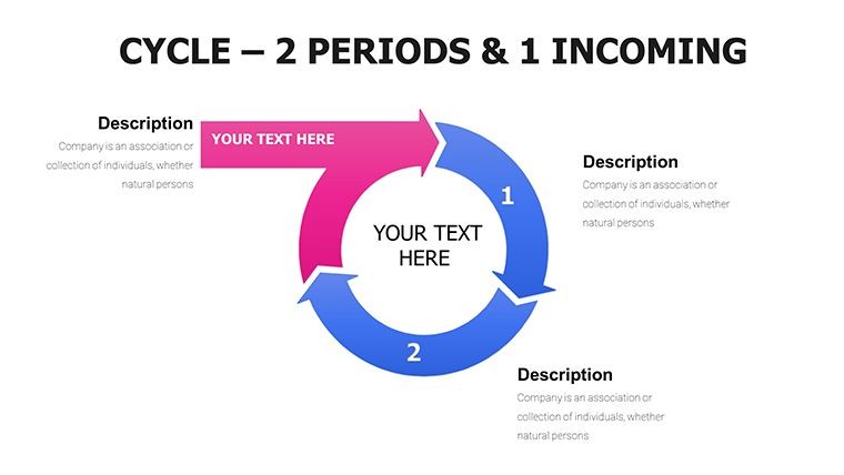
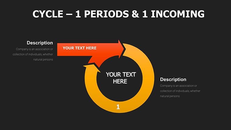
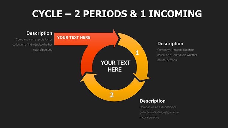
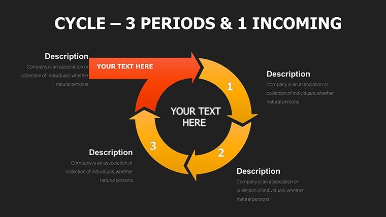
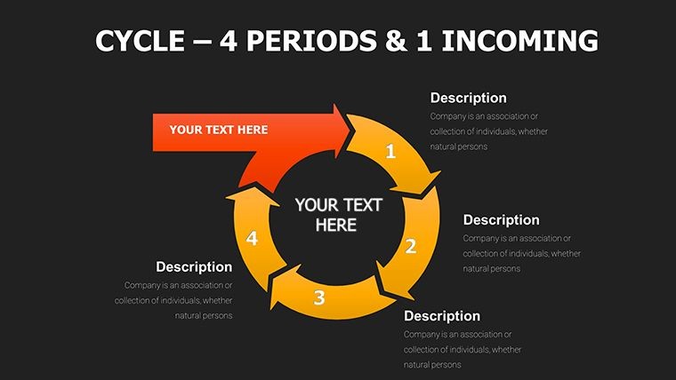
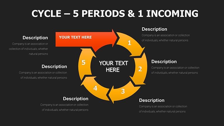
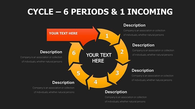
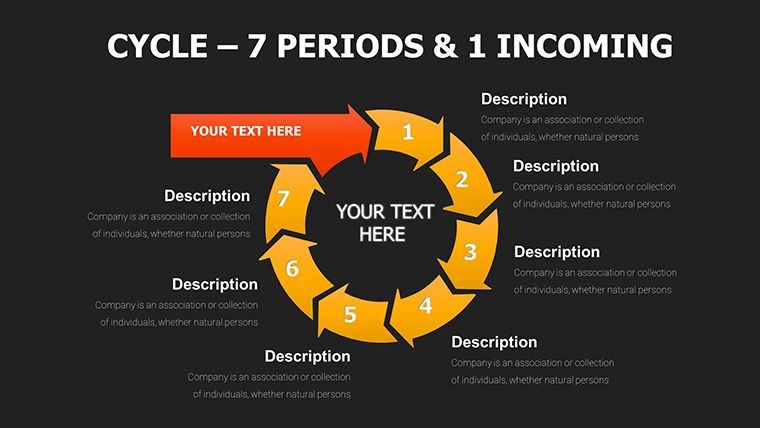
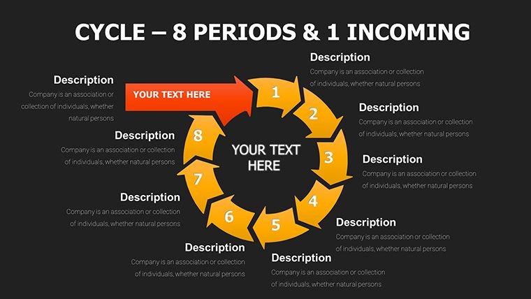
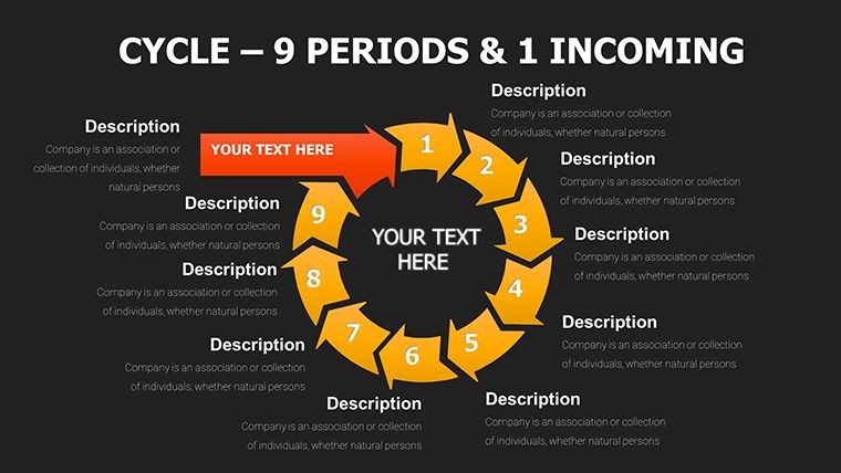
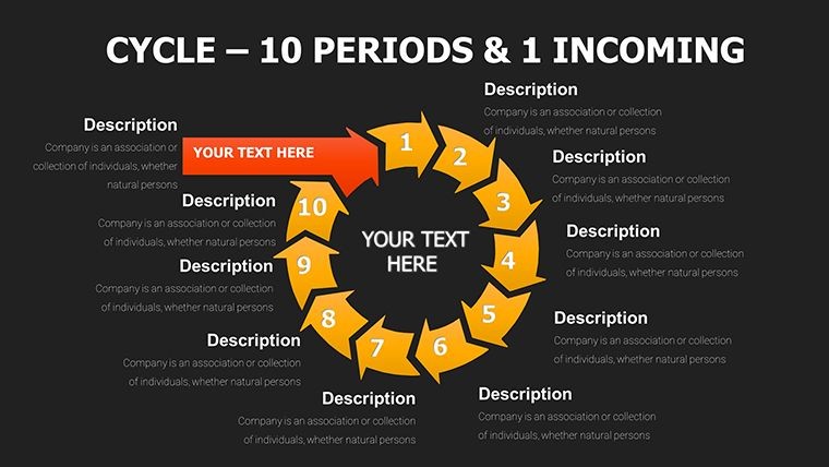
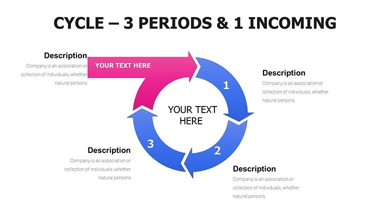
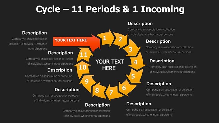
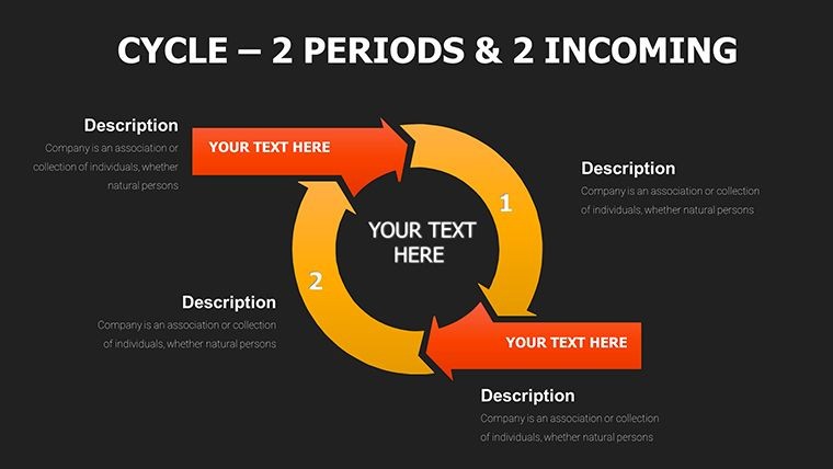
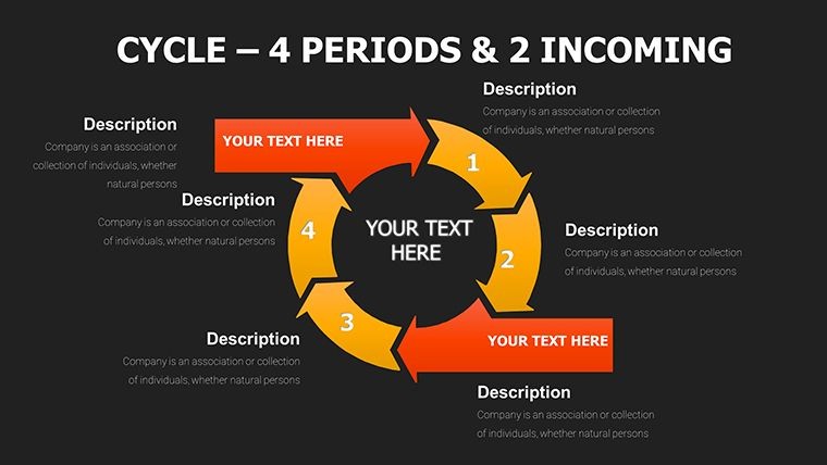
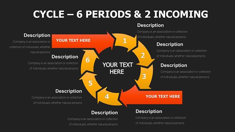
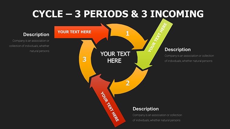
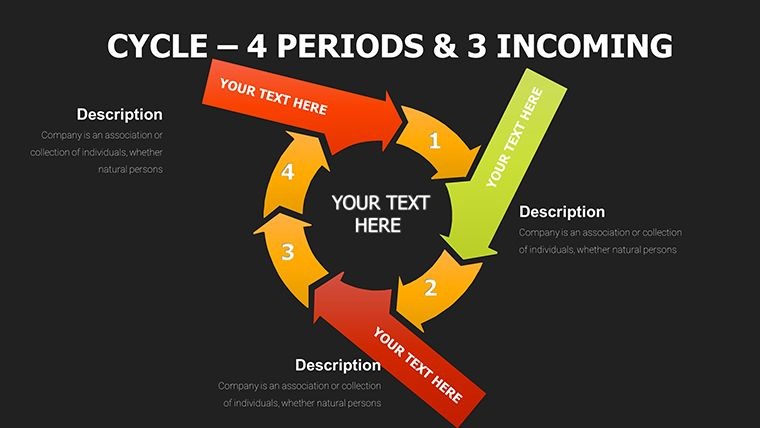
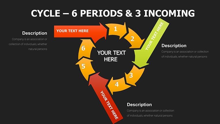
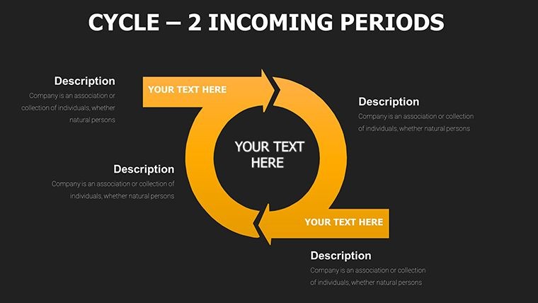
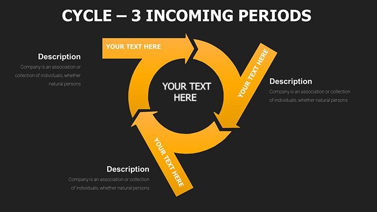
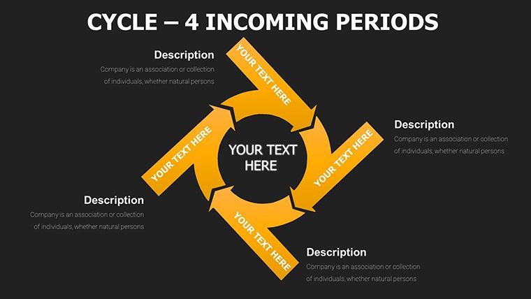
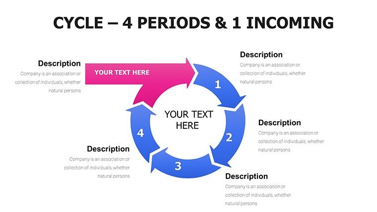
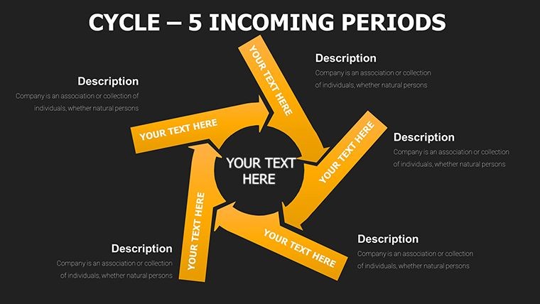
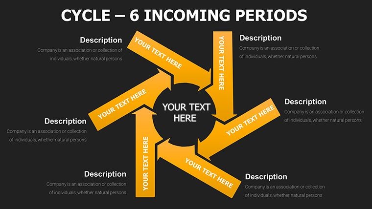
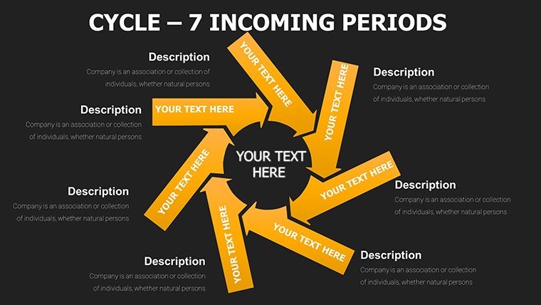
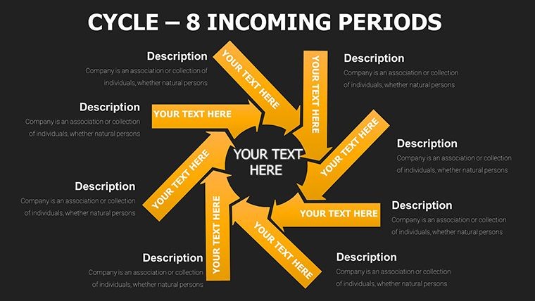
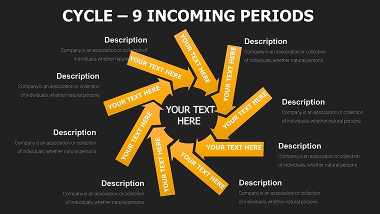
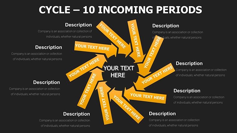
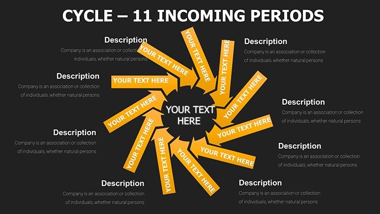
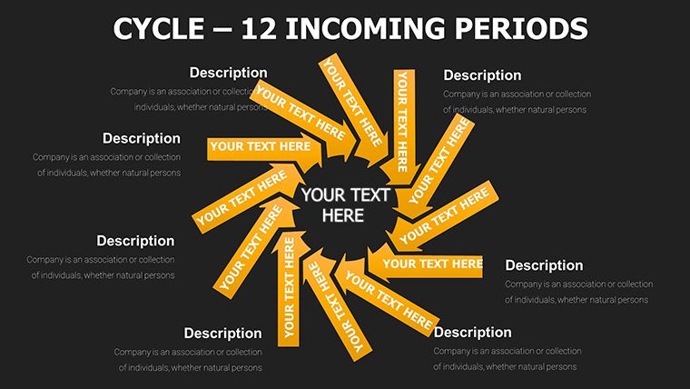
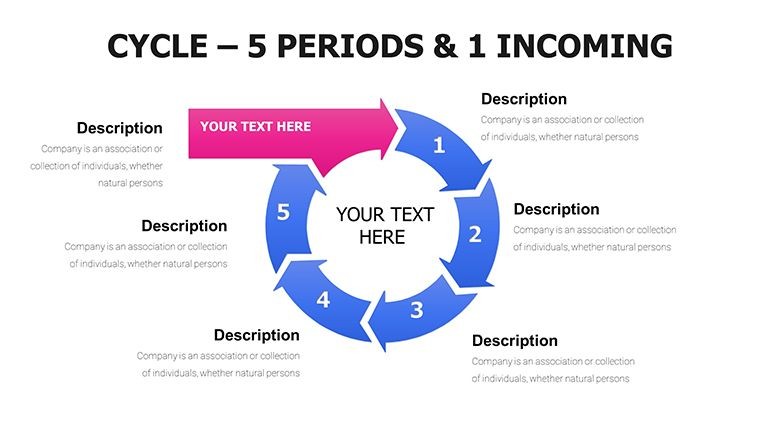
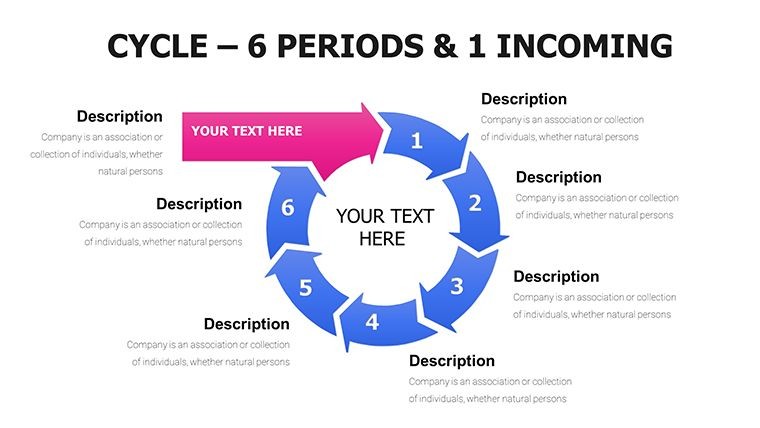
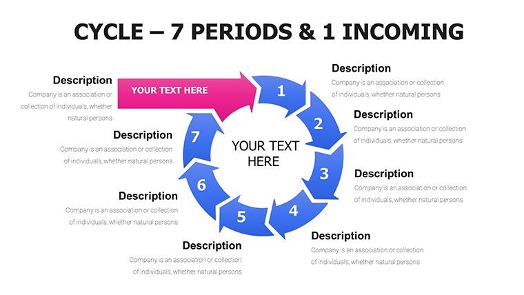
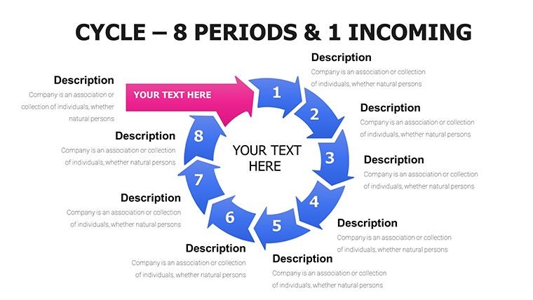
Slides cover categories of cycle, process, pie, arrows and puzzles with multiple variations such as incoming data streams merging into vibrant cycle diagrams and pie charts revealing market share through puzzle segmentation.
Key Features
Every element supports full drag-and-drop editing, chart data updates and text replacement. Animations trigger automatically on click or build order. The 57-slide set includes 5 color schemes that swap across all elements while preserving proportions and shadows for consistent professional output.
FeatureDetailsSlide Count57 editable slidesChart TypesInterlocking cycles, puzzle processes, flowing arrows, segmented piesFile Format.key for Apple KeynoteColor SchemesFive versatile options with one-click swapAnimationsBuilt-in sequential reveals and path animationsResolutionVector 300 DPI with gradients and shadowsProfessional Use Cases
A project manager at a tech firm used the incoming arrows slide mapping lead nurturing stages in a funnel-shaped cycle to present quarterly goals to the executive team, clarifying bottlenecks before they impacted delivery timelines.
A marketing director at a SaaS company applied the pie chart segmented with puzzle edges to illustrate market share distributions during a client strategy session, resulting in immediate approval for targeted campaign adjustments.
Real-World Applications
Consultants leverage the interlocking cycle diagrams when breaking down economic cycles or supply chain overviews for logistics clients, while donation impact tracking uses the period wheels with radial spokes for nonprofit board reports.
How to Customize
Download the .key file, open in Apple Keynote 11 or later, select any slide containing interlocking cycles or puzzle-piece processes, then update data directly in the chart editor. Swap between five color schemes with one click, adjust text placeholders, reposition flowing arrows and enable built-in path animations via the slide inspector. Export as PDF or present live with all elements retaining crisp vector quality.
This exact sequence replaces hours of manual design with minutes of targeted edits while preserving the engineered connectivity between cycles, arrows and puzzle segments.
Why Choose This Template
Unlike building interlocking cycles or puzzle-piece diagrams from scratch, which demands extensive manual alignment of arrows, segmentation of pies and testing of animations, this 57-slide set delivers pre-engineered layouts with baked-in 300 DPI vectors, gradient fills and sequential reveals already tested for impact. It differentiates from the related 44-slide Cycle Periods Incoming version and step-arrow templates by adding puzzle integrations and five color schemes that support complex storytelling scenarios such as customer journey funnels or agile sprint visualizations.
The design decisions prioritize connectivity symbols through interlocking and puzzle elements because they visually reinforce progression and interdependency, helping audiences grasp relationships faster than plain circles or lines ever could.
Add the Dynamic Cycle Charts Keynote Template to your collection today for instant professional data storytelling.
FAQ
How do I edit interlocking cycles and puzzle processes in this template?After opening the .key file in Keynote, select any slide with interlocking cycles or puzzle-piece processes. Update data values through the chart editor, change colors using the five built-in schemes via the format panel, and adjust arrow paths or puzzle edges individually. Text placeholders replace with your content instantly while animations remain intact. The vector layers allow resizing without quality loss and support drag-and-drop repositioning for custom layouts.
Is the template compatible with Keynote 11 and later versions?Yes, the 57-slide .key file is optimized for Keynote 11 and newer with backward compatibility through simple layer adjustments for earlier builds. All interlocking cycles, puzzle-piece processes, flowing arrows and pie charts open natively with full animation and color scheme support preserved. Vector construction guarantees crisp rendering on Retina displays and when exported to PDF or video.
What licensing covers commercial presentations and client work?The included license allows unlimited use in commercial presentations, client deliverables, reports and published materials. You can modify the 57 slides freely and share exported versions with audiences or teams. The original .key file cannot be resold or redistributed as a template. This fully supports agencies, consultants and corporations creating dynamic cycle charts for internal or external use.
How many slides and what unique elements are provided?The template contains 57 editable slides across cycle, process, pie, arrows and puzzles categories. Unique elements include interlocking cycles for connectivity, puzzle-piece processes for segmentation, incoming arrows for funnel mapping and pie charts with puzzle edges for market share. Built-in animations and five color schemes add dynamic impact not found in simpler cycle collections.
What is the exact download format and process?Purchase grants instant access to the single .key file with all 57 slides. The download link appears immediately after checkout and a receipt with product ID KC00017 emails for reference. File size is optimized for fast transfer and the archive opens directly in Keynote with no extraction needed. Support is available if any issue arises during the process.
Good for
- Project roadmaps and sprint plans
- Product launch timelines
- Quarterly or annual review decks
- Company history and milestone summaries
Licence
reviews
The median line is thick.
The fan chart for uncertainty bands.
The colored bands show confidence intervals.
Used this for an economic forecast.
FAQ
Will it work in Google Slides?
Are fonts embedded?
Can I use this for client work?
What's the refund policy?
Do you update the template after purchase?
Similar templates
See all Keynote Charts →


All 57 slides