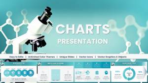
Keynote Charts Template for Chemical and Biochemical Engineering


Type: Keynote Charts template
Category: Tables, Illustrations
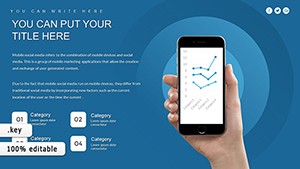
Sources Available: .key
Product ID: KC01041
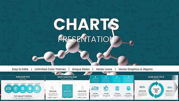
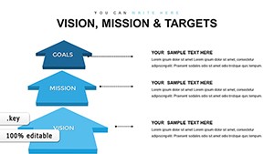
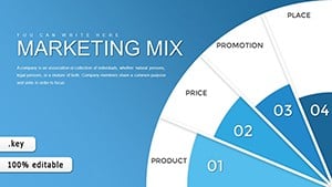
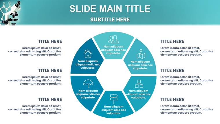
Template incl.: 41 editable slides
Envision a world where your chemical engineering data doesn`t just sit on a slide - it flows, reacts, and captivates. Our Keynote Charts Template for Chemical and Biochemical Engineering is engineered for that precise purpose. Crafted for STEM trailblazers like biochemical engineers optimizing fermentation processes or chemical researchers modeling fluid dynamics, this template packs 41 editable slides into a powerhouse of visualization. It`s not about flashy effects; it`s about precision, like adhering to AIChE standards for technical presentations. Picture a biotech startup founder using these tools to pitch scalable bioreactor designs to investors, turning complex kinetics into digestible insights. With input from PhD-level experts, this isn`t generic - it`s a tailored ally that saves you from design drudgery, letting you focus on innovation. As one user from a Fortune 500 chem firm noted, "It slashed my prep time for quarterly reviews, making data pop without the hassle."
Why This Template Revolutionizes STEM Presentations
In chemical and biochemical engineering, where equations meet real-world applications, clarity is non-negotiable. This template embodies that with a neutral palette and structured grids, drawing from ergonomic design principles to reduce cognitive load. Begin with overview slides that frame your project - say, a Sankey diagram illustrating mass balances in a distillation column. These visuals aren`t arbitrary; they`re optimized for engineering workflows, supporting everything from HAZOP analyses to lifecycle assessments.
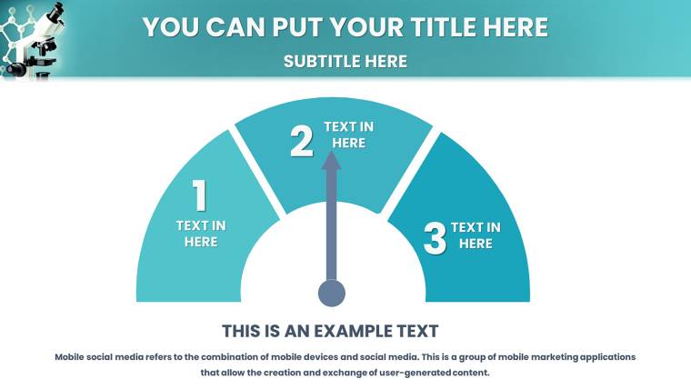
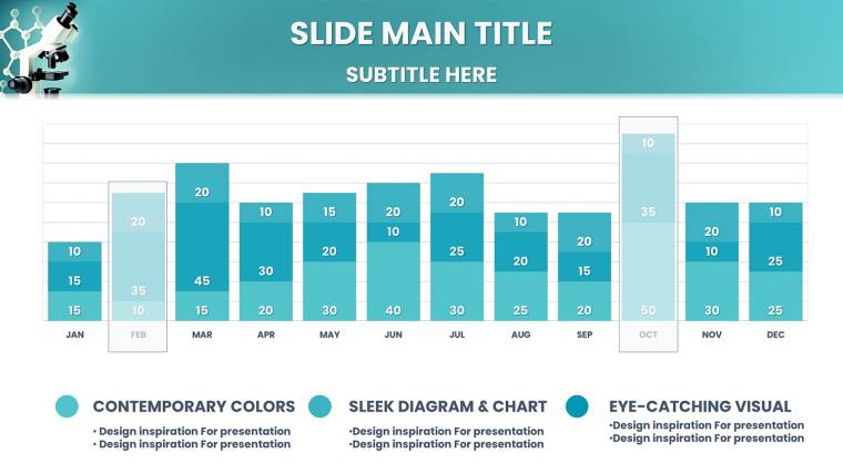
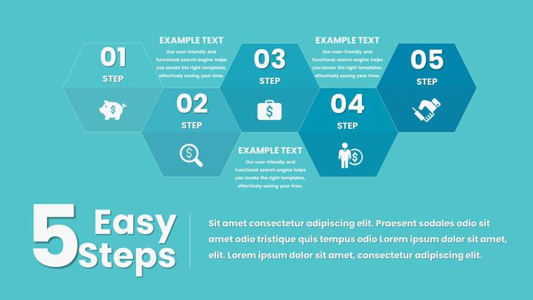
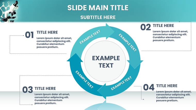
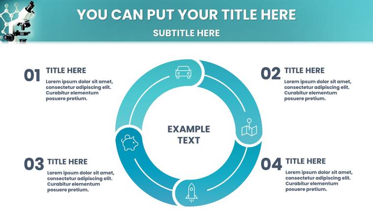
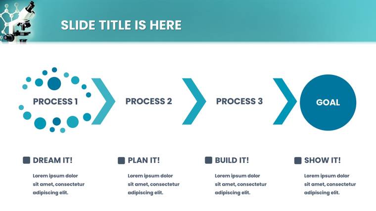
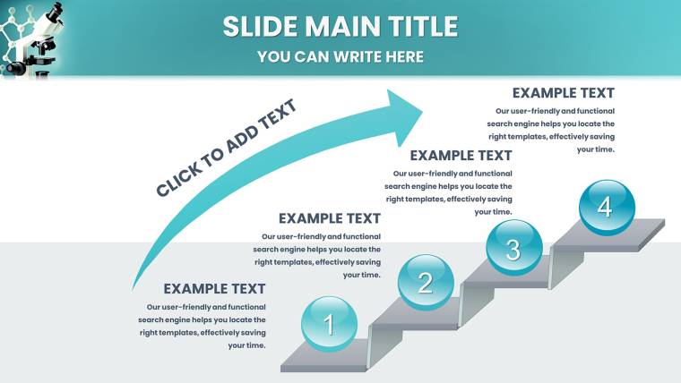
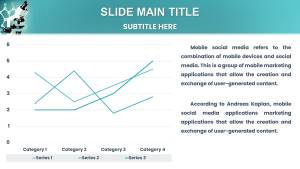
Dive into the meat: Flowcharts map reaction sequences with branching paths for contingencies, ideal for process safety discussions. Gantt charts timeline R&D phases, helping teams align on milestones like pilot scaling. And for data-heavy sections, pie charts break down feedstock compositions, with tooltips for deeper dives. All elements are vector-scaled, ensuring fidelity in exports for journal submissions or patent filings.
Essential Features for Engineering Precision
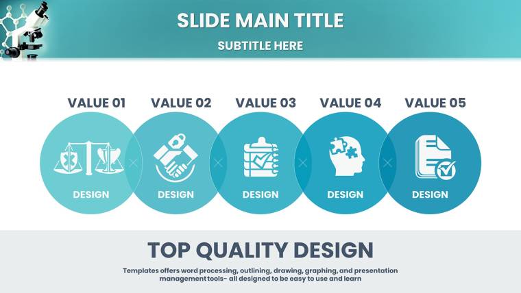
- Advanced Chart Variety: Sankey for energy flows, flowcharts for pathways, Gantt for timelines - each tunable to your datasets.
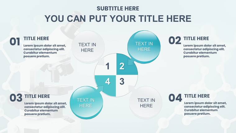
- Biochemical-Specific Infographics: Visualize enzyme interactions or metabolic networks with modular components.
- Drag-and-Drop Interface: No coding needed; resize, recolor, or animate elements intuitively in Keynote.
- Lightweight Optimization: Fast-loading files for iOS/macOS, perfect for on-the-go edits during site visits.
- Animation-Ready: Built-in transitions simulate processes, like fluid movement in reactor models.
These aren`t bells and whistles - they`re necessities. Take a real scenario: An MIT lab used similar diagrams to present biofuel optimizations, securing grants by clearly showing efficiency gains. Our template elevates this with exclusive biochemical motifs, fostering authoritativeness in your delivery.
Tailored Use Cases in Chemical and Biochemical Fields
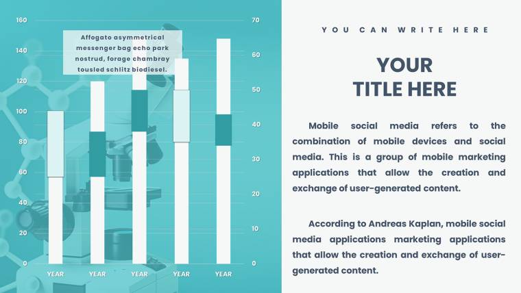
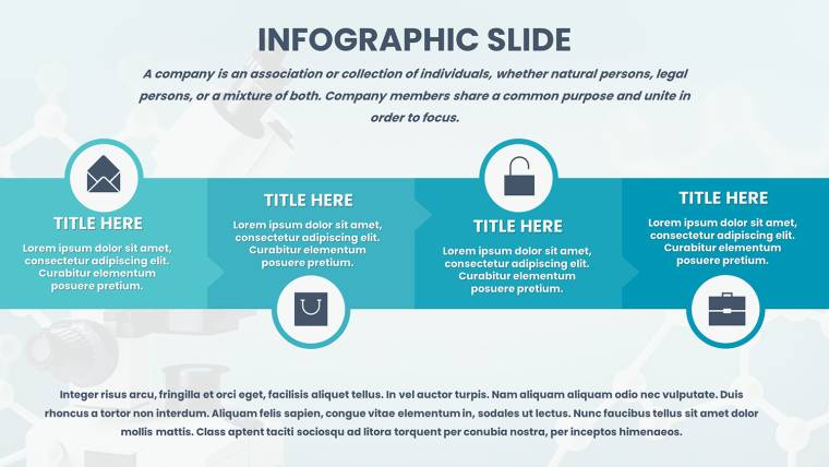
Let`s apply it step-by-step. For academic defenses, structure your thesis with hypothesis slides featuring comparative bar graphs - contrast simulated vs. experimental yields. In industry pitches, use infographics to highlight ROI in process upgrades, like reducing waste in catalytic conversions.
University lectures benefit from interactive elements: Break down Le Chatelier`s principle with dynamic equilibrium charts, engaging students visually. For conferences, poster-supporting slides condense research into scannable formats, adhering to event guidelines for impact.
- Assess Your Needs: Identify key data points, such as reaction rates or yield curves.
- Import Seamlessly: Pull from Excel or simulations, auto-populating charts.
- Refine Aesthetics: Match colors to safety codes - red for hazards, green for efficiencies.
- Test Interactivity: Run through animations to ensure smooth narrative flow.
- Iterate Based on Feedback: Collaborate via Keynote`s sharing, refining for precision.
This approach mirrors agile engineering methodologies, boosting productivity. Compared to basic tools, it offers depth - like specialized Sankey nodes for multi-stream processes - avoiding the pitfalls of mismatched generics.
Value Propositions for Busy Professionals
What sets it apart? Exclusivity in STEM-tuned designs, praised by users for cutting prep by half. It`s trustworthy, with no proprietary locks, and supports high-def outputs for publications. Weave in LSI like "process optimization visuals" organically, enhancing discoverability.
For global reach, font versatility handles technical symbols. Subtle CTAs, such as "Dive Deeper into Data," encourage engagement without overt salesiness.
Expert Tips to Amplify Your Engineering Narratives
Go beyond basics: Employ the rule of thirds for slide composition, placing key charts off-center for dynamism. Storyboard your talk - use timelines to arc from problem to solution. In virtual formats, optimize for bandwidth with compressed graphics.
Avoid overload: Limit to three data series per chart, per visualization best practices. Reference cases like ExxonMobil`s use of flow diagrams in sustainability reports for inspiration. With this template, your presentations become catalysts for ideas, sparking discussions in boardrooms or labs.
Eager to engineer better presentations? Grab this chemical engineering charts template and propel your work forward.
Frequently Asked Questions
Can I integrate this with simulation software data?
Yes, easily import from tools like Aspen or MATLAB, with charts updating automatically.
What Keynote versions does it support?
Fully compatible with current macOS/iOS versions, backward to Keynote 10 with core features intact.
Is it suitable for non-engineering STEM fields?
Certainly - adapt for physics or materials science with minimal tweaks to charts.
How do I handle large datasets?
Use built-in summarization tools or duplicate slides for segmented views.
Are there customization guides?
Included tutorials cover advanced edits, plus links to Keynote mastery resources.
Does it facilitate team edits?
Yes, via real-time iCloud collaboration for distributed engineering teams.