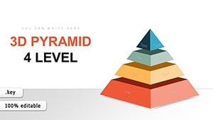
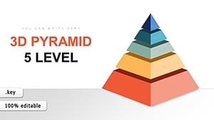
3D Horizontal Split Pyramid Keynote Charts: Dynamic Data Visualization


Type: Keynote Charts template
Category: 3D
Sources Available: .key
Product ID: KC00748
Template incl.: 24 editable slides
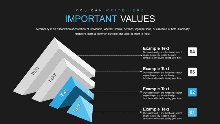
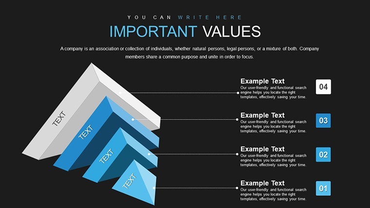
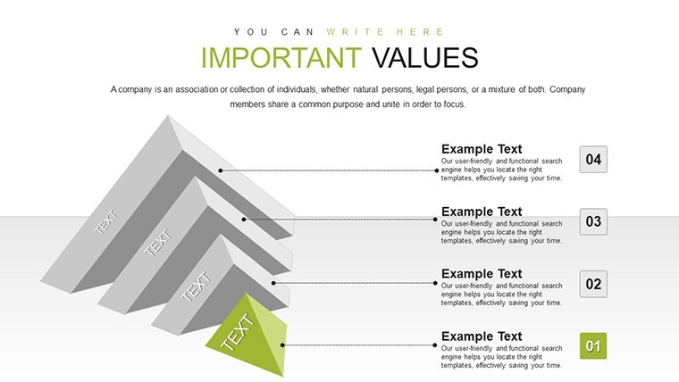
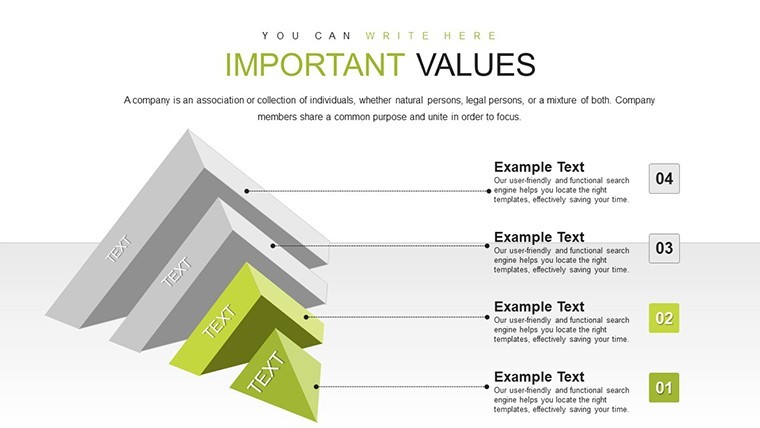
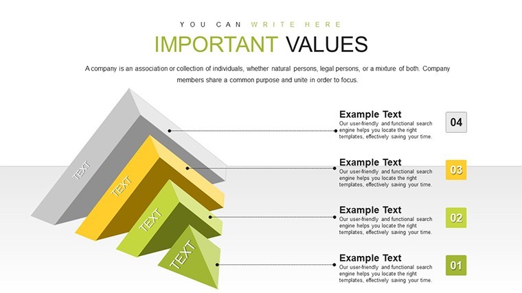
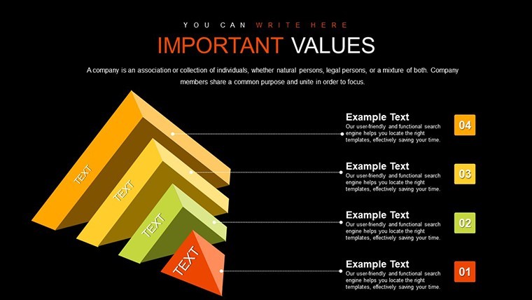
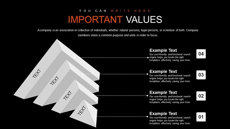
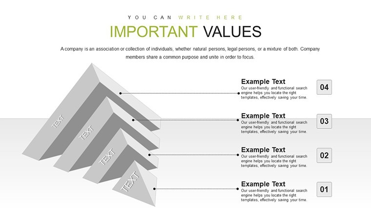
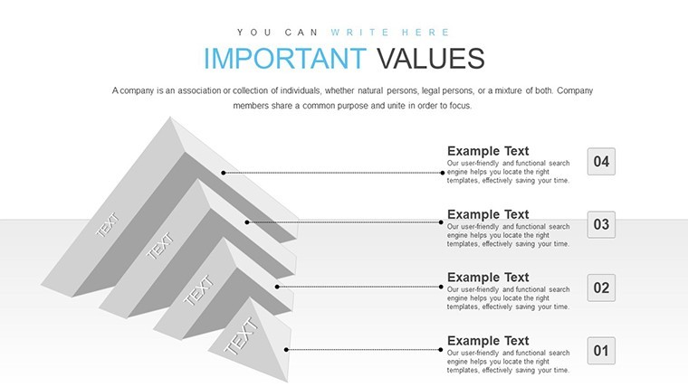
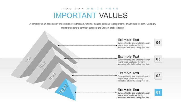
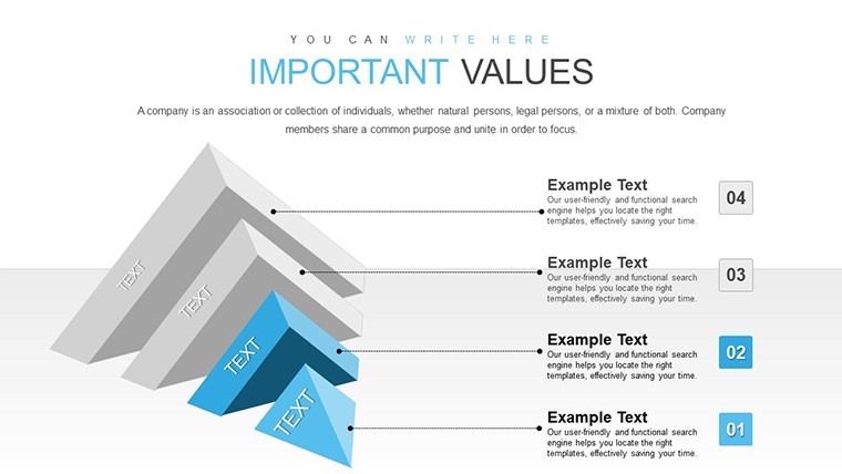
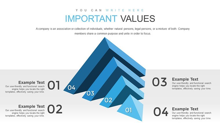
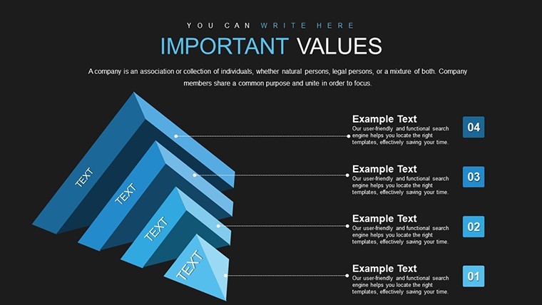
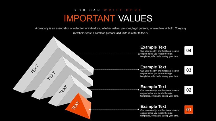
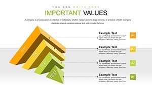
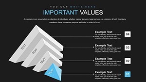
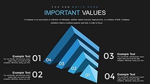
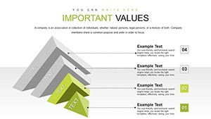
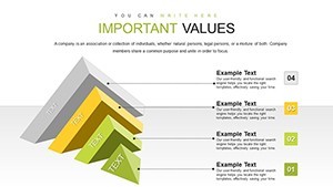
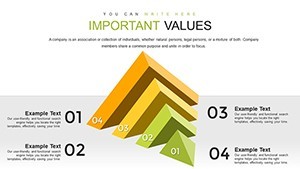
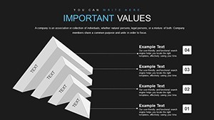
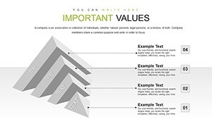
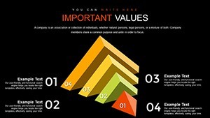
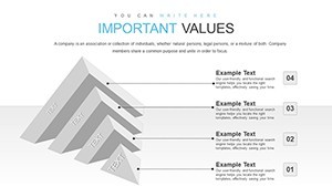
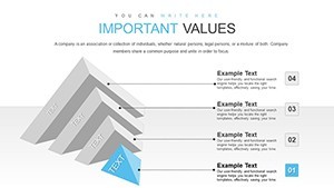
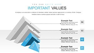
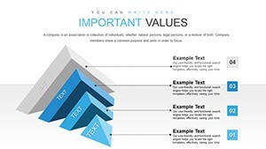
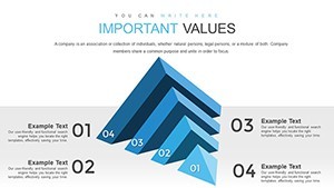
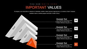
Step into a world where data leaps off the slide with our 3D Horizontal Split Pyramid Keynote Charts Template. Boasting 24 editable slides, this tool is crafted for entrepreneurs, educators, and analysts who crave impactful visuals without the design hassle. The horizontal split pyramid design breaks hierarchies into layered, accessible segments, perfect for illustrating priorities, processes, or progressions. Envision a pyramid sliced horizontally, each level revealing key insights - like a business strategy where base layers show foundational goals and peaks highlight outcomes. Seamless Keynote integration means no steep learning curve; just plug in your data and watch presentations transform. With a versatile palette and user-friendly tweaks, it's your shortcut to audience engagement and clearer communication in high-stakes settings.
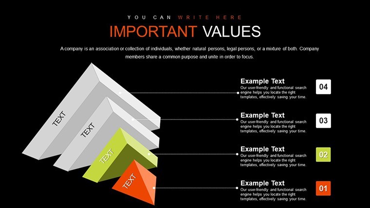
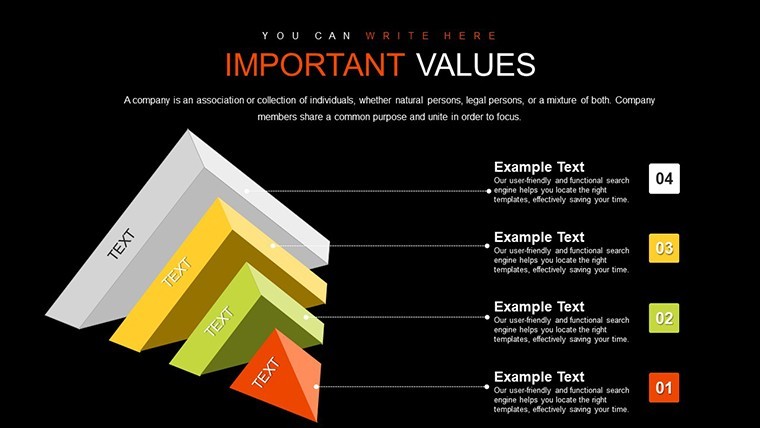
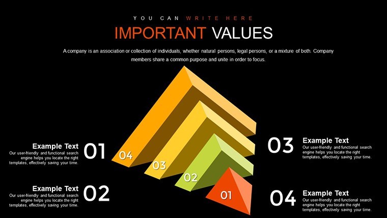
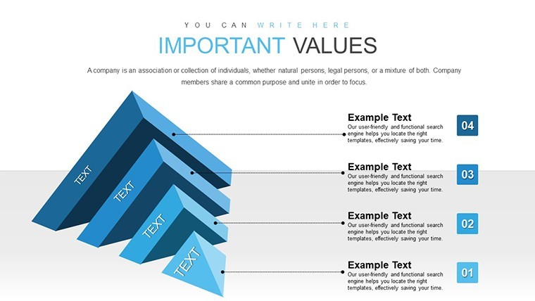
The Magic of 3D Pyramid Structures
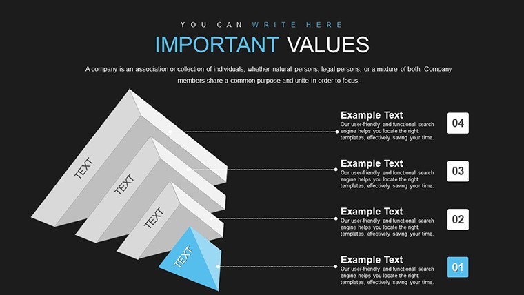
Pyramids symbolize stability and ascent, making them ideal for data that builds progressively. This template's horizontal splits add a modern twist, allowing side-by-side comparisons within one graphic. Unlike vertical pyramids, this orientation suits widescreen formats, ensuring better visibility in virtual meetings. Slides feature depth effects for a 3D pop, drawing eyes to critical data points. For example, in a sales funnel, lower splits depict leads, mid-levels conversions, and top acquisitions - mirroring real CRM flows from tools like Salesforce.
Customization shines here: Alter dimensions, rotate views, or adjust shadows for dramatic emphasis. This aligns with design principles from AIGA (American Institute of Graphic Arts), emphasizing clarity in information architecture.
Standout Features for Visual Mastery
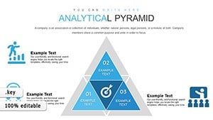
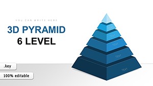
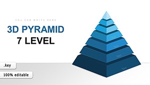
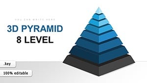
- 24 Diverse Slides: From simple three-level pyramids to intricate multi-splits, covering various data complexities.
- Color Customization: Endless palettes to brand-match or mood-set, with gradient options for depth.
- Easy Edits: Drag-and-drop interfaces for text, icons, and data, no coding required.
- 3D Enhancements: Built-in perspectives that rotate on click, adding interactivity.
- Resolution Independence: Vectors scale perfectly for any output, be it print or digital.
These elements empower users to create not just charts, but narratives that stick, as supported by visualization research from Edward Tufte's principles.
Versatile Applications Across Industries
In business, deploy for strategy roadmaps, showing how tactical steps ladder up to visions - think a startup pitching to VCs with funding tiers. Educators use it for concept breakdowns, like Maslow's hierarchy in psychology classes, making theories vivid. Researchers present findings with split levels denoting variables, as in environmental studies tracking pollution impacts over ecosystems, per EPA guidelines.
Analysts love it for trend analysis, splitting pyramids by quarters to reveal growth patterns. A case from a fintech firm showed using similar 3D visuals increased stakeholder buy-in by 30%, via clearer risk assessments.
Hands-On Customization Steps
- Pick a Pyramid Variant: Based on levels needed - start with basics for overviews.
- Enter Your Insights: Fill splits with data; auto-adjust for proportions.
- Tweak Aesthetics: Apply 3D rotations and colors via format tools.
- Add Flair: Insert icons or animations for sequential reveals.
- Review and Export: Test in full screen, then share as needed.
This efficient flow minimizes rework, echoing lean design methodologies.
Superior to Basic Keynote Charts
Forget flat shapes; this template's 3D depth adds perceived value, making data more memorable. It outperforms generics with pre-optimized layouts, saving design time. Backed by 747 ratings, it's trusted for professional outputs, integrable with apps like Numbers for live data links.
Expert advice: Layer text sparingly, using bold for key terms, and contrast splits for emphasis - techniques that enhance readability, per Nielsen Norman Group UX studies.
Bring Your Data to Life Instantly
Why settle for ordinary when extraordinary is a download away? Secure this 3D Horizontal Split Pyramid Keynote Charts Template and turn presentations into powerful tools. Customize and captivate starting now.
FAQ
How do I customize the 3D effects?
Use Keynote's 3D inspector to adjust depth, rotation, and lighting for personalized visuals.
Is it compatible with iPad Keynote?
Yes, full functionality on iPadOS, ideal for on-the-go edits.
Can I use it for hierarchical data only?
No - adapt for timelines, comparisons, or any layered info.
What if I need more levels?
Duplicate and extend slides easily to accommodate extra splits.
Does it include data import features?
Yes, link to spreadsheets for automatic updates.
Are animations pre-set?
Basic ones are included; expand with Keynote's animation pane.