Magnifying Glass Analysis Keynote Charts - Editable Keynote


Type: Keynote Charts template
Category: Illustrations, Puzzles, Analysis
Sources Available: .key
Product ID: KC00688
Template incl.: 18 editable slides
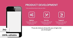
18 Keynote chart slides built around a magnifying glass analysis theme
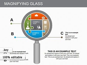
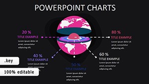
The .key file opens with 18 fully editable slides, each structured around a magnifying glass visual motif - a format suited for presenting focused analysis, zoomed-in data examination, or layered relationship mapping to stakeholders. The layouts cover five distinct chart types: abstract diagrams for conceptual overviews, left-to-right flow charts suited for process or workflow sequences, relationship charts that map dependencies between nodes, strategic management visuals for multi-layered planning overviews, and business movement charts that show directional shifts or trend progressions over time.
The magnifying glass graphic element appears as a structural device - not purely decorative - anchoring the focal point of each slide and directing the viewer's eye toward the key data area. All elements are vector-based, so resizing for high-resolution output or large-screen display does not affect quality. In practice, you replace text labels, adjust the node connections in the relationship charts, and update the flow arrows to match your process. Typically, teams reuse the same diagram structure across multiple reports, swapping only the content.
This Keynote chart template is built for analysts, strategy consultants, or project managers who need to show interconnected data without building diagrams from scratch. The flow chart slides handle left-to-right step-by-step sequences well - useful when explaining a process to a non-technical audience in a single slide. The relationship chart layouts work best when you have four to eight elements with defined connections, such as stakeholder maps or dependency structures. Not ideal for dense numerical data tables or dashboards requiring live chart updates.
Use this instead of drawing shapes manually in Keynote when you need a pre-aligned, thematically consistent set of analysis visuals. The predefined magnifying glass structure keeps each slide's focus clear, so you don't spend time arranging elements slide by slide. Color changes apply element by element since the page does not indicate a slide master color scheme - adjust fills via Keynote's Format panel for consistent branding. The file is Keynote-exclusive (.key format); the page does not specify a minimum Keynote version, but the standard KEY format is compatible with Keynote 10 and later on macOS.
The strategic management slides support analysis that maps long-term plans with multiple contributing layers - useful when a leadership team needs to see how operational priorities connect to overall direction. After placing your data, viewers can identify which relationships carry the most weight and where the process has gaps. No free version is available; the full set of 18 slides is included in the $20.00 purchase.
Everything is already structured. Download and start editing immediately
Specifications
| Feature | Details |
|---|---|
| Slides | 18 editable slides - abstract, flow, relationship, strategic management, business movement chart types |
| File format | .key (Keynote native) |
| Software compatibility | Keynote (macOS); minimum version not specified - compatible with current KEY/KTH standard |
| Editable elements | Vector shapes, text labels, flow arrows, node connections - all resize and recolor independently |
| Aspect ratio | 16:9 widescreen |
| Color schemes | Not specified - colors editable via Keynote Format panel per element |
| Free vs Paid | Single paid version only - $20.00 for all 18 slides |
| Product ID | KC00688 |
Frequently Asked Questions
Does this template work with Keynote on Mac and what version is required?
The file is in .key format, which is Keynote's native format for macOS. The page does not specify a minimum version, but the standard KEY format is supported by Keynote 10 and later. If you're running a current macOS installation, the file will open and all editable elements will be accessible. Keynote for iPad also supports .key files, though complex vector layouts are best edited on desktop.
How do I change colors across all slides consistently?
Color editing is done through Keynote's Format panel. Select a shape or element, open the Style tab, and change the fill color. To apply a consistent color across multiple slides, select all instances of a shape type using Edit > Select All, then apply the fill. The page does not confirm a slide master color switcher, so color changes are best done element by element or by selecting matching shapes across slides simultaneously.
Can I use this template for client-facing presentations and commercial projects?
ImagineLayout licenses templates for professional use including client presentations and commercial projects. The standard license covers use in presentations delivered to clients. For specific licensing terms covering redistribution or resale of the template files themselves, review the Terms of Use at imaginelayout.com/terms/ before purchase.
Is there a free version or trial available?
The page lists a single paid version at $20.00 with no free tier or preview download mentioned. The product includes all 18 slides in the purchased .key file. Preview images are available on the product page to evaluate the layouts before buying.
What is the refund policy if the template doesn't meet my needs?
ImagineLayout offers refunds for non-delivered items (within 14 days of purchase) and for templates with serious defects affecting usability (within 72 hours of purchase). If the product does not match its description, the case is reviewed individually. Refunds are not issued for downloaded templates that have been used for an extended time. Contact support with your order number and a clear explanation to initiate a request.
Browse more analysis-focused layouts in the Analysis Keynote Charts category or explore the full Keynote Charts collection.