Keynote Square Matrix Charts - Fully Editable | ImagineLayout


Type: Keynote Charts template
Category: Matrix
Sources Available: .key
Product ID: KC00686
Template incl.: 14 editable slides
Keynote diagram template for square matrix visuals
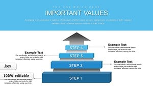
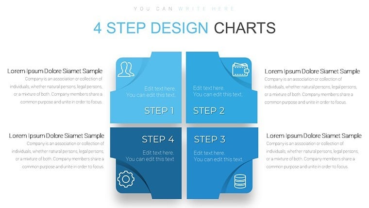
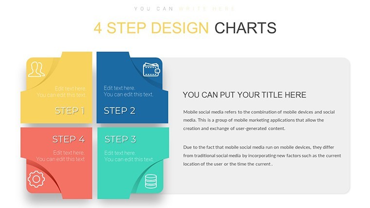
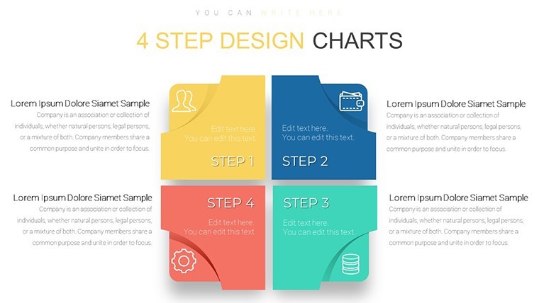
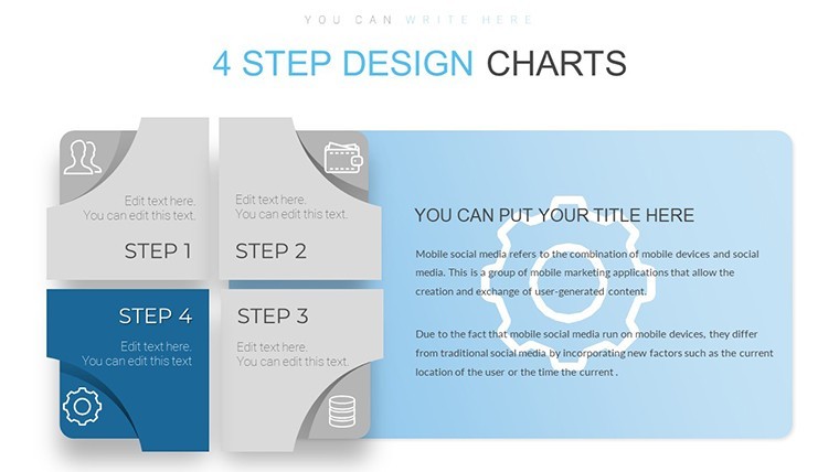
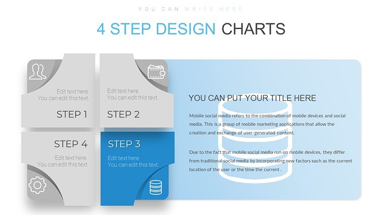
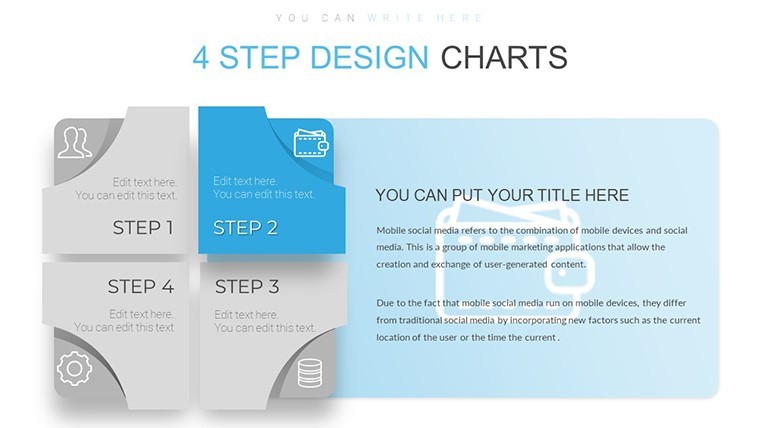
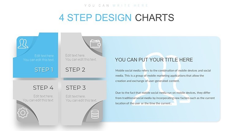
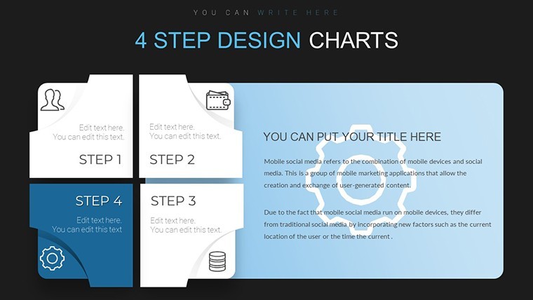
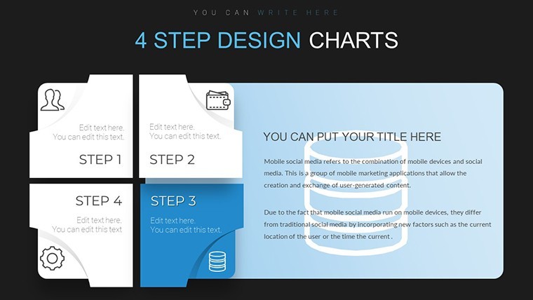
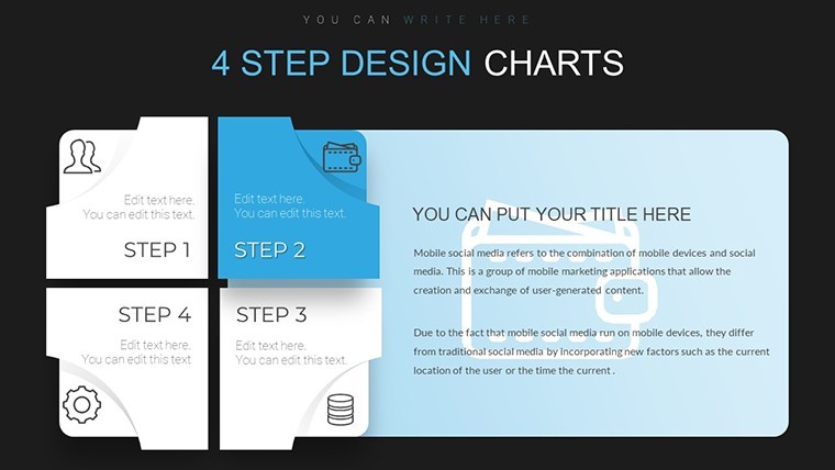
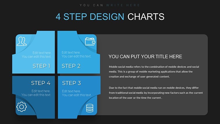
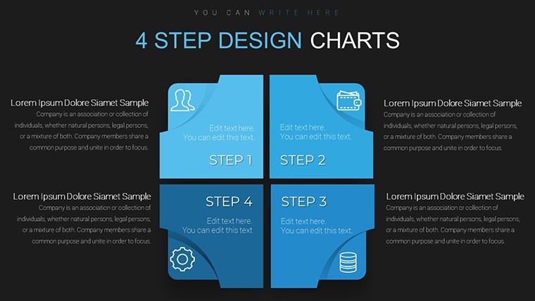
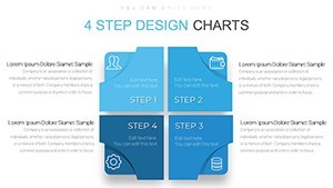
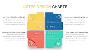
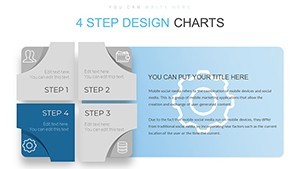
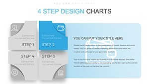
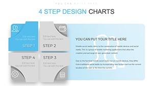
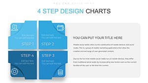
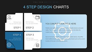
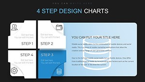
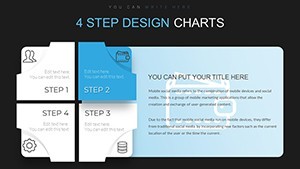
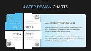
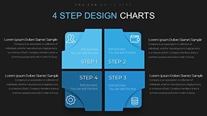
14 four-step square matrix charts clarify comparisons when briefing product teams on architecture options.
For teams mapping priorities without designer support these layouts remove manual alignment work.
The predefined square grid prevents overcrowded layouts.
Paid version supplies the full 14 editable slides in KEY format. The page does not list color schemes or free version details but files match standard Keynote requirements.
Use this instead of building matrix diagrams manually. The square structure supports decision analysis so viewers rank four options and select the optimal path.
Best when your content fits four clearly bounded categories not eight or more.
Everything is already structured.
| Feature | Details |
|---|---|
| Slides / diagrams | 14 four-step square matrix charts |
| File format | KEY |
| Software version | Keynote 12+ |
| Color schemes | Not listed - master slide palette switch |
| Editable elements | Square cells steps and borders resize independently |
| Aspect ratio | 16:9 |
| Free vs Paid | Paid unlocks all 14 editable slides |
| Masters / Backgrounds | Unified master for instant theme updates |
Download and start editing immediately
How do I change colors across all charts?
Select View > Master Slides first. Update the theme colors in the Format panel on the right. This instantly refreshes every square matrix step in the 14 diagrams. In practice the change takes under 30 seconds and applies globally without touching individual slides.
Can I use these charts for client work?
Yes the license permits commercial use in client presentations. One purchase covers one project. You may not resell the template itself or share the source file. For multiple client projects purchase additional licenses.
What is the difference between free and paid versions?
The page does not list free version details. Paid version provides the complete 14 editable four-step square matrix charts in KEY format. Free downloads if offered contain limited previews only.
What are the refund conditions?
Refunds are available within 14 days of purchase if the KEY file fails to open in current Keynote. Submit the support ticket with proof of incompatibility. Refunds are not issued after successful download and editing.
What Keynote version and macOS do I need?
Files work in Keynote 12 or newer on macOS Ventura and later. Older versions may open with reduced editability for advanced segment effects. Test in your current installation before full rollout.
View matrix Keynote charts templates or Infographic Design Keynote Charts.