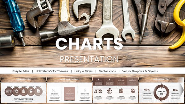
16 Laptop Data Charts - Editable Keynote | ImagineLayout


Type: Keynote Charts template
Category: Tables, Illustrations
Sources Available: .key
Product ID: KC00649
Template incl.: 16 editable slides
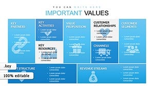
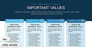
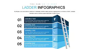
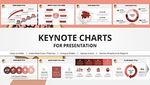
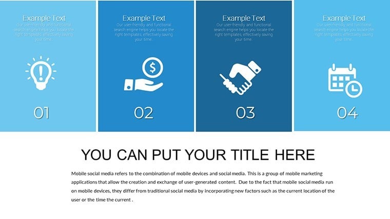
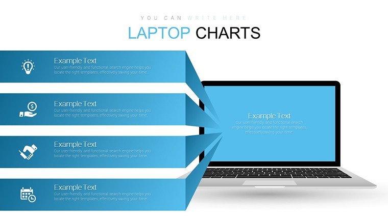
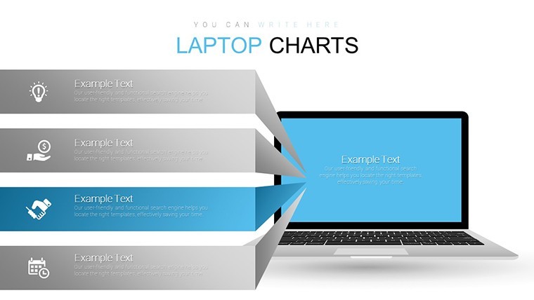
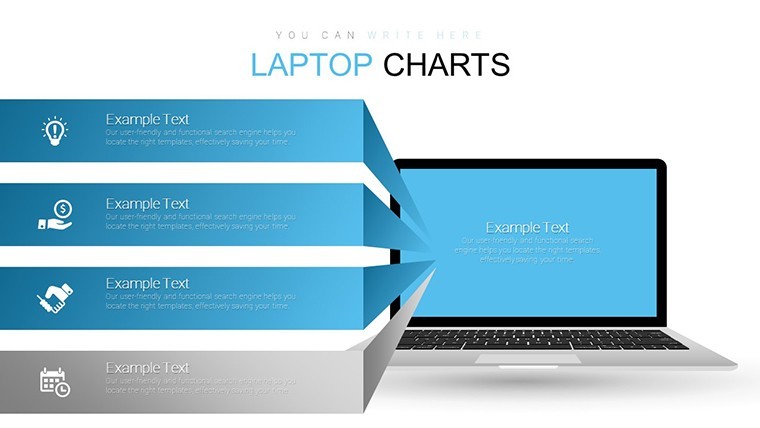
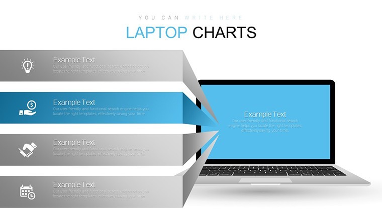
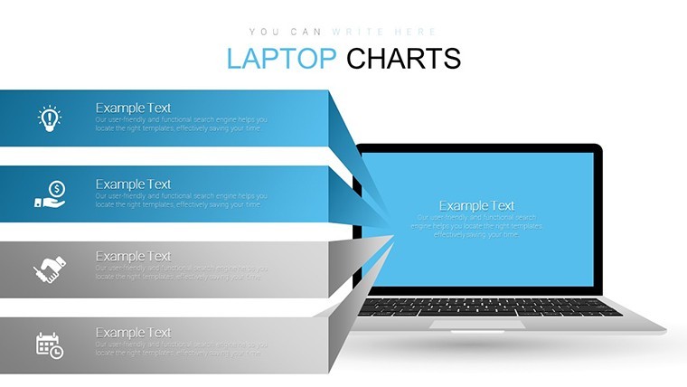
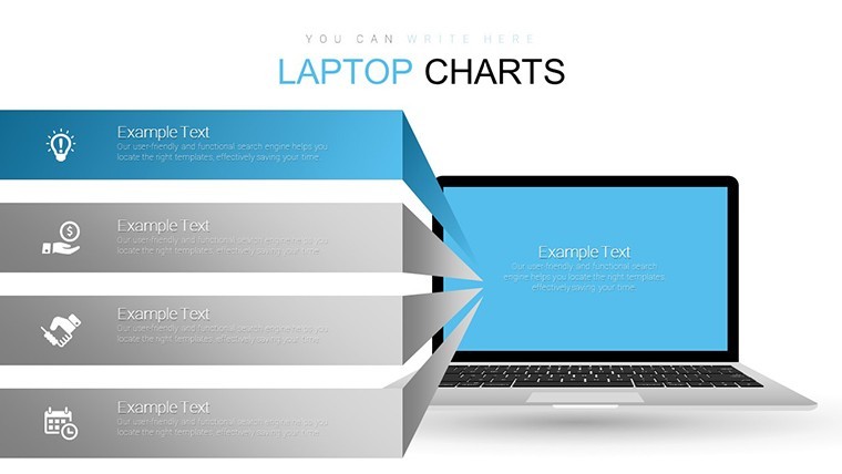
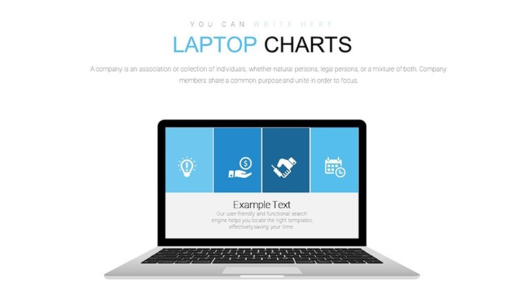
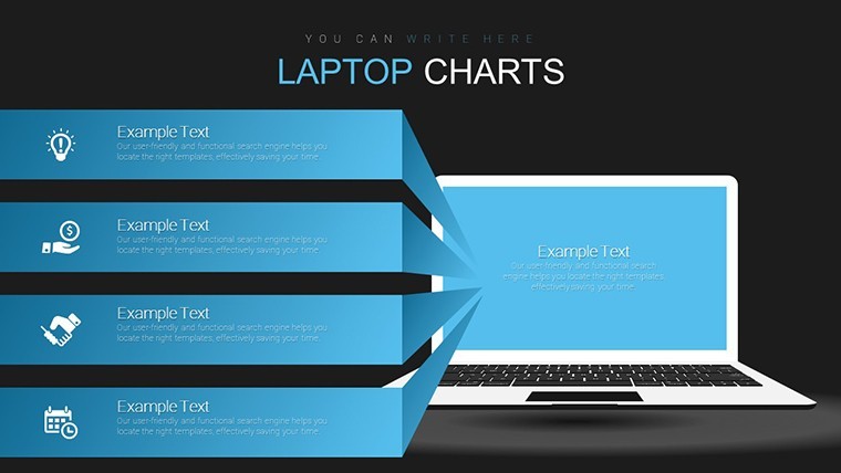
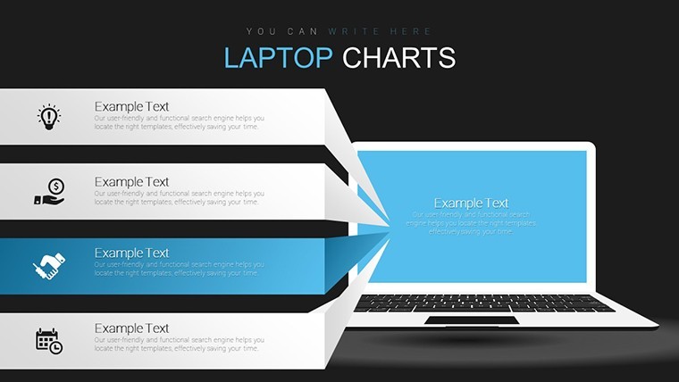
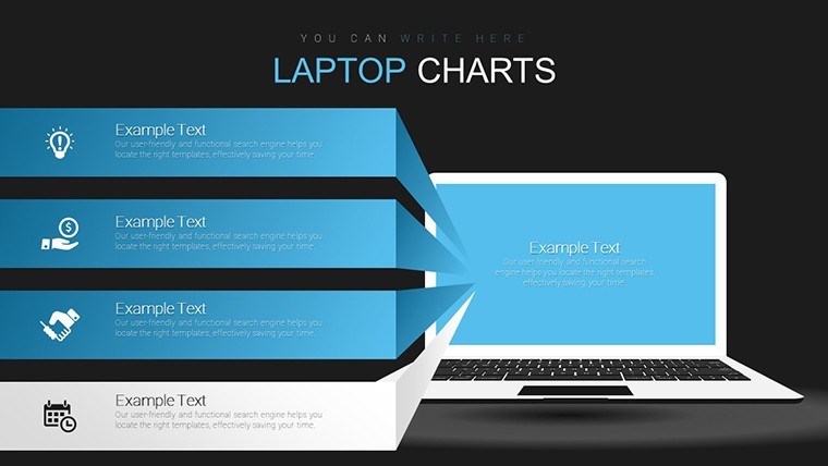
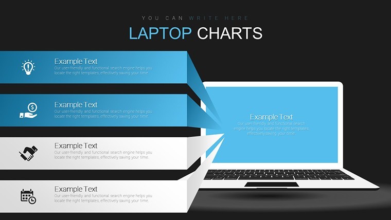
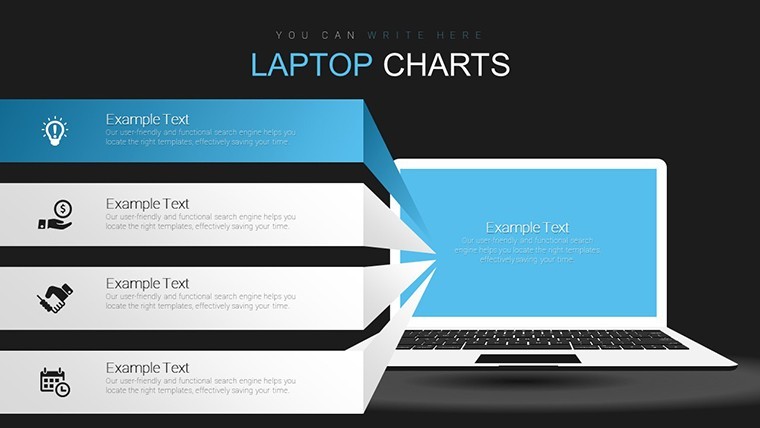
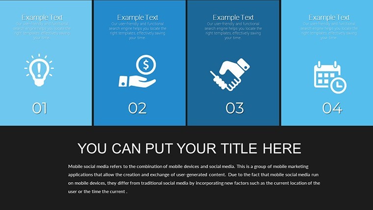
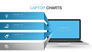
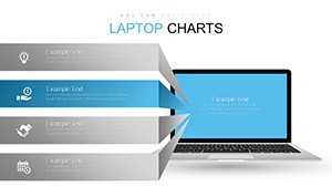
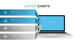
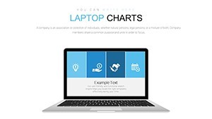
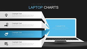
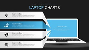
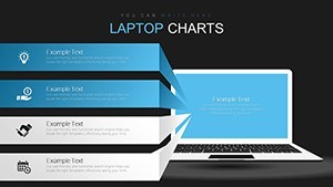
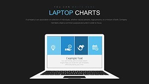
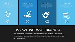
Vibrant laptop-themed bar graphs pie charts line graphs and tables fill the KEY file with 16 editable slides for data comparison in internal reporting.
No complex layouts just structured blocks.
You can duplicate slides and reuse the same structure.
In practice the themed graphics let you drop sales or performance numbers straight into the charts and the layout stays clean across multiple slides.
For monthly performance reviews the predefined bar and line structures handle trend tracking out of the box.
Typically this supports prioritization analysis so viewers can decide budget shifts after seeing clear proportions in one view.
Use this instead of building diagrams manually in Keynote.
The laptop visual framing keeps every chart readable on one slide preventing overcrowded layouts.
Managers preparing internal reports for executives will benefit most.
Not ideal for purely narrative storytelling decks.
Avoid it if your data requires radial or hierarchical views rather than standard comparison charts.
In most cases you only replace text and adjust colors via the slide master.
See more tables keynote charts templates.
You open the file and start editing.
Download and start editing immediately
What Keynote version is required?
The template is built on Apple's Keynote platform and works with current installations.
Standard KEY files open without issues in recent macOS versions.
Full chart animations display correctly once loaded.
How to change colors via slide master?
Open the file in Keynote then access View > Edit Master Slides.
Select graph elements update the color palette and the update applies across all 16 slides instantly.
This ensures brand consistency without editing each chart individually.
Can I use this template for client work?
Yes the license permits use in client presentations and reports.
Customize the decks freely for external delivery.
Do not resell or share the original files.
What are the free vs paid differences?
The page does not list a free version.
The paid version delivers all 16 editable slides with full laptop theming and charts.
Everything is included for immediate use.
What are the refund conditions?
Digital KEY files are non-refundable once downloaded.
Reach out for support if you encounter any file issues.
Refunds apply only to verified technical delivery problems.