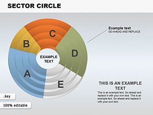
Important Sector Circle Free Keynote Charts Template


Type: Keynote Charts template
Category: Free Templates, Pie
Sources Available: .key
Product ID: KC00610
Template incl.: 18 editable slides
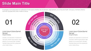
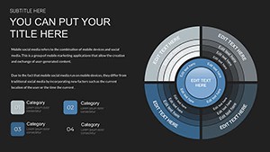
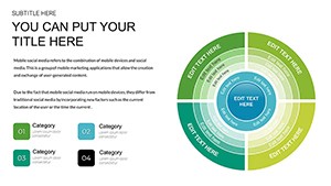
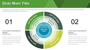
Data speaks volumes when presented right, and sector circle charts - advanced pie variants - excel at emphasizing proportions with flair. Our free Important Sector Circle Keynote Charts template delivers 18 editable slides, crafted to spotlight critical data points in business reports, academic lectures, or marketing analyses. Picture a chart where one sector pops with bold coloring, drawing eyes to market share dominance or budget allocations instantly. Compatible with Keynote on Mac and iOS, this template features vibrant schemes and customizable elements that adapt to your story. It's more than visuals; it's a strategy for clarity, rooted in information design principles from experts like Edward Tufte, who advocate for data integrity without distraction. Ideal for professionals seeking to convey insights quickly, this free resource tackles visualization challenges head-on, turning numbers into narratives that stick.
The Art of Sector Emphasis in Data Presentation
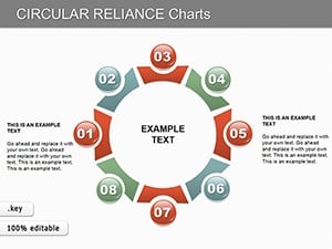
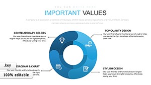
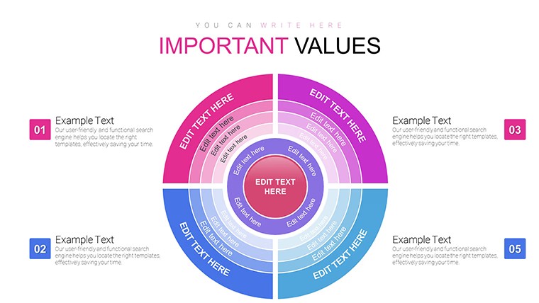
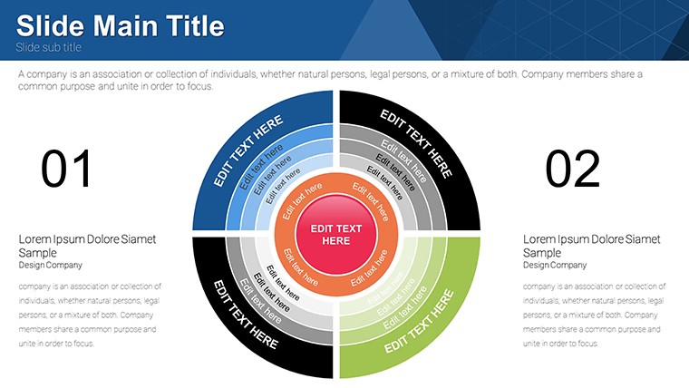
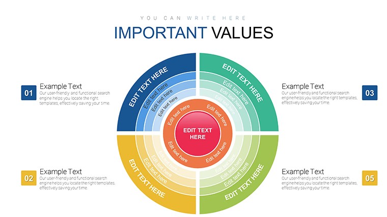
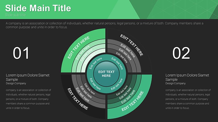
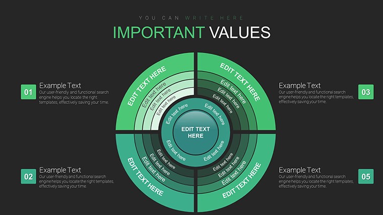
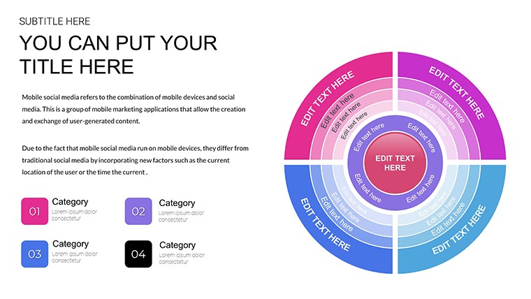
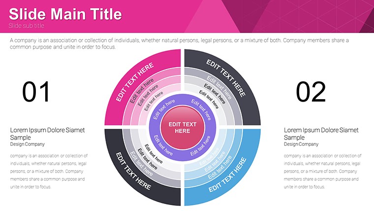
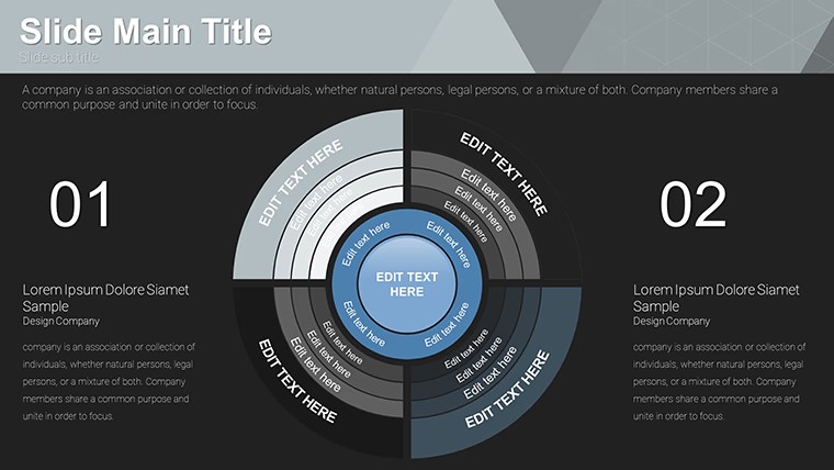
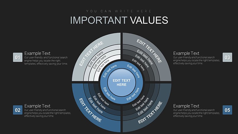
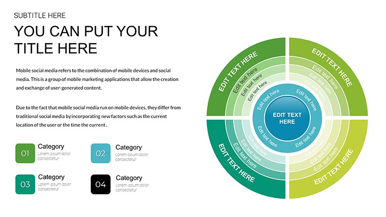
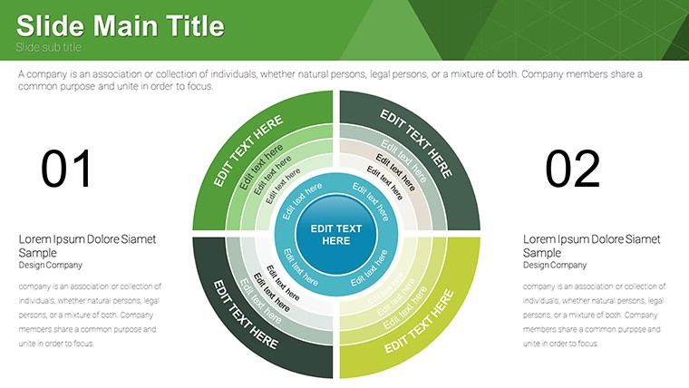
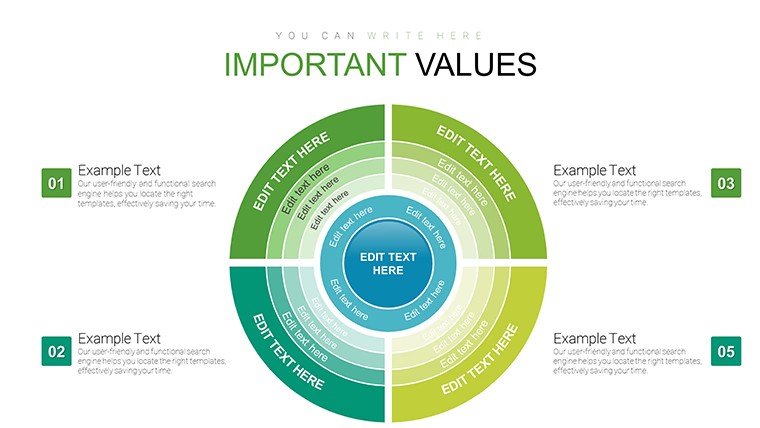
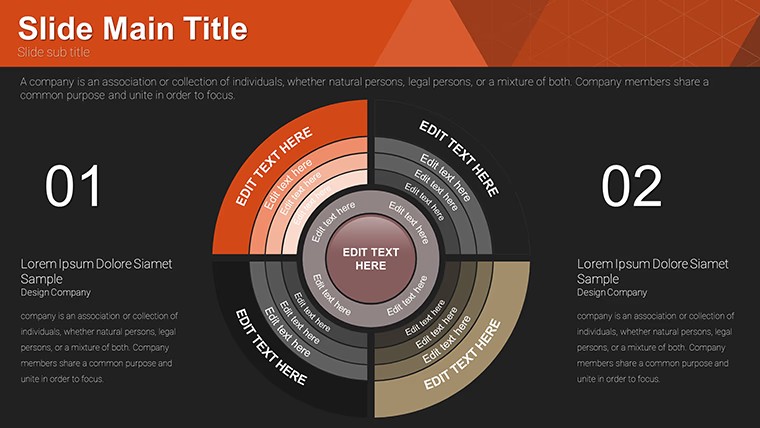
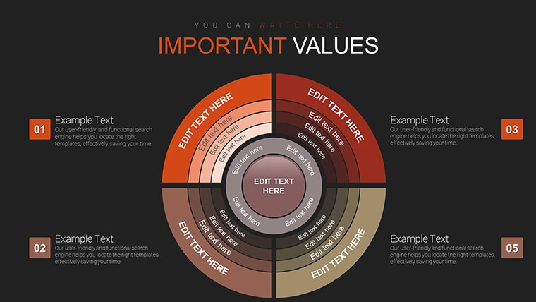
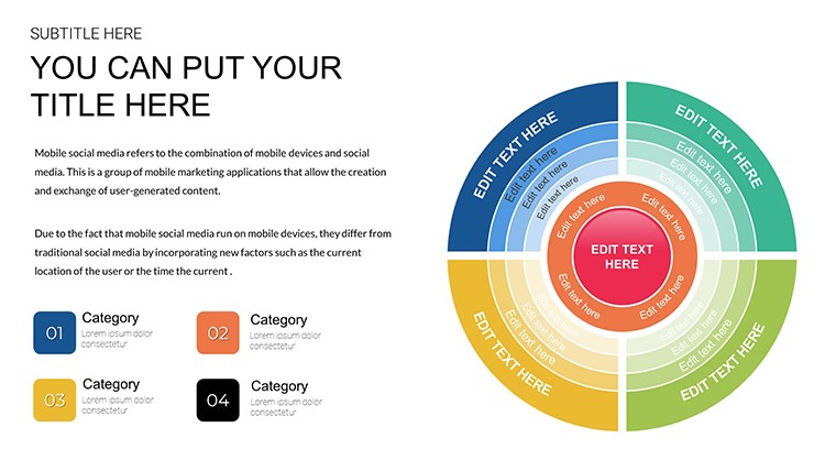
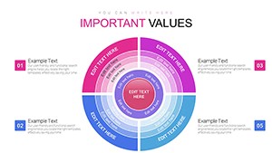
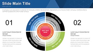
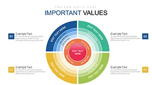
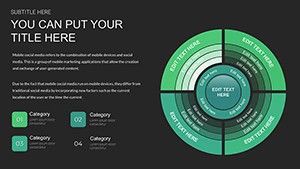
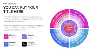
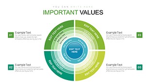
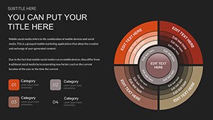
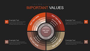
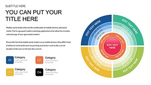
Sector circles go beyond traditional pies by allowing highlighted segments, perfect for underscoring priorities like a dominant revenue source. This template includes variations with 4-12 sectors, each with dynamic labeling and color coding for intuitive understanding. For instance, a six-sector slide could depict portfolio diversification, with one enlarged for emphasis on high-yield assets. The design incorporates modern gradients and shadows, enhancing depth while maintaining simplicity. Backed by visualization research from Harvard Business Review, such charts improve retention by 65% over text alone. Our template's flexibility extends to font customizations and data imports from spreadsheets, ensuring seamless workflow integration.
Essential Features for Impactful Charts
- Multiple Variations: 18 slides with diverse sector counts and highlight options for tailored data stories.
- Customization Ease: Adjust colors, labels, and sizes effortlessly, with Keynote's tools for precise tweaks.
- Bold Visuals: High-contrast designs ensure visibility, even in low-light settings.
- Infographic Quality: Professional elements like legends and tooltips for added context.
- Device Optimization: Responsive layouts for iPad edits or Mac projections.
Drawing from industry standards, these features minimize errors in data representation, unlike generic charts that often misalign labels.
Practical Scenarios and Success Stories
In quarterly earnings calls, finance teams use sector circles to highlight profit drivers, as done by Apple in investor decks. Marketers analyze campaign ROI, emphasizing top-performing channels that boosted leads by 40% in a recent HubSpot case. Academics simplify demographic data for sociology classes, fostering better student engagement. Strategic planners at consultancies like Bain map competitive landscapes, identifying market gaps that led to client expansions. A nonprofit example: Visualizing donation distributions to showcase impact, resulting in increased funding during annual galas.
Customizing Your Sector Charts Step by Step
- Download and Launch: Open the .key file in Keynote for immediate use.
- Input Data: Replace placeholders with your figures, using copy-paste from Excel.
- Highlight Key Sectors: Apply bold styles to focal points via the format menu.
- Refine Aesthetics: Choose from color palettes or add animations for reveals.
- Export and Share: Save as video or PDF for versatile distribution.
Enhance with tools like Tableau for complex data, or keep it simple for quick insights. Tips include limiting sectors to seven for cognitive load, per Gestalt principles.
Edges Over Conventional Pie Charts
Standard pies often confuse with too many slices; our emphasized sectors clarify priorities. This template's pre-optimized designs cut creation time, offering superior fidelity compared to online freebies.
Integrating into Your Data Workflow
Link with Google Sheets for live updates or use in conjunction with analytics platforms like Google Analytics for real-time metrics.
Conclusion: Make Data Memorable Now
Harness the power of focused visuals - download our free Sector Circle template and illuminate your data like never before.
FAQ
How do I highlight a specific sector? Select the sector and apply bold formatting or color changes in Keynote.
Is data import supported? Yes, easily paste from spreadsheets for quick updates.
Suitable for large datasets? Best for 4-12 sectors; aggregate data for clarity.
Can I animate the charts? Keynote allows segment-by-segment builds for dynamic effects.
What about export options? Export to images, PDFs, or even movies for broader use.