Free Templates PowerPoint Charts
An analyst updating the monthly executive dashboard has the new numbers but not the time to rebuild every visual. These free PowerPoint chart templates already contain the chart structure, label placement, and color logic - so the deck stays consistent and the afternoon goes to the analysis, not the slide design.
The collection covers the chart types that carry real business arguments: sales funnels that show pipeline drop - off at a glance, Gantt layouts for project milestone tracking, radar charts for multi - variable comparisons, matrix grids for decision frameworks, timeline slides for roadmap conversations. A marketing operations lead comparing three campaign channels or a project coordinator updating a steering committee on delivery status - these templates already hold the structure those moments require. Find the chart layout that matches your next data slide and download it.
 (782)
(782) Free Decision-Making PowerPoint Charts: Streamline ChoicesID: #PC00660free
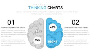 (736)
(736) Free Thinking Charts PowerPoint Template: InnovateID: #PC00651free
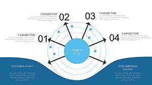 (230)
(230) Free Radar PowerPoint Charts TemplateID: #PC00646free
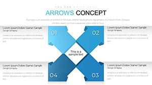 (459)
Arrows Flow PowerPoint Charts Template: Streamline Your Ideas CreativelyID: #PC00643free
(459)
Arrows Flow PowerPoint Charts Template: Streamline Your Ideas CreativelyID: #PC00643free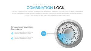 (1182)
 Combination Lock PowerPoint Charts Template - Download PPTXID: #PC00641free
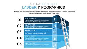 (102)
Free Ladder Infographics PowerPoint Charts Template - Download PPTXID: #PC00640free
(102)
Free Ladder Infographics PowerPoint Charts Template - Download PPTXID: #PC00640free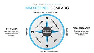 (1190)
Marketing Compass PowerPoint Charts Template: Navigate Your StrategyID: #PC00638free
(1190)
Marketing Compass PowerPoint Charts Template: Navigate Your StrategyID: #PC00638free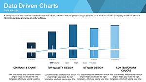 (458)
Data-Driven PowerPoint Charts Template: Visualize Insights EffortlesslyID: #PC00637free
(458)
Data-Driven PowerPoint Charts Template: Visualize Insights EffortlesslyID: #PC00637free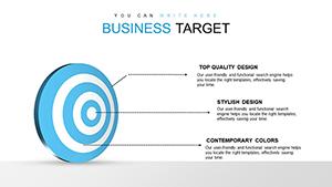 (367)
Business Target PowerPoint Charts Template: Hit Your Goals VisuallyID: #PC00636free
(367)
Business Target PowerPoint Charts Template: Hit Your Goals VisuallyID: #PC00636free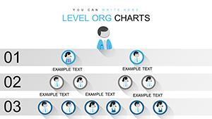 (858)
Free Level Org PowerPoint Charts TemplateID: #PC00635free
(858)
Free Level Org PowerPoint Charts TemplateID: #PC00635free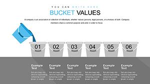 (906)
Free Bucket Chart PowerPoint Template - Fully Editable Instant DownloadID: #PC00634free
(906)
Free Bucket Chart PowerPoint Template - Fully Editable Instant DownloadID: #PC00634free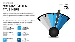 (1071)
Free Speedometer Dashboard PowerPoint Template - Fully Editable & Instant DownloadID: #PC00632free
(1071)
Free Speedometer Dashboard PowerPoint Template - Fully Editable & Instant DownloadID: #PC00632free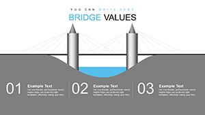 (309)
Bridge Value PowerPoint Charts Template: Quantify Infrastructure ImpactID: #PC00631free
(309)
Bridge Value PowerPoint Charts Template: Quantify Infrastructure ImpactID: #PC00631free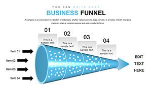 (684)
Free Sales Funnel PowerPoint Template - Fully Editable Instant DownloadID: #PC00627free
(684)
Free Sales Funnel PowerPoint Template - Fully Editable Instant DownloadID: #PC00627free (521)
Timeline PowerPoint Charts - Instant Download | ImagineLayoutID: #PC00626free
(521)
Timeline PowerPoint Charts - Instant Download | ImagineLayoutID: #PC00626free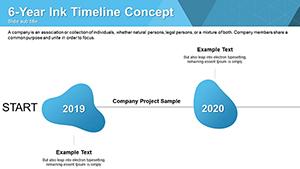 (491)
Free Ink Timelines PowerPoint Charts: Artistic Flow for Your StoriesID: #PC00624free
(491)
Free Ink Timelines PowerPoint Charts: Artistic Flow for Your StoriesID: #PC00624free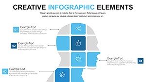 (309)
Free Creative PowerPoint Chart Presentation Template for MatricesID: #PC00622free
(309)
Free Creative PowerPoint Chart Presentation Template for MatricesID: #PC00622free (580)
Concepts Metaphors PowerPoint Charts - Free Download TemplateID: #PC00621free
(580)
Concepts Metaphors PowerPoint Charts - Free Download TemplateID: #PC00621free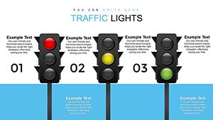 (711)
Free Traffic Lights PowerPoint Charts for Professional PresentationsID: #PC00619free
(711)
Free Traffic Lights PowerPoint Charts for Professional PresentationsID: #PC00619free (759)
Free Process Description PowerPoint Charts - PPTX TemplateID: #PC00616free
(759)
Free Process Description PowerPoint Charts - PPTX TemplateID: #PC00616free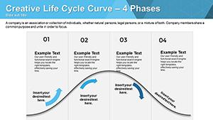 (208)
Life Cycle Curve Free PowerPoint Charts: Charting Growth and EvolutionID: #PC00615free
(208)
Life Cycle Curve Free PowerPoint Charts: Charting Growth and EvolutionID: #PC00615free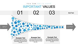 (493)
Free Innovation Funnel PPT Template: Streamline Your Idea PipelineID: #PC00614free
(493)
Free Innovation Funnel PPT Template: Streamline Your Idea PipelineID: #PC00614free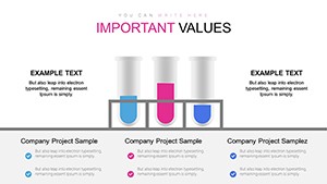 (1151)
Free Chemical Process Flowchart PowerPoint Template - Fully EditableID: #PC00613free
(1151)
Free Chemical Process Flowchart PowerPoint Template - Fully EditableID: #PC00613free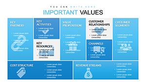 (154)
Free Business Model Canvas PowerPoint Template - Instant DownloadID: #PC00612free
(154)
Free Business Model Canvas PowerPoint Template - Instant DownloadID: #PC00612free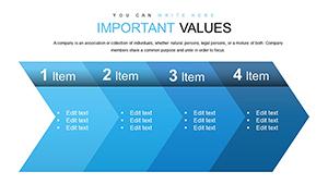 (272)
Free Simple Chevron Steps PowerPoint Charts: Streamline Your Processes VisuallyID: #PC00611free
(272)
Free Simple Chevron Steps PowerPoint Charts: Streamline Your Processes VisuallyID: #PC00611free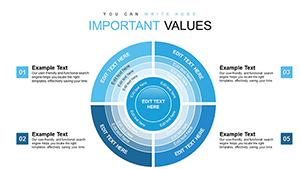 (802)
Free Important Sector Circle PowerPoint Charts: Visualize Proportions EffortlesslyID: #PC00610free
(802)
Free Important Sector Circle PowerPoint Charts: Visualize Proportions EffortlesslyID: #PC00610free (972)
Christmas PPT Charts - Instant DownloadID: #PC00430free
(972)
Christmas PPT Charts - Instant DownloadID: #PC00430free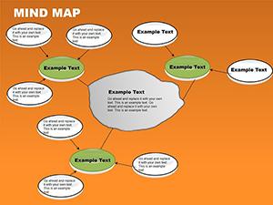 (855)
Free Mind Map PowerPoint Template - Unlock CreativityID: #PC00070free
(855)
Free Mind Map PowerPoint Template - Unlock CreativityID: #PC00070free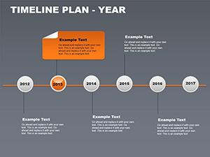 (594)
Free Yearly Timeline PowerPoint Charts - 12 Editable SlidesID: #PC00069free
(594)
Free Yearly Timeline PowerPoint Charts - 12 Editable SlidesID: #PC00069free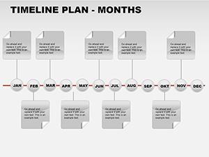 (704)
Free Monthly Timeline PowerPoint Template - 12 Editable SlidesID: #PC00068free
(704)
Free Monthly Timeline PowerPoint Template - 12 Editable SlidesID: #PC00068free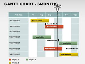 (175)
Free 6-Month Gantt Chart PowerPoint TemplateID: #PC00067free
(175)
Free 6-Month Gantt Chart PowerPoint TemplateID: #PC00067free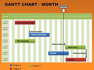 (56)
Free Monthly Gantt Charts PowerPoint TemplateID: #PC00066free
(56)
Free Monthly Gantt Charts PowerPoint TemplateID: #PC00066free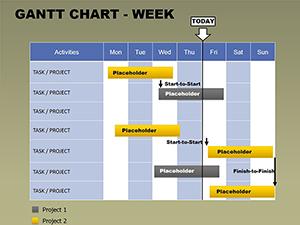 (35)
Free Weekly Gantt Chart PowerPoint TemplateID: #PC00065free
(35)
Free Weekly Gantt Chart PowerPoint TemplateID: #PC00065free
Which chart type to reach for - and when the wrong one costs you the room
Chart selection is a communication decision, not a design one. A sales funnel slide works when the argument is about conversion rate at each stage - the visual shape of the funnel tells the drop - off story before the presenter says a word. A radar chart works when you`re comparing multiple attributes of several options simultaneously and no single axis is more important than the others. A matrix works when the point is which quadrant something belongs in. Use a bar chart for that last one and the quadrant logic disappears. The chart type that gets misused most often is the pie. A pie shows proportions of a whole - that`s it. When people use it to compare five products across three metrics, the argument collapses. The matrix templates here solve that specific problem: they force the comparison into a structure where the position carries meaning, not just the label.
What the Gantt, funnel, and timeline layouts do differently from static chart images
A Gantt chart is, structurally, a table with time on one axis and tasks on the other. The layouts here are built as editable PowerPoint objects - not screenshots or images dropped onto a slide. That distinction matters when a milestone shifts by a week and you need to update the slide two hours before the steering committee call. With an image, you`re rebuilding. With a native object, you drag a bar. The funnel templates work the same way. Each stage is a separate editable shape with its own text placeholder. Add a stage, remove one, change the percentage label - the layout adjusts without manual repositioning. From working on quarterly pipeline decks, this is the specific thing that saves time in the final hour before a presentation, when numbers get updated and slides need to reflect them accurately.
Real - world scenarios across five chart categories
Marketing operations lead comparing campaign channel performance. Three channels across six metrics - CTR, conversion rate, CPA, ROAS, volume, and trend. A radar chart overlays all three profiles on one slide. The shape of each polygon tells the story faster than a six - row table. When I opened a radar template for a client quarterly review, the pre - set axes matched the standard marketing metrics exactly, saving twenty minutes of axis labeling.
Project coordinator updating a steering committee on delivery status. A Gantt layout shows planned vs actual timing for fifteen workstreams. The steering committee needs to see where delays are happening and which dependencies are at risk. The Gantt does that in one view. The coordinator updates the bar positions weekly without rebuilding the entire chart.
Sales operations lead reporting on pipeline conversion. A funnel template shows drop - off at each stage from lead to closed deal. The narrowing shape communicates the conversion rate story. When I opened a funnel template for a client quarterly review, the pre - set stage labels matched our CRM exactly, saving twenty minutes of setup. The funnel has been reused in eight weekly reviews since.
Product manager presenting a quarterly roadmap. A timeline layout with milestone - based positioning shows feature delivery dates across three quarters. The leadership team needs to see sequencing and dependencies. The template uses a hidden table for milestones, so adding a new row redistributes spacing automatically. No manual dragging of shapes.
Strategy analyst presenting a portfolio decision framework. A matrix grid shows where products fall across market growth and market share. The BCG - style layout forces the placement conversation. The slide becomes the decision anchor for resource allocation discussions. The pre - set axes and quadrant labels mean the analyst can focus on positioning the products, not building the grid.
When to choose these free PowerPoint charts over adjacent categories
If your argument depends on a specific structural framework - conversion drop - off, time - plus - task, multi - variable comparison, quadrant positioning - then these templates are the right choice. For conventional data visualization where you need linked charts that update automatically when numbers change, use PowerPoint`s native chart templates. For process flows and relationship mapping where the logic is directional rather than comparative, switch to PowerPoint diagram templates. And if your point is geographic distribution, a PowerPoint map template will communicate more clearly.
Why rebuilding these structural chart types from scratch wastes time
You could build a funnel in PowerPoint using shapes. The time isn`t lost in drawing trapezoids - it`s lost in alignment, scaling, and text placement. Getting four stages to maintain consistent widths when you change a label, ensuring the narrowing proportion looks right, keeping connector lines attached when you move a stage. That`s where most people burn time. These templates solve that upfront. The slide master defines color behavior, the grid spacing is consistent, and the layout handles text overflow predictably. You change one accent color, and every chart in the collection updates across the deck.
Technical note: milestone - based vs duration - based timeline layouts
The timeline layouts handle two distinct logics: milestone - based (specific dates, no duration) and duration - based (bars that represent spans of time). They look similar in a thumbnail but behave differently in editing. If you add a milestone mid - sequence to a duration - based template, the spacing may need adjustment. Worth checking which type you`re opening before filling in real project dates. The milestone - based templates use hidden tables and handle row additions cleanly. The duration - based templates use drawn shapes and require manual adjustment when you insert a new bar.
Why this free collection is actually useful for working analysts
All templates here are free to download and edit in PowerPoint. No stripped - down versions, no watermarks, no "upgrade to unlock" popups. The free versions deliver the complete editable slides with no paid upgrade listed on the page. The templates are built as editable PowerPoint objects - not screenshots or images dropped onto a slide. That distinction matters when a milestone shifts by a week and you need to update the slide two hours before the steering committee call. With an image, you`re rebuilding. With a native object, you drag a bar.
Navigate related chart categories
This free collection covers the structural chart types that carry real business arguments. For a broader range of free presentation slides, see free PowerPoint templates. For free structural chart types that Keynote doesn`t build natively, compare with free Keynote charts. For paid structural charts with larger slide counts, browse PowerPoint chart templates.
Frequently Asked Questions
Are these charts really free with no watermarks?
Yes. These free PowerPoint chart templates come from the same library as our paid collections - no stripped - down versions, no watermarks, no "upgrade to unlock" popups. The free versions deliver the complete editable slides with no paid upgrade listed on the page. You download, open in PowerPoint, and start editing. That`s it. No credit card required, no signup wall.
Can I use these charts for commercial presentations?
Yes. The free templates come with a standard license that allows commercial use. You can present them in client meetings, internal reviews, and investor decks without additional fees. The only restriction is redistribution of the template file itself. You cannot resell the template as your own product, but you can use it to create presentations you charge for.
How do I update the data in the funnel template?
The funnel templates are built as separate editable shapes, not linked charts. To update a conversion percentage, select the stage shape and edit the text label. To change the width of a stage (which represents conversion rate visually), drag the shape`s handles. The template maintains the narrowing proportion across stages, so adjusting one stage`s width won`t break the overall funnel shape. For recurring reports, save a clean copy of the funnel and duplicate it each time rather than reusing the same file.
Will these templates work in Google Slides?
The short answer is: primarily PowerPoint, but they can be imported into Google Slides. When you upload a PPTX file, most shapes and colors transfer correctly, but some fine details - like grouped layers or font styles - may shift slightly. For funnels and Gantt charts that rely on precise shape alignment, expect some drift. If you`re a heavy Google Slides user, test a single chart first before building a full deck. For final presentations, export to PDF from PowerPoint to preserve the exact layout.
What`s the difference between these free charts and your paid PowerPoint charts?
The free collection gives you core structural chart types - sales funnels, Gantt milestones, radar comparisons, matrix grids, timeline layouts. The paid collection includes those plus more specialized layouts, larger slide counts (often 30 - 50 slides instead of 10 - 15), and additional variants of each chart type. For most one - off presentations, the free set is enough. For recurring decks or teams that present the same charts weekly, the paid collection offers more depth and consistency across a larger library.