How to Change the Style of All Slides in a Presentation Without Redoing Each One
You click a new theme, half your slides update, half don't — here's why, and how to actually fix all of them at once.
Design tips, tutorials, product updates, and industry insights.

You click a new theme, half your slides update, half don't — here's why, and how to actually fix all of them at once.

The fastest diagram in PowerPoint isn't the one you draw — it's the one you never have to draw twice.
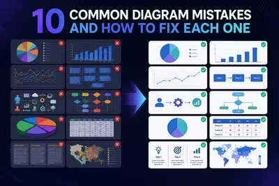
Most diagram problems aren't about design taste at all — they're structural mistakes that quietly confuse the exact person you're trying to persuade.

Most "radar charts are bad" takes are half right — here's the narrow window where they beat a table outright.
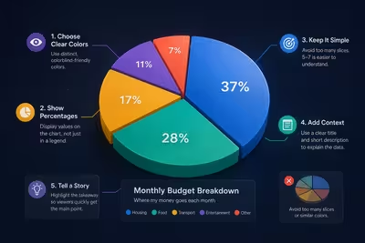
Most pie chart advice is about looking good — here's what actually makes one readable, and the one case where a pie chart quietly beats a bar chart.

Most sales funnel diagrams show a shape everyone recognizes — and hide the one number that actually matters.

The chart that looks the most impressive on your screen is often the one your audience trusts the least — here's how to pick the one that actually works.

Most QR codes on slides get scanned by three people and ignored by the other ninety-seven — here's the part of the process everyone skips.

The data isn't the problem — the decisions you're avoiding about it are.