Radar Chart vs. Table: When the Web Actually Wins
Most "radar charts are bad" takes are half right — here's the narrow window where they beat a table outright.
Design tips, tutorials, product updates, and industry insights.

Most "radar charts are bad" takes are half right — here's the narrow window where they beat a table outright.
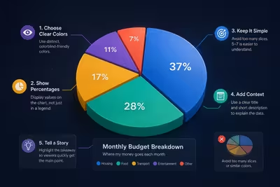
Most pie chart advice is about looking good — here's what actually makes one readable, and the one case where a pie chart quietly beats a bar chart.

Most sales funnel diagrams show a shape everyone recognizes — and hide the one number that actually matters.
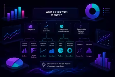
The chart that looks the most impressive on your screen is often the one your audience trusts the least — here's how to pick the one that actually works.

Most QR codes on slides get scanned by three people and ignored by the other ninety-seven — here's the part of the process everyone skips.

The data isn't the problem — the decisions you're avoiding about it are.

The slide you're proudest of in the room is often the one that falls apart the moment you're not there to talk over it — here's how to build one that doesn't.
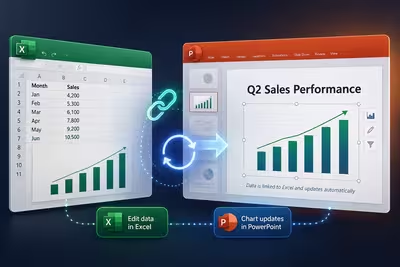
The method most people use to add an Excel chart to a slide is also the one that guarantees they'll be rebuilding it by hand the next time the numbers change.

Most annual reports are technically accurate and practically unreadable — here's how to fix the part that's actually broken.