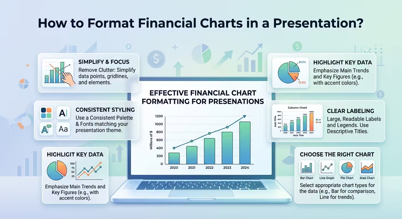
A financial chart can contain perfectly accurate numbers and still leave the audience unsure what they are looking at. That is the uncomfortable part of presenting financial information: the problem is often not the data. It is the way the data has been framed.
I often see finance slides where every number is technically correct, yet the audience has to work too hard to find the one number that actually matters. A revenue line competes with five other lines. A variance chart gives equal visual weight to a tiny deviation and a major problem. A dashboard displays twelve KPIs without making clear which one should trigger a decision.
Good financial chart formatting solves that problem before the presenter starts talking. The chart should make the financial relationship visible first, and let the speaker add the interpretation second.
Start With the Financial Question, Not the Chart Type
One of the easiest ways to create a weak financial slide is to open PowerPoint, choose a chart, and then try to fit the data into it. The better sequence is almost the opposite.
Start by asking what the audience needs to understand. Are you showing growth? Explaining a budget variance? Comparing business units? Showing how cash moved from opening balance to closing balance? Demonstrating that profitability changed even though revenue increased?
Those questions determine the visual structure.
- Trend over time: usually a line or column chart is appropriate when the progression itself matters.
- Category comparison: use bars when the audience needs to compare departments, products, regions, or periods.
- Planned versus actual: use paired bars, variance visuals, or a bridge structure when the gap is the story.
- Cash movement: a waterfall-style chart can explain how individual inflows and outflows produce the final position.
- Financial composition: use a proportional chart when the audience genuinely needs to understand how a total is divided.
For more structured financial storytelling, a dedicated financial charts PowerPoint template can provide useful starting layouts instead of forcing every report into the same generic chart.
Make the Important Number Visually Win
Suppose a chart contains revenue, operating expenses, EBITDA, and net profit. If all four series use equally strong colors and line weights, the audience has no reason to know which one deserves attention.
This is where financial chart formatting becomes more than decoration.
Give the primary metric the strongest visual treatment. Supporting figures can remain visible but quieter. For example, if the purpose of the slide is to explain falling profitability, net profit might receive the strongest emphasis while revenue and costs provide the explanation around it.
I would also avoid automatically giving every positive value the same bright treatment and every negative value the same alarming treatment. Financial meaning depends on context. A negative variance in expenses may be favorable, while a negative variance in revenue may be a problem.
Color should communicate financial meaning, not simply positive and negative emotions.
A useful test is to temporarily imagine the chart in grayscale. If the intended hierarchy disappears completely, the design is probably relying too heavily on color.
Format Axes and Labels for the Way People Actually Read Finance
A chart axis is easy to ignore when you are building the slide and surprisingly difficult to interpret when you are sitting in the audience.
Financial charts often become unnecessarily complicated because they display excessive precision. If the underlying decision concerns millions of dollars, showing every value down to the last unit rarely helps. It can make the chart look more analytical while making the comparison harder.
Use units that match the decision:
- Use thousands or millions when the figures are large enough to justify them.
- Keep currency symbols from repeating on every single data label when the axis or subtitle already establishes the unit.
- Use the same unit across comparable charts in the same presentation.
- Round values when the additional precision does not change the decision.
- Make the reporting period explicit: month, quarter, fiscal year, or rolling period.
There is one important exception. If a small numerical difference is itself the subject of the slide—for example, a narrow margin or a small forecast deviation—rounding too aggressively can hide the very issue you are trying to explain.
The rule is simple: precision should follow the decision, not the spreadsheet.
Use Variance to Explain What Changed
Executives rarely need a chart merely to confirm that two numbers are different. They need to understand why they are different.
Imagine a budget slide showing:
- Budget: $8.0M
- Actual: $9.1M
A pair of columns establishes the gap, but it does not explain it. If the additional $1.1M came from labor, materials, logistics, and one exceptional expense, the more useful visual may be a variance bridge showing how the original budget moved to the actual result.
This is why waterfall and bridge structures are particularly useful in financial presentations. They turn a static difference into a sequence of causes.
The Cash Flow Charts collection is a useful reference for this kind of left-to-right financial explanation, especially when the story involves inflows, outflows, balances, or budget movement.
But do not use a waterfall simply because it looks sophisticated. If the audience only needs to compare two totals, a simple bar chart will usually communicate faster.
Be Careful With Dual-Axis Charts
Dual-axis charts are tempting because they allow two metrics with different scales to share one visual. They can also create a misleading impression of correlation.
For example, revenue might be shown in millions while margin is shown as a percentage. Two lines can appear to move together simply because the designer selected convenient axis ranges.
If the relationship between the variables is central to the argument, consider separating the charts or using a different visual structure. If a dual axis is genuinely necessary, label both axes aggressively and make the units impossible to confuse.
In a board or investor presentation, I would rather spend another half-slide on two clear charts than save space with a visual that requires an explanation before anyone can interpret it.
Design Financial Dashboards Around Decisions
A financial dashboard has a different job from an individual financial chart. It has to establish a quick overview without turning into a miniature spreadsheet.
A practical dashboard usually works better when the metrics are grouped by the questions the audience is likely to ask: revenue, profitability, liquidity, efficiency, or cash flow.
For example, instead of arranging ten unrelated KPI cards in a grid, you can create a hierarchy:
- Top level: the few numbers that define the current financial position.
- Middle level: charts explaining movement or variance.
- Supporting level: smaller metrics that help explain the primary figures.
The Financial KPI Dashboard template demonstrates this type of finance-focused structure with KPI cards, charts, and financial categories arranged for reporting use.
The important part is not copying the layout. It is understanding the hierarchy behind it. A dashboard should answer “What needs attention?” before it answers “What numbers do we have?”
Keep Forecasts Visually Different From Actuals
One of the easiest mistakes to make in a financial presentation is allowing historical results and projections to look identical.
If actual revenue is represented by a solid line and forecast revenue continues with exactly the same visual treatment, the audience may not notice where measured performance ends and assumption begins.
Separate the two deliberately. A change in line style, a subtle background transition, or a clearly labeled forecast section can establish the boundary without turning the chart into a legend puzzle.
The same principle applies to scenarios. Base case, upside, and downside should not be presented as if they were three equally certain outcomes. Their visual treatment should communicate that they have different levels of certainty.
This is particularly important in financial planning decks, where a beautifully formatted forecast can accidentally look more certain than the underlying assumptions justify.
Build a Financial Chart That Survives the Presentation Room
A chart that looks perfect at 150% zoom on your monitor may fail completely when projected across a meeting room.
Before finalizing the slide, check it at the size at which people will actually see it. Can someone sitting at the back distinguish the labels? Can they identify the highlighted series? Can they understand the units without leaning toward the screen?
Then perform a more ruthless test: hide the explanatory paragraph and look only at the chart. Can you tell what changed, compared with what, and over what period?
If not, the chart is probably asking the presenter to do too much work.
A strong financial presentation does not eliminate explanation. It changes the role of explanation. Instead of spending thirty seconds telling the audience how to read the graph, you can spend those thirty seconds explaining why the result matters.
That is the real goal of financial chart formatting. Not prettier bars, cleaner lines, or more sophisticated dashboards. The goal is to make the financial argument visible before the discussion starts.
When I build these slides, I usually make one final check: if the audience remembers only one visual relationship from this slide, is that the relationship I intended to show? If the answer is no, the chart still needs work—regardless of how polished it looks.
Comments (0)