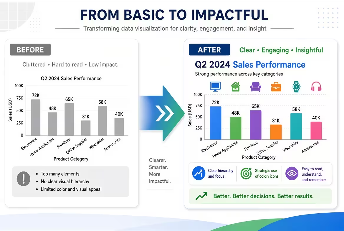
A before-and-after slide looks easy until you put the two versions on screen and realize that the audience is not sure what changed. The images may be technically comparable, yet the message still feels weak. One picture is larger, the crop is different, the labels compete with the visuals, or the “after” state simply looks nicer without explaining why.
That is the real challenge: a before-and-after infographic is not an image comparison. It is a visual argument about change. The design has to make the starting point, the transformation, and the result understandable almost immediately.
Start With the Change, Not the Two Pictures
When I build this type of slide, I first ask one question: What exactly should the audience notice?
If the answer is “everything,” the infographic probably needs another round of editing. A before-and-after comparison works best when it has one dominant comparison: a process became faster, a layout became simpler, a product changed, a problem was corrected, or a measurable condition improved.
For example, imagine a hypothetical presentation about redesigning a company's website. Showing two screenshots is not enough. The audience needs to understand that the redesign changed the navigation structure, reduced visual competition, and made the primary action easier to find.
The screenshots are evidence. The infographic is the explanation.
This distinction also affects the headline. Instead of a generic title such as “Before and After,” use a headline that tells the audience what changed: “From a crowded homepage to a focused conversion path.” The images can then support that statement rather than forcing the audience to discover it themselves.
Build the Comparison as One Composition
The most common mistake is designing the “before” side and “after” side independently. That usually creates two cards sitting next to each other rather than one coherent comparison.
Think of the slide as a single horizontal or vertical system:
- Before: establish the original state.
- Transition: show what changed between the two states.
- After: make the resulting state visually decisive.
The transition element can be surprisingly small. A directional arrow, a narrow connector, a transformation label, or a short phrase such as “Redesigned” may be enough. The important point is that the middle of the composition should explain the relationship between the two sides.
For more complex comparisons, diagram-based layouts can be useful because they provide a controlled structure for relationships and transformations. ImagineLayout's PowerPoint Diagrams collection includes editable layouts for flowcharts, processes, relationships, and other visual structures that can be adapted for this purpose.
Make “Before” and “After” Physically Comparable
This is where a lot of otherwise polished slides fail.
If the two images represent the same object, interface, room, product, person, chart, or document, their frames should normally have identical dimensions. Otherwise, the audience starts comparing the presentation of the images instead of their content.
Suppose the “before” photograph is a wide rectangle while the “after” photograph is cropped tightly into a square. Even if both photos contain the same subject, the second version will appear more important simply because it occupies a different visual scale.
I would use the same:
- frame dimensions;
- aspect ratio;
- alignment;
- visual scale;
- caption position;
- distance from the central comparison element.
There is one useful exception. If the purpose of the infographic is specifically to demonstrate a change in scale, then different sizes can become part of the story. But that should be intentional. If scale is not the message, don't let inconsistent cropping accidentally become the message.
Use Labels to Tell the Audience Where to Look
A viewer should not have to decode which side is “before.” At the same time, enormous labels can turn a clean comparison into a poster.
A simple hierarchy usually works well: a small status label, the main visual, then one short explanation of the relevant change.
For example:
- BEFORE — fragmented navigation
- AFTER — simplified navigation
Notice that the labels do more than identify chronology. They identify the reason for the comparison.
Color can reinforce this distinction, but I would not rely on color alone. A muted treatment for the “before” state and a stronger accent for the “after” state can create useful hierarchy. However, the labels and spatial arrangement should still make sense if the slide is viewed in grayscale or from the back of a meeting room.
If you are working with several comparison elements, editable infographic and chart layouts can speed up the construction. For example, ImagineLayout's Magnifying Glass PowerPoint Charts infographic template provides editable visual structures that can be repurposed for presentations where a specific detail needs to be highlighted.
Don't Let the “After” Side Become a Sales Poster
There is a temptation to make the result dramatically more attractive: brighter colors, larger imagery, stronger typography, more visual effects. Sometimes that works. Sometimes it quietly damages the comparison.
The problem appears when the audience cannot tell whether the result is genuinely better or simply better presented.
For a business presentation, I prefer to give the “after” state more visual emphasis only when the underlying evidence supports it. If the slide is about a redesigned dashboard, for instance, highlight the improved information structure rather than covering the result with decorative gradients and oversized checkmarks.
This is particularly important in analytical, consulting, medical, technical, or executive presentations. The design should make the improvement easier to inspect, not harder to question.
For broader infographic work, ImagineLayout also maintains a dedicated presentation template library where you can find editable PowerPoint and Keynote structures for different visual storytelling needs.
Add Evidence Where the Images Cannot Speak for Themselves
A before-and-after visual becomes much stronger when the audience can connect the visible change to a specific outcome.
That does not necessarily mean adding a large chart. Often, one concise metric, annotation, or callout is enough.
Imagine a hypothetical operations presentation showing an old workflow and a redesigned workflow. The two diagrams demonstrate that several steps were removed, but a small annotation can explain the business relevance: “Two approval stages eliminated.” Now the audience knows what to inspect.
The key is to keep evidence attached to the comparison it explains. If the metric is placed in a distant corner of the slide, the audience has to mentally connect two separate objects. If it sits directly beneath the relevant change, the relationship is obvious.
Three Layouts That Work for Different Before-and-After Stories
There is no single correct format. The right layout depends on what kind of change you are showing.
Side-by-side comparison
Use this when the audience needs to inspect two states simultaneously. It is particularly effective for photographs, interfaces, documents, packaging, dashboards, and visual redesigns.
The strongest version usually keeps both panels identical and uses the center gap for the transformation cue rather than filling that space with decoration.
Before → Change → After
This works better when the transformation itself matters. The middle section can contain a short process, three modifications, or a visual connector explaining how the original state became the final state.
This format is especially useful when “after” cannot be understood simply by looking at the two endpoints.
Before / After with focused callouts
Use this when the images contain too much information for a simple split-screen comparison. Instead of describing everything, attach two or three precise callouts to the areas that changed.
The constraint matters here: if every visible difference receives a callout, the infographic stops functioning as a comparison and becomes an annotated diagram. Choose only the changes that support the slide's main claim.
The Final Test: Can Someone Explain the Change in Five Seconds?
Before presenting the slide, remove yourself from the design process for a moment. Look at it as if you have never seen the project before.
Can you immediately identify which state is before and which is after? Can you see what changed? Can you understand why the change matters? If the answer to any of these is “not quite,” adding more decoration probably will not solve the problem.
Usually, the fix is more structural: equalize the image frames, rewrite the headline, reduce the number of callouts, strengthen the transition between states, or make the evidence sit closer to the change it explains.
A good before-and-after infographic should make comparison feel almost effortless. The audience should not spend its attention figuring out how the slide works. That attention belongs to the change itself — because that is the story the slide was built to tell.
Comments (0)