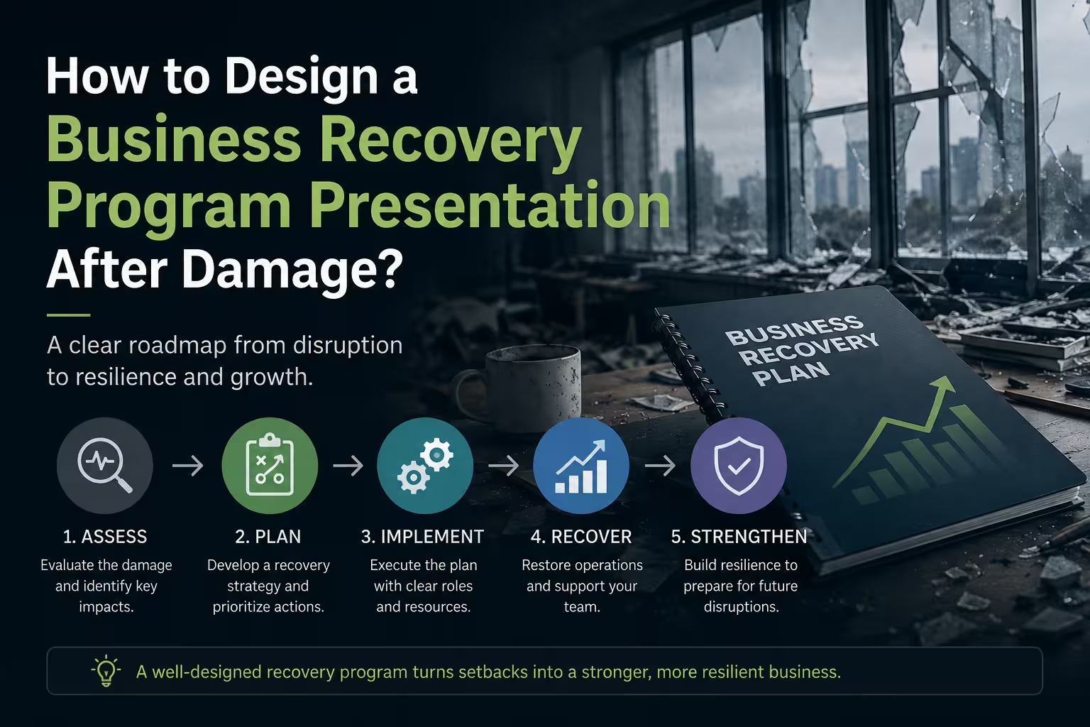
A damaged business does not become easier to understand just because you put the numbers into PowerPoint. In fact, the opposite often happens: photographs, repair estimates, financial losses, operational problems, and funding requests get placed on separate slides, and the audience is left to work out the connection themselves.
That is the real challenge. A business recovery program presentation has to show not only what was damaged, but why a particular recovery sequence makes business sense. The strongest decks make the logic visible: this happened, this is what it affects, this is what needs to happen first, this is what it will cost, and this is what changes once the work is completed.
Start with the business problem, not the repair list
A recovery presentation can easily turn into a catalogue of damaged equipment, buildings, inventory, infrastructure, and documents. That may be useful evidence, but it is rarely the best opening for a decision-maker.
Instead, begin with the operational consequence of the damage. For example, a hypothetical manufacturing company might have lost part of its production area. The important story is not simply that the roof, electrical system, and machinery were damaged. The important story is that production capacity has fallen, orders are at risk, employees cannot work normally, and revenue depends on restoring a specific sequence of operations.
A useful opening structure is:
- Current situation: what happened and what is currently unavailable.
- Business impact: which operations, customers, revenue streams, or capabilities are affected.
- Recovery objective: what must be restored for the business to operate again.
- Decision required: what approval, financing, resources, or coordination is needed.
This approach prevents the presentation from becoming a technical inspection report. The damage still matters, but it is presented in the context of business recovery.
Turn damage into a recovery map
One thing people overlook is that the most expensive item is not necessarily the first item that should appear in the recovery plan.
A damaged business usually has dependencies. A facility may need electrical work before equipment can be installed. Equipment may need to be restored before production can restart. Production may need to resume before a major customer can be served normally. A presentation should make these dependencies visible instead of hiding them inside paragraphs.
A simple recovery map can divide the program into stages such as:
- Damage assessment and immediate stabilization
- Critical infrastructure restoration
- Equipment and technology recovery
- Operational restart
- Capacity restoration
- Return to normal or improved operations
For each stage, show four things: what is being restored, why it matters, what it depends on, and what evidence confirms completion.
If the recovery involves many parallel workstreams, a timeline or process diagram is usually more effective than several pages of narrative. ImagineLayout's PowerPoint Charts collection includes editable chart layouts that can be adapted for timelines, comparisons, and structured reporting.
Separate immediate survival from full recovery
This is where many recovery presentations become misleading. They show one large recovery budget as if every expense belongs to the same phase.
It rarely works that way.
A business may need temporary premises before permanent repairs are finished. It may need replacement equipment before the original facility is fully restored. It may need temporary logistics, outsourcing, emergency inventory, or alternative suppliers simply to keep operating.
So create a distinction between:
- Immediate stabilization: actions required to prevent further losses or maintain essential operations.
- Operational recovery: actions required to restore the core business process.
- Full restoration: investments required to return the organization to its previous operating condition.
- Resilience improvements: optional or strategic improvements that reduce future vulnerability.
The last category deserves particular care. A recovery program can legitimately include improvements, but presenting every improvement as damage-related can weaken credibility. Keep restoration and enhancement visibly separate.
Make the financial story follow the operational story
A recovery budget becomes much easier to defend when the audience has already seen why each major cost exists.
Instead of opening with a large funding request, build toward it. First establish the operational problem, then the recovery sequence, and only then show the financial requirement.
A practical financial section can include:
- Damage-related restoration costs
- Temporary operating costs
- Equipment replacement or repair
- Infrastructure and facility work
- Technology and systems recovery
- Working-capital requirements during the recovery period
- Contingency allowance, with the basis for the allowance explained
Do not force all of these categories into one chart. If the funding request contains several fundamentally different types of expenditure, a waterfall, comparison, or phased budget can reveal the logic more clearly.
For financial slides, a resource such as ImagineLayout's Cash Flow Charts can provide editable structures for showing cash movements, comparisons, and financial reporting rather than starting every chart from an empty slide.
Show what recovery changes financially
There is an important distinction between cost of recovery and financial effect of recovery.
A repair budget tells the audience what money is required. It does not automatically explain what happens to the business after the money is spent.
Depending on the program, the presentation may need to connect recovery actions with measures such as:
- restored production or service capacity;
- expected operating capacity by recovery phase;
- revenue-generating activities that can restart;
- fixed and variable operating costs during the transition;
- working-capital pressure;
- assets restored or replaced;
- the point at which normal operations are expected to resume.
Be careful with forecasts here. If the figures depend on assumptions about demand, construction timing, supply availability, or financing, label them as assumptions. A precise-looking forecast built on uncertain inputs can undermine an otherwise credible presentation.
For a more detailed view of assets, liabilities, revenues, and overall financial condition, a financial-position slide can be useful. ImagineLayout's Financial Position PowerPoint Chart Template is specifically structured around presenting company financial health visually.
Build one slide that answers “Why this sequence?”
This may be the most valuable slide in the entire deck.
Recovery programs often contain competing priorities. Everyone can agree that repairs are necessary; the difficult question is which repairs should happen first.
Use one slide to show the decision logic. For example:
- Priority 1: action that enables several other recovery activities.
- Priority 2: action that restores a critical revenue-generating capability.
- Priority 3: action that increases capacity after basic operations are secure.
- Priority 4: improvement that strengthens the business beyond the minimum restoration requirement.
This is also where dependencies belong. If Project B cannot begin until Project A is complete, show the relationship graphically. A simple dependency diagram can communicate more in a few seconds than a paragraph explaining the same sequence.
The goal is not to make the recovery plan look sophisticated. It is to make the sequence defensible.
Design the evidence slides differently from the decision slides
A common mistake is to use the same visual treatment for everything: photographs, financial tables, timelines, and management recommendations all receive the same layout.
They have different jobs.
Evidence slides should help the audience verify the situation. Use photographs, inspection findings, inventories, technical descriptions, and documented estimates where appropriate.
Decision slides should help the audience choose an action. Use priorities, alternatives, costs, dependencies, risks, and expected outcomes.
Progress slides should help the audience see what has changed. Use completed versus remaining work, milestones, expenditure against plan, and current blockers.
Keeping these functions separate also makes updates easier. When new repair information arrives, you can update the evidence without rebuilding the strategic narrative.
Finish with a recovery dashboard, not a decorative final slide
The last slide should answer the question the audience will probably ask as soon as the meeting ends: “How will we know whether this recovery program is working?”
A useful recovery dashboard can track a small group of operational and financial indicators, such as:
- recovery milestones completed;
- critical facilities or assets restored;
- operational capacity recovered;
- actual expenditure versus approved budget;
- major unresolved risks;
- next decision or funding milestone.
Keep the dashboard tied to the recovery plan. If a metric does not influence a decision, trigger an action, or demonstrate progress, it probably does not belong on the final slide.
The strongest business recovery program presentation does not try to make damage look less serious. It does something more useful: it turns a difficult situation into a sequence of understandable decisions.
When the audience can move naturally from damage → business impact → recovery priorities → funding → timeline → measurable recovery, the presentation stops being a collection of slides and starts functioning as part of the recovery program itself.
That is the standard I would use when reviewing the deck before presenting it: if someone removes the presenter from the room and can still understand why the recovery plan is structured the way it is, the presentation is doing its job.
Comments (0)