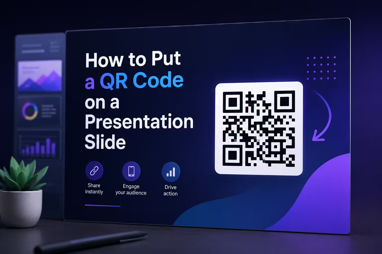
Someone in the back row lifts their phone, scans, waits, gives up, and puts the phone back down before the page even loads. Nobody in the room noticed — the presenter had already moved to the next slide. That's the actual failure rate of most QR codes in presentations, and it has almost nothing to do with whether the code itself is "correct." A correctly generated QR code can still fail an audience in half a dozen ways that have nothing to do with the black-and-white squares.
Why a technically valid code still doesn't get scanned
The instinct, when a QR code underperforms, is to blame placement — too small, too close to the edge, hidden behind the speaker's shoulder. Those things matter, but they're rarely the actual cause. The more common culprit is the destination URL itself. A long tracking link full of UTM parameters generates a denser code with more modules packed into the same physical size, and density is what kills scan reliability at a distance — not the size of the square on the slide.
Run the destination through a link shortener before generating the code, not after. A short URL produces a lower-module-count code that stays readable at a smaller physical size, which matters more once you're designing for a 20-foot conference room instead of a laptop screen six inches from someone's face.
The error-correction setting almost nobody touches
Every QR code generator has an error-correction level — usually labeled L, M, Q, or H — buried in an advanced options panel most people never open. It controls how much of the code can be damaged or obscured and still scan correctly. If you're placing a logo in the center of the code, which is common on branded slides, you need the highest level (H) so the logo doesn't eat into data the scanner needs.
Here's where it gets complicated: a higher error-correction level makes the code visually denser, and a denser code is harder to scan from a distance, not easier. So a code built to survive a logo overlay can end up less reliable for a room of 200 people than a plain code with no branding at all. If the logo matters more than the back-row scan, that's a legitimate choice — just make it on purpose instead of by default.
Sizing it for the room, not the screen you're designing on
A code that looks perfectly crisp on a 14-inch laptop can be unreadable projected across a room, because the relationship that matters is size-to-viewing-distance, not size-to-slide. A rough working rule: the code's side length should be at least one-tenth of the distance to your furthest viewer. For a room where the back row sits 30 feet away, that's a code roughly 3 feet wide once projected — which is bigger than most people instinctively place it.
One thing I wouldn't recommend: dropping the code into a corner as an afterthought once the rest of the slide is finished. It usually ends up too small to hit that ratio, and resizing it after the layout is locked means fighting whatever grid the rest of the deck follows. If the deck already runs on a consistent grid, the code needs its own reserved zone from the start — not a gap wherever one happened to be left over.
Built as a shape, not pasted as an image
Most QR generators export a flat PNG, and most people drop that PNG straight onto the slide as a picture. That works, but it's the same mistake that turns decks into bloated files: a raster image at whatever resolution the generator produced, resized visually but still carrying its full pixel data underneath. On a single slide it's negligible. Across a deck with a code on every section divider, it adds up in a way that shows up later when the file won't attach to an email.
The cleaner path, if your generator supports it, is exporting as SVG and letting PowerPoint treat it as a vector shape rather than a picture — same visual result, a fraction of the file weight, and it stays crisp no matter how large you scale it for the room-size math above. If you're already working with native vector shapes elsewhere in the deck, this is the one place people forget to keep that consistency.
The part that decides whether any of this mattered
None of the sizing or error-correction work changes the fact that a scan is only step one. Bitly's 2025 QR code report found that nearly all marketers surveyed had increased their use of QR codes over the previous year — but the same research space, in a separate benchmark from Uniqode, put typical scan-to-click-through conversion at roughly 15-20% depending on placement and context. That gap between "scanned" and "acted on" usually comes down to what's waiting on the other end: a mobile page that loads slowly, or a desktop-formatted site nobody bothered to check on a phone, undoes everything the code did right.
Leave the slide up longer than feels necessary, too. A code that flashes for four seconds before the next slide cuts it off doesn't fail because it was designed badly — it fails because nobody accounted for the ten or so seconds between a phone coming out and a page finishing its load.
Next deck you build, generate the code last, after the destination page is actually tested on a phone — not first, as a placeholder square you'll "deal with later." The square is rarely the problem. What it points to usually is.
Comments (0)