I once watched a perfectly accurate radar chart lose a client meeting. The numbers were right. The design was clean. Nobody in the room could read it in under ten seconds, and by the time they'd worked out which axis meant what, the point had already slipped past them. The chart wasn't wrong — it was just answering a question nobody in that room was asking.
That's the part most guides skip. They'll tell you a pie chart shows proportions and a line chart shows trends, which is true and also not the thing that trips people up. The real failure point isn't matching chart type to data type — most people get that part right on the first try. It's matching chart type to how much interpretive work your specific audience is willing to do, and that changes the "correct" answer more than any textbook rule admits.
Start with what the data is doing, not what it looks like
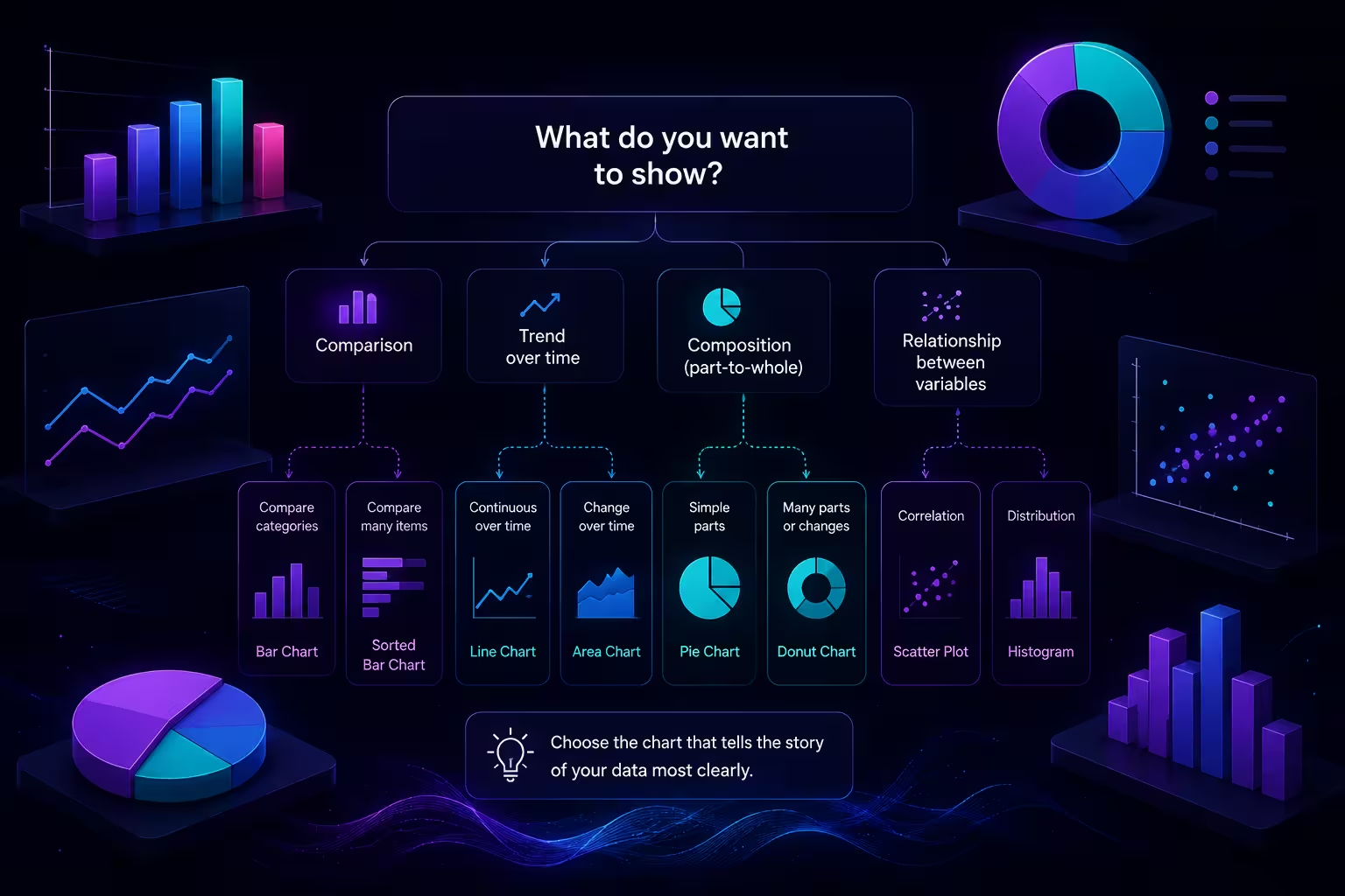
Before opening any design tool, I ask one question: is this data comparing, trending, composing, relating, or distributing? Comparisons (sales by region) want bars. Trends (revenue over twelve months) want lines. Composition (budget breakdown) wants stacked bars or a pie, depending on the count. Relationships (correlation between spend and conversions) want scatter plots. Distribution (how ages cluster) wants histograms. This five-way split, close to the logic behind the Financial Times' visual vocabulary project that data teams like Flourish's have built on, covers the vast majority of business data without needing anything exotic.
Here's the part that gets left out: two of those five categories can describe the same dataset at once. Monthly revenue by product line is both a trend and a comparison. Pick trend, and you get five overlapping lines nobody can trace. Pick comparison, and you get a wall of bars with no sense of momentum. Neither is wrong. The one that fails is whichever one doesn't match what you're actually about to say out loud when you present it.
Bar charts are the safe choice — except when "safe" becomes the problem
In my experience, bar charts win by default because almost nobody misreads them. Ten categories, clear labels, done. That's exactly why they get overused for data that has more going on than a simple comparison — a bar chart flattens sequence, so if the order of your categories carries meaning (a funnel, a maturity curve, a ranked priority list), a straight bar chart quietly erases that story while looking perfectly competent on the slide.
The fix isn't complicated, but it's the step people skip under deadline pressure: order the bars deliberately, not alphabetically, and if sequence matters more than the values themselves, you're probably looking at a funnel or a stepped diagram instead of a chart at all.
Pie charts deserve less contempt than most style guides give them
Pie charts get treated as the villain of every "chart mistakes" article, and mostly for good reason — the human eye is bad at comparing angles, so once you're past four or five slices, a pie chart asks the audience to do math they can't do at a glance. But the blanket "never use pie charts" advice ignores the one case where they're genuinely the best tool: two to three segments, one of which is clearly dominant, presented for two seconds on a summary slide rather than analyzed line by line. A single 70/30 split reads faster as a pie than as a bar, because the imbalance is visible before anyone consciously processes the numbers. The mistake isn't the chart type — it's stretching it past the point where it still does that job.
I wouldn't recommend defaulting to pie for anything with a "top 10" in the title, though. That's a bar chart wearing a costume.
When the data isn't numeric at all, you're not choosing a chart — you're choosing a diagram
This is where a lot of "which chart" advice quietly stops being useful, because process flows, org structures, decision trees, and stakeholder maps aren't charting numbers — they're mapping relationships and sequence. A flowchart handles decision logic. An org chart handles hierarchy. A Venn diagram handles overlap between a small number of sets, and stops being legible past three circles no matter how well it's drawn. If you catch yourself trying to force a process into a bar chart because that's the tool you already have open, that's usually the sign you need a diagram template built for structure rather than magnitude — this collection of process, hierarchy, and relationship diagram layouts covers most of that ground without starting from a blank canvas.
The trade-off nobody puts on the checklist: familiarity versus precision
Here's the complication that most "pick the right chart" checklists leave out entirely. The technically ideal chart for a dataset and the chart your specific audience can read fastest are not always the same chart, and when they diverge, precision usually has to lose. A slopegraph is often the more precise way to show a before-and-after shift than a pair of bar charts — but if the room has never seen one, you'll spend your presentation time explaining the chart instead of the finding. I've sat through exactly that meeting. The insight was solid. The chart type ate the first three minutes.
The practical rule I use: reach for the less familiar format only when the standard one would actively misrepresent the data, not just when the unusual one looks sharper. Everywhere else, pick boring and well-labeled over clever.
A quick stress test before you commit
Before finalizing, I put the draft chart in front of someone who hasn't seen the underlying data and give them five seconds. If they can't say what's going up, down, biggest, or smallest in that window, the chart type is wrong for the room — not necessarily wrong in theory, just wrong for this audience, this slide, this moment. That five-second test has caught more bad chart choices for me than any selection framework, because it measures the thing that actually matters: whether the diagram does the explaining, or whether you still have to.
If you're building the deck itself and want a head start rather than a blank slide, a library of editable chart layouts or a specific format like a pre-built pie chart template saves the formatting time so the five-second test is the only thing you still have to think hard about.
Next time you're staring at a spreadsheet before a chart type, try asking what you'll say out loud when you show it — the answer to that question, more than any lookup table, is usually the one that tells you which diagram to pick.
Comments (0)