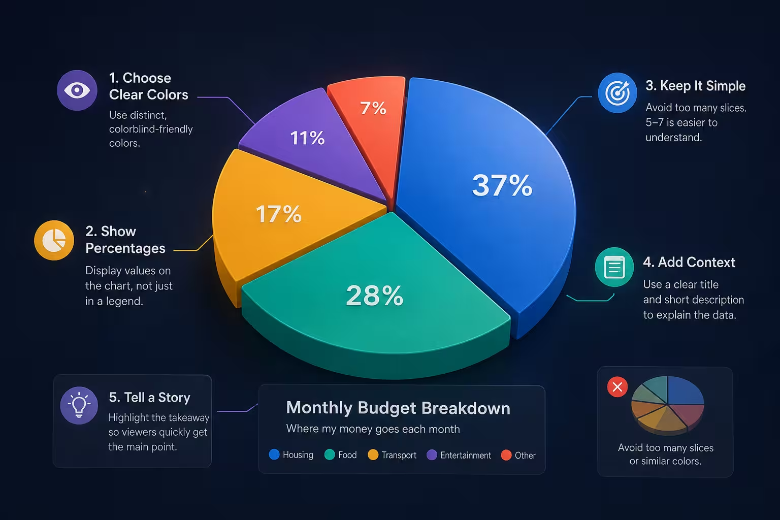
Somewhere around the third redesign, every presentation designer has the same thought while staring at a pie chart client feedback insisted on: "this is going to get torn apart in the meeting, and I still have to make it pretty." Pie charts have a strange reputation — practitioners are told to avoid them, and yet clients keep asking for them, because a circle divided into colored wedges just reads as "here's the whole picture" faster than almost any other chart. So the real question isn't whether to use one. It's whether the one you're about to build will actually hold up once someone squints at it from the back of the room.
The research everyone quotes half of
The standard line against pie charts comes from Cleveland and McGill's work on graphical perception, which found that people judge position along a common scale far more accurately than they judge angles or areas — the two things a pie slice asks your eye to do. That part of the story gets repeated constantly. What gets left out is a 1991 study by Ian Spence and Stephan Lewandowsky, published in Applied Cognitive Psychology, which tested something closer to how people actually use these charts: not "which slice is bigger," but "does this group plus that group add up to more than half." On that specific task — the kind of comparison someone in a budget review actually makes — pie charts held their own against bar charts, and in some cases edged ahead, because a circle gives your eye natural anchor points at the quarter and half marks that a bar chart doesn't offer in the same way.
So the honest rule isn't "pie charts are bad" or "pie charts are fine." It's narrower: if the reader needs to compare two individual slices precisely, reach for a bar chart. If the reader needs to gauge whether a handful of categories together make up roughly half or a quarter of the total, a well-built pie chart is doing exactly what it's good at.
The slice count rule nobody quantifies
"Keep it simple" shows up in every article on this topic, and it's true in the way "eat healthy" is true — accurate, and useless without a number attached. In practice, I stop trusting a pie chart around seven slices, not because there's a hard perceptual cliff at that point, but because past six or seven wedges, at least two of them usually land within a couple of percentage points of each other, and no amount of color coding fixes the fact that the eye can't rank-order angles that close. The fix isn't always "cut categories" — sometimes it's collapsing the smallest three or four into an "Other" wedge, which keeps the chart honest about scale without pretending five near-identical slivers of data are each worth their own color.
The exception: if you genuinely only need the reader to identify the single largest category and treat everything else as background, you can push past seven slices, because that's a one-slice-vs-the-field judgment, not a slice-vs-slice one. It's the same logic as the Spence and Lewandowsky finding — match the chart to the actual comparison being asked of the reader, not to a fixed slice count.
Labeling is where most "beautiful" pie charts quietly fail
A legend sitting off to the side looks clean in a mockup and is genuinely annoying in a live presentation — the reader's eyes have to bounce between wedge and label, matching colors, while you're already talking about the next point. Direct labeling, where the category name and percentage sit right next to or inside their own slice, removes that round trip entirely. It costs you some visual minimalism. It's worth it every time the chart will be viewed for more than a few seconds unsupervised, like in a PDF report someone reads without you in the room.
Where this breaks down is thin slices — anything under roughly 5-6% of the total usually can't fit a label inside it without the text overlapping the next wedge. That's the moment to pull the label outside the circle with a short leader line, or fold that sliver into the "Other" category from the slice-count rule above. Don't shrink the font instead; shrunk labels on thin slices are the single most common thing that makes an otherwise decent pie chart look amateur in a screenshot.
Color is doing more work than most people assign it
One thing people overlook: color in a pie chart isn't decoration, it's the only thing separating two adjacent wedges when their angles are close enough to be ambiguous. A palette that's aesthetically cohesive but low-contrast — several muted blues and teals, say — can make a chart that's technically accurate but functionally unreadable, because the reader is now doing color-matching instead of quantity comparison. I'd rather see one deliberately saturated color reserved for whichever wedge the narrative is actually about, with everything else pushed to muted grays. That single contrast choice does more for comprehension than a five-color gradient ever will, and it also tells the reader where to look first instead of leaving them to scan the whole circle.
Building it without starting from a blank circle
None of the above requires custom illustration work — it's mostly decisions you make before you touch the chart tool. If you're working in PowerPoint, a pie diagram template that already separates label placement from the wedge geometry saves you from fighting the software's default legend behavior later. And if the deck needs more than one chart type across the same report, pulling from a broader chart template set keeps the color and label conventions consistent between the pie chart and whatever bar or line chart sits next to it — which matters more than people expect, since a reader who's learned your color logic on slide 4 shouldn't have to relearn it on slide 9.
Next time someone asks for a pie chart, the useful question isn't "how do I make this look good" — it's "what comparison does the reader actually need to make." Answer that first, and the slice count, the labeling, and the color choices mostly settle themselves.
Comments (0)