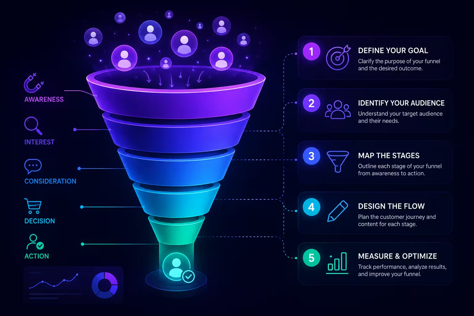
A sales director once handed me a funnel slide with five neat, evenly tapering bands — awareness, interest, decision, action, loyalty — and asked why the board kept asking the same question every quarter: "where exactly are we losing people?" The diagram looked finished. It answered nothing. The bands were even because someone had picked round numbers for the mockup and never gone back to plug in real ones.
That's the trap with funnel diagrams specifically, more than with most chart types: the shape is so recognizable that it reads as informative even when it's empty. Anyone can draw a trapezoid getting narrower toward the bottom. The actual work is in what the narrowing represents, and that's the part most guides skip in favor of listing software.
Decide What Each Stage Actually Counts Before You Open Any Tool
The single most common failure in a sales funnel diagram isn't visual — it's definitional. A stage like "qualified leads" means something different to the SDR team than it does to the account executives reviewing the same funnel a quarter later, and if the count going into that band shifts definition between reporting periods, the diagram is comparing two different things while looking like one continuous shape.
Before you touch a chart tool, write your stages as plain-language rules, not labels: what specific action or status moves a record from stage 2 to stage 3, and who owns marking that transition. In my experience, this step alone kills more bad funnels than any formatting choice — a hypothetical example: if "demo scheduled" gets logged the moment a rep sends a calendar invite rather than when the prospect confirms it, that stage will always look artificially strong, and every diagram built on top of it will overstate momentum right where leadership is watching closest.
Choose Absolute Counts or Percentages — Not Both, Not Loosely
Here's where most advice says "label your data clearly" and moves on. That's not wrong, it's just incomplete for funnels specifically, because a funnel chart's entire visual argument is proportional narrowing — and proportional narrowing hides absolute scale.
Say your top stage has 4,000 leads and your bottom stage has 40 closed deals. A percentage-only funnel will show a 1% overall conversion and nothing else, which looks alarming but tells nobody whether 40 deals is good or bad for your business size. An absolute-count-only funnel shows the real numbers but makes the narrowing between a 30%-drop stage and a 3%-drop stage look almost identical if the raw counts happen to be close. The fix isn't picking one over the other on principle — it's matching the choice to the question the audience is actually asking. A board wants proportional efficiency. A sales manager staffing next month wants absolute volume. If you're presenting to both in the same meeting, you likely need two funnels, not one funnel with two label sets crammed onto it.
Build the Stages in Your Tool of Choice
Once the stage logic and the count-vs-percentage decision are settled, the actual construction is mechanical. In PowerPoint or Keynote, a funnel is typically a set of stacked trapezoid or rectangle shapes with widths scaled to your values — either drawn manually with the shape tool and aligned on guides, or built from a pre-structured funnel layout where you just swap in your numbers and let the proportions adjust. If you're not starting from a blank canvas, a library of ready-made chart layouts saves the alignment work, since getting trapezoid edges to actually meet at consistent angles by hand is fiddlier than it looks.
For a straightforward five-stage sales journey — awareness through loyalty — a pre-built structure like a five-level funnel layout gets you to "just edit the labels and numbers" faster than building segment shapes from scratch. For funnels with branching paths or multiple sub-funnels feeding one main stage — say, three lead sources converging before qualification — a layered funnel template with more editable segments handles that complexity without you having to invent the layout logic yourself.
If you'd rather stay in Excel, a stacked bar chart with a transparent "offset" series (a trick for centering each stage so the bars appear to taper) gets you a genuine funnel chart without leaving your spreadsheet — useful if the diagram needs to update automatically as your CRM export refreshes, which a static PowerPoint shape never will.
Where Round Benchmarks Quietly Distort the Whole Diagram
There's a temptation, once the shape exists, to sanity-check it against an industry number and adjust your stages until it "looks right" — this is where a lot of funnels quietly stop representing your actual pipeline. HubSpot's own sales benchmarking guidance puts typical B2B lead-to-customer conversion somewhere in the low single digits, with enterprise software deals often landing even lower given longer decision cycles. That's a useful gut check for whether your overall funnel is wildly out of line with peers — it is not a target to reverse-engineer your stage definitions toward. I've watched teams redraw stage boundaries specifically to land closer to a benchmark number, which produces a diagram that reassures the room and describes nothing real underneath it.
When the Data Doesn't Want to Be a Funnel
Not every sales process narrows in one direction, and forcing one that doesn't into a funnel shape is a specific, avoidable mistake rather than a general design sin. If prospects regularly move backward — a deal drops from "negotiation" back to "qualified" after a budget freeze, then re-enters later — a funnel diagram can't show that motion at all; it only shows a snapshot of counts per stage at a point in time. A Sankey diagram or a simple stage-transition table will actually represent the back-and-forth, where a funnel would just quietly erase it and imply a cleaner journey than the one your reps are living through.
None of this makes the funnel a bad chart — it's still the fastest way to make a room understand where a pipeline thins out. It's just a chart that rewards the boring work done before you open the software far more than it rewards which tool you open. Define the stages first, decide what the numbers mean, and the shape mostly draws itself.
Comments (0)