Why Minimalism Makes Presentations More Persuasive
Minimalist slides cut distraction and sharpen your message. Here's why simpler presentations often communicate more effectively than dense ones.
Design tips, tutorials, product updates, and industry insights.

Minimalist slides cut distraction and sharpen your message. Here's why simpler presentations often communicate more effectively than dense ones.
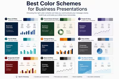
A practical breakdown of color schemes that actually work in business decks, from safe corporate palettes to accent strategies that hold up in a boardroom.
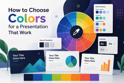
A practical guide to picking presentation colors that support your message instead of fighting it — with real trade-offs, not just theory.

Practical, tested ways to design presentations that work for people with vision impairments — contrast, structure, screen readers, and delivery habits.
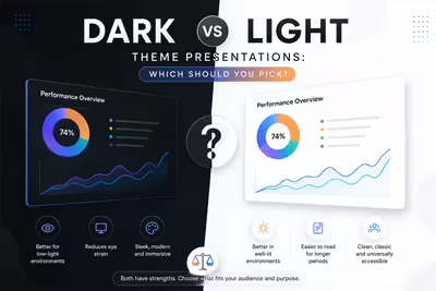
Comparing dark and light presentation themes across boardrooms, webinars, and pitch decks — with practical guidance on when each actually works better.

Most closing slides get rushed. Here's how to design a last slide that reinforces your message instead of just saying goodbye.
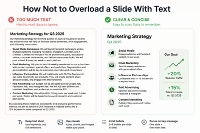
Practical ways to cut text from your slides without losing meaning — covering hierarchy, pacing, and what to move to speaker notes instead.
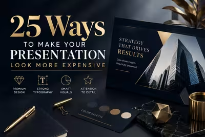
Practical, no-budget ways to make slides look polished and professional — better typography, spacing, and color choices, not expensive tools or a design degree.

Tired of blank stares during your presentations? These 10 practical slide design rules help you keep attention without gimmicks or clutter.