5 Presentation Design "Rules" That Quietly Don't Work
The advice every presentation designer repeats sounds airtight — until you watch it fail in a real client deck, and nobody says why.
Design tips, tutorials, product updates, and industry insights.

The advice every presentation designer repeats sounds airtight — until you watch it fail in a real client deck, and nobody says why.

Most companies don't have a template problem — they have thirty of them, and nobody remembers which one is actually current.

A gradient-filled chart can look sophisticated and still quietly tell your audience the wrong story — here's the mechanism behind it.
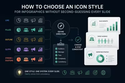
The icon style you pick before lunch on a Tuesday ends up defining how trustworthy your entire deck looks — here's how to choose one you won't regret by slide twelve.
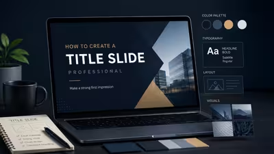
It's the one slide every single person in the room actually looks at — so why does it get built last, in five minutes, with whatever's left over?
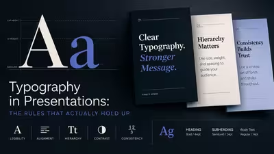
Most typography advice for slides falls apart the moment you're in a real room with a bad projector — here's what actually holds up.
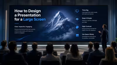
The slide that looks perfect on your laptop is the same slide that gets cropped, washed out, or unreadable the moment it hits a 75-inch boardroom display — here's why.

Most slide animation gets switched off by the second audience question — here's how to build the kind that survives contact with a live room.

Animation is supposed to hold attention — so why does it so often do the opposite, and what actually decides which side of that line you land on?